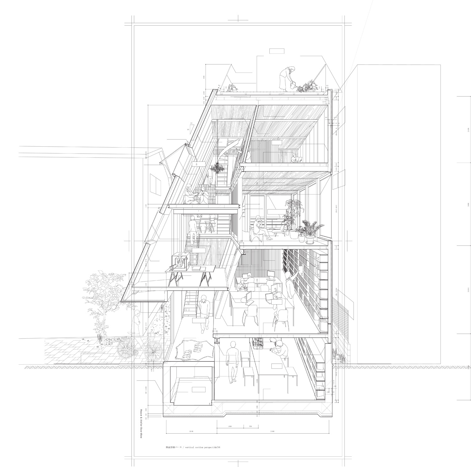
one my favorite books is GRAPHIC ANATOMY by atelier bow-wow. His drawings are probably my favorite because of his unique perspectives and I want to know how he draws them.
whats a tip/technique/secret to pull off a perspective section?
Start with a building section and work backwards, filling-in to align with a mirrored and scaled-down 'beyond' elevation...I don't believe there is any software involved, or required for this.
I think it's all 2d cadwork aligning section with elevation and connecting the lines and finish with some people, plants and other props. But what is important is to decide where the vanishing point is to get the right dynamic effect.
If you made your 3D model with enough detail - at least showing beam and stud sizes and offsets - instead of the usual 6" wide structureless polygon, you could get a drawing like this from Rhino simply by changing the camera settings and making 2D out of the perspective view instead of the elevation views. It would take longer to model but the payoff would be not having to match section to elevation drawings as previously suggested.
After that, you would just need to spend some time in Illustrator cleaning up the line-weights, adding hatch patterns and entourage. All in all, it would be a time consuming process no matter which way you roll the dice, so you probably need to consider if this particular drawing convention is going to add anything to your project.
draw 3D model in sketchup - select your view and cut section - export 2D image as dwg - open in CAD - change line-weights and add detail/entourage. It also helps if you've already drawn some wall sections in CAD beforehand...
2d section line work + 1 point perspective + outline of ppl gardening and taking showers + interns = awesome
I read an interview where they said that it took a whole group of interns and a huge amount of work. All done on cad I think. The drawings were mainly done for the book as opposed to the actual projects.
^ yeah, I can imagine a contractor not being super impressed with sectional perspective drawings with entourage. Unless maybe you only used playmates-in-the-shower entourage.
For once the interns would likely beg to draw those bathroom elevations.
A framer on a job I once worked on built a crucial piece of framing wrong because we had left a scale figure in the drawing, and it masked what he actually needed to see.
Bonehead move on our part, but then it was my first job out of school. The project manager should have known better.
the drawings were most likely extracted from the real working dwgs. No contractor would look at these seriously.
however, we have ourselves used the book as a handy translation tool in our own office. our knowledge of construction jargon in english has become quite bad so it is great that tsukamoto's gang have done the work for us ;-)
I agree that these drawings won't be appropriate for real applications, but since I am still in school, it's just for show. more so for shits and giggles.
thanks for all the suggestions guys. I think the hardest part is finding the vanishing point to make all these drawings work.
^ just make sure everything else in your project is solid before taking the time to do a drawing convention that is more show than information. I've shot myself in the foot more than once spending too much time on the graphic and probably not enough time on the actually meat of the project. Or just be willing to chalk up a bad review to a technical/graphic learning experience.
Although I have also been guilty of spending time on the graphic simply to piss of my studio instructor who insisted on Architectural Record-esque presentations, i.e. white boards, black lines and no extras. We instead choose to make our boards look like a graphic novel, complete with one-liners, dark, moody renderings and lots of colors. Needless to say, he was not impressed but it was the most fun I had in that studio all year.
i wouldnt discount different drawing conventions though, sometimes different relationships need to be expressed in "non-conventional" ways. sometimes, a drawing can tell you more than just a simple section. some materiality on those sections would kick ass though
Kinda cool, but not really anything innovative or new. 3D and a little line work after the fact should be able to achieve this without a ton of effort (obviously the level of construction detail is up to you).
Personally I think they are 'ok', but not that interesting.
the details of tsukamoto and his wife are not so innovative, but are pretty well conceived in order to achieve bigger goals, so i appreciate their work on that level. it is more common that architects treat details as a fetish exercise, where construction is a separate problem from the planning. here the details are not made for the sake of being clever, nor are they ever particularly workman-like (just done because they are being paid to get the work done). and that is an achievement.
which is the reason the perspectives make sense. the buildings bow-wow make are invariably intended to be inhabited. without people they make no sense at all and that is what is being shown here. the technique is not an end in itself but a tool for expressing something that is otherwise harder to see.
something that is different from say mies, where people are frankly irrelevant. different in fact from most architects these days. in that sense the superficial trick of making perspectives from detailed sections is more significant than the (dead easy) technique. which is why i like this book immensely, even though the projects themselves are not my favourites by a long shot.
my guess is that anyone who copies this technique without also understanding the purpose it was used for will not get the same kind of results.
tsukamoto teaches at ucla, but im not sure if he still does.
hasselhoff- is this true that very few people use 3d software in japan? I guess I can see that. I have seen other drawings that wasn't by Tsukamoto, but were also japanse and they happen to make regular cad drawings pop out /.
for those who don't find these drawings to be "spectacular", do you guys have any examples of your favorites?
3d or 2d, it doesn't matter. sharing is knowledge.
jump - I am not dismissing them entirely, I do think that there is a nice hierarchy not found in many drawings. But we were making similar drawings in school, 10+ years ago, ink on mylar, etc. Typically not with as many construction details, but still with 'space' being the emphasized area.
My favorite drawings, that I can recall, are the usual suspects - FLW, Hadid, Libeskind's ink on mylar are quite nice, Miralles and Pinos, early Morphosis, etc.
Go look at their ealier El Croquis for good examples, long before 3D images became the norm.
the drawings were most likely extracted from the real working dwgs. No contractor would look at these seriously.
while these sketches do not do a lot to show a contractor assembly, i've known plenty of contractors that are very appreciative of 3d sketches. if i'm drawing something in 2d that i know to be a little confusing, i'll often pop the detail into sketch up and make a 10 minute axon of it. contractors, at least the good ones, will oooo and aaaaah over the 3d. they think it's kinda cool like we think it's cool. lately, i've even started to add these drawings to the construction documents, and i've never heard any complaints which isn't to say that you shouldn't know how to put together a traditional set of drawings, but a 3d sketch can go a long way towards explaining your design intent.
yeah that is true enough jafidler. we generally do the same and get the same reaction.
these drawing however are absolutely not for consumption by contractors. they are for students.
i know you aren't dismissing, trace.
the point for me again is that these buildings are NOT about space. they are about inhabitation. Hence the need for people and furniture. Without people using them all of the work of atelier bow-wow is absolutely stupid. They don't "do" objects in space. In fact they don't even do "space". That isn't an ambition for them. So yes the technique is old, but the intent is not. And that is the lesson from these dwgs. Here is the apparently popular new archi-lingual (that sounds dirty doesn't it?) word, AFFORDANCE made real in a non-splashy way. The architecture affords certain types of inhabitation and the only way to truly communicate that is with this kind of drawing. so, i am impressed. not with the images but with the message, and with the way affordance affects their detailing. it isn't something we get very often in our current world of fetish-driven detailing.
as far as the technique goes, i think we actually were required to do similar thing back in 89 as part of our drawing class. so yeah i totally get what you are referring to trace. when i started architecture school we had 4 macs, they were black and white and wee as hell. i taught myself to use minicad on them in first year undergrad, but teachers were not happy and so presentations remained on mylar with rapidograph until i did m.arch 10 years later.
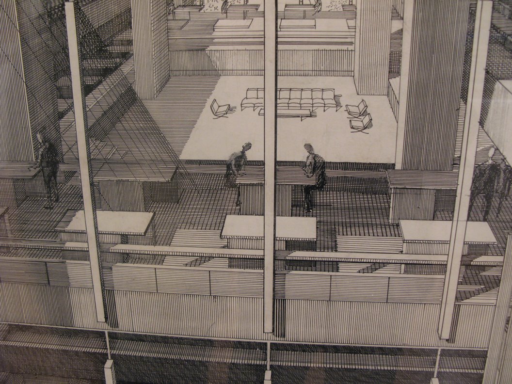
nice perspective by rudolph, 10.
that image illustrates my point quite well. it is cold and not about affording anything at all. the point rudolph was making was about space and connectivity. take the people away and his work is still rock-solid. admirable, but entirely different. and also for that reason slightly boring in our modern world, to my view.
Interesting points, jump. I suppose in that light I, too, give them a little more credence.
To me, though, architecture is about space, cold or not. I want to 'see' and 'feel' experience, not have it overly diagrammed. All subjective, I suppose, but all the detail in those renderings looks distracting to me - like there is something they are hiding or covering up (ie no 'space').
There is space in that image, though. If I were a prof, I'd say "poche them walls to add more clear hierarchy and delete the clutter. Show me the architecture". The 'stand back 10 feet' kinda test - can you still read the drawing without it being a foot away?
I appreciate their effort and intention (and you pointing that out), it just doesn't do much for me.
i can understand that trace. i don't like their architecture so much for just the reasons you site. on the other hand i think they are working towards something quite powerful.
with all the naysayers out there decrying the gilded excess of recent architecture one might be inclined to question what could replace that work...most seem to assume it is going to be something green, but i suspect the work bow-wow is doing is deeper and even more appropriate as a response. myself i don't take issue with architecture of excess so much, but if i were searching for a different way to practice architecture these guys would be my model. it's pretty potent stuff, and once they get it figured out i expect them to have lots of influence.
the clutter doesn't bug me. i think it is a japanese aesthetic, and maybe requires some steeping to feel right. over the years of living in japan my own sensibility has become very much removed from american tastes i notice, to the point that much of what i see from the west feels slightly off now...maybe you are experiencing the opposite...
i am surprised no one has said it, but both archicad and revit can do this just by using a singular function.
the latest archicad is still a little ahead of revit in that it can actually note and dimension in the 3D window. i am sure revit is not too far behind!
kinda late on this post, but I think there must be an easier way this drawing was made. I have a Tadao Ando: Detail book and almost all the drawings in there seem to be as detailed (perhaps more) and a large number of them in perspective views. I doubt students were hired to just use some 2D technique to create such perspectives for the book. They're probably using some software like Revit that allows them to model the construction details and extract orthographic or perspective drawings from them. Although these books have been out a fairly long time ago, so I doubt they used Revit for it.
I have an almost similar question, although is what I am looking for a bit different to the perspective drawings of Atelier Bow-Wow.
I am looking for a (the most efficient) way to make large scale isometric drawings. Also with a high degree of detail as for example drawings from sanaa / atelier bow-wow or fala atelier.
These ones here are good examples, varying a little in scale, but thats exactly what I am looking for. Thanks in advance for your hints!
I think this drawing is totally about space. Within their building envelope every inch of space is utilized. It's like horror vacui. But within the dense urban context of Japanese cities this seems very practical. And part of atelier bow wow's research agenda is understanding everyday spaces, underutilized spaces, and nitty gritty daily domestic life. All captured here.
Also on a functional level knowing every little piece of furniture, appliances, pets, etc ensures they have accounted for the needs of their clients.
I'd like to call the original poster out for referring to these drawings as "his" drawings. As far as I am aware Atelier Bow Wow is a partnership comprised of a man and a woman. Beyond that most certainly these drawings are not drawn by Yoshiharu Tsukamoto himself nor by Momoyo Kaijima herself but instead by a team of dedicated employees and interns.
Sexism is really old fashioned just as racism is just as continuing to pretend architecture is created by one person is. The more the world of architecture shucks off those relics of the past and embraces diversity the more we will see architecture that is truly different. I don't know about you but more different is more exciting to me than more of the same is.
Lewis Tsuramaki Lewis does some interesting hybridized perspective sections. They use a mash-up of hand-drawing and computer rendering with a distinctive color palette.
Jul 1, 15 4:10 pm ·
·
Block this user
Are you sure you want to block this user and hide all related comments throughout the site?
Archinect
This is your first comment on Archinect. Your comment will be visible once approved.

HOW TO: Draw ATELIEW BOW-WOW Perspectives
one my favorite books is GRAPHIC ANATOMY by atelier bow-wow. His drawings are probably my favorite because of his unique perspectives and I want to know how he draws them.
whats a tip/technique/secret to pull off a perspective section?
Can you post any links to their perspective sections?
Start with a building section and work backwards, filling-in to align with a mirrored and scaled-down 'beyond' elevation...I don't believe there is any software involved, or required for this.
please pot example
please post example
I think it's all 2d cadwork aligning section with elevation and connecting the lines and finish with some people, plants and other props. But what is important is to decide where the vanishing point is to get the right dynamic effect.
2d section line work + 1 point perspective + outline of ppl gardening and taking showers = awesome.
that didn't work....
never mind.....just go here:
link
If you made your 3D model with enough detail - at least showing beam and stud sizes and offsets - instead of the usual 6" wide structureless polygon, you could get a drawing like this from Rhino simply by changing the camera settings and making 2D out of the perspective view instead of the elevation views. It would take longer to model but the payoff would be not having to match section to elevation drawings as previously suggested.
After that, you would just need to spend some time in Illustrator cleaning up the line-weights, adding hatch patterns and entourage. All in all, it would be a time consuming process no matter which way you roll the dice, so you probably need to consider if this particular drawing convention is going to add anything to your project.
I wish CD drawings were this artistic.
SketchUp Pro method:
draw 3D model in sketchup - select your view and cut section - export 2D image as dwg - open in CAD - change line-weights and add detail/entourage. It also helps if you've already drawn some wall sections in CAD beforehand...
it looks like they've used 3D CAD blocks...
this is all first year undergrad stuff.
2d section line work + 1 point perspective + outline of ppl gardening and taking showers + interns = awesome
I read an interview where they said that it took a whole group of interns and a huge amount of work. All done on cad I think. The drawings were mainly done for the book as opposed to the actual projects.
^ yeah, I can imagine a contractor not being super impressed with sectional perspective drawings with entourage. Unless maybe you only used playmates-in-the-shower entourage.
For once the interns would likely beg to draw those bathroom elevations.
A framer on a job I once worked on built a crucial piece of framing wrong because we had left a scale figure in the drawing, and it masked what he actually needed to see.
Bonehead move on our part, but then it was my first job out of school. The project manager should have known better.
the drawings were most likely extracted from the real working dwgs. No contractor would look at these seriously.
however, we have ourselves used the book as a handy translation tool in our own office. our knowledge of construction jargon in english has become quite bad so it is great that tsukamoto's gang have done the work for us ;-)
I agree that these drawings won't be appropriate for real applications, but since I am still in school, it's just for show. more so for shits and giggles.
thanks for all the suggestions guys. I think the hardest part is finding the vanishing point to make all these drawings work.
^ just make sure everything else in your project is solid before taking the time to do a drawing convention that is more show than information. I've shot myself in the foot more than once spending too much time on the graphic and probably not enough time on the actually meat of the project. Or just be willing to chalk up a bad review to a technical/graphic learning experience.
Although I have also been guilty of spending time on the graphic simply to piss of my studio instructor who insisted on Architectural Record-esque presentations, i.e. white boards, black lines and no extras. We instead choose to make our boards look like a graphic novel, complete with one-liners, dark, moody renderings and lots of colors. Needless to say, he was not impressed but it was the most fun I had in that studio all year.
who has time or money to do fancy drawings like these?
i agree, they're pretty money, but damn - it can't be billable...
i love the 2 week anxiety before a review. oh, what colors should my renderings be!! the good days!
i wouldnt discount different drawing conventions though, sometimes different relationships need to be expressed in "non-conventional" ways. sometimes, a drawing can tell you more than just a simple section. some materiality on those sections would kick ass though
hehe holz.box, it's not billable, its free! He is a teacher you know..
my guess it is the work of unpaid student interns. to be honest these would be very good education and worth the work even if unpaid.
My experience in Japan. CAD. Very few people use/know 3D software. CAD+brute force+last train+JPY700 for dinner=drawing.
Kinda cool, but not really anything innovative or new. 3D and a little line work after the fact should be able to achieve this without a ton of effort (obviously the level of construction detail is up to you).
Personally I think they are 'ok', but not that interesting.
that is interesting perspective trace.
the details of tsukamoto and his wife are not so innovative, but are pretty well conceived in order to achieve bigger goals, so i appreciate their work on that level. it is more common that architects treat details as a fetish exercise, where construction is a separate problem from the planning. here the details are not made for the sake of being clever, nor are they ever particularly workman-like (just done because they are being paid to get the work done). and that is an achievement.
which is the reason the perspectives make sense. the buildings bow-wow make are invariably intended to be inhabited. without people they make no sense at all and that is what is being shown here. the technique is not an end in itself but a tool for expressing something that is otherwise harder to see.
something that is different from say mies, where people are frankly irrelevant. different in fact from most architects these days. in that sense the superficial trick of making perspectives from detailed sections is more significant than the (dead easy) technique. which is why i like this book immensely, even though the projects themselves are not my favourites by a long shot.
my guess is that anyone who copies this technique without also understanding the purpose it was used for will not get the same kind of results.
tsukamoto teaches at ucla, but im not sure if he still does.
hasselhoff- is this true that very few people use 3d software in japan? I guess I can see that. I have seen other drawings that wasn't by Tsukamoto, but were also japanse and they happen to make regular cad drawings pop out /.
for those who don't find these drawings to be "spectacular", do you guys have any examples of your favorites?
3d or 2d, it doesn't matter. sharing is knowledge.
jump - I am not dismissing them entirely, I do think that there is a nice hierarchy not found in many drawings. But we were making similar drawings in school, 10+ years ago, ink on mylar, etc. Typically not with as many construction details, but still with 'space' being the emphasized area.
My favorite drawings, that I can recall, are the usual suspects - FLW, Hadid, Libeskind's ink on mylar are quite nice, Miralles and Pinos, early Morphosis, etc.
Go look at their ealier El Croquis for good examples, long before 3D images became the norm.
while these sketches do not do a lot to show a contractor assembly, i've known plenty of contractors that are very appreciative of 3d sketches. if i'm drawing something in 2d that i know to be a little confusing, i'll often pop the detail into sketch up and make a 10 minute axon of it. contractors, at least the good ones, will oooo and aaaaah over the 3d. they think it's kinda cool like we think it's cool. lately, i've even started to add these drawings to the construction documents, and i've never heard any complaints which isn't to say that you shouldn't know how to put together a traditional set of drawings, but a 3d sketch can go a long way towards explaining your design intent.
Paul Rudolph

yeah that is true enough jafidler. we generally do the same and get the same reaction.
these drawing however are absolutely not for consumption by contractors. they are for students.
i know you aren't dismissing, trace.
the point for me again is that these buildings are NOT about space. they are about inhabitation. Hence the need for people and furniture. Without people using them all of the work of atelier bow-wow is absolutely stupid. They don't "do" objects in space. In fact they don't even do "space". That isn't an ambition for them. So yes the technique is old, but the intent is not. And that is the lesson from these dwgs. Here is the apparently popular new archi-lingual (that sounds dirty doesn't it?) word, AFFORDANCE made real in a non-splashy way. The architecture affords certain types of inhabitation and the only way to truly communicate that is with this kind of drawing. so, i am impressed. not with the images but with the message, and with the way affordance affects their detailing. it isn't something we get very often in our current world of fetish-driven detailing.
as far as the technique goes, i think we actually were required to do similar thing back in 89 as part of our drawing class. so yeah i totally get what you are referring to trace. when i started architecture school we had 4 macs, they were black and white and wee as hell. i taught myself to use minicad on them in first year undergrad, but teachers were not happy and so presentations remained on mylar with rapidograph until i did m.arch 10 years later.
nice perspective by rudolph, 10.
that image illustrates my point quite well. it is cold and not about affording anything at all. the point rudolph was making was about space and connectivity. take the people away and his work is still rock-solid. admirable, but entirely different. and also for that reason slightly boring in our modern world, to my view.
Interesting points, jump. I suppose in that light I, too, give them a little more credence.
To me, though, architecture is about space, cold or not. I want to 'see' and 'feel' experience, not have it overly diagrammed. All subjective, I suppose, but all the detail in those renderings looks distracting to me - like there is something they are hiding or covering up (ie no 'space').
There is space in that image, though. If I were a prof, I'd say "poche them walls to add more clear hierarchy and delete the clutter. Show me the architecture". The 'stand back 10 feet' kinda test - can you still read the drawing without it being a foot away?
I appreciate their effort and intention (and you pointing that out), it just doesn't do much for me.
i can understand that trace. i don't like their architecture so much for just the reasons you site. on the other hand i think they are working towards something quite powerful.
with all the naysayers out there decrying the gilded excess of recent architecture one might be inclined to question what could replace that work...most seem to assume it is going to be something green, but i suspect the work bow-wow is doing is deeper and even more appropriate as a response. myself i don't take issue with architecture of excess so much, but if i were searching for a different way to practice architecture these guys would be my model. it's pretty potent stuff, and once they get it figured out i expect them to have lots of influence.
the clutter doesn't bug me. i think it is a japanese aesthetic, and maybe requires some steeping to feel right. over the years of living in japan my own sensibility has become very much removed from american tastes i notice, to the point that much of what i see from the west feels slightly off now...maybe you are experiencing the opposite...
10, Thank you for posting the Rudolph
i am surprised no one has said it, but both archicad and revit can do this just by using a singular function.
the latest archicad is still a little ahead of revit in that it can actually note and dimension in the 3D window. i am sure revit is not too far behind!
kinda late on this post, but I think there must be an easier way this drawing was made. I have a Tadao Ando: Detail book and almost all the drawings in there seem to be as detailed (perhaps more) and a large number of them in perspective views. I doubt students were hired to just use some 2D technique to create such perspectives for the book. They're probably using some software like Revit that allows them to model the construction details and extract orthographic or perspective drawings from them. Although these books have been out a fairly long time ago, so I doubt they used Revit for it.
The above comment is hilarious.
Hello!
I have an almost similar question, although is what I am looking for a bit different to the perspective drawings of Atelier Bow-Wow.
I am looking for a (the most efficient) way to make large scale isometric drawings. Also with a high degree of detail as for example drawings from sanaa / atelier bow-wow or fala atelier.
These ones here are good examples, varying a little in scale, but thats exactly what I am looking for. Thanks in advance for your hints!
http://www.falaatelier.com/cdup
or this one. slide number two:
http://www.falaatelier.com/aurora
Also on a functional level knowing every little piece of furniture, appliances, pets, etc ensures they have accounted for the needs of their clients.
I'd like to call the original poster out for referring to these drawings as "his" drawings. As far as I am aware Atelier Bow Wow is a partnership comprised of a man and a woman. Beyond that most certainly these drawings are not drawn by Yoshiharu Tsukamoto himself nor by Momoyo Kaijima herself but instead by a team of dedicated employees and interns.
Sexism is really old fashioned just as racism is just as continuing to pretend architecture is created by one person is. The more the world of architecture shucks off those relics of the past and embraces diversity the more we will see architecture that is truly different. I don't know about you but more different is more exciting to me than more of the same is.
Lewis Tsuramaki Lewis does some interesting hybridized perspective sections. They use a mash-up of hand-drawing and computer rendering with a distinctive color palette.
Block this user
Are you sure you want to block this user and hide all related comments throughout the site?
Archinect
This is your first comment on Archinect. Your comment will be visible once approved.