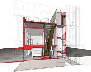
For my portfolio, I am currently working on a plan - section combination for one of the projects - a small residential project. I shaded the plan, and it looks good for what I am trying to do. Now I am wondering, how would I go about shading in section?
The method used for the plan is roughly this (no, this is not the project - just a picture that I found through google images):
try vray toonshader to render contours of the model too...
I like Wes Jones's drawings, you might want to look into that..
Unfortunately, I don't have any image now to post..
his website sucks
if you're really looking to go old skool aldo rossi-style, you choose an altitude and an azimuth for your sun angle. azimuth will determine the angle of your shadows in plan. azimuth will determine the angle in section. (obviously, you also have to site your building accurately.)
i'm not sure this will necessarily make your section "pop," as you will only get shadows on one side of your building, but it will make your drawing more rich with real world information.
if you are simply interested in showing greater depth, you might explore using perspective, layering, etc. i'm sure you know the drill.
As an avid Rhino-used I am well versed in other methods of getting depth in the drawing. However, as with many recent graduates I have some gaps in my knowledge of more traditional drafting.
Shading a section
For my portfolio, I am currently working on a plan - section combination for one of the projects - a small residential project. I shaded the plan, and it looks good for what I am trying to do. Now I am wondering, how would I go about shading in section?
The method used for the plan is roughly this (no, this is not the project - just a picture that I found through google images):
http://www.keyano.ca/Graphics/Collections/Facilities/Keyano.Facilities(Campus_Development_Master_Plan)(2005).jpg
My plan is strictly grayscale.
Any ideas/examples?
Have you tried rendering the inside of the model, in say vray, and then photoshopping and underlaying the linework?
try vray toonshader to render contours of the model too...
I like Wes Jones's drawings, you might want to look into that..
Unfortunately, I don't have any image now to post..
his website sucks
I would prefer to not use the rhino model. I am sure there are methods to do this - does anyone know?
LTL style is my fav!

Or my version...(not sure if this will work)
link
LTL have some truly awesome drawings.
However, this is a straight up section with background - no perspective. I just want the drawing to pop better off the page using shadows.
err...middle page, left side
...
I like the grayscale look; you could also accent the cut line to match board text, etc.
gotcha!
beautiful drawings ryan
Nice drawings ryanj - I don't think any of the sublinks work, just your main presentation board.
thanks!...yea, they worked at one point, don't know what's up.
Ryan - what I am looking for is the section/elevation equivalent of the shading on your siteplan: http://ryanbehring.com/Final%20Review/board%20images/siteplan.jpg
Ok, not trying to toot my own horn, but here's a 2D version I did a few years back...
plan
section
Could you assign subtle colors to the floor plan and have them correspond with the spaces shown in section?
Ryanj, those are all nice drawings and I could do that. However, in the context of what I am looking for they are completely different.
I am after a method of using shadows on the drawing to make the section pop stronger.
An example in elevation: http://www.jimmylimarchitect.com/image2/Side%20Elevation%20of%20Eu%20House,%20KL..JPG
I am looking for examples and methods on how to do this in seciont - how do you treat interior spaces, etc.
kungapa - firstly I would find images of sections. But try a bold colour for the poche, and a lined shadow
if you're really looking to go old skool aldo rossi-style, you choose an altitude and an azimuth for your sun angle. azimuth will determine the angle of your shadows in plan. azimuth will determine the angle in section. (obviously, you also have to site your building accurately.)
i'm not sure this will necessarily make your section "pop," as you will only get shadows on one side of your building, but it will make your drawing more rich with real world information.
if you are simply interested in showing greater depth, you might explore using perspective, layering, etc. i'm sure you know the drill.
Jafidler - I can't believe I didn't think about looking at some Rossi drawings.
Great reference:
http://www.moma.org/images/collection/FullSizes/00883002.jpg
As an avid Rhino-used I am well versed in other methods of getting depth in the drawing. However, as with many recent graduates I have some gaps in my knowledge of more traditional drafting.
I kinda liked Hadid's drawings:


Most could be done with some creative use of Illustrator.
Nice presentation overall.
http://www.skyscrapercity.com/showthread.php?t=402070
i was gonna take it back to ink on mylar with solid shadows....
I loved ink on mylar!! I miss drawings, honestly, but too time consuming and no flexibility.
I should try to dig up those old drawings, maybe I could call them 'art' and stick them on my wall.
:crizzler: - any good examples on solid shadows in section?
Block this user
Are you sure you want to block this user and hide all related comments throughout the site?
Archinect
This is your first comment on Archinect. Your comment will be visible once approved.