been working on the website for a few months now and did the graphics/layout and a good friend of mine programmed it. looks alot better than the old on and hopefully people/companies will sort of understand what i'm doing now.......
there's the portfolio site and the online store
i still have a few little graphic things to catch up on but the site should be fully functionable.
if you surf it a bit and find any glitches, let me know..... we have tested it in firefox and IE and so far so good.....
i'm hoping to due a full launch of my clothing line in spring with some newer designs and sizes/etc..... right now just getting the details worked out with the garments.
looks good. You may want to look at the spacing between text boxes and images.. they seem somewhat close, and that may detract a bit from the overall graphically integrity of the whole pages. There's all sorts of rules about this issue in graphic design.
i have some shirts laying around for now and havent seen what i have left...been doing alot of sponsering/promotion with the gear....
the next run will have m-3x in mens and s-l in ladies......
not really a market for larger sizes just yet..... that will come later though
i'll look at the text box/image spacing.... i know when i first layed out the site is was a bit bigger but then my programmer decided to shrink it for a more common reso/screen viewing size... so had to drop/push a few things around......
i have alot to do still with my product lines....i have to stay busy....
if anyone wants to refer me for a model gig, i'll send you a thankyou package ;)
navigation was a little less than intuitive, however. the things down the left look like menus, but don't act like them. a lot of the language is a little too self-promoting for my taste, but it may work for you. the "quotes" are nearly meaningless. (sorry.)
i'd suggest increasing the size/impact of the 'home : portfolio : contact' menu on the inside pages.
why do the two ":" buttons top right not work on every page? as a user, i want to go back to the same place i used a button before.
the navigation bar for the portfolio area of the site jumps to the bottom and is small and unimportant looking. took me a while to find it after having used navigation in different places before that.
get some friends to use the site and watch them. see if they have to search around for things or they just start clicking. you don't want it to be frustrating or to try users' patience in the least. you want them to 1) be engaged and 2) flow.
these comments are meant to be helpful, so take them in that spirit. i do think it looks good and i hope that it builds some business for you!
i'm viewing on safari, and here are some glitches that i notice in addition to what Steven mentions above:
- you cannot return easily and obviously to the home page from the other pages. in my opinion, this is crucial to let the viewer feel they are not lost.
- it would be nice to have a more straightfoward navigation system that shows a list of projects and where they fall in your organization structure. without this sort of "map" i feel like i might be missing things and i'm not guided in a narrative sense to see all from a start to a finish.
- i think the images and work can speak for themselves, so consider if you need the large black and white graphic at the top of each page. it takes up space that you can use to enlarge your photos or include more navigational information.
i do think your imagery is quite nice and can really make a big impact if allowed to shine.
Agree with csolomon and Steven above. I also intuitively moused back up to the top right : dots looking to go "home", then had to hunt around for the little word home down in the left lower corner instead. I would rather use the two : dots for more than the initial entry into your portfolio/shop, as they are such a STRONG part of your identity. Use them more - they look great on the shirts, they should be usable on the site.
When I go to portfolio, the first image to come up is the drawings. I personally think the interiors page is much stronger as a first image.
----------------------------------
OK wait - I just went back again and now it seems the first page to come up when I hit "portfolio" is changing - I got furniture once, and products once. I still think, for what you are doing, interiors might be your strongest page.
Also, in Firefox on a pc, the bottom navigation line of text - drawings products models etc. - is off the screen, below the thumbnail images. Maybe it's just a setting on my computer.
-----------------------------------
I've been back several times now and keep seeing things I missed the first time around...I'm thinking this is not a good thing, as I tried to take a thorough tour the first time and obviously didn't hit everything. Could the left-right navigation icons at the bottom of the page in the bar of thumbnails - currently a little white-on-black rectangle with a little white triangle adjacent - be a single larger triangle, with color? I think currently that icon blends into the white border around each image and gets a bit lost.
---------------------------
As said above, overall the graphics look cool and the content is really strong - just little glitchy things that need to be addressed. People are lazy (including me) and it needs to be really easy for us to use! So are you going to get a ModernPostcard made and mass mail the local firms (your client base, I'm guessing) to alert them that the new website is up?
Overall looking good. I agree with some of the navigation issues: non-obvious return to home, and the bottom links are too small to reflect their importance. Also, I keep trying to click on the words an the left on the home page as if they were links.
Nice timing on this, I am seriously considering quitting my office job to open my own shop offering everything from stickers to residential design work. Very inspiring, and I realize from your other posts it's not too easy. Do you do your own printing on the shirts?
i'm de-boogering the site and the ":" will become a navigation tool also....
the sizes of the pics were suggested by the programmer since not everyone views in a larger format...i.e. laptop size over a desktop size.....
i will relook the bio/etc and the text...... i not really much of a vocabulary typer of guy so i might have to have a friend write a bio for me.....
the background will be changing...the image of the pipe at top..... i will have a set of random backgrounds that will change per visit...still programming that
just have to get the site up to get some feedback and work out the glitches...
thanks fo the comments and i will take into them into consideration.....
have visited before, and this version of the site is def better than last one,
i think the work is better than the website makes it look.
the text to the left would make a fine menu, but isn't. which confuses. i keep getting lost.
i think you would be best served by simplicity as the work is already different enough to stand out. LB's idea is very good, ie to use the dots logo (which is quite nice, btw). she is also correct about the laziness thing. making standard navigation would not be a bad idea at all, just to make it easier for people like me who don't want to think about where to click.
like steven i find the quotes a bit off, but that is just cuz corporate speech scares me.
I agree jump. The site def does not do the work justice. I thought the services and store items on the left was the navigation. The online store could use better organization of the information [image, image nav, purchase button, quantities, etc]. Same is true of the portfolio. The nav within each section is completely lost in the experience. Once I'm in the portfolio or store I can't jump to the other without hitting the browser back button. Simpicity will help greatly. Just a few things to consider.
The postcard images look great - very simple, and does do the form of the work justice, as said above in contrast to some of hte busyness of the site.
It's hard work making good things, and hard work promoting the good work you do! Believe me, from watching my husband try to market himself for 12 years I know how time-consuming it is!
hey... i met a girl at a conference this past weekend in sarasota, florida that was wearing one of your shirts... she was originally from detroit, but now lives in south florida...

got the new website up....
been working on the website for a few months now and did the graphics/layout and a good friend of mine programmed it. looks alot better than the old on and hopefully people/companies will sort of understand what i'm doing now.......
there's the portfolio site and the online store
i still have a few little graphic things to catch up on but the site should be fully functionable.
if you surf it a bit and find any glitches, let me know..... we have tested it in firefox and IE and so far so good.....
www.237am.com
i'm hoping to due a full launch of my clothing line in spring with some newer designs and sizes/etc..... right now just getting the details worked out with the garments.
thanks
b
looking good dude.
where're the XL shirts, man!? us fat guys get no love!?
The website looks nice. A lot of your work is really dope.
looks good. You may want to look at the spacing between text boxes and images.. they seem somewhat close, and that may detract a bit from the overall graphically integrity of the whole pages. There's all sorts of rules about this issue in graphic design.
thanks
i have some shirts laying around for now and havent seen what i have left...been doing alot of sponsering/promotion with the gear....
the next run will have m-3x in mens and s-l in ladies......
not really a market for larger sizes just yet..... that will come later though
i'll look at the text box/image spacing.... i know when i first layed out the site is was a bit bigger but then my programmer decided to shrink it for a more common reso/screen viewing size... so had to drop/push a few things around......
i have alot to do still with my product lines....i have to stay busy....
if anyone wants to refer me for a model gig, i'll send you a thankyou package ;)
b
it would be good to have some more portfolio examples, especially for the services you list.
also on the front page why have 3 columns? it seems 2 should be fine, would allow you to upsize the text a little also.
a subtle background effect would be nice, just to differentiate the content portion a bit more.
overall though, a good job
LOOKS great, cryzko!
navigation was a little less than intuitive, however. the things down the left look like menus, but don't act like them. a lot of the language is a little too self-promoting for my taste, but it may work for you. the "quotes" are nearly meaningless. (sorry.)
i'd suggest increasing the size/impact of the 'home : portfolio : contact' menu on the inside pages.
why do the two ":" buttons top right not work on every page? as a user, i want to go back to the same place i used a button before.
the navigation bar for the portfolio area of the site jumps to the bottom and is small and unimportant looking. took me a while to find it after having used navigation in different places before that.
get some friends to use the site and watch them. see if they have to search around for things or they just start clicking. you don't want it to be frustrating or to try users' patience in the least. you want them to 1) be engaged and 2) flow.
these comments are meant to be helpful, so take them in that spirit. i do think it looks good and i hope that it builds some business for you!
i'm viewing on safari, and here are some glitches that i notice in addition to what Steven mentions above:
- you cannot return easily and obviously to the home page from the other pages. in my opinion, this is crucial to let the viewer feel they are not lost.
- it would be nice to have a more straightfoward navigation system that shows a list of projects and where they fall in your organization structure. without this sort of "map" i feel like i might be missing things and i'm not guided in a narrative sense to see all from a start to a finish.
- i think the images and work can speak for themselves, so consider if you need the large black and white graphic at the top of each page. it takes up space that you can use to enlarge your photos or include more navigational information.
i do think your imagery is quite nice and can really make a big impact if allowed to shine.
i like the hottie w the hoop earrings modeling the t's...
Agree with csolomon and Steven above. I also intuitively moused back up to the top right : dots looking to go "home", then had to hunt around for the little word home down in the left lower corner instead. I would rather use the two : dots for more than the initial entry into your portfolio/shop, as they are such a STRONG part of your identity. Use them more - they look great on the shirts, they should be usable on the site.
When I go to portfolio, the first image to come up is the drawings. I personally think the interiors page is much stronger as a first image.
----------------------------------
OK wait - I just went back again and now it seems the first page to come up when I hit "portfolio" is changing - I got furniture once, and products once. I still think, for what you are doing, interiors might be your strongest page.
Also, in Firefox on a pc, the bottom navigation line of text - drawings products models etc. - is off the screen, below the thumbnail images. Maybe it's just a setting on my computer.
-----------------------------------
I've been back several times now and keep seeing things I missed the first time around...I'm thinking this is not a good thing, as I tried to take a thorough tour the first time and obviously didn't hit everything. Could the left-right navigation icons at the bottom of the page in the bar of thumbnails - currently a little white-on-black rectangle with a little white triangle adjacent - be a single larger triangle, with color? I think currently that icon blends into the white border around each image and gets a bit lost.
---------------------------
As said above, overall the graphics look cool and the content is really strong - just little glitchy things that need to be addressed. People are lazy (including me) and it needs to be really easy for us to use! So are you going to get a ModernPostcard made and mass mail the local firms (your client base, I'm guessing) to alert them that the new website is up?
Overall looking good. I agree with some of the navigation issues: non-obvious return to home, and the bottom links are too small to reflect their importance. Also, I keep trying to click on the words an the left on the home page as if they were links.
Nice timing on this, I am seriously considering quitting my office job to open my own shop offering everything from stickers to residential design work. Very inspiring, and I realize from your other posts it's not too easy. Do you do your own printing on the shirts?
What happened to the hats?
thanks for the replies
i'm de-boogering the site and the ":" will become a navigation tool also....
the sizes of the pics were suggested by the programmer since not everyone views in a larger format...i.e. laptop size over a desktop size.....
i will relook the bio/etc and the text...... i not really much of a vocabulary typer of guy so i might have to have a friend write a bio for me.....
the background will be changing...the image of the pipe at top..... i will have a set of random backgrounds that will change per visit...still programming that
just have to get the site up to get some feedback and work out the glitches...
thanks fo the comments and i will take into them into consideration.....
b
the detroit guy
this is the front of my postcard that i have started to mail out
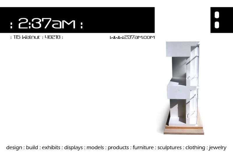
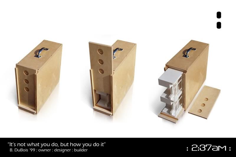
back
and just found out that postcard stamps are cheaper than regular stamps.......
and i have some z-fold bochures that i can mail out if i feel a need to......
being 1-man army can really burn you out
b
have visited before, and this version of the site is def better than last one,
i think the work is better than the website makes it look.
the text to the left would make a fine menu, but isn't. which confuses. i keep getting lost.
i think you would be best served by simplicity as the work is already different enough to stand out. LB's idea is very good, ie to use the dots logo (which is quite nice, btw). she is also correct about the laziness thing. making standard navigation would not be a bad idea at all, just to make it easier for people like me who don't want to think about where to click.
like steven i find the quotes a bit off, but that is just cuz corporate speech scares me.
I agree jump. The site def does not do the work justice. I thought the services and store items on the left was the navigation. The online store could use better organization of the information [image, image nav, purchase button, quantities, etc]. Same is true of the portfolio. The nav within each section is completely lost in the experience. Once I'm in the portfolio or store I can't jump to the other without hitting the browser back button. Simpicity will help greatly. Just a few things to consider.
b, that postcard is niiiiiiiiiiiiiccceee!!!!
i also love the box you built for the model. a work of art in itself.
The postcard images look great - very simple, and does do the form of the work justice, as said above in contrast to some of hte busyness of the site.
It's hard work making good things, and hard work promoting the good work you do! Believe me, from watching my husband try to market himself for 12 years I know how time-consuming it is!
thanks for the input people
i have toooo much in the portfolio to really make everything tie together...... so i went the simple approach.....
hopefully in a few days the site will be tweeked a bit more..... nothing major though.......
the post card is front/back....i prolly should have put a line in between...haha
over the past 7 years or so..... i went through about 5 different sites and designs and so far i think this one actually shows my work the best......
i dont know what really works and what doesnt........... i just have to roll with it and hopefully some work will happen......
b
got the ":" working on each page......
if a few people can double check and test them out that would help....
if anyone wants me to send them a postcard..... email me...hahaha.....
b
hey... i met a girl at a conference this past weekend in sarasota, florida that was wearing one of your shirts... she was originally from detroit, but now lives in south florida...
hahahaha....... dope.... was it the 313grey speghetti top one...if so i think i know her..
b
yep... it was...
crystal...hahaha
small world.....plus i have a mental note of where my stuff goes...hahaha
thanks for "locating" one of my shirts......
b
Block this user
Are you sure you want to block this user and hide all related comments throughout the site?
Archinect
This is your first comment on Archinect. Your comment will be visible once approved.