These last two projects give affirmation and meaning to every child-architect's early vision, that the unsheathed house frame, going up in his or her neighborhood, was far more delightful at that state than it was later. . .
sorry, but, as you can probably tell by now, holz, i'm not good at just pictures without commentary...
that grimshaw shelters project can hardly be called a 'small project' just because the individual artifacts are small. while most of these projects you've posted have a particular one-off bespoke quality, the shelters project was a metro wide string of structures that was only possible because of the numbers: leveraging the modularity of pieces through multiplication.
alriiiiight, Steven... I'll give it a shot. writing's not my forte.
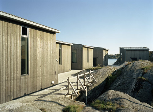
Niels Bruun & Henrik Corfitsen arkitekter
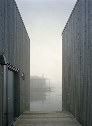
Nordic Watercolour Museum Ateliers- Skärhamn, SE
the project was won via one of the largest nordic competitions at the time.
the residences sit precariously at the edge of the world, Skärhamn is located at the westernmost part of sweden.
the siting appears to be a play on local buildings, which also reach out to land and water - Skärhamn has a well protected harbor and doubles in size during summer.
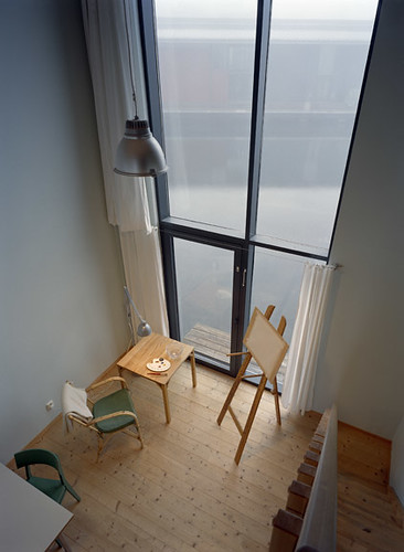
each atelier is 520 sf.
i wasn't able to find a floor plan, but i'm assuming that there is a bathroom, kitchenette and work space on the ground floor, with a bedroom/workspace upstairs. the interior is minimally finished.
the exterior is vertically oriented wood siding, painted grey.
as a whole, the architect flips buildings which adds a touch of frivolity.
the atelier are physically seperated from the museum by water, but are connected visually. this allows a certain degree of independence by the artists in residence. a pedestrian bridge provides access.
on the landward side, the deck melds with the landscape. siting the atelier partially in the water reduced the development's encroachment on the surrounding municipality.
It can't be denied that some minimal verbal description is vital, in combination with images, to permit the understanding of a project. There are things that drawings and photos alone cannot convey, whether atmospheric and poetic, or program- and site-descriptive.
But if forced to choose, I'll still take pictures over words -- of course !
a restructuring of the expo '02 site, yverdon-les-bains
completed 2007.
a simple study using common language among various themes:
meditation, picnic shelter, info kiosk, snack kiosk, restrooms...
i'm really intrigued by the moves with this project. by simply re-orienting the type, or combining with another pavilion, a diverse number of readings as well as experiences are possible.
the form is relatively simple... 2 parallel walls of lumber. each walls appear solid in one instance, transparent the next. the roof, a simple structure w/ polycarb to keep out the rain.
it will be interesting to see how this one ages, or if the pavilions get torched.
Nice. (Is that as over-used as "interesting" ? Sorry.) I like the connection (disconnection) with the ground.
But I have to say, there is "good random" and "bad random" in re the blocking seen directly above (not so bad, but the full wall shown is). Truly random (fallen leaves) in nature is sometimes lovely, sometimes not -- in either case, it is temporary. Nature gets to try it again. Not so with the builder.
i think you might be right on the random, though i'm hoping they signify something interesting (perhaps a musical score?)
they way they are not flush with grade is pretty interesting. i also dig the detailing of the groundscape.
the finish on the exterior is interesting, i dion't know if that's weathering or a stain. but it makes for an interesting effect.
also, i really dig that not all these pavilions are ADA accessible. don't get me wrong, i think there is a time and place for those things, but i don't think a lot of moves would be as strong if the tables couldn't span the entire width of the structure.
Holz...My pleasure it just seems as if there have been a lot of smaller projects getting press lately.
Also, basically every piece of architecture is see coming out of Chile, Argentina etc is all very thoughtful and often done withh what seems to me minimal cost, fuss and just lovely...
My favorite small (!) building in San Francisco -- a guard house at the Pacific Campus of California Pacific Medical Center, on Webster Street. I don't know who is responsible for the design; it dates from the late 'nineties. It is surrounded by extensive hardscape of the same white concrete-trimmed hard brick.
My impression on seeing this little gem was that I'd love a house of the same materials, detailed in the same way, steel door frame-as-structure, frameless glass, copper roof and all. The Robert Sunday residence of Wright (Marshalltown, IA) appears to be an example, thought the visible structure and finish are of wood.
from the LAtimes review of Stylish Sheds and Elegant Hideaways: Big Ideas for Small Backyard Destinations by Debra Prinzing and photographer William Wright.
Yeah, I really hate it when holz.box and others create great threads and spend a lot of time finding projects and ideas, submitting content, generally enlightening others and providing a great resource for archinect. It really sux.
The 2008 pavilion for Kivik Art Centre in southeast Sweden has been designed by David Chipperfield and Antony Gormley. The pavilion, which was constructed in only two months, is a sculpture entirely in concrete. Formed of three interlocked 100 m3 volumes – ‘The Cave’, ‘The Stage’ and ‘The Tower’ – the pavilion offers three different ways of experiencing the nature and landscapes around Kivik.
‘The Cave’ – a solid, dormant space in the base of the sculpture where one can rest on a wall-fixed bench, offers the enclosed feeling of being in the dark forest.
Stairs then take the visitor up to the first floor – ‘The Stage’ – a horizontal volume open to the landscape, where one looks out but is also exposed.
The third volume – ‘The Tower’ – takes the visitor up spiral stairs to a platform almost 18 metres above the ground, where one is rewarded with a spectacular view over the trees towards the Baltic Sea.
Question, there is a discussion going on the news thread for the Sou Fujimoto project.
Basically is it eco, because they used douglas fir, i had one arguement some other commenters had another.
I ask what about compared to the Kivik Pavilion is wood more or less "eco" than concrete???
nam, according to the abitare article, it's cedar not doug fir...
from an ecological standpoint, the wood is significantly better than steel and slightly better than concrete. there is less embodied energy (sum of the energy required to extract, harvest, process, manufacture, transport, construct and maintain products) as the manufacturing process for concrete and especially steel is several times as intense as that for lumber. the manufacture of concrete and steel also emits significantly more pollutants during the construction process, and off-gassing is an issue as well.
also, i don't think these are old growth trees, the lines aren't very tight and they don't seem to look like the old growth cedar i've seen here.
that being said, it might not be taken from a managed forest. so it might not be as green as it could be, however, if detailed correctly, it will stand for generations (there are some log constructions stateside that are several hundred years old) and that in and of itself should help quantify for you, whether it is "eco" or not.
compared to a temporary concrete pavilion, well, the wood could be reused several times over, whereas the concrete would have to be busted up (also energy intensive) and at best could be turned into a retaining wall or decorative piece...
Holz,
Thanks while i was wrong about the douglas fir being used,
you confirmed my viewpoint...
Sure old, trees are wonderful natural objects and it is nice when they are preserved, if we are talking what is a better source material, i thought wood was generally (with all the usual caveats) th more "eco" friednly way to go.
small projects
These last two projects give affirmation and meaning to every child-architect's early vision, that the unsheathed house frame, going up in his or her neighborhood, was far more delightful at that state than it was later. . .
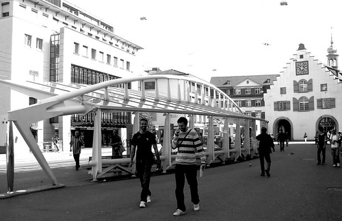
marktplatz bus stop, sankt gallen

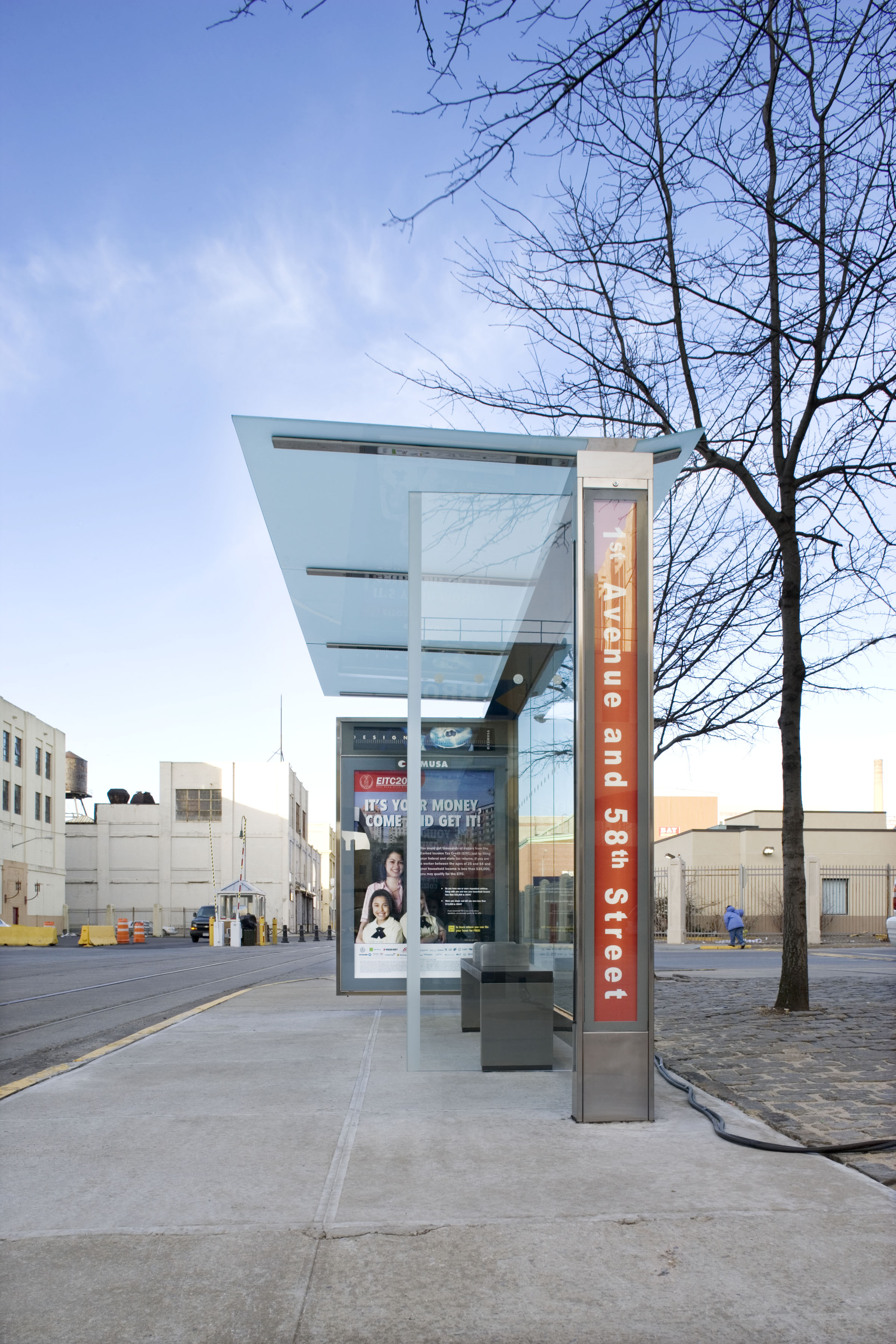
nyc bus shelters/newsstands/etc


la dallman
bus shelter
sorry, but, as you can probably tell by now, holz, i'm not good at just pictures without commentary...
that grimshaw shelters project can hardly be called a 'small project' just because the individual artifacts are small. while most of these projects you've posted have a particular one-off bespoke quality, the shelters project was a metro wide string of structures that was only possible because of the numbers: leveraging the modularity of pieces through multiplication.
carry on!
Robert Oshatz

Robert Oshatz

alriiiiight, Steven... I'll give it a shot. writing's not my forte.

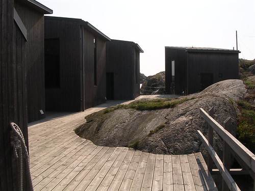
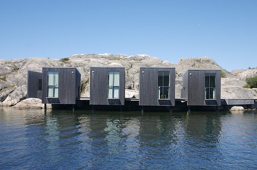

Niels Bruun & Henrik Corfitsen arkitekter
Nordic Watercolour Museum Ateliers- Skärhamn, SE
the project was won via one of the largest nordic competitions at the time.
the residences sit precariously at the edge of the world, Skärhamn is located at the westernmost part of sweden.
the siting appears to be a play on local buildings, which also reach out to land and water - Skärhamn has a well protected harbor and doubles in size during summer.
each atelier is 520 sf.
i wasn't able to find a floor plan, but i'm assuming that there is a bathroom, kitchenette and work space on the ground floor, with a bedroom/workspace upstairs. the interior is minimally finished.
the exterior is vertically oriented wood siding, painted grey.
as a whole, the architect flips buildings which adds a touch of frivolity.
the atelier are physically seperated from the museum by water, but are connected visually. this allows a certain degree of independence by the artists in residence. a pedestrian bridge provides access.
on the landward side, the deck melds with the landscape. siting the atelier partially in the water reduced the development's encroachment on the surrounding municipality.
this image almost looks like a watercolor...
i think this is a bega fixture...
i wasn't demanding commentary from YOU, holz, just excusing my own since i keep interrupting an otherwise pure flow of luscious images.
nicely done, though.
It can't be denied that some minimal verbal description is vital, in combination with images, to permit the understanding of a project. There are things that drawings and photos alone cannot convey, whether atmospheric and poetic, or program- and site-descriptive.
But if forced to choose, I'll still take pictures over words -- of course !
Pavillon Franz Marc, Muenchen


2 nearly identical pavilions built for the franz marc retrospective in munich. constructed in 4 weeks.
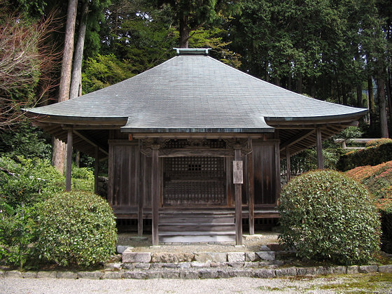
ANCIENT SMALL PROJECT: ohara imperial tomb Japan
9 pavilions


a restructuring of the expo '02 site, yverdon-les-bains
completed 2007.
a simple study using common language among various themes:
meditation, picnic shelter, info kiosk, snack kiosk, restrooms...
i'm really intrigued by the moves with this project. by simply re-orienting the type, or combining with another pavilion, a diverse number of readings as well as experiences are possible.
the form is relatively simple... 2 parallel walls of lumber. each walls appear solid in one instance, transparent the next. the roof, a simple structure w/ polycarb to keep out the rain.
it will be interesting to see how this one ages, or if the pavilions get torched.
Nice. (Is that as over-used as "interesting" ? Sorry.) I like the connection (disconnection) with the ground.
But I have to say, there is "good random" and "bad random" in re the blocking seen directly above (not so bad, but the full wall shown is). Truly random (fallen leaves) in nature is sometimes lovely, sometimes not -- in either case, it is temporary. Nature gets to try it again. Not so with the builder.
i think you might be right on the random, though i'm hoping they signify something interesting (perhaps a musical score?)
they way they are not flush with grade is pretty interesting. i also dig the detailing of the groundscape.
the finish on the exterior is interesting, i dion't know if that's weathering or a stain. but it makes for an interesting effect.
also, i really dig that not all these pavilions are ADA accessible. don't get me wrong, i think there is a time and place for those things, but i don't think a lot of moves would be as strong if the tables couldn't span the entire width of the structure.
ok, i need to find a better word than interesting. ack
Via DesignBoom


[url=http://www.kkas.net/Kochi Architects[/url]
They Previously did the already posted (i think) Atelier for a Calligrapher
Ahhhhh!
[url]=http://www.kkas.net/Kochi Architects[/url]
Ahhh
Kochi Architects
Via Designboom
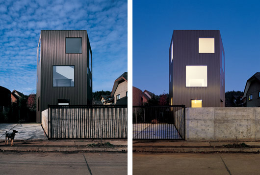
The young chilean based architects 'pezo von eellrichshausen' recently completed the build of their project 'casa wolf'
work is amazing...
there are a ton of amazing chilean architects that best be getting recognized soon... quite hiding already.
thanks for keeping it going, nh. i've been preoccupied for the last few weeks.
I like his web site.
Holz...My pleasure it just seems as if there have been a lot of smaller projects getting press lately.
Also, basically every piece of architecture is see coming out of Chile, Argentina etc is all very thoughtful and often done withh what seems to me minimal cost, fuss and just lovely...
My favorite small (!) building in San Francisco -- a guard house at the Pacific Campus of California Pacific Medical Center, on Webster Street. I don't know who is responsible for the design; it dates from the late 'nineties. It is surrounded by extensive hardscape of the same white concrete-trimmed hard brick.


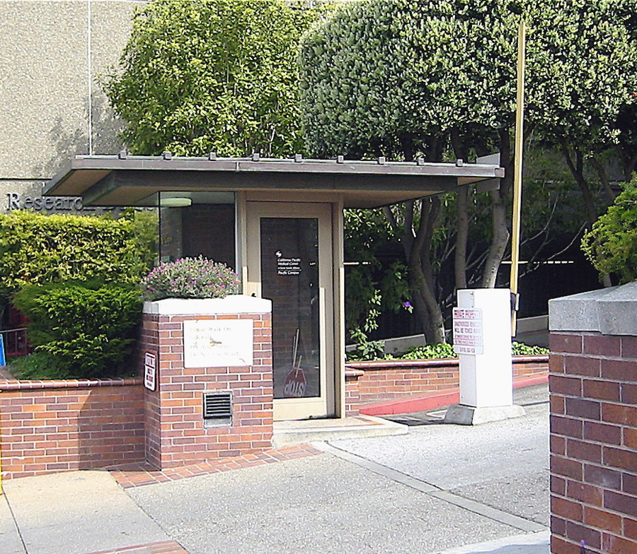

My impression on seeing this little gem was that I'd love a house of the same materials, detailed in the same way, steel door frame-as-structure, frameless glass, copper roof and all. The Robert Sunday residence of Wright (Marshalltown, IA) appears to be an example, thought the visible structure and finish are of wood.
I didn't realize he was born in 1966.
from the LAtimes review of Stylish Sheds and Elegant Hideaways: Big Ideas for Small Backyard Destinations by Debra Prinzing and photographer William Wright.


Via Domus..


The House in Hokkaido is an exercise in introversion by Jun Igarashi.
Woops...

Ahhh!!!1


The magic number is. . .420 (some say 417 or 418).
A recent review of the book Micro-Very Small Buildings by Ruth Slavid
Via Designboom
micro very small buildings' is a survey of over 50 newer and lesser known projects from around the globe. many of the works contain only a few spaces, but in a lot of cases, they are often presented as single spaces.
I mean the thread is great but it's just holz posting pics....
Not just Holz......
ouch. my depression is at an all time high right now, too.
Yeah, I really hate it when holz.box and others create great threads and spend a lot of time finding projects and ideas, submitting content, generally enlightening others and providing a great resource for archinect. It really sux.
apocalipstick on the other hand...
Again via Designboom.
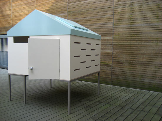
"House on a Table" by Soojin Hyun
link
diab -- sarcastic wednesday isn't until *tomorrow*
Soojin Hyun takes furnitecture seriously. . .
SDR - it's 4.58pm and Wednesday where I am....

Ah -- the avant garde !
Kivik Pavillion by David Chipperfield Architects a collaboration with British artist Anthony Gormley....
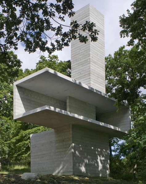
Yummy. But I can't read the material. . .
i believe it's board formed concrete...
‘The Cave’ – a solid, dormant space in the base of the sculpture where one can rest on a wall-fixed bench, offers the enclosed feeling of being in the dark forest.
Stairs then take the visitor up to the first floor – ‘The Stage’ – a horizontal volume open to the landscape, where one looks out but is also exposed.
The third volume – ‘The Tower’ – takes the visitor up spiral stairs to a platform almost 18 metres above the ground, where one is rewarded with a spectacular view over the trees towards the Baltic Sea.
-temporary pavilion out of concrete?!?
Next Generation House - Kumamura, JP

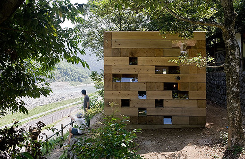

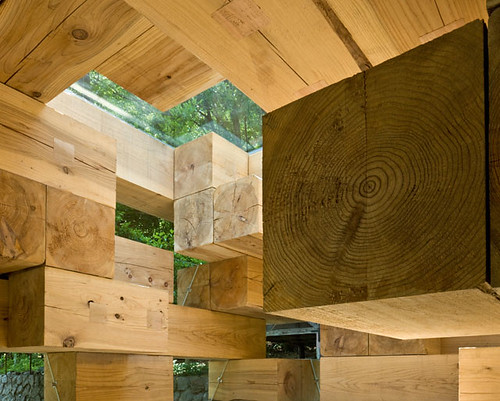

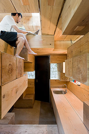
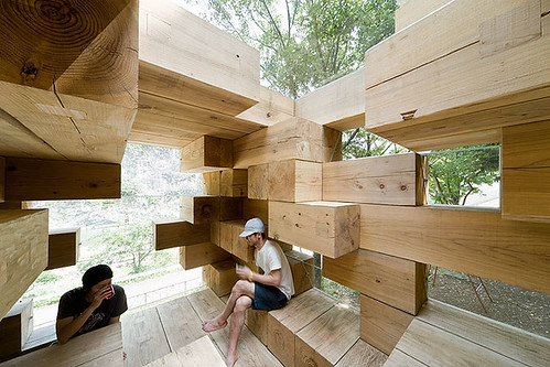
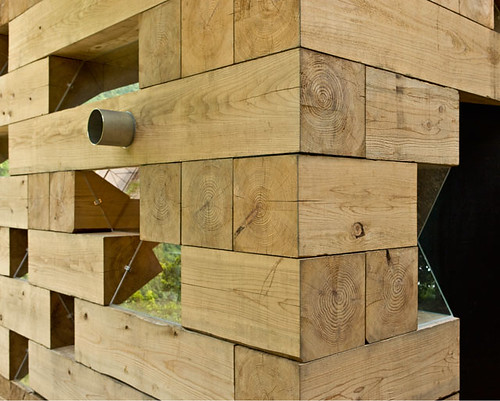
a weekend house set on a hill overlooking the kuma river.
the form is a wooden 4m cube.
construction is stacked cedar, held in place by weight and metal cables.
waste material is re-used as stairs and slipping fields to direct views.
skylights are utilized, providing additional light and views of the sky.
care is taken to minimize the skylight frame, thus allowing a purer visual link
the slippage of members creates a multitude of spaces, but are they useful?
semblances of normalcy, a cabinet, a sink and a door...
fixed windows are set oblique and secured w/ plastic plugs
Wow. Why not ?
Question, there is a discussion going on the news thread for the Sou Fujimoto project.
Basically is it eco, because they used douglas fir, i had one arguement some other commenters had another.
I ask what about compared to the Kivik Pavilion is wood more or less "eco" than concrete???
nam, according to the abitare article, it's cedar not doug fir...
from an ecological standpoint, the wood is significantly better than steel and slightly better than concrete. there is less embodied energy (sum of the energy required to extract, harvest, process, manufacture, transport, construct and maintain products) as the manufacturing process for concrete and especially steel is several times as intense as that for lumber. the manufacture of concrete and steel also emits significantly more pollutants during the construction process, and off-gassing is an issue as well.
also, i don't think these are old growth trees, the lines aren't very tight and they don't seem to look like the old growth cedar i've seen here.
that being said, it might not be taken from a managed forest. so it might not be as green as it could be, however, if detailed correctly, it will stand for generations (there are some log constructions stateside that are several hundred years old) and that in and of itself should help quantify for you, whether it is "eco" or not.
compared to a temporary concrete pavilion, well, the wood could be reused several times over, whereas the concrete would have to be busted up (also energy intensive) and at best could be turned into a retaining wall or decorative piece...
Holz,
Thanks while i was wrong about the douglas fir being used,
you confirmed my viewpoint...
Sure old, trees are wonderful natural objects and it is nice when they are preserved, if we are talking what is a better source material, i thought wood was generally (with all the usual caveats) th more "eco" friednly way to go.
Designboom (again) does a great review of recent Tiny House
 tutu House
 Z Glass
 port-a-bach
 h House
Small swellings of every shape and size
Some of my favs....
Block this user
Are you sure you want to block this user and hide all related comments throughout the site?
Archinect
This is your first comment on Archinect. Your comment will be visible once approved.