I like your comebacks. They are exactly how I think, but I also have the home work due! When I know of what I am doing, maybe I will offer some competition.
So look. I'm not *always* against blank walls (pedagogically, that is - heh), as sometimes they provide needed visual quiet as a counterpoint to vibrancy etc. But generally, as an urbanist, one needs to be anti blank walls on the sidewalk, which is appropriate.
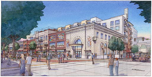
But this historic-ish building veritably *features* a blank wall at sidewalk level along one whole side. There are so many arguments that Modernism is just blank walls, but then one sees an accurate-ish historic style that's entirely predicated on a tall, stable base, resulting in a blank sidewalk wall, and...well, I'm not sure what my point is. It just stuck out to me that most lovers of classical styles would like this corner building even though urbanistically it's pretty bad.
Oct 19, 17 11:13 am ·
·
senjohnblutarsky
And the solution above?? Plop in some Louis Sullivan windows on either side of the centered entry. Another random thought:
I swear every bank that guy did seems to occupy a corner lot...
Oct 19, 17 11:18 am ·
·
Block this user
Are you sure you want to block this user and hide all related comments throughout the site?
Archinect
This is your first comment on Archinect. Your comment will be visible once approved.
What style is this building?
The build in the corner with the clock. I am trying to figure out what style the building is.
LIKE
sometimes I have moments of brilliance.
When is your homework due?
I like your comebacks. They are exactly how I think, but I also have the home work due! When I know of what I am doing, maybe I will offer some competition.
Romanesquish.
RomaneSQUISH is so perfect.
paleolithic
neoduanyesque
winner
Fascist.
Beaux-arts more than anything, I believe.
some vague Florentine Renaissance look
Late Capitalism.
It's classical, feels vaguely Italian Renaissance.
It looks like Mornington Crescent.
btw, this is what the buildings currently look like:
http://www.kcra.com/article/bl...
Gentrification City, here we come!
After seeing the photograph I'm definitely convinced it is an Anthropocene construct.
So look. I'm not *always* against blank walls (pedagogically, that is - heh), as sometimes they provide needed visual quiet as a counterpoint to vibrancy etc. But generally, as an urbanist, one needs to be anti blank walls on the sidewalk, which is appropriate.
But this historic-ish building veritably *features* a blank wall at sidewalk level along one whole side. There are so many arguments that Modernism is just blank walls, but then one sees an accurate-ish historic style that's entirely predicated on a tall, stable base, resulting in a blank sidewalk wall, and...well, I'm not sure what my point is. It just stuck out to me that most lovers of classical styles would like this corner building even though urbanistically it's pretty bad.
And the solution above?? Plop in some Louis Sullivan windows on either side of the centered entry. Another random thought: I swear every bank that guy did seems to occupy a corner lot...
Block this user
Are you sure you want to block this user and hide all related comments throughout the site?
Archinect
This is your first comment on Archinect. Your comment will be visible once approved.