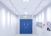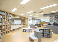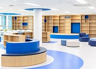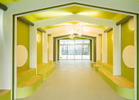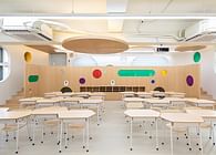
Breaking away from the existing partition office type, a new type of office is attempted by adding a space where you can relax and work in the centralized work space. Currently, when various work methods are emerging, we tried to increase the efficiency of work through a new type of work space.
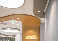
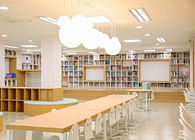
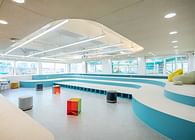
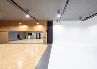
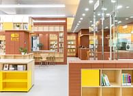
It is a project to remodel several neglected spaces on the 4th and 6th floors of Hanyang University's main building. The office on the 4th floor, with corridors on both sides, was originally a filming studio and a pantry space, but it was messy because it was neglected. Both walls in contact with the corridor are demolished and planned as a lounge. While replacing the existing office floor, the corridor is made of the same material. It gives the lounge a sense of openness and allowed people passing through the corridor to naturally enter the lounge. The wall on the elevator penetrates the window so that the person who gets off the elevator can immediately recognize the lounge on the fourth floor. The ceiling structure, which is connected from the elevator to the lounge ceiling through the window, comes down the wall and connects to the floor. Connectivity is given as a ceiling structure. In the lounge on the 4th floor, there are furniture arrangements in which groups of various sizes can gather, including 1, 2, 4, and 6 people. You can freely chat or relax by gathering in a place other than the office. It is also possible to have a light tea time by providing a pantry space with a water purifier and a refrigerator.
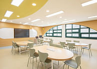
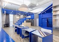
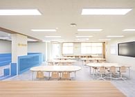
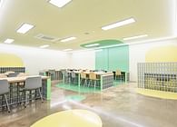
The sixth floor is planned to be an office of the Planning Department, two conference rooms and a lounge. The existing sixth-floor corridor was frustrating because it was composed of threads on both sides. The office wall is replaced with glass, and the walls of the space to be composed of a lounge are all torn down so that it could be used as a wider lounge, including the hallway. The conference room is made into a space by erecting a wall, but glass is used to give a sense of openness. The planning department's office has built-in furniture that puts all necessary furniture, such as refrigerators, trash cans, closets, lockers, and cabinets, on one wall, so that the space can be used efficiently. After leaving the office, the space at the end of the hallway on the left is given blue points. A pantry space is prepared with kitchen furniture and Irish furniture. An island that can sit alone, a round table for small groups, a big table for large groups, and a sofa that can sit freely are placed so that it can be used in various forms according to the purpose. The window is given a window seat to make it a space where you can rest quietly by yourself. A shoe rack is created under the window seat as a space where you can take off your shoes and go up. The two conference rooms can be used efficiently by varying the number of people available for 4 and 8 people. Except for the planning office, all floors are made to look like a single space with epoxy, but the floor with kitchen furniture and big tables is separated by different colors with paint. Although the area seems to be separated by the floor pattern, it is not stuffy because the space is divided by walls. The ceiling gives the impression of being separated into three spaces: a conference room, a lounge, and an office, with the rest of the lounge space except for the office and the conference room as an exposed ceiling. Among the exposed ceiling parts, where kitchen furniture and window sheets are located, a ceiling structure is created to connect to one space, but it gives a slightly separated feeling. The ceiling structure of the planning department's office passes through the office and crosses the exposed ceiling of the lounge to the wall and floor in the big table area. The office seems to be separated due to the glass wall between the office and the lounge, but it is directed as a connected space.
Status: Built
Location: Seoul, KR


