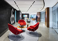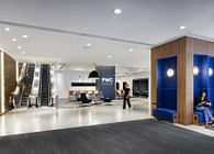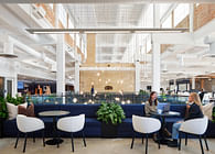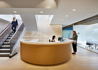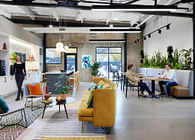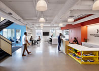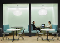
When walking into the new Radisson Hotel Group Americas (RHG) office the visitor is welcomed with color and light. This modern combination sets the tone for the design of the new office for RHG. The lobby is bold and confident in its expression of color and light. The contrast between spaces is emphasized. The lobby intersects with the cafe by simple garage doors, and the more industrial feeling of the space shines through. This was intentional making the idea of hospitality and celebration part of the first impression the visitor has of the space.
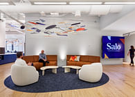
The cafe is a fun space that plays on the idea of contrast through the material application of black and white, and the design feature of the custom light panels made of walnut that cantilever over the space. The ceiling panels have a complex pattern of light and movement, which adds playfulness to this dramatic feature. This layered effect speaks to the confident and modern nature of the RHG brand. The panels anchor the cafe and the collaboration area off the team entrance to the space.
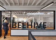
“This move for Radisson was important to address the changing nature of their work,” says Betsy Vohs, Studio BV Founder and CEO. “Their previous office had been located for decades in an iconic suburban building in the Twin Cities. The leadership looked to the Covid pandemic as an opportunity to shift their location and how they work.” Moving closer to downtown to a new building offered the Radisson team a better physical location to serve their teams and visitors. It’s closer to their hotels in the market, the airport and an easier commute for team members. This was also a big opportunity to shift how they work, who comes to work and why. The space is less than half the size of the previous office space. That was a big decision to eliminate a lot of private offices and workspaces. The design team worked with the Radisson leaders to understand what was driving their work now. What did they need when they were at the office and what will bring them back to the office. The idea of total flexibility and hospitality were those themes. The majority of the workspace in the new office is about collaboration and meeting space. The variety and style of these spaces are varied and unique. There are lockers and resource hubs and tech centers that support their hybrid team members. The design and construction team have work rooms and project layout and mock areas that allow them to do their unique work in the office but balanced with flexibility to work remotely.
Radisson has 4 distinct brands in the Americas. These brands have different personalities and clients. “The feeling of hospitality and brand that can connect to all their hotel brands was a key design driver,” said Vohs. “The design team did a deep dive into the Radisson brands to find alignment and universality. The design of the headquarters space builds on the qualities of all of those brands and is not connected to them by color or design style. The office headquarters is universal and connects to all of the RHG brands and allows the teams to feel that the headquarters is a universal design that appeals to the overall brand of RHG.”
KEY THEMES: Individual, Transported, Edgy, Bold, Unexpected, Confident
Status: Built
Location: Saint Louis Park, MN, US
Firm Role: Architecture, Interior Design, Brand Design, Custom Furniture, Furniture
Additional Credits:
Location: St. Louis Park, MN
Client: Radisson Hotel Group Americas
Year: 2022
Category: Workplace, Headquarters
Studio BV Role: Architecture, Interior Design, Brand Design, Custom Furniture, Furniture
Photographer: Corey Gaffer Photography
Size: 38,000 Sq Ft.
Team:
Contractor- Greiner
Furniture- Intereum
SDDI- Film and graphics
SEG- custom ceiling


