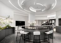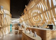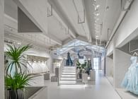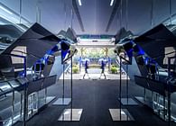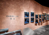
The traditional retail store of miyama is expanded to Shin Kong Place in Suzhou. The owner wants to design a high-quality space for presentation and sake tasting at the new store. Four freezers need to be placed and the public exhibition zone above 2.4 meters cannot be changed which is required by property management, so the main design goal is to utilize the three walls in the 30 square meter space so as to make exhibition express its theme by itself. Sake is incredible liquid made from rice and water. It is Japanese typical alcoholic drink with local characteristics. We find a balance between sake bottles and flat eaves of verandas in Japanese architecture when exploring how to arrange sake in the space based on sake itself. Just as Louis Isadore Kahn said, need is easy to satisfy, but desire is hard to realize. The functional need for placing sake is easy to satisfy, but the feature of the space’s desire is hard to express. Based on Kahn’s architectural philosophy of “Form Evokes Function”, components of the sake store are evoked by form of sake. Cylindrical tiles echoes the shape of sake bottles, and the disposition of tiles in eave culture is converted into stacking of cylindrical tiles. Sake bottles have three sizes: small, medium and large. Height of tiles on walls are designed as per the medium size, and diameter of tiles on walls and racks is designed as per the diameter of large-sized bottles. The height of racks is parallel to overlap between two tiles. Sake bottles are placed in the grid system composed of cylindrical tiles, which meets the needs of different bottle sizes and finds the balance between bottle placement and units of exhibition walls. Bottles are mainly made of glass and frosted glass with a variety of colors. The most inclusive super white glass and frosted transparent glass are chosen as the main materials in the space to echo the quality of sake. Tiles on walls are made of frosted acrylic instead of frosted glass for safety, but textures of the two materials are nearly the same. The store continues to adopt stainless steel and glass materials of the original freezers. The two materials are inclusive and as clear as water, which just echoes “purity” of sake. People needs to calm down to feel its beauty with both gentle and strong spirits. Background walls have a variety of colors, which encourages consumers to interact with the store. For example, consumers are inspired by diverse experience to take and share photos, which may make the store Internet famous. During construction of the project, we find the organic relationship between sake and units of exhibition walls by exploring the nature of space, and figure out the balance between bottle placement and units of exhibition walls. The exhibition space developed from the structural system organizes sake in a pure and harmonious way, and brings aura to modernity.
Status: Built
Location: Suzhou, CN


