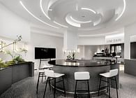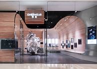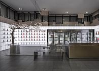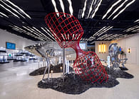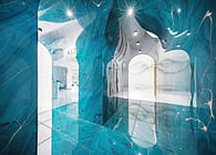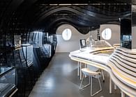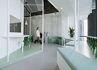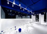
ONESWEAR is a romantic jewelry brand founded by 65 designers. The founder hopes that their designs will only serve the 10% minority who are allergic to public aesthetics. The new store is located in the Hubin 88 Shopping Center in Shangcheng District, Hangzhou, with an area of 80 square meters. When a city full of vitality and explosive power meets an independent and pioneering brand...
Slightly rebellious
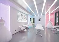
In the post-epidemic era, ONESWEAR has changed its spatial strategy from its original avant-garde temperament to a space that is more focus on itself and closer to users. The design of the new store is soft , gentle and romantic. However, the brand tone and customer group positioning are still destined to require a little "minority factor" in space design.
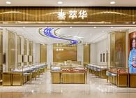
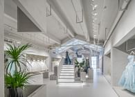
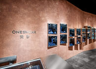
The design abandons the formulaic design ways of traditional jewelry stores, it does not pursue gorgeous decoration such as precious stones, wood grains, and metal edges in, but uses mottled light pink texture paint to find an emotional balance between simplicity, roughness, and gentleness.
Semiotics, occult archeology
We hope that the space is fuzzy and full of ambiguity and imagination, just like love relationship or a secret room.
The site has an irregular outline which likes a trapezoid. Therefore, the design creates conditions for movable booths by making use of the bevel edge. At the same time, the angular space between walls becomes abstract symbols. They are naturally formed when dealing with the complexity of the space, and also become a recognizable decorative language.
We organized all the changes under the same tone. The method is more like "excavation" than "building". The interior is like a mysterious stone chamber to be explore.
Facade
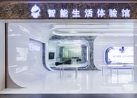
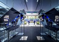
Although it is a closed space, it is still necessary to balance the unity and difference between the inside and outside. We hope to give the experiencer a private and enveloping interior experience. The public side facing the public area is an extension, deconstruction and discreteness of the same vocabulary.
Display windows are set up on the facade, and an gray space is formed through the concave entrance door design. It serves as a buffer for switching between inside and outside, and also carries brand theme elements that are updated from time to time.
Flexible space, productized and reusable furniture and cost control
The inclusiveness of the scene and cost control are inevitable topics in the current environment. Therefore, the layout of the design also aims to take into account the efficiency of use and maximum flexibility: a reception desk and modular display cabinets are efficiently set up on the outside of the space, and in the middle part space can be switched to different display and negotiation rest space modes according to needs.
All furniture, including booths, showcases, and reception tables, are productized movable reusable furniture, which is also a very important concept of design: sustainability and flexible slayout.
Status: Built
Location: Hangzhou, CN


