Background
With the progress of society and science and technology, the contemporary way of working has been different. The future office needs to be able to attract and retain creative and executive people who can create a platform that increases productivity while balancing employee interaction and space quality and experience.
Original condition
Office space is located in the National Science and Technology Park in an ordinary compartment, the space height is 2.7 meters, the area is 84 square meters, one side facing the corridor inside the floor, the other side is the south window, has a better view of the landscape, but with the tube hiding in the wall, the layout of the overall space has restrictions and impact. A company can only rent a room for no more than three years and to be returned as its original status according to the policy. So as a start-up office, design is to meet the multiple functions of office space while redefining the space in a low-budget way. But innovation doesn't mean breaking all the limits and recreating a new space, but redefining the working mode and creating the space experience at the lowest cost in the existing stock space.
Layout and use
The designer's work can be divided into "independent work", "team work", "presentation and discussion", and "meeting and reporting" four parts. We want to create as flexible, interactive, equal and fun a space as possible. So we cut the space into three parts: entrance space, conference space, office space. The creation of the entrance public area is still an essential part of the project as a new type of office space, while a more comfortable, relaxing and living experience has become an important requirement for the creative team to create a new office space public space. All exhibitions and storage are interspersed in 3 spaces to form an integral part of the designer's working life.
Design strategy
How to redesign the studio space in a limited space itself is an interesting experiment. We want to have a limited space of 84m2, which caters to about 15 designer offices, while also having a: seating area (tea and clutter placement), model workbench, material rack, conference room, library, design discussion area, print area. These are just the office functions of ordinary design firms, we also need to have a certain number of project display, honor certificate display and model display, as well as reserve a certain degree of flexible space for the subsequent development of the expansion. In this office we will sit in different places. We want to focus, communicate, participate in meetings, and discuss new ideas. The starting point for the design of office space is the experience of different scenes at work. In different work scenarios, we can deconstruct, reorganize, or even break the inherent office space attributes. Privacy and openness, blocking and communication, stay and flow. The office space is divided into 2 large office groups and a temporary office space in the middle. In addition to the different configurations required for different projects, comfort is critical to productivity.
Workspace design
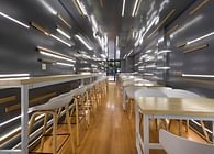
Free communication is essential for team innovation, open office space is an effective place to obtain information and inspire, close to the south to adequate lighting surface, to create an efficient working environment, because each design team is generally 2-6 people, so the office team can be flexible according to each design team. Create a certain degree of privacy between each other, but also maintain a visual sense of communication with other teams. An entire long table group can accommodate a team of long-term projects, the group consists of different independent and team work points, and through a series of fixed, mobile, personal and remote equipment to make it easier and intuitive to transform the shuttle in the project. Maintaining the closure and uniqueness of the group itself will help facilitate internal work and provide an adequate platform to showcase and share ongoing work. This arrangement establishes its boundaries but guarantees a visual sense of looseness.
Walls and cooling green plants
The green plant lights up the fresh vitality of the office space, and the wall on one side serves as a research project of the studio: the indoor vertical green wall is used to adjust the indoor temperature and humidity. The plants grown on them are regularly watered through an automatic irrigation system. It is the visual center of office space as one of the most distinct visual elements. At the same time, a large number of different varieties of fresh plants will continuously improve the air quality inside the office, and screen out the best species through time detection.
Meeting space
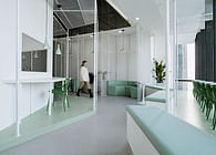
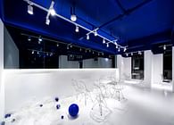
In order to ensure privacy and transparency at the same time, the meeting room adopts the design of frosted glass, such exchange area keeps each other transparent and connected, which enhances the tension of the place. The conference table can meet daily meetings, presentations, small trainings and lectures. The projection combines with the original white wall to maximize the display.
Entrance space
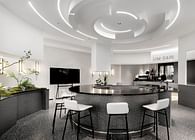
The entrance space is a leisure space in this small space and integrates multiple auxiliary functions, so people can take a short break here. Instead of the traditional tea room treatment in the closed office space, we use the enlarged island-style tea room to create a place for employees to relax and work, and a platform for interaction between people at work. Although the glass partition side space on the side of the conference room is limited, it opens up a whole area of indoor material matching area and storage and book storage space below. Plants, books, artwork and small models are scattered throughout the office to add to the everyday personality of design life.
Display area
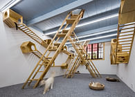
Design works should not be an unattainable luxury, it should be a daily product. We divided the walls into different areas and identified three main display walls by means of model deployment: for the finished work, the ongoing project, and the unfinished project. The model of the project is placed on the shelf of the entrance space, and the shelf of the conference room is placed with the project text, the certificate of the award certificate, and the published magazine paper.
Everything in the space is to ensure that the people in the office are happy to work and play their talents here. Under the guidance of the concept of “work, sharing, innovation”, the central area itself has become a knowledge-based economic development base by creating joint office space, multi-functional rooms and the first digital production workshop in the region. This is about creating a space to attract, motivate, develop and retain outstanding talent. The workplace is no longer just a place to work. It is a place to be yourself, a place where you are at its best, and a place you are proud of as an organization ambassador.
Status: Built
Location: Suzhou, CN
Additional Credits: Vertical greening: Min.Ding,Wuxingzi.Deng,Yin.Jiang
Wall Display: Xiaoqiao.Guan, Mingyuan.Cui
Photo: Jieqi.Yao


