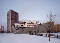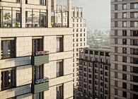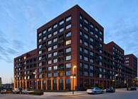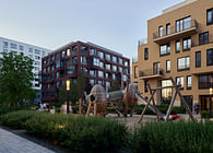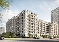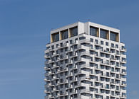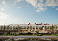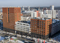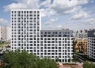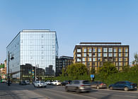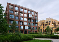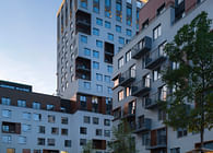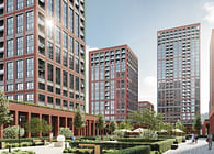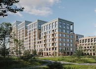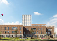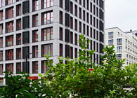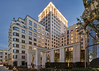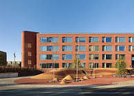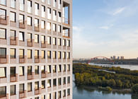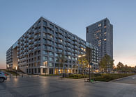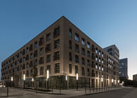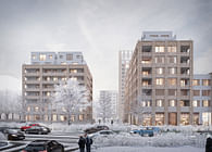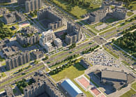
Developed by Brusnika in 2018, the office complex in Kandinsky House, Yekaterinburg, hosts the company’s HQ. A five-storey building with a GFA of 4500 metres square, it looks like a glass rectangular adjacent to the residential block at a 90° angle. Bronze-tinted HPL panels finish the building, with the foundation and the top clad with dark gabbro granite, the finishing material of the facade. Metal pillars support the office complex from the first to the fourth floor, lightening the structure and forming shade above the entrance. The block roof acts as the fifth facade with a garden for residents.
Brusnika office takes all the building floors, accommodating 360 full-time employees and 50 auxiliary workstations to cater for staff on business, host a meeting, or change the scenery to shift focus.
High space density was the project challenge: the architects had to accommodate numerous staff in a relatively small area while designing an open space promoting diversity and encouraging interaction. With a negative experience in mind, where conventional offices of a business centre made colleagues distance from each other, disrupting communication, we tried to avoid this in our new office complex. The concept was to facilitate communication, share ideas and instil the company ethos without distracting each other and enjoying a quiet place conducive to productive work.
Designers aimed at a cosy and flexible working zone, contrasting the conventional office space notion. We consciously avoided linear zoning, dazzling white lights, noise pollution, wires hanging under each desk, and austere negotiation rooms. The interior mimics a creative cluster with diverse areas for work, leisure, meetings, and informal communication during breaks. Three core ideas are behind this design.
The concept of the natural comes first. The interior finishes and decor reflect the idea in natural colours: olive and grass greens, egg yolk yellow, soft fruit red, plum, and other shades, and authentic materials, such as stone, concrete, and timber.
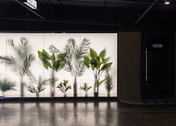
In addition, panoramic perimeter glazing results in high insolation. Warm lighting with adjustable brightness - from medium to dimmed, typical for residential quarters, complements natural solar gain. And finally, the space hosts a raft of house plants between the workstations, in conference rooms and offices, lounges and reception zones. The plants also enliven the building facade with transparent partitions made of cord to support climbers. The frontage features green blocks, enhancing the building’s high-tech design to contrast with the natural elements.
The second idea is about cosiness and creating a home from home. Carpeting muffles the usual office hum — it absorbs footsteps and has a homely feel. Acoustic insulation with soundproof boards or curved folded felt in the open space and perforated ceilings with underlay in the conference rooms blocks the noise. Mounts in the shape of globes and felt floor and overhead panels conceived by the Brusnika object designer serve as ornamental and acoustic elements. An assortment of furnishings in the interior, such as drapes, blinds, mobile partitioning made of fabric and felt and upholstered furniture: ottomans, settees, and variously shaped armchairs - all diffuse noise and create a homely ambience.
The third idea is the variety of room functions and flexible zoning compared to conventional offices. Workstations of several types reflect different working formats: individual areas to focus and avoid distractions, several blocks linked together but divided with mobile partitions for teamwork when needed, and group positioning for regular communication within one department. Workstations differ in desk height, types of armchairs, and fittings with plants, colour schemes, lighting and storage areas. Most furniture is custom-made. Furniture design aligned with utility lines accommodates built-in wiring. The open-plan area needed multiple vertical partitions: dividers, overhead hanging lights, baskets, and pergolas. They lengthen the space and weigh it down, bringing in homeliness. In addition to workstations, a wide range of civic spaces are available: small telephone booths or cosy rooms for online meetings, negotiation rooms to sit 4-6 people, conference rooms with mobile partitioning, felt corridors - walk and talk, and acoustic dividers for telephone conversations.
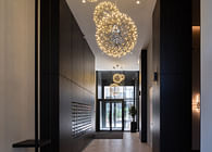
According to the brief, the ground floor is a spacious civic space. Designed as a hospitable and comfortable area, it creates a pleasant environment for visitors and employees. Split into several sections, it has a welcome zone with a reception desk and corporate co-working space, a restaurant with a bar stand and a mobile lecture area, a public cloakroom with changing rooms, and a mezzanine floor for private negotiations and important meetings. This floor is the only place where employees can change and have a meal, while on the upper floors, there are coffee points and lockers to keep personal belongings. The ground floor is being redecorated and is due for completion by late December. The four upper floors are in commission, and our employees have moved in.
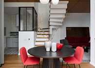
Each floor symbolises Brusnika cities of presence: the first floor is for Tyumen, the second - for Novosibirsk, the third - for Yekaterinburg, and the fourth - for Kurgan and Surgut. The cities' identity reflects in the names of negotiation rooms with recognisable local toponyms: the Clock House, the White Tower, the Arrow, Babarynka, and so on. With standard structure, the floors differ in interiors, varying in zoning, workstation types, fittings for negotiation rooms and open spaces. The company approach and core ideas apply everywhere. All the floors, apart from the ground floor, feature circular layouts, where there are no dead-end zones, all the spaces communicate with each other and promote transparency. The elevator zone and toilets hide in the core of the office complex. Fire escape staircases, providing additional links between the floors, have become part of the interior, with wooden bannisters and a black minimalist balustrade to complement their concrete flights of steps.
A signature of the first floor is its engineering zone with mobile stands, tables with deep pull-out drawers, vertical compartments, sloping shelves, and hinged bars - all you need to store construction, fitting and textile samples. Inside the area sits a sizeable negotiation desk with storage space and a textile wall to recreate a printed brief with its materials for an integrated vision of the project.
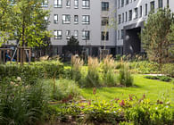
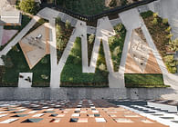
The Kandinsky office now hosts the Brusnika architecture practice, communications department, and technical and managerial cluster. The project is perfectly consistent with the company’s approach to product design and coveys its core values of openness, humanity, and diversity. Next to the office block entrance, we have designed a green public pocket park available for staff during breaks.
Status: Built
Location: Yekaterinburg, RU
Firm Role: Designer
Additional Credits: Design: Brusnika. Design
Project lead designer: Natalia Shurakova
Project designers: Alexander Vorontsov, Elena Kalinina, Yulia Kachainova, Ksenia Repina, Alexandra Nikulina
Photography: Maxim Loskutov
Photography stylist: Anastasia Bauer


