
ShowCase is an on-going feature series on Archinect, presenting exciting new work from designers representing all creative fields and all geographies.
We are always accepting nominations for upcoming ShowCase features - if you would like to suggest a project, please send us a message.
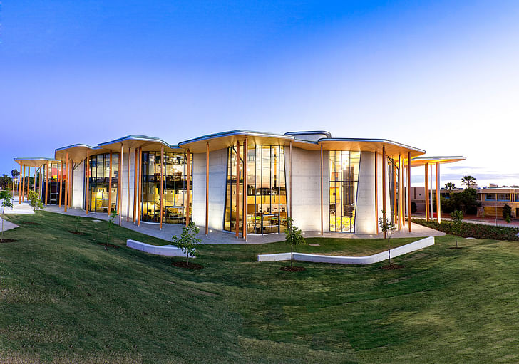
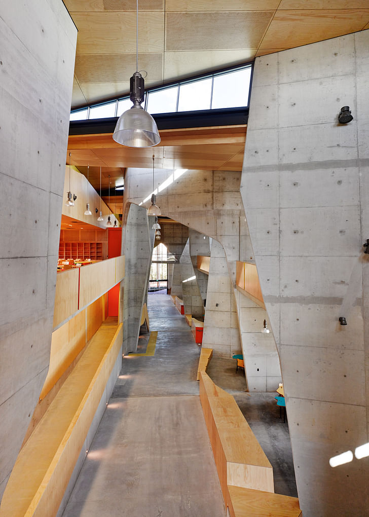
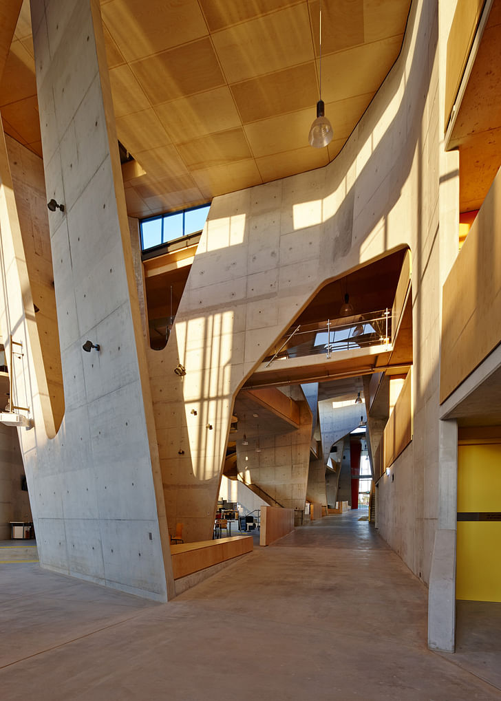
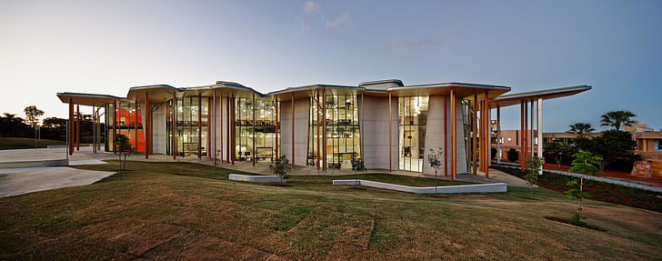
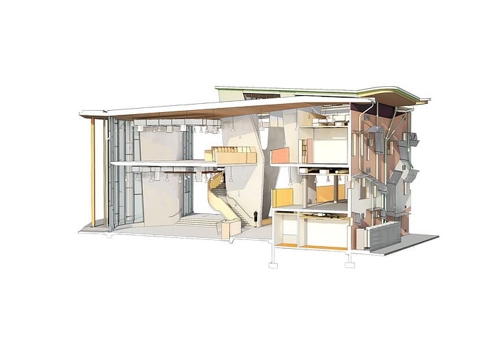
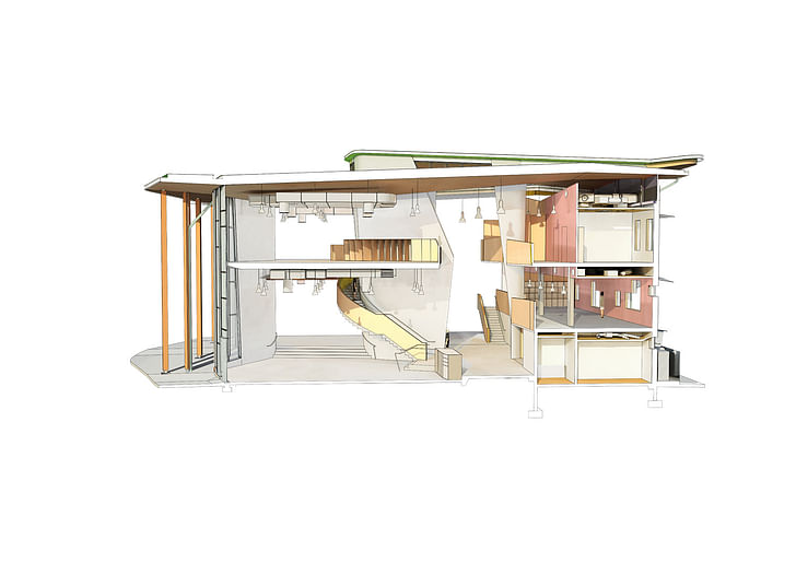
Stretching long and lofty with no dominant facade, CRAB Studio’s Abedian School of Architecture in Queensland, Australia is a rich hybrid of simple elements. Giant glass windows extend from floor to ceiling along the building, flooding the interior with light and allowing distant views of surrounding Bond University’s campus. Planes of wood, glass and concrete dominate every eyeful, drawn together with a coordinated furniture design. The tall ceiling, concrete interior and sharp curves are reminiscent of Le Corbusier’s Saint-Pierre church, while the cheerful coordinated furniture and open workspaces suggest a noted attention to workplace trends.
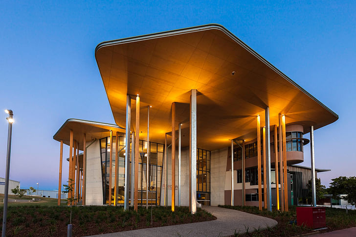
Architects Peter Cook and Gavin Robotham wanted to create a school with a ‘sense of theater’, where non-academic interactions could find a stage amidst a diversity of other activities. The space was built to be non-restrictive and open but also distinctive, with nooks and crannies for play and study in equal parts. The intended work ethic seems to be a mash-up between bubbly preschool energy and sober, votive dedication.
From CRAB Studio's project description:
CRAB’S APPROACH TO THE BOND DESIGN
It is our experience that philosophical intentions and curricula have a habit of ebbing and flowing over time but should always be based around observable habits and needs.
Changes occur in response to world issues and new global challenges but sometimes the generators of change are more local - a change of personnel, for example. Hopefully they are the result of thoughtful extensions to the discipline of architecture – the entrenchment of a new way of teaching which reflects life outside.
Thus the material disposition of elements, spaces and mechanisms must be devised in such a way that future visions are not inhibited. A big, bland shed that could be subdivided by screens might be a response to such a view, but we believed strongly in the responsibility of architecture to identify – and by this identification – to stimulate.
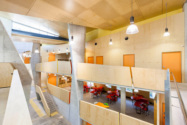
Thus this building, the studios and other major spaces follow a clear system – but with deliberate idiosyncrasies – that can resonate with the users. We illustrate this delight in ‘the ‘incidental’ and the ‘episodic’ by logging moments in the building’s life, responding with devices such as the ‘scoops’ and constantly drawing upon our long experience of architecture schools.
We play out our belief that - as well as identifiable ‘teaching’- the experience of a good school is made up of friendship, atmosphere, nuance intriguedness and inspiration. So we devise a series of stages upon which this can all be played-out : which result in ‘platforms’, ‘pockets’, ‘corners’, ‘eyries’ and ‘escape runs’.
There are built elements and territories that cry out to be appropriated by those who themselves will spend their lives responding to peoples’ needs.
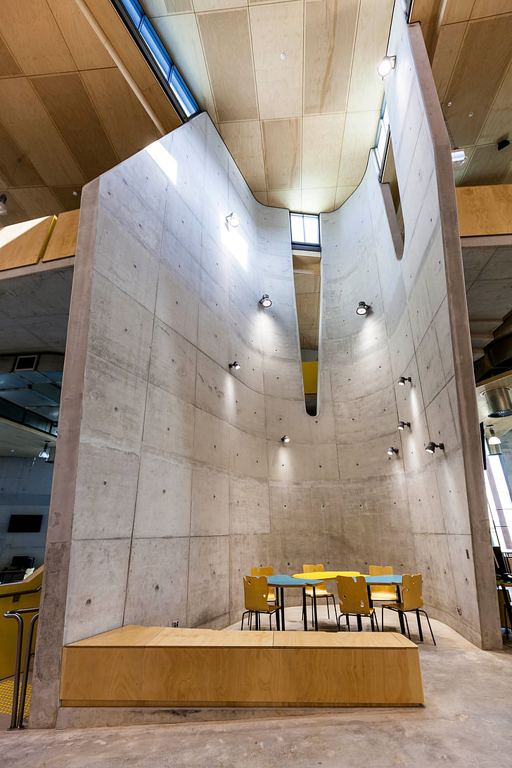
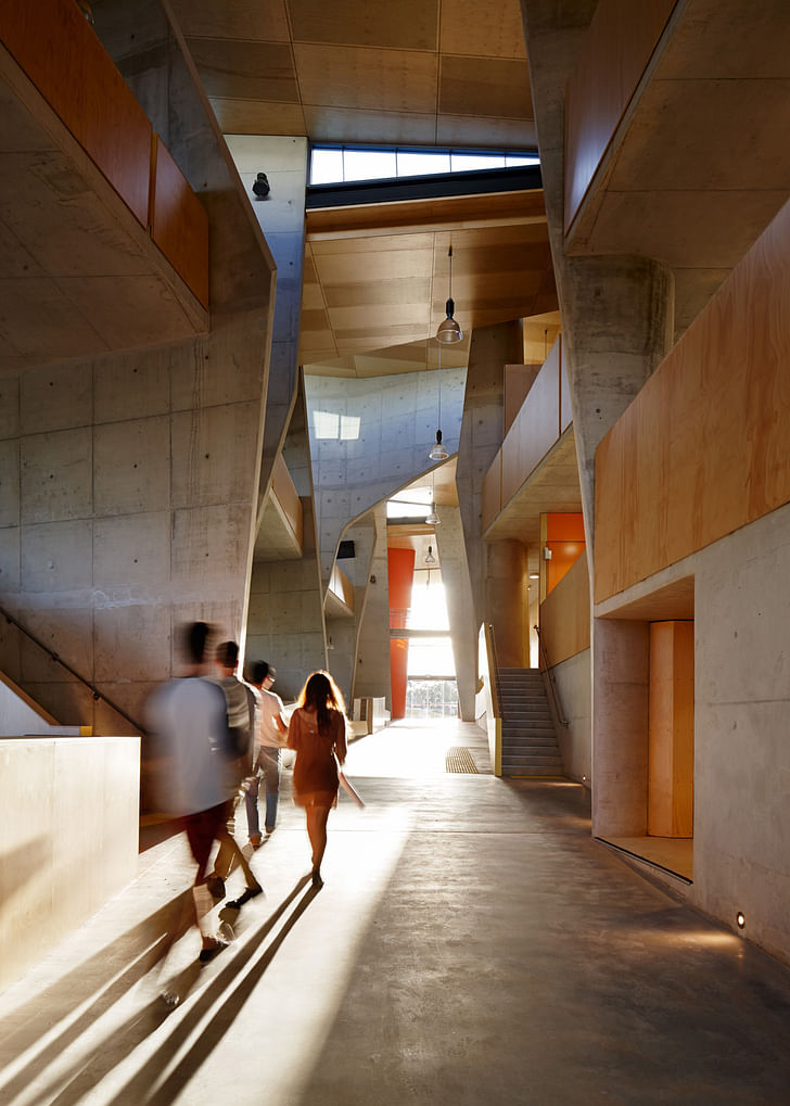
Forested pads & silent scoops
Bond University’s new Abedian School of Architecture might be experienced as varied and episodic journey.
Sheltered and determined to the north, the building is airy, effortless and free to the south.
The curvature of its spinal interior route establishes a new soft core for the North West Quadrant of the Campus – a core populated by the life of the school, by student experimentation, social gatherings, lectures, crits and weird happenings...
Leaving the existing spine pathway, the broad internal path dives underneath the nose of the quiet-study strip and proceeds past a series of ‘scoops’.
Via its meandering internal ‘hill’, the rise and fall of the building gently echoes the topography of its surroundings.
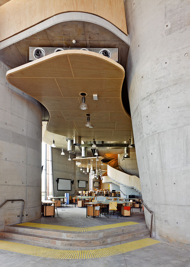
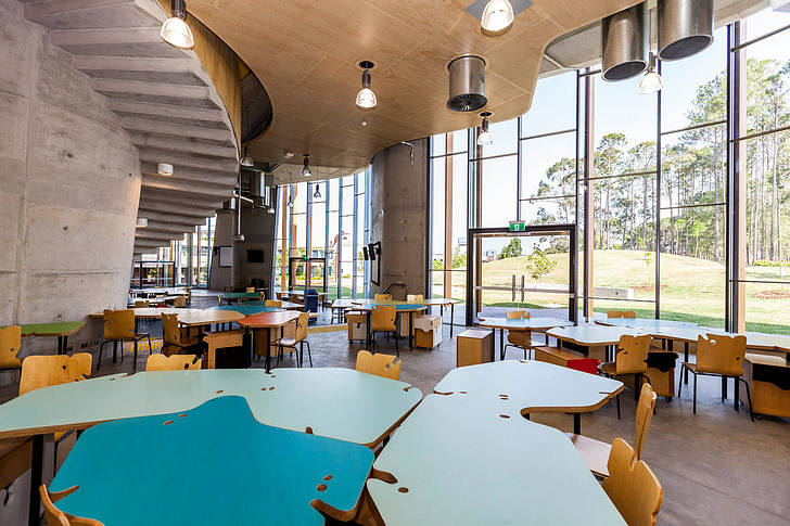
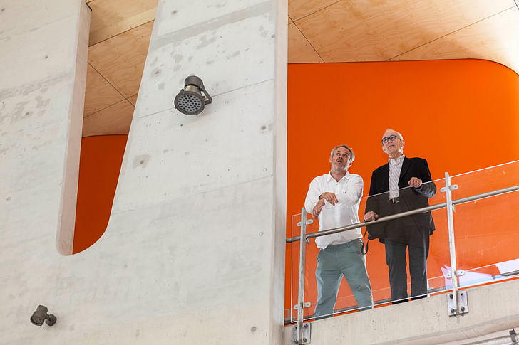
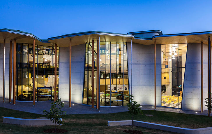
From this ‘street’ the faculty’s studios and large gathering spaces spread out onto a terraced deck – which itself melts into a re-vegetated hillside garden.
These ‘tectonic rafts’ together with the central ‘spine’, quieter study areas and dramatic ‘scoops’ define the building’s rocky core.
In welcome contrast a majority of the filtering ‘wraps’ and ‘insertions’ are of a softer, more translucent character.
We created a very ambient building, where the individual can really identify with the nature of his or her activity – thus the studio pads, scoops, decks and corners – though based on a clear hierarchy and system – have significant shifts of direction or variations of size.
These elements particularise – we hope, in a subtle and enjoyable way.
We wished to manipulate the surface of the building – sheltering it from direct northern light and filtering the southern light into the interior. Avoiding glare and overheating – without homogenising one’s experience the interior.
We created instead, an idiosyncratic series of ‘lit places’ and darker, more elemental pockets.
A multi-modal approach climate control
Our proposal is designed from the ground up to minimise undesirable solar gain within the building’s thermal envelope.
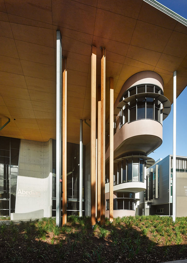
Both the roof and façade systems anticipate the potential strength and direction of the Queensland summer sun. Together the orientation of the building’s openings, with the sunhoods and column system of the facades succeed in mitigating a majority of the Sun’s potentially excessive effects.
The building’s orientation reduces the potential exposure of the north, east and west facing walls and windows. On these facades, each opening is sheltered from the strongest direct sunlight. Additional summer solar protection has been applied to all north facing windows. On the largest, west elevation external vertical columns and overhanging roof protect the studio areas from the harshest indirect summer sun.
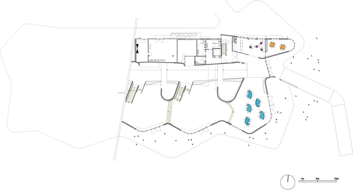
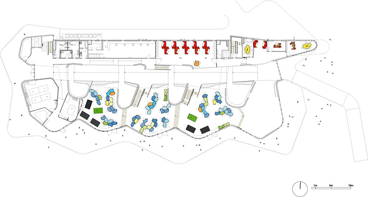
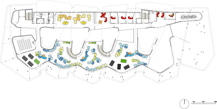
We have also taken account of the prevailing winds during the development stage of our scheme. The building encircles the crown of the hill, turning its harder ‘back’ to the colder south winds. Winds, whereas the north façade shelters a variety of window configurations that are screened from the sun by a series of metallic ‘eyebrows’ that effectively create a art piece as well as a shielding system.
Internally, the main circulation areas along the internal ‘street’ act as a thermal buffer and encourage the natural movement of air along the length of the building.
The building’s construction also provides a higher degree of inertia against external temperature fluctuations than similar contemporary technologies. The thermal mass of the concrete ‘scoops’ absorb heat when the surroundings are hotter than the mass, returning that warmth to the environment during the evening and at night when the surroundings are generally cooler.
Whilst it may not be possible to eliminate entirely the need for traditional mechanical air-conditioning in all areas of the building, the differentiated internal envelope allows for flexibility in its application whilst the design of the building itself will limit the degree to which conventional cooling methods need be relied upon.
Abedian School of Architecture
Former Managing Editor and Podcast Co-Producer for Archinect. I write, go to the movies, walk around and listen to the radio. My interests revolve around cognitive urban theory, psycholinguistics and food.Currently freelancing. Be in touch through longhyphen@gmail.com
2 Comments
What a weird, yet interesting building.
Its outside scale is confusing. Closer inspection reveals it has 2, and sometimes 3 levels. It is a bizarre fusion of Ronchamp (the concrete forms inside, mostly), brutalism, Bruce Goff inspired Bart Prince organic, and recent "do whatever the hell you want, but include some weird geometries" vernacular. The latter is depicted in its floor plan(s) with curvilinear bump outs and the petal type forms set atop spindly columns at the exterior.
It's interesting, but I wouldn't want to go to a-school in it. Nor would I want to live in Australia.
Without seeing it in person, the pictures are very similar in tone to Enric Miralles' Scottish Parliament building with the combination of concrete, wood and free forming. I prefer Miralles' artistry to the more simple forms here, but hey, probably lower budget. Definately has nothing to do with Brutalism, sorry bloggers (everything concrete is not Brutalist).
Block this user
Are you sure you want to block this user and hide all related comments throughout the site?
Archinect
This is your first comment on Archinect. Your comment will be visible once approved.