
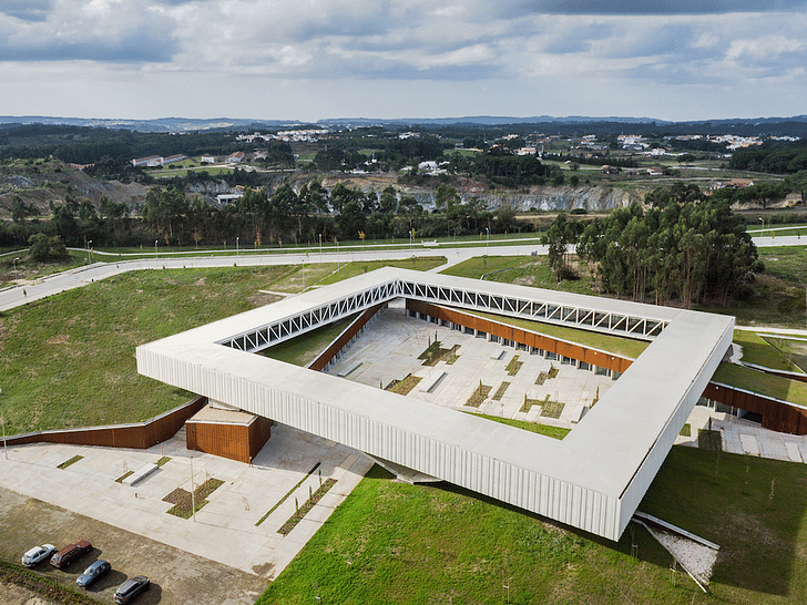
How does one create a main piazza in the absence of a surrounding urban fabric that typically encloses a Piazza? The design team around architect Jorge Mealha drew from its traditional Portuguese typologies and conceived the Óbidos Technological Park Main Building in the countryside north of Lisbon as contemporary interpretation of a Terreiro.
While just recently completed, the project has already garnered a respectable nomination for the European Union Prize for Contemporary Architecture – Mies van der Rohe Award 2015.
From the architects:
Back in 2010 the Óbidos Municipality launched an international architectural competition. The aim of the competition was to design the Central Buildings and the Main Piazza for the Óbidos Technological Park, intended as a built structure to allocate start-up creative business companies.
The Technological Park site is located in the outskirts of Óbidos, a small and beautiful historic town located approximately one hundred kilometres north of Lisbon.
The Óbidos region is still characterised by a mainly rural presenting a still balanced arrangement between forest and small agricultural premises, where small paved surfaces and buildings spread trough this territory in an almost random way. The plot designated to build the Óbidos Technological Park main building and main piazza reuses the place where before was located the main construction supply site for the A8 highway, that today links Lisbon to the north of the country.
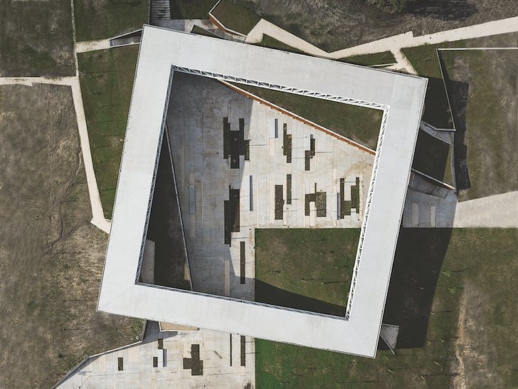
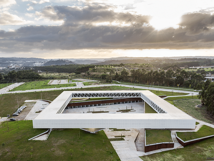
The design strategy proposes a solution which tries to reverse the ongoing pavement process in this territory trough a solution aiming to reverse this logic, trying to increase as much as possible the green surface. More than designing a building as such, the strategy adopted tries to (re)create an place with a civic realm where landscape is determinant for its spatial structure.
The design had also dealt with the competition programme, which, in strange way for us, was asking for a main piazza for a technological park in the middle of a countryside. Those program premises where a reason to arise some design doubts. How to create a piazza in the middle of this particular and still beautiful countryside? How to design (draw) a piazza without an urban fabric surrounding and evolving such place?
Either as a result of negotiation trough time within, the urban fabric convenes an all range of associated functions - housing, commerce, crafts, etc - as seen in Piazza San Marco in Venice, or as a baroque symbolic design as in Praça do Comércio in Lisbon or even as in Piazza Navona in Rome where the piazza, a bit in a palimpsest way, overlaps is actual geometry on top of earlier premises and programes. For us, a piazza, as a concept, can not be separated from the urban realm that conforms and shapes its limits and purpose. The study concerning the shape, uses and geometry of several piazzas and the possible adequacy to the project site emerged during the design process as a quite strange and forced solution. So, how to draw a piazza without a city, without its generator urban fabric? This design perplexity, the inadequacy for us of trying to design a piazza without a urban fabric, a surrounding civic process, as been a key factor to look and try to search for alternative public spaces. So, the design strategy shifted and tried to search for other kind of convivial spaces who could achieve the intended public realm without designing a piazza as such.
In several places of Portugal’s countryside still exist some interesting public spaces called “Terreiros”. Characterising some settlements or small villages, those convivial spaces range from a kind of formless shape almost without buildings surrounding them, to a sort of regular places completely integrated and evolved by small constructions.
We found those public spaces, in a quite interesting way for us, the “terreiros”, those kind of large free external spaces, where in fact quite effective public realm devices despite its often formless borders.
In those very flexible spaces, throughout the year, small communities organise traditional corteges, informal open air markets, religious processions, music concerts and traditional activities or games. Much less dependent from an urban fabric, those civic spaces are very flexible and quite strong in providing opportunities to encounter and a wide range of convivial activities. Then, instead of proposing to draw a urban piazza as such, the project shifted to propose a large public space with similar convivial characteristics as a piazza, but much more flexible towards its relation with a building environment or geometry.
Maintaining the convivial aims expressed in the competition brief, the design decision focused in the aim of creating a large public space with an either easy and flexible relation with the few buildings nearby, but mainly as a complement of the surrounding natural landscape.
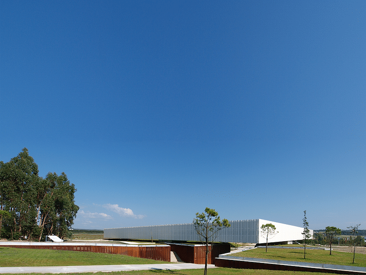
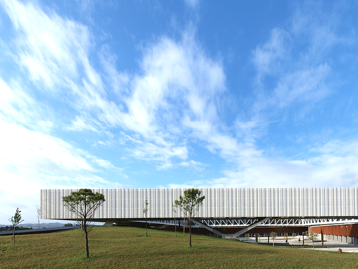
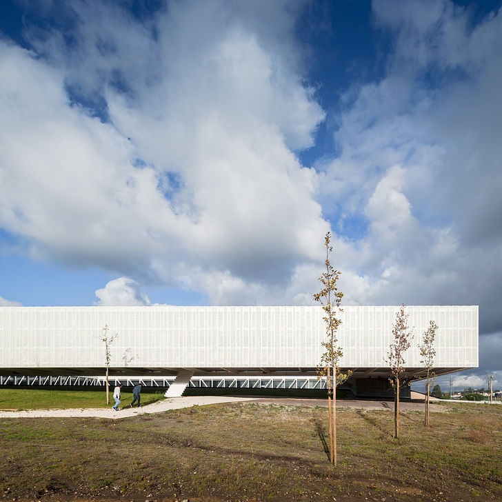
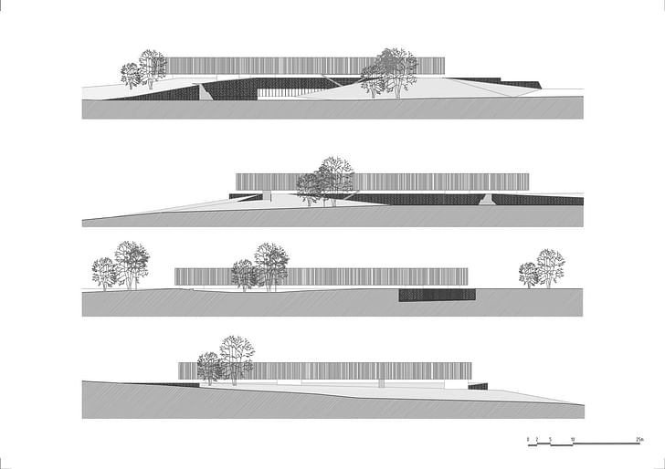
Other aspect concerned the qualities and characteristics of large buildings in this particular territory. It was possible to notice that apart from the small built settlements that somehow mark this lusty territory, we could notice some large farms or convents and monasteries scratching thin horizontal lines in the still mainly green landscape. Those larger built structures marking the territory perspective with thin horizontal lines where of crucial importance for the design development. So, the design tried to draw a building that would appear in the landscape mainly as a thin horizontal line, as a subtle long and continuous wall.
On the other hand, the research and study of larger religious structures in the region, namely as Batalha’s Monastery and Cristo’s Convent in Tomar, revealed interesting aspects towards the competition programme. The cloisters presented by those religious structures where of particular effectiveness for the requested programme. In fact, as a start-up companies compound, communication and easy contact between users is a fundamental aspect. Or, a cloister structure is quite effective towards the possibility of a strong visual interaction. So, the design process went also trough the possibility of creating a solution where a kind of cloister could be related with all other programme premises.
In parallel, further layers of knowledge contaminate and have given support to the ongoing design process. Two sources where of particular interest for the design team. One was the John Maeda’s book “The Laws of Simplicity” and the other the exhibition “The New Silk Roads” from Kyong Park, held at Museo de Arte Contemporáneo de Castilla y Léon in Spain a few years ago.
This exhibition from Kyong Park dealt with the expression and registry in the territory of some actions resulting from negotiation, conflict, superimposition, contamination and balance that where similar to the ones emerged trough the premises of our design process in development. The design for the projecto for Óbidos Technological Park Central Building was somehow balanced and supported by similar tactics towards territory and architecture.
The book from John Maeda “The Laws of Simplicity” as been used as a conceptual frame, as a kind of architectural treaty, a model for architectural thought. Trough notions as reduce, organize, time, differences, context and emotion, the design research and development tried to balance the programme’s requirements with solutions as simple as possible, strongly contaminated by the law 10 on the book, the one where Maeda, states that “simplicity is about subtracting the obvious and adding the meaningful”.
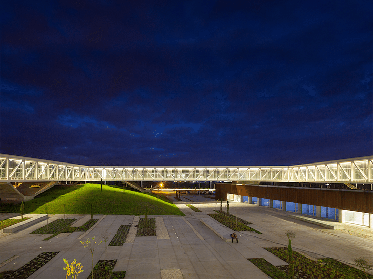
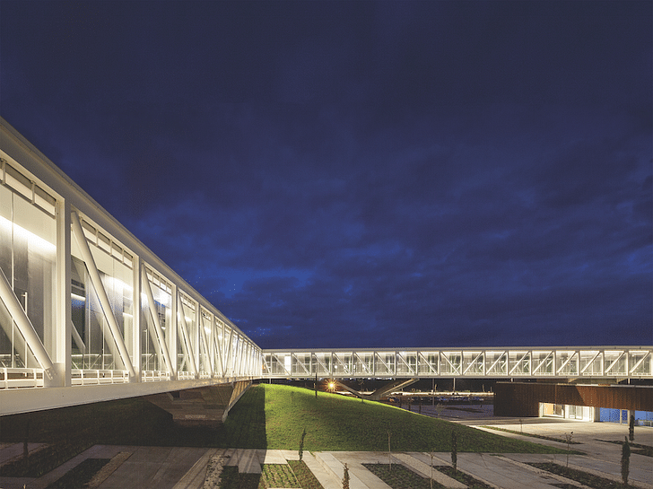
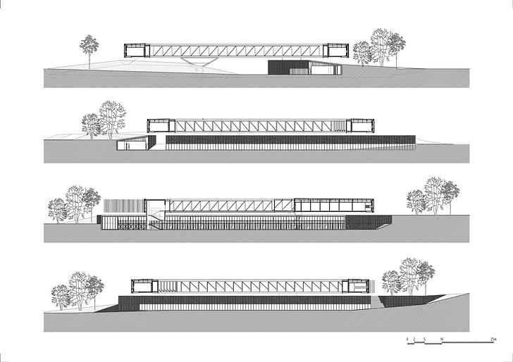
The resulting design proposal is at the end quite simple and somehow literal towards the addressed references. One inner surface of the plot was partially paved with his limits suggesting a kind of natural - the result of an erosion process - borders. Part of this paved area, the “terreiro”, have random large buttonholes in order to increase soil permeability. Surrounding this space, two long walls incorporates part of the programme and sustain surrounding land. At southwest corner, a new hill is created reusing the land movements needed to imbed all the ground floor program of the building.
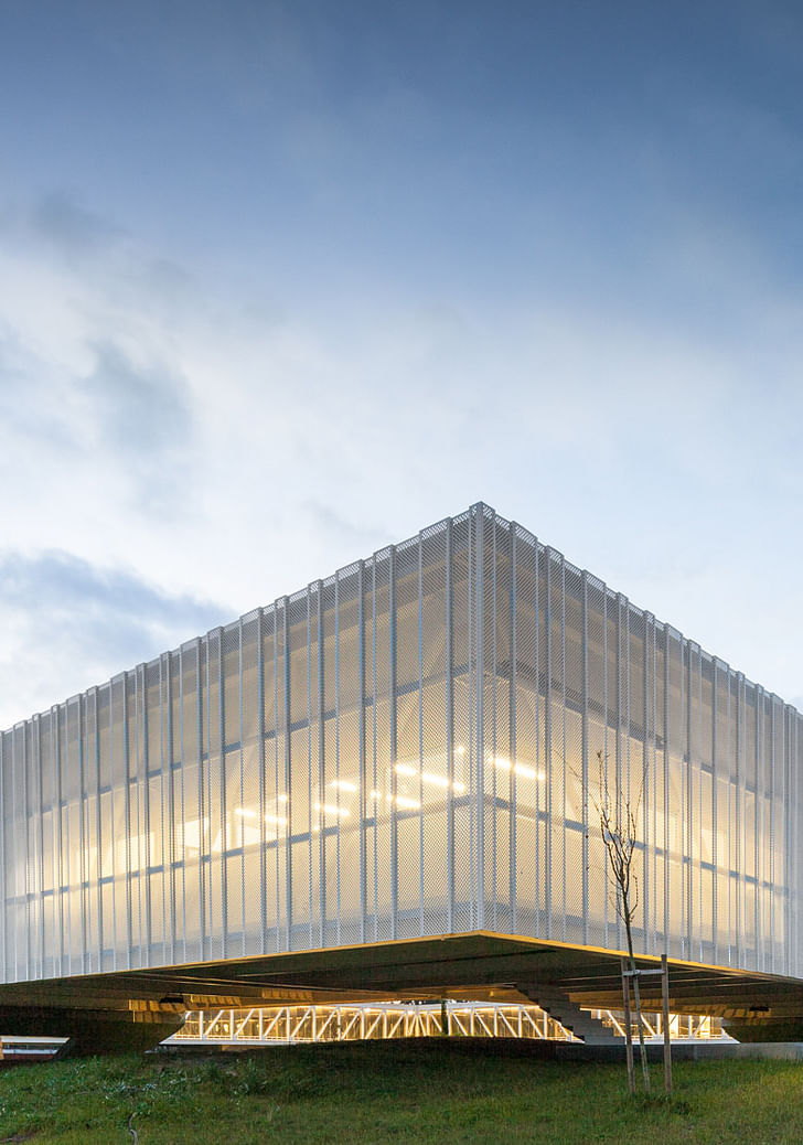
On top, above the created civic space and the (re)created and extended landscape, a huge but thin voided square, an office cloister, a frame, floats supported only in six points delimiting the space and filtering the perspectives inwards and outwards.
The decision to imbed part of the programme underneath the landscape aims several goals. One is to increase the green surface within the plot. The other is to decrease energy needs in terms of cooling/warming mechanical systems of the building. Finally, creating the new hill - reusing the land moved to locate the ground floor program - we somehow suggest an southwest natural limit to the “terreiro”, avoiding to spent energy with the transport of that land to other places, and thus avoid to create an embankment elsewhere.
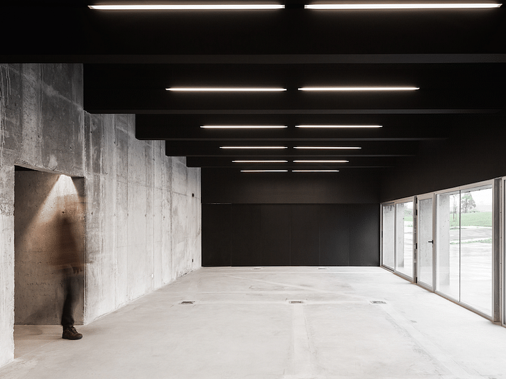
The program was distributed in a very clear and simple way. At ground floor are located all the support spaces as the main meeting and multipurpose room, the Fablab, the small restaurant, some shops and the main technical areas. The floating cloister absorbs almost all the office units for the startup companies and a few labs. Both floors present large areas organised trough a modular structure providing huge flexibility to be adapted concerning the needs.
Materials:
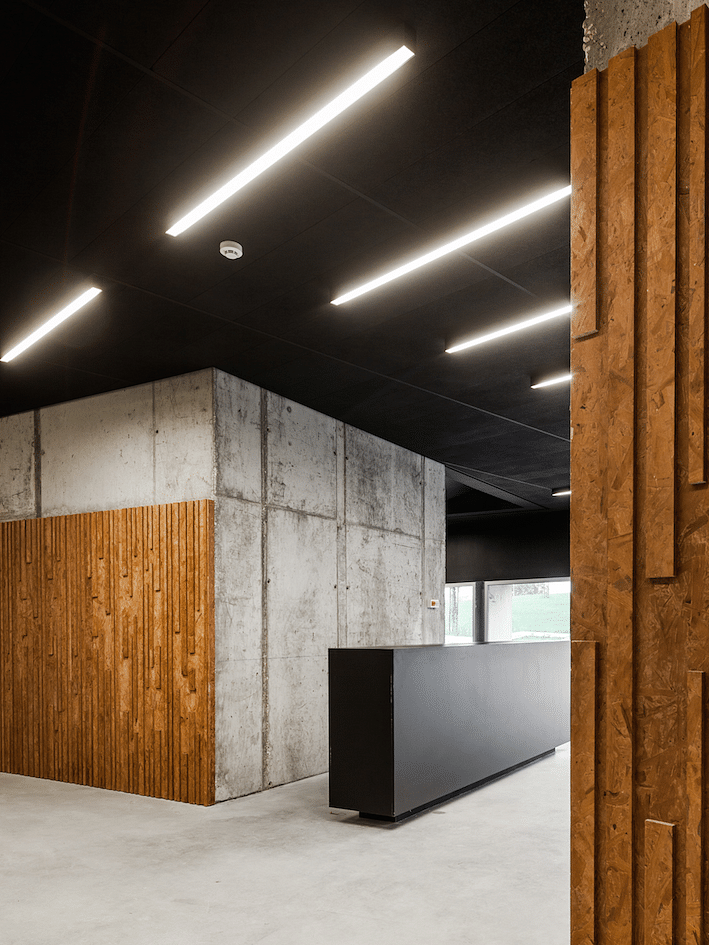
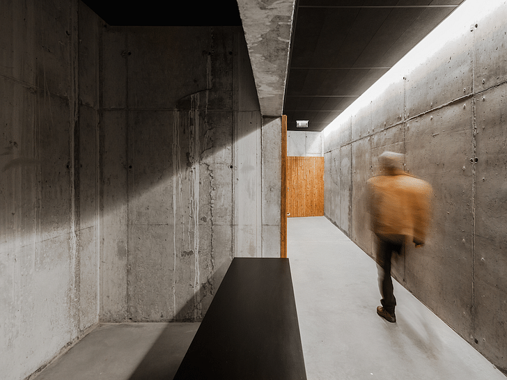
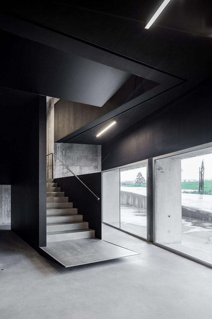
Mainly three materials are used. Concrete, Steel and glass. Basically, ground floor is about rough concrete, expressed as a telluric structure belonging to hearth. On purpose, all the marks of the building process where left, acting as a mural texture and a storyboard memory. Also on purpose, the emphasis on the rough plasticity of concrete was seen as a expression feature and towards spatial identity. All ground floor as do to with hearth, with its rough and heavy expression. Internal walls and floors are in concrete. A few appointments in wood (OSB textured panels) and black painted elements (reception counters, acoustic false ceilings, staircases) proposes an internal framework of perspectives, balancing with the expression of the concrete walls.
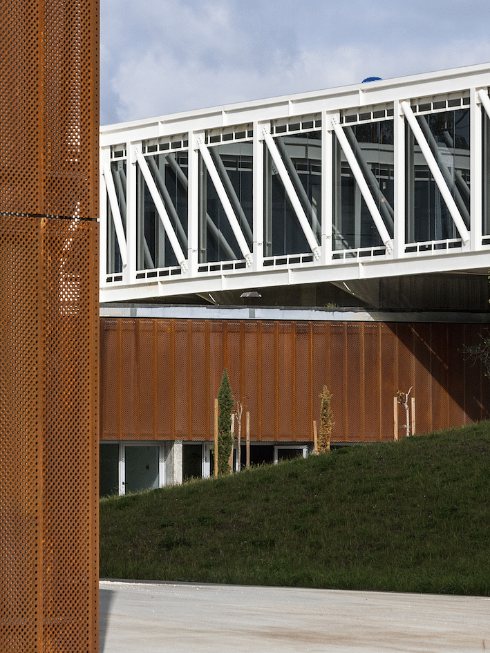
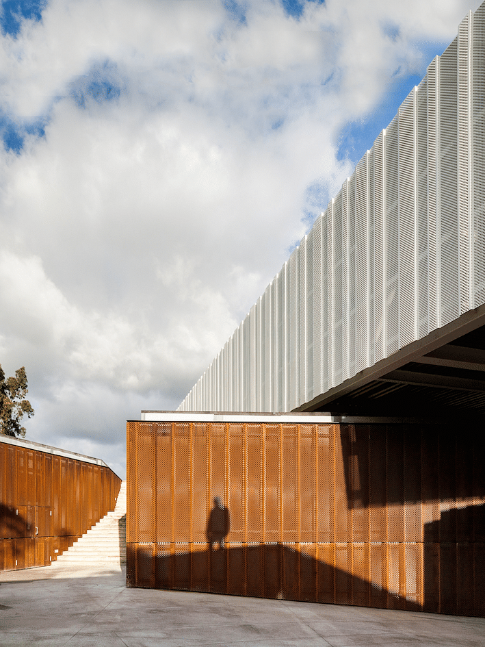
Externally, at ground floor, apart from windows (double thermal glass with natural color aluminium frame), two materials are used. Concrete and corten steel. The external concrete floor is texturised with metal powder in order to slightly and randomly stain with rust this pavement troughout time. Part of the walls are covered by rusty corten steel panels. Those panels are made using standard modules of scaffold (ref. Meiser) pavement units.
Opposed to ground floor, the first floor is all about geometry and precision. A set of huge metal trusses, assembled to create four voided and interconnected prisms, builds a large and floating square cloister. The structure rims the modularity of the startup office units that occupy most of the space on this floor.
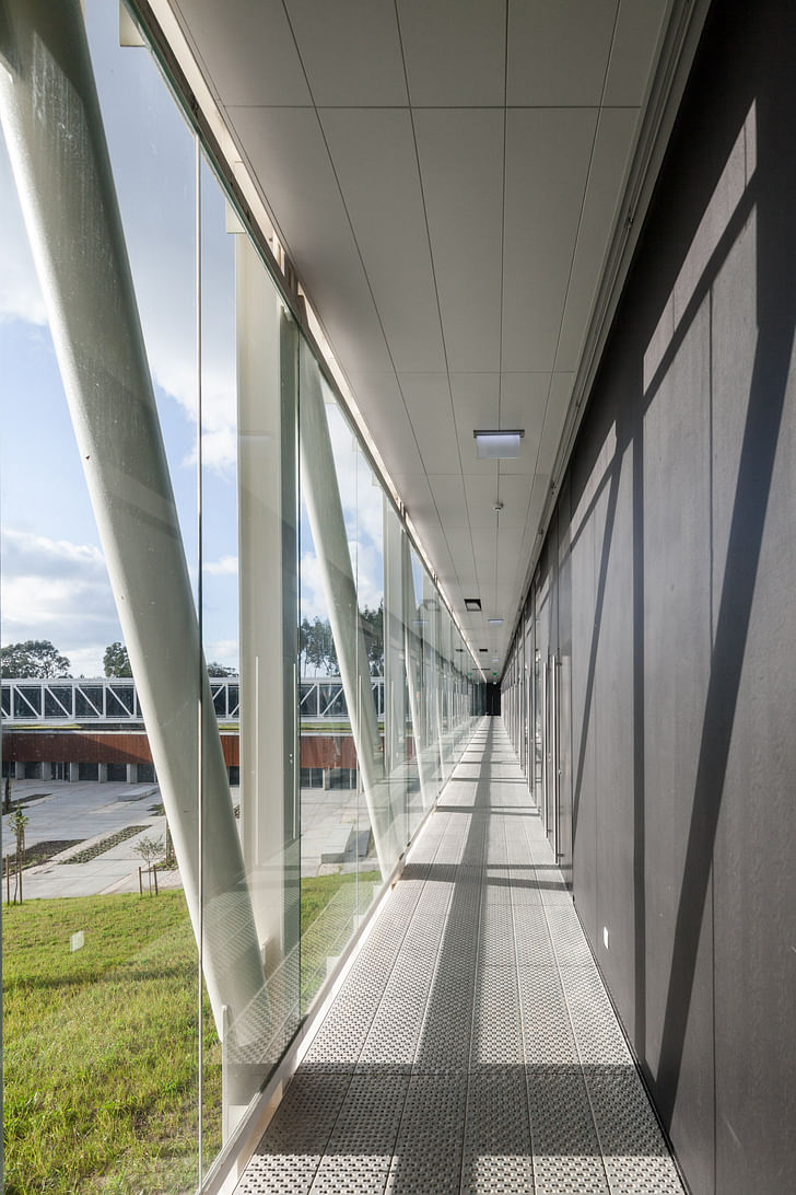
On this floor, circulation is made trough a inner and naturally ventilated circulation, protected by a huge glass surface. External walls are made with light damp proof insulated panels and internal walls have been built with light dry gypsum panels system.
On the cloister, the circulation pavement is in folded perforated steel scaffold units, and false ceiling are in light aluminium suspended sheets. The outer facade is completely covered by light, translucent and transparent white membrane, built with lacquered perforated steel scaffold units.
Drawings:
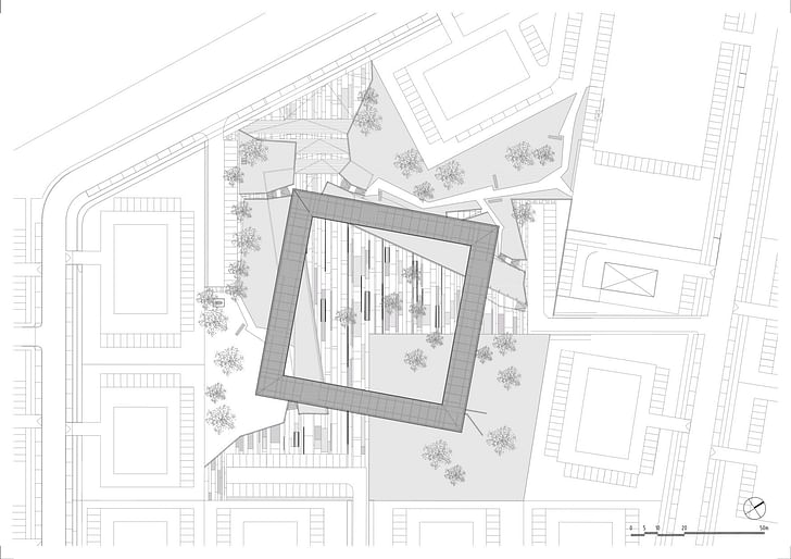
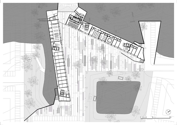
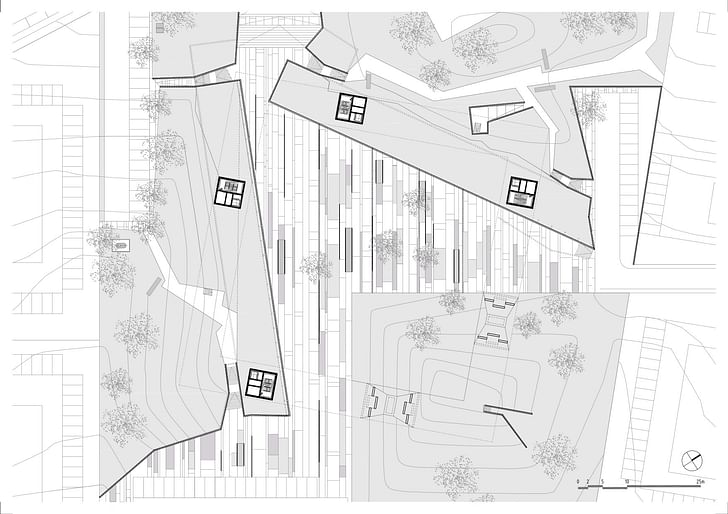
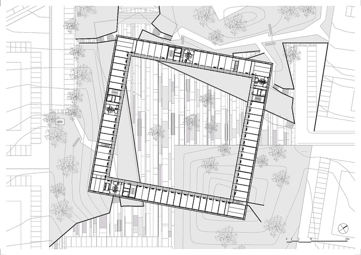
Credits:
Author: Arch. Jorge Mealha
Architecture Project Team: Arch. Andreia Baptista (Coordinator), Arch. Carlos Paulo, Arch.
Diogo Oliveira Rosa, Arch. Filipa Ferreira da Silva, Arch. Filipa Collot, Arch. Gonçalo
Freitas Silva, Arch. Inês Novais
Structural Engineering: José Ferraz & Associados – Serviços de Engenharias e Consultoria, Lda (Built Project), Eng. José Gomes Ferraz, Eng. Lívio Oliveira, Eng. Bruno
Santos
Electrical: Eng. António Ferreira, Eng. Pedro Ramos
Climatisation: Eng. Luís Graça
Fire Consulting: Segurinis, Eng. Jorge Miranda (Built Project); Eng. Joaquim Viseu (Base Project)
Hydraulic: S.E. Serviços de Engenharia Lda
Acoustic: S.E. Serviços de Engenharia Lda
Thermal and Solar: S.E. Serviços de Engenharia Lda
Landscape Architect: Arch. Mafalda Lavrador
Construction Company: MRG Engenharia e Construção S.A.
Client: Parque Tecnológico de Óbidos
Gross Floor Area: 4,096 m2
Project Dates: 2010-2012
Construction Dates: 2013-2014
Cost/m2 including external spaces & landscape: 1,076 €/m2
Photographs Credits: João Morgado
ShowCase is an on-going feature series on Archinect, presenting exciting new work from designers representing all creative fields and all geographies.
We are always accepting nominations for upcoming ShowCase features - if you would like to suggest a project, please send us a message.
Alexander Walter grew up in East Germany with plenty of Bratwurst. He studied Architecture and Media Design at Bauhaus-Universität Weimar, Germany, and participated in foreign exchange programs with Washington-Alexandria Architecture Consortium in Alexandria, Virginia and Waseda University in ...
6 Comments
beautiful
Use of irregularities quite successful. I think it's so elegant.
strict geometry is fascinating. very nice!
Only disappointment is that courtyard. I would have filled it with more trees.
WOW A Complete Project
When the trees inside the courtyard grow it will be spectacular. Otherwise very nice. A little cold feeling for me, but that's a minor complaint, I would love to have made such a nice building.
Block this user
Are you sure you want to block this user and hide all related comments throughout the site?
Archinect
This is your first comment on Archinect. Your comment will be visible once approved.