
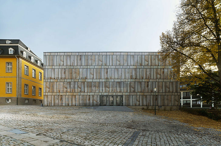
ShowCase is an on-going feature series on Archinect, presenting exciting new work from designers representing all creative fields and all geographies.
We are always accepting nominations for upcoming ShowCase features - if you would like to suggest a project, please send us a message.
Project Description from Max Dudler:
Folkwang University of the Arts is home to one of the largest musicological collections in Germany. Until now, its inventory of approximately 190,000 items of sheet music, sound recordings, images, books and other media has been stored in various archives and libraries across the region. But now, musicological items from three institutions - Folkwang University, the former Library of Musicology at the Ruhr University Bochum as well as the music education department of the University Duisberg-Essen - have been brought together under a single roof, in a new building designed by Swiss-born architect Max Dudler. Situated on the Werden campus, the library was inaugurated at the end of September 2012.
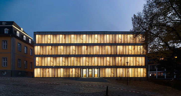
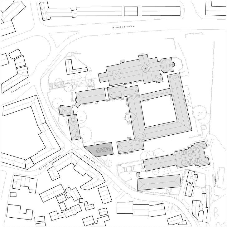
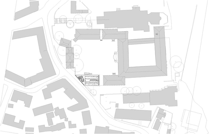
Folkwang University of the Arts is North Rhine Westphalia’s college of art and music. Its main campus is housed in the former Benedictine abbey of St. Ludgerus in Essen-Werden, situated in the southern Ruhr Valley. The small 8th century site was extended into a princely baroque residence in the 18th century, arranged around a magnificent courtyard (Cour d’honneur). The construction of the new library on the south side of the courtyard by Max Dudler replaces a 19th century military hospital building demolished in 1969. In 2006, Max Dudler won the design competition organized by the Duisburg branch of the Building and Real Estate Management Authority, North Rhine Westphalia. The project was generously supported by the Alfried Krupp von Bohlen und Halbach Foundation.
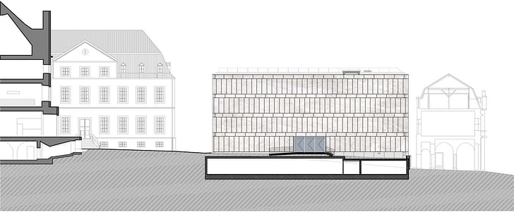
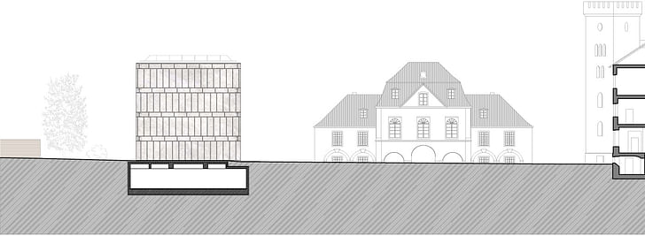
In 1811, while under French occupation, a prison was set up in Werden Abbey. The Prussians extended this and erected a hospital building on the south side of the courtyard. Upon the demolition of the hospital building, the remaining ensemble of buildings looked unbalanced. Without reproducing the original shape of the prison, the new building encloses this side of the courtyard with its voluminous crystalline structure. The new building’s eastern side adjoins the so-called administrative wing of the old abbey. The volume of the new building corresponds approximately to that of the Prussian wing across the courtyard.
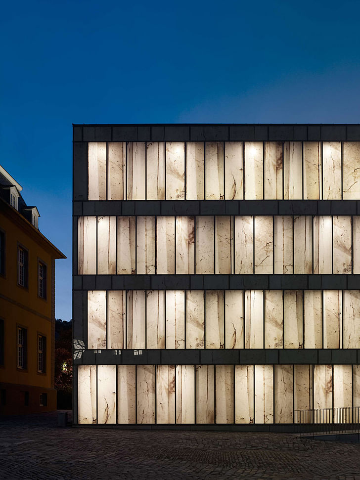
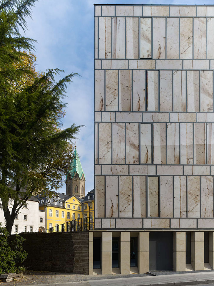
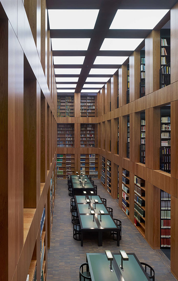
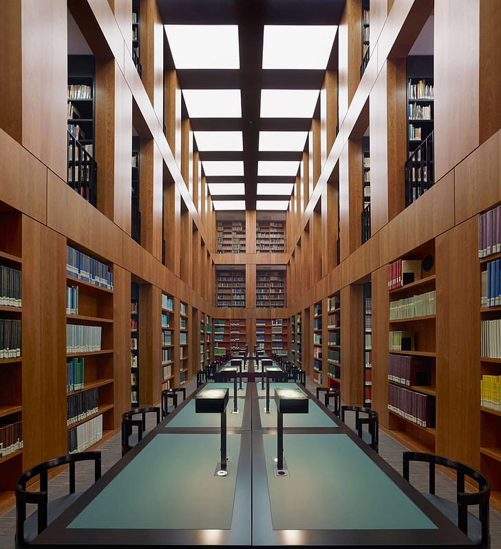
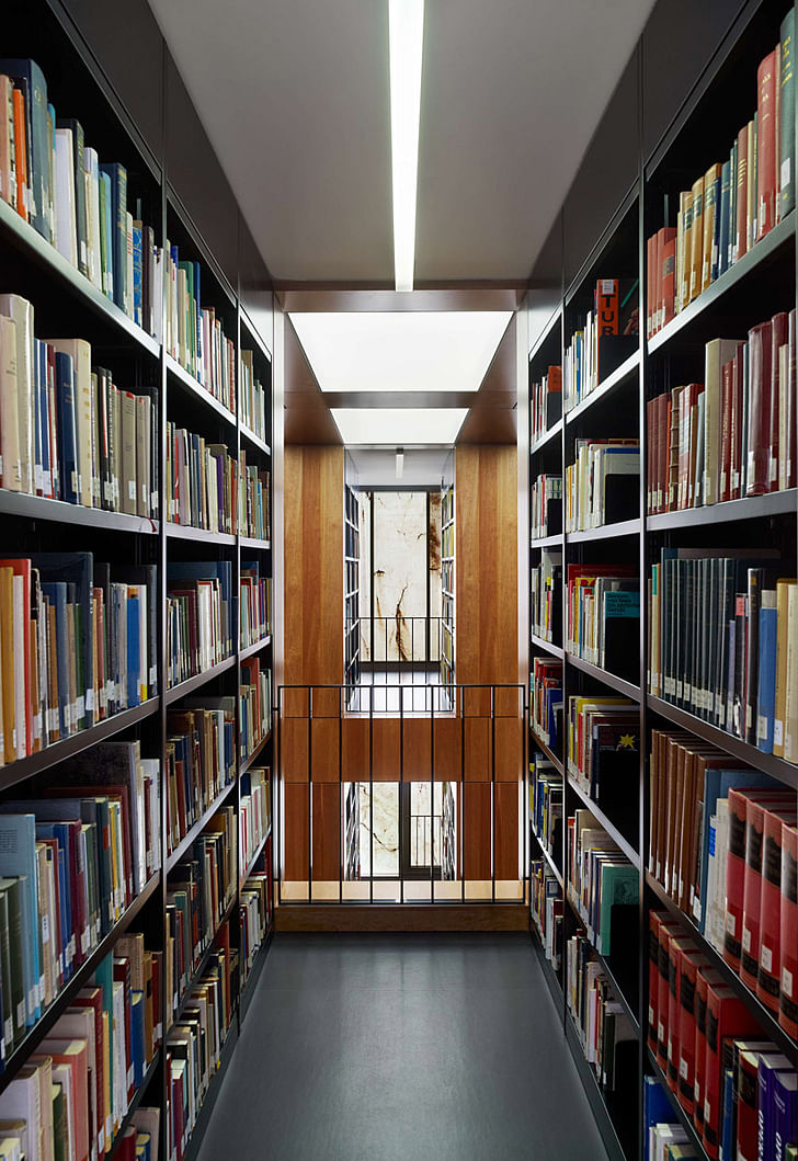
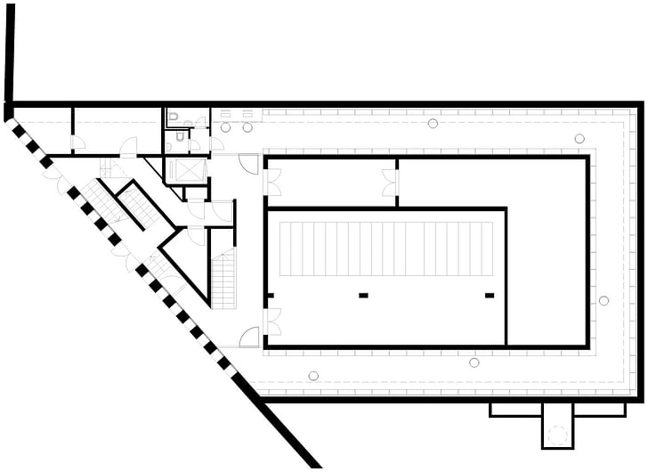
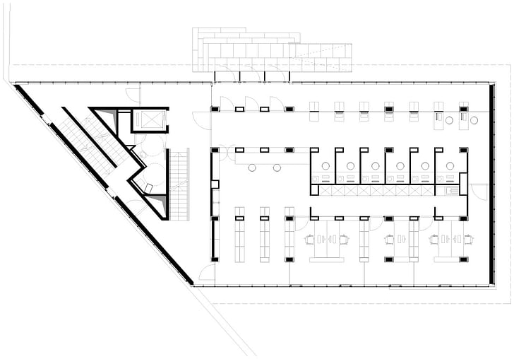
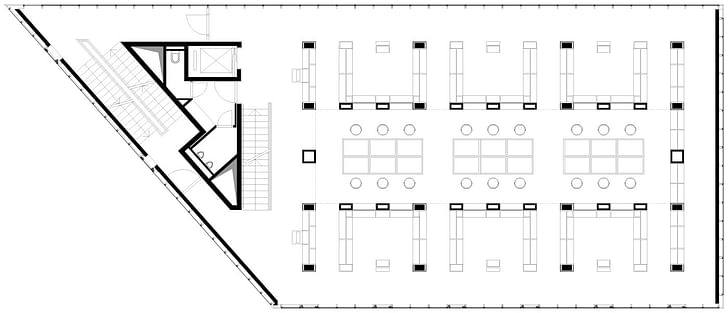
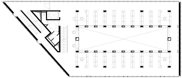
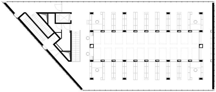
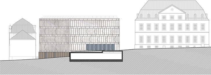
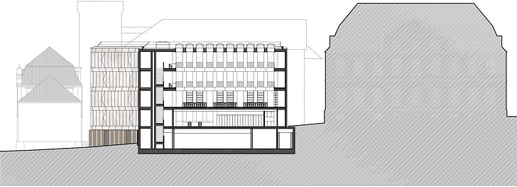
Folkwang Library was conceived as a monolithic body built atop the level base of an old rough stone wall. Max Dudler’s concept for the building is based on the idea of the ‘museum showcase’: An exterior shell protecting the valuable contents within. The functional areas are grouped around the reading room, which lies at the center of the building. The book shelves are arranged in strict order around this room, thereby lending scale and structure to the building as a whole. There are two entrances to the library: The main entrance is from the courtyard via a flight of external steps, designed to approximate the style of the entrances to the other buildings leading off from the courtyard. The library’s other entrance on the Klemensborn serves as an emergency exit. Lending desks, media cubicles, an administration area and cloakroom are situated on the ground floor; the reading room on the first floor. The compact archives are housed in the library’s basement.
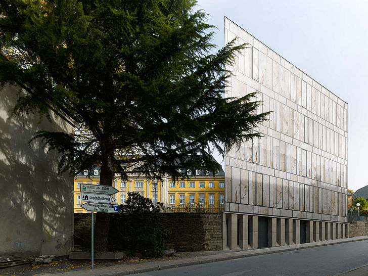
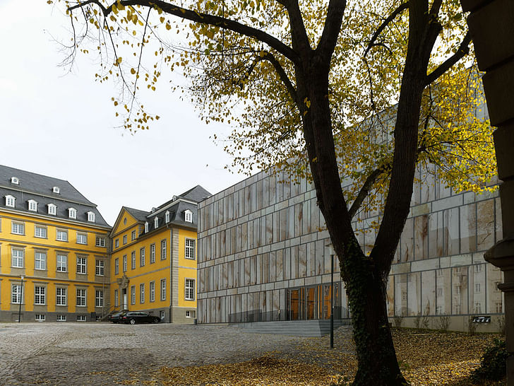
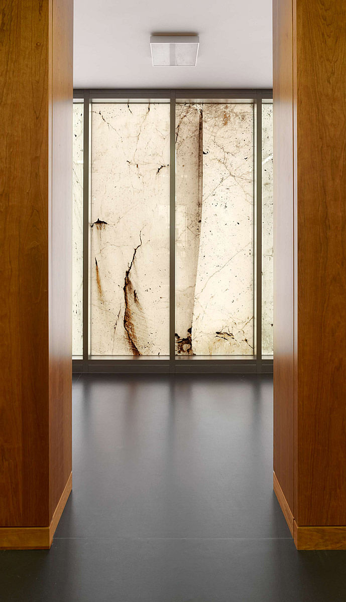
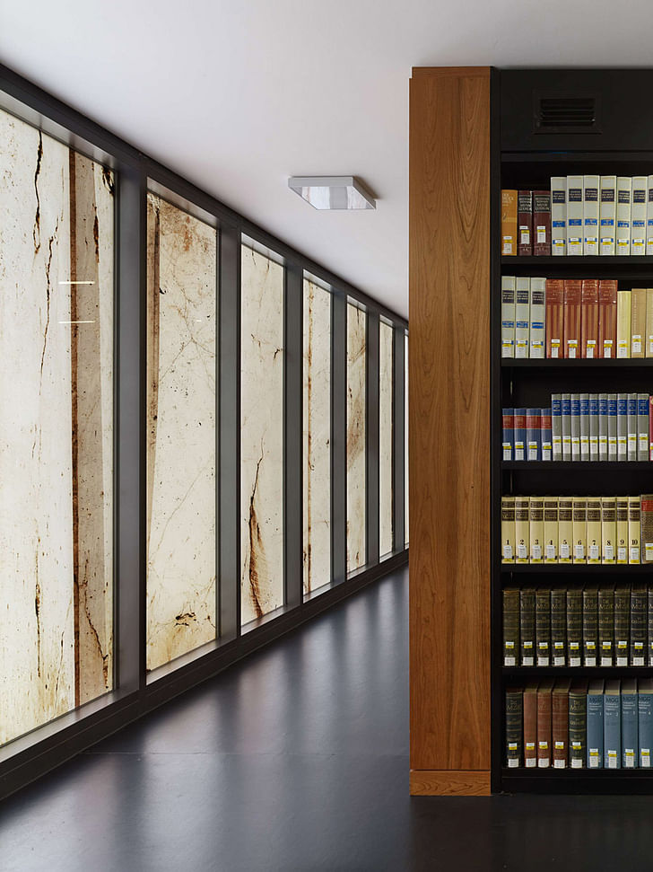
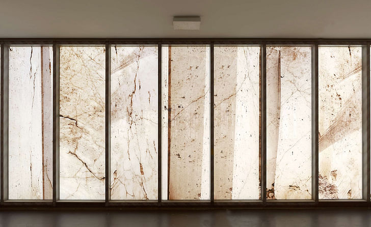
The design of the building’s facade was developed in collaboration with the photographer Stefan Müller. Every pane of glass in the facade depicts a large format close-up of a quarry. These photographs reproduce the unhewn stone in its original size. The photographic works were applied directly onto the glazing using a special technique. In keeping with the elemental meaning of the number twelve in music, twelve motives were pieced together into an overall composition. As with the scagliola technique of the Renaissance used to create stucco marbling, this special photographic technique creates the illusion of the facade being fashioned from the stone material itself. At the same time, a tension is created between the imagery of the textured stone and the flat surface of the glass, reminiscent of the historical sgraffito technique, whereby a graphic embossing is etched into a smooth plaster surface. The new building’s smooth glass surfaces create the perfect impression of a polished monolith. But this is called into question by the translucency of the building’s exterior, thereby playfully breaking the boundaries both from inside and out. Silhouettes of people can be seen beyond the facade. The interior is bathed in a soft, filtered light. In the evening, the building illuminates the courtyard outside.
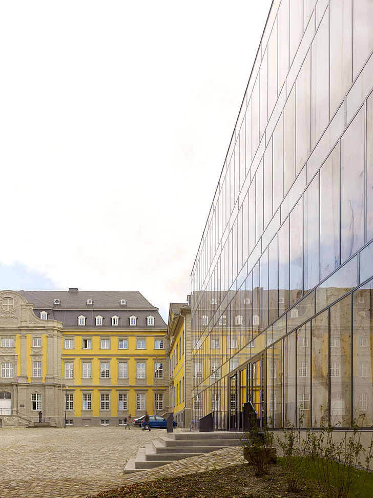
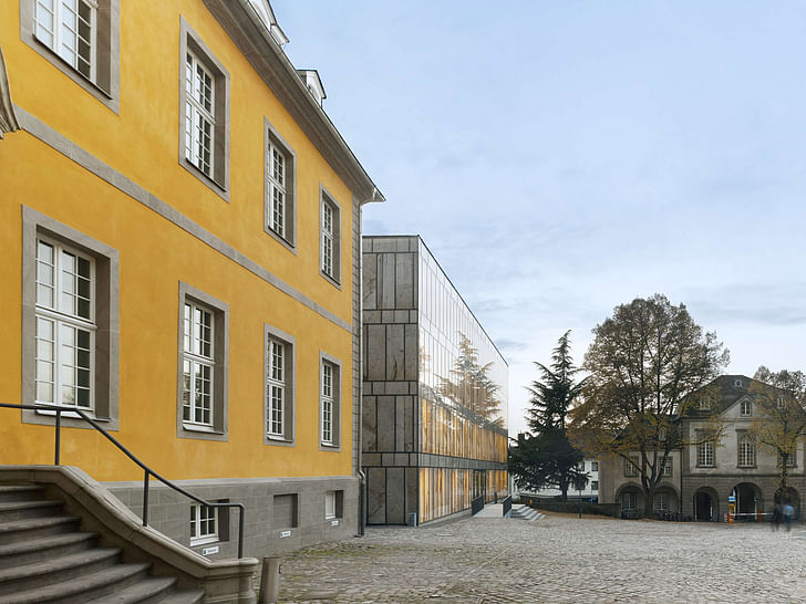
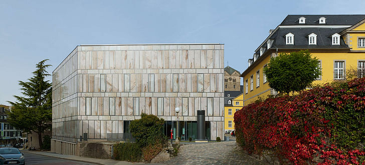
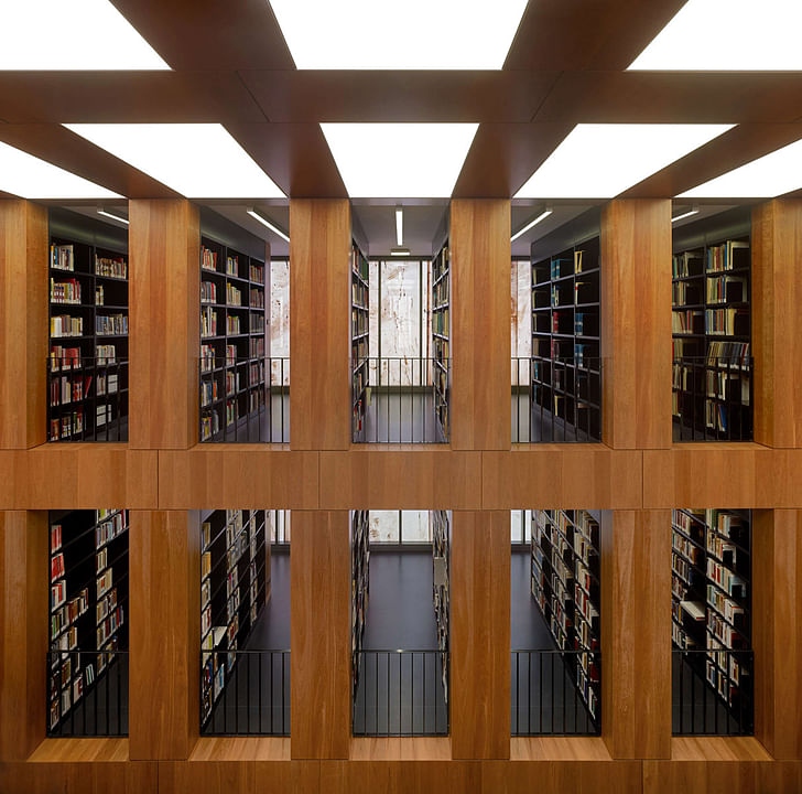
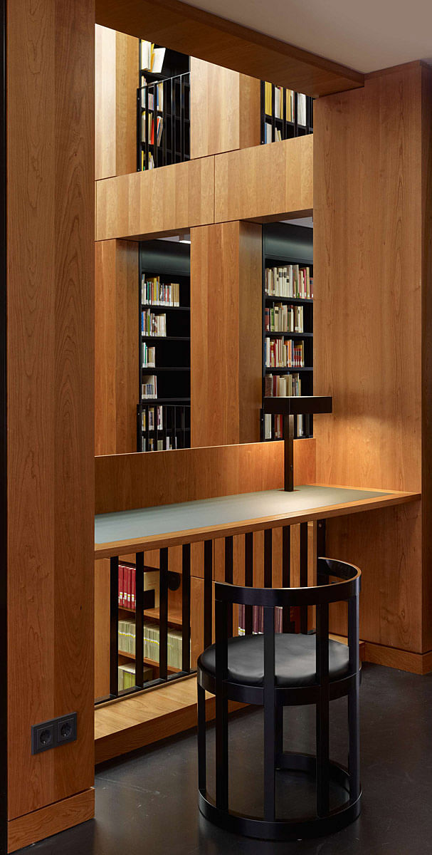
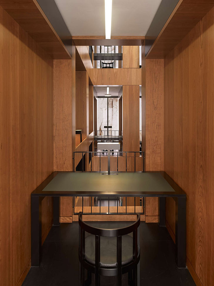
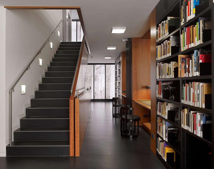
The building comprises a reinforced concrete skeleton with concrete cores to provide stiffening. The glass facade is attached to the building’s projecting structural slabs using the mullion-transom system. The concrete pillars are shaped and positioned according to the dimensions of the book shelves. The pillars are clad in cherry wood, which is also used for the shelving in the reading room. Not all the pillars are load-bearing. Some are used as part of an ‘inert’ air-conditioning system. With the ventilation pipes being channeled directly through the reinforced concrete ceilings, this building material’s potential as a heat sink is thereby put to good use. Through coupling this with a heat exchanger, an innovative contribution to energy efficiency is achieved.
The library furnishings – such as its tables, chairs and shelves – were also designed by Max Dudler.
Drawings:
Project Details:
Building Name: Folkwang Library
Location: Essen-Werden, Germany
Client: Duisburg branch of the Building and Real Estate Management Authority, North Rhine Westphalia; Supported by the Alfried Krupp von Bohlen und Halbach Foundation
User: Folkwang University of the Arts
Building Volumes: 982 m2 usable floor area; 1,707 m2 gross surface area; 5,603 m3 gross building volume
Design and Construction Period:
Design commenced: 2006
Construction commenced: 2010
Construction completed: September 201
Architect: MAX DUDLER
Project Manager: Alexander Bonte
General Contractor: Derichs u Konertz GmbH u Co KG Krefeld
General Planners during the Construction Period: Nattler Architects
Structural Engineers: Leonhardt, Andrä und Partner – Beratende Ingenieure VBI, GmbH, Berlin
Building Services: Winkels Behrens Pospich – Ingenieure für Haustechnik GmbH Münster
Construction Physics / Acoustics: Müller-BBM GmbH Berlin
Photographer: Stefan Müller
Find more photos of the library in the image gallery below.
7 Comments
Nicely done, and really pretty, but the façade is a rather direct, um, "reinterpretation" of the Beinecke Library.
why the quotes? it is a reinterpretation of beinecke .. put through a herzog & demeuron filter
interiors reinterpret kahn's exeter library and wright's larkin building and plenty of other stuff too yeah nice project. i like that knife edge on the beinecke-sque rear facade 5th image down woah that looks thin
It's a bit too literal of a reinterpretation for me, hence the quotes. I love the knife edge though, it's nicely done. I'd be really interested to see the interior of that space, with the stairs/atrium, it looks like from the plan.
too literal because of the material, FRaC? because the rest isn't really the same thing. beinecke is a concrete frame, exposed, with a lozenge-shaped opening of square proportions. This is a curtain-wall detail, with alternating vertical and horizontal panels, very rigidly rectangular. expression is very intentionally flat, as opposed to the expression of the structure at beinecke.
at most i think the use of the material characteristics (because it might even be a little bit different material) is a quote.
It looks like the original proposal was for actual marble, which came back astronomically expensive, so they VE'd to curtain wall instead.
I wish, however, that instead of using the film to mimic marble, they would have used it to do something marble could never achieve. Like commission a high art graffiti artist to do a building wrap or something.
alibaster would have been a nice alternative but probably too expensive.
Another fine project by Max Dudler, tightly controlled, very Ungersian, well done!
Block this user
Are you sure you want to block this user and hide all related comments throughout the site?
Archinect
This is your first comment on Archinect. Your comment will be visible once approved.