
ShowCase is an on-going feature series on Archinect, presenting exciting new work from designers representing all creative fields and all geographies.
We are always accepting nominations for upcoming ShowCase features - if you would like to suggest a project, please send us a message.

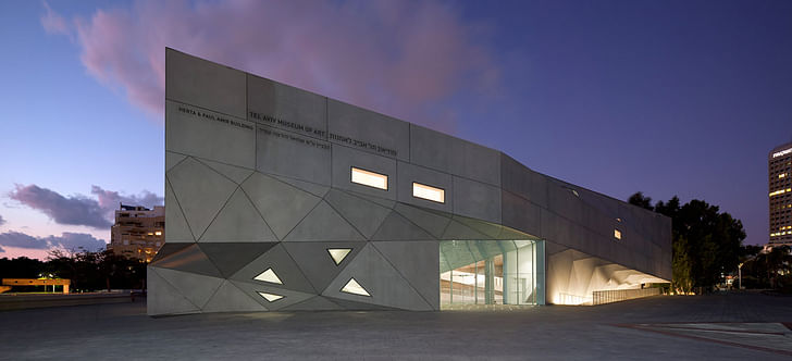
The new Herta and Paul Amir Building at the Tel Aviv Museum of Art is located in the heart of Tel Aviv at 27 Shaul Hamelech Boulevard, set back from the street behind a large plaza. The Ministry of Justice stands to the east; the Beit Ariela Municipal Library and the Center for the Performing Arts are to the west. The site for the Amir Building is a triangular plot between the existing Museum complex, the Library and the Center for the Performing Arts.
The competition brief called for a building to house an installation of the Museum’s comprehensive collection of Israeli art, as well as its architecture and design galleries, drawings and prints galleries, photography study center, art library, new auditorium, a large gallery for temporary exhibitions and public amenities
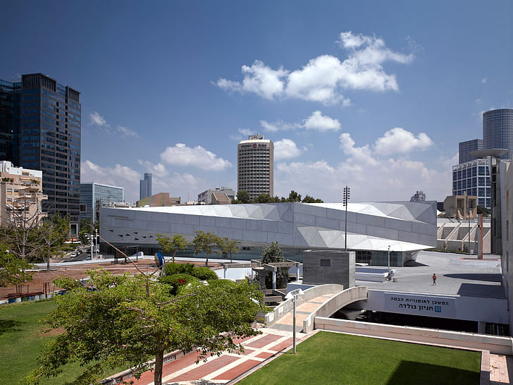
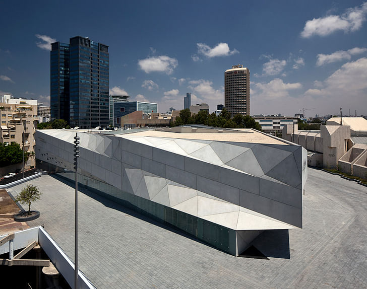
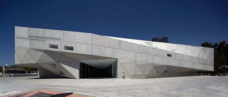
Conceptually, the Amir Building is related to the Museum’s Brutalist main building (completed 1971; Dan Eytan, architect). At the same time, it also relates to the larger tradition of Modern architecture in Tel Aviv, as seen in the multiple vocabularies of Mendelsohn, the Bauhaus and the White City.The gleaming white parabolas of the façade are composed of 465 differently shaped flat panels made of pre-cast reinforced concrete. Achieving a combination of form and material that is unprecedented in the city, the façade translates Tel Aviv’s existing Modernism into a contemporary and progressive architectural language.
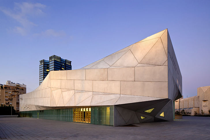
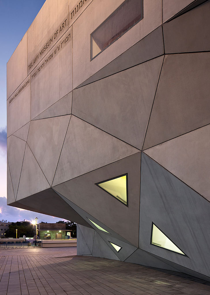
The design for the Amir Building arises directly from the challenge of providing several floors of large, neutral, rectangular galleries within a tight, idiosyncratic, triangular site. The solution is to “square the triangle” by constructing the levels on different axes, which deviate significantly from floor to floor. In essence, the building’s levels—three above grade and two below—are structurally independent plans stacked one on top of the other.
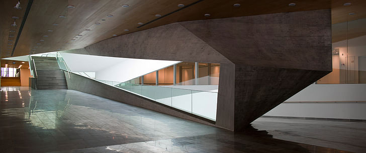
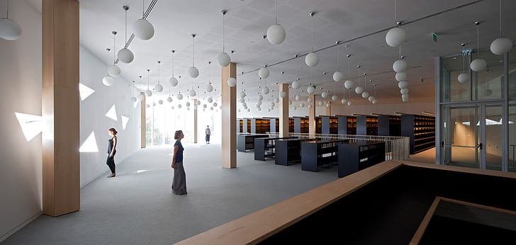
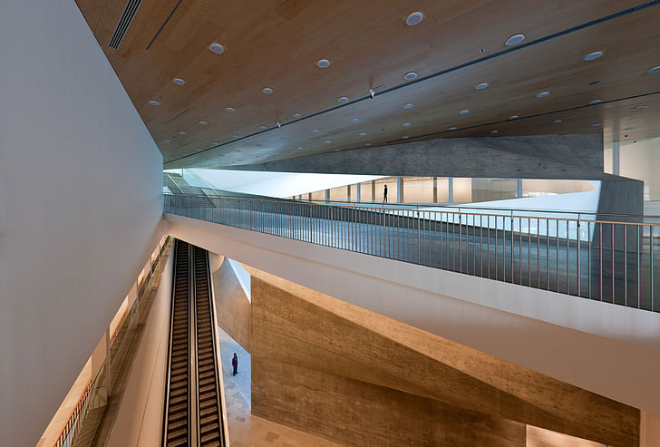
These levels are unified by the “Lightfall”: an 87-foot-high, spiraling, top-lit atrium, whose form is defined by subtly twisting surfaces that curve and veer up and down through the building. The complex geometry of the Lightfall’s surfaces (hyperbolic parabolas) connect the disparate angles of the galleries; the stairs and ramped promenades along them serve as the surprising, continually unfolding vertical circulation system; while the natural light from above is refracted into the deepest recesses of the half-buried building. Cantilevers accommodate the discrepancies between plans and provide overhangs at the perimeter.
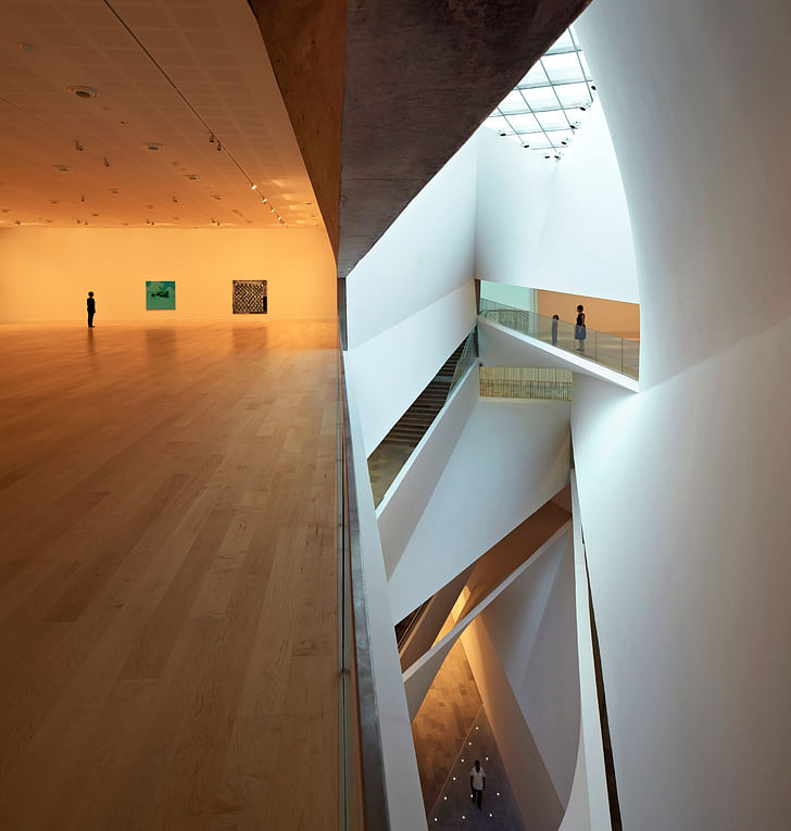
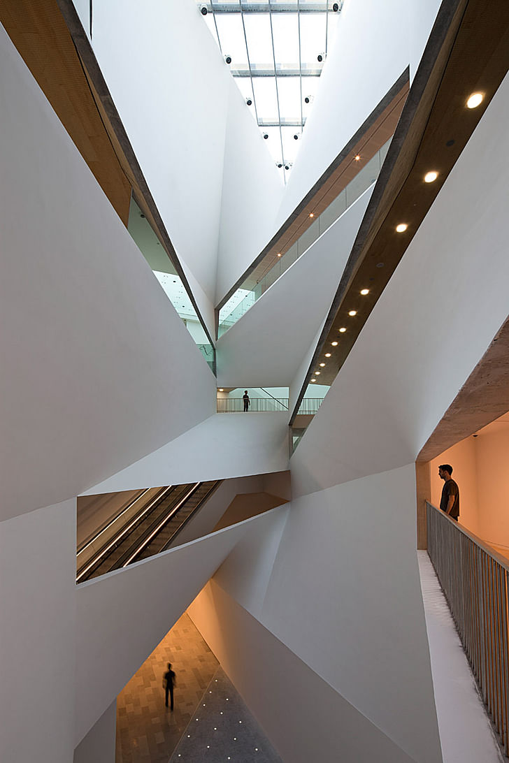
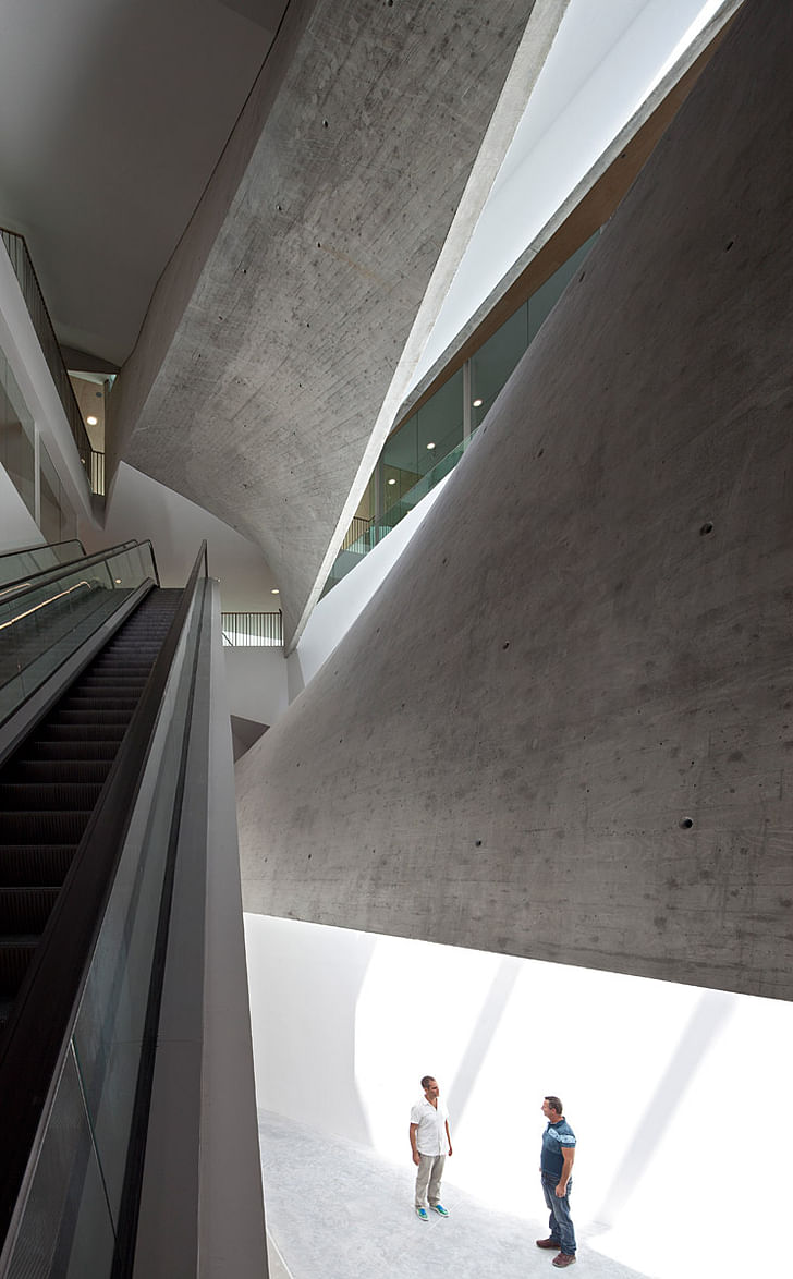
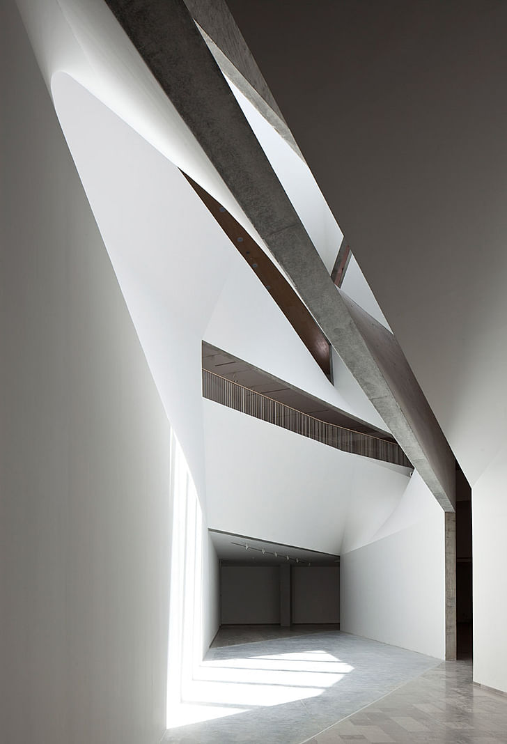
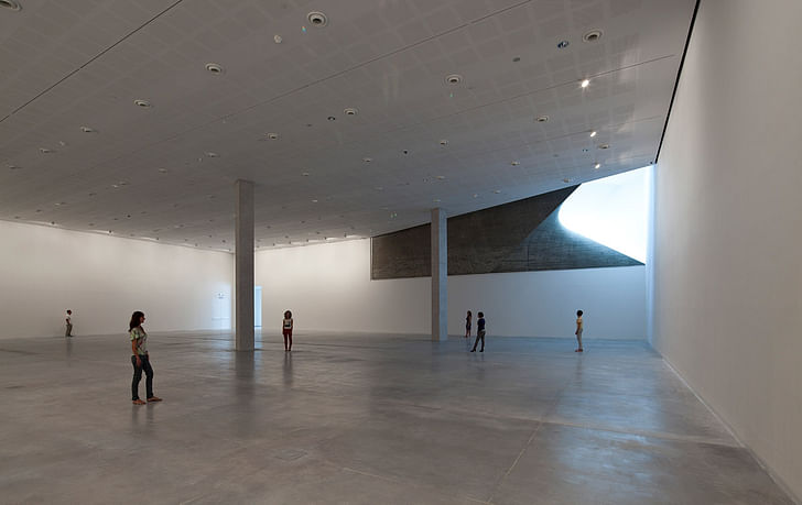
In this way, the Amir Bulding combines two seemingly irreconcilable paradigms of the contemporary art museum: the museum of neutral white boxes, which provides optimal, flexible space for the exhibition of art, and the museum of spectacle, which moves visitors and offers a remarkable social experience. The Amir Building’s synthesis of radical and conventional geometries produces a new type of museum experience, one that is as rooted in the Baroque as it is in the Modern.
Size
195,000 square feet (18,500 square meters), built on a triangular footprint of approximately 48,500 square feet (4,500 square meters)
Cost
$55 million (estimated)
Leadership
Mordechai Omer, Director and Chief Curator
Tel Aviv Museum of Art
Architect
Preston Scott Cohen, Inc., Cambridge, Massachusetts
Preston Scott Cohen, Principal
Key Dates
Architectural competition: 2003
Design development and construction documents: 2005-06
Groundbreaking: 2007
Opening: October 2011
Principal Spaces
Israeli Art galleries 18,500 square feet
Architecture and Design galleries 7,200 square feet
Drawings and Prints galleries 2,500 square feet
Temporary exhibitions gallery 9,000 square feet
Photography study center 3,700 square feet
Art library 10,000 square feet
Auditorium 7,000 square feet
Restaurant 3,200 square feet
Offices 2,700 square feet
Principal Materials
Pre-cast reinforced concrete (facades), cast-in-place concrete (Lightfall), glass, and steel (structural frame)
Design Competition
Preston Scott Cohen, Inc. was selected through a two-stage design competition organized under the direction of architect Jacob Grobman.
Design Team
Preston Scott Cohen, principal in charge of design
Amit Nemlich, project architect; Tobias Nolte, Bohsung Kong, project assistants
Consultants
Project Managers: CPM Construction Managment Ltd.
Structural Engineers: YSS Consulting Engineers Ltd., Dani Shacham
HVAC: M. Doron - I. Shahar & Co., Consulting Eng. Ltd.
Electrical: U. Brener - A. Fattal Electrical & Systems Engineering Ltd.
Lighting: Suzan Tillotson, New York
Find plans, elevations, sections and diagrams in the image gallery below. All drawings courtesy of Preston Scott Cohen, Inc.
8 Comments
Unhappy Hipsters of Tel Aviv, it is lonely in the modern art world.
But, thank you for not photoshopping in the red balloon dog of Jeff Koons. The design is like the nuances of Morphosis, Hadid and Libeskind combo, but really, a little deaf and static. One would expect a more dynamic strategy for a vibrant, eventful, significant and politically saturated nebulous country and its artists.
1-10 scale, 6.85 for being a disciplined orchestra man and few 'good' concrete adventures around where the light comes in.
Is all of the interior dynamics necessarily? It seems to me it would compete with the art, too much background , too paraphrase Kant, for "disinterested aesthetic contemplation" . This is an active engaging work of architecture. I wonder how, or if, the museum artworks would be effected by the architecture?
eric chavkin
I like it, but forgive me for seeing strong shades of Zaha and Libeskind...? Anyways, better than anything I'll ever do, has some awesome interior spaces. Kinda shocked by the landscaping though.. didn't think anyone outside of first and second year students could get away with paving the whole damn lot.
This is one of the most sophisticated pieces of architecture I've seen in years. Real mastery of geometry. The use of materials, the exposure of concrete and more traditional wood flooring and such also help ground the building and release it from the territory of pure expression of sculptural form. And I could not agree more with 18x32 about the comments regarding art. I think the demand of a typical "white box" as the ideal environment to view art relates to a curatorial bias as if there is a "proper" way of viewing art. It is not only a byproduct of the emergence of art production and distribution as an industry of commodities but also results from emergence of the curator as a hyper-specific gatekeeper of the way society interacts with art. If we look at older museums, or neoclassical buildings turned into museums, would we conclude that the ornamentation of the interior or the exterior "distracts" the viewer from understanding the artwork? Why does the experience of viewing art be devoid of context, as if we are viewing it on a computer screen with a white background?
It IS unclear why the museum vs. art dialectic comes up as a conversation. The form of the building is precisely the result of retaining an absolutely neutral, rectangular, white-box gallery. That one edge of each of the six galleries borders the central 'lightfall" does not usurp the neutrality of the box. If the concern is with the overall form of the building competition with the specificity of a particular piece of art, hanging on the wall or standing in the round, then the person with that view must either simply be a classicist who envies the past, or doesn't understand the ability of disparate scales to exist together without competition.
I know this is essentially a reiteration of 18x32, but its worth saying again.
The new wing is the first Israeli ambassador of digital architecture. Several years ago, when it still had not taken shape, it was presented at the exhibition, "Performalism," at the Helena Rubinstein Pavilion, alongside similar works in this new genre of structures, which the exhibition curators defined as "transferring the emphasis in architectural discourse from function to performance." Or in other words, architecture based on its role which violates the public's trust in its moral responsibility. This is the architecture of crisis.
from Esther Zandberg in a local review for the paper Haaretz entitled A beautiful waste of space
Seems like Esther Zandberg has some catching up to do, architecture has been about crisis since the birth of modern architecture, and a few decades before that. And after reading the full article, all these very vague associations between built form and democracy, built form and openness etc. become even more difficult to justify. She makes the museum sound like the "safety" fence down the street. On the other hand, she is right in pointing out that architecture has mainly become about the spectacular, and not much more, through a prioritization of technique, more specifically digital technique.
Go ARchitects, I would venture that modernism, in the case of tel aviv, as a modern colonial city, was largely the opposite of a crisis and formed part of its identity. it did not have to break with history but was invested in creating a new history.
i sense that there is a discernible retro-ness about the building. actually, it is not "digital" architecture as we have come to understand it what with parametricism and so on. i disaagree with the article; it is not a fetishism of the digital age but a fetishistic subversion- and therefore an extreme case- of traditional projective gemeotry - after all, thats one of the courses that prescon scott cohen teaches at harvard. i would imagine that the digital here plays a part as a visualization and drawing, not as design input. projective geometry posits complete equality between top view and side view, plans, sections and so on. non-discursive space results through an assembly of the data captured by these orthogonal views. this is the reason why, where the building is extraordinary, it is extraordinary in negating a distinction between what is wall, what is roof..etc. In other words, this building is an apotheosis of a traditional viewing and drawing convention, not one that has been introduced as a novel digital method. it does not, in my opinion, have the spirit of zaha hadid who is highly sensitized to the distinction of horizontal and vertical and can therefore negotiate the possibilities in between in a spatial, rather than surface folding manner. for zaha hadid and perhaps for libeskind, gravity is crucial...in this building, it is not. also here it is not visualization of space that is so important but rather visualization itself as precursor to space. this is the poetics of autocad. thats not necessarily a criticism (unless we bring in the lack of some other provision that we expect from a people-centric -rather than ocularcentric- building). this is just an interpretation.
Block this user
Are you sure you want to block this user and hide all related comments throughout the site?
Archinect
This is your first comment on Archinect. Your comment will be visible once approved.