Well.
You know that awkward, gelatinous time between projects where you haven't quite rebooted to start a completely new project? I'm currently suspended in it; I still have a mild hangover from the last project and, as eager as I am to start clean-slate on a new project, I can't help but obsess over irrelevant questions like, Is the milk in the fridge bad? Where have all my socks and dirty laundry gone? How have I managed to cut my ankle in three different places?
Anyway.
As a bit of a closure, I'll briefly talk about the studio project that I did with my very talented mate, Mark, which was also an entry into a competition held by Spacing Magazine.
The brief asked us to consider and evaluate existing urban infrastructures of a city to further challenge or test their possibilities. We were to then investigate what these typologies offered to the city and look into additional existing opportunities.
In layman's term, we were asked to redesign either a bus stop or a subway entrance. Architecturally.
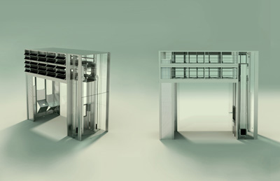
And this is what we came up with:
The crit panel referred to it as an urban vending machine, which sort of stuck. We used the available infrastructure of a bus route which is well-spread and well-established in terms of use and number, to make up for the sparsity of fresh grocery stores in the suburbs of Toronto. It was also a means of merging the two different events--using the public transit and shopping for groceries--into one to make the daily timeline more efficient. We recognized, especially as students, that the idea of shopping without a car could be very discouraging and that using the transit system as a means of distribution could help out a lot of people.
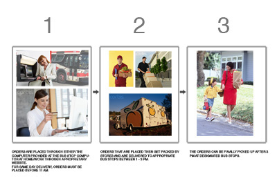
A shoddy diagram of how it works: 
The boxes that you see stacked on top are actually climate-controlled lockers that will store the customers' groceries. There is a conveyor system and a simple elevator and chute that will retrieve the goods down to the ground level or load it to the top when the delivery is made. 
The final review was actually very enjoyable. The panel seemed to be amused by the pitch and were having a lot of fun with it. The competition panel, apparently not so much: a metro station with a green roof won, but hey. It could have really taken off in Japan, who knows. 
1 Comment
This is a brilliant concept and striking architectural form. Have you contacted Peapod in the states to inquire about the viability of it? At the right price, it might be very successful here.
Block this user
Are you sure you want to block this user and hide all related comments throughout the site?
Archinect
This is your first comment on Archinect. Your comment will be visible once approved.