New Delhi, IN
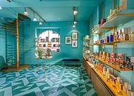
Designed as a first in a series of multi-designer pret stores, where the collections are themed and curated, Neel Sutra- the India Fashion store is emblematic of Indian Design ethos.
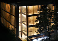
Sited at The New Oberoi Hotel in the suburban abode of NCR- Gurgaon, the hotel spawns a high-end luxury international experience. The brief was to create a unique and distinct design ambience that would be conspicuouswithin the context of other established global hi-design brands at the hotel and elsewhere in the vicinity.The customized and curated storeis conceivedwithin this international collective constructas a step ahead of conventional high street retail to showcase a motley bunch of Indian fashion designers.Contemporary design in India usually expresses the complexity in Indian Design discourse with kitsch. The India Fashion Storeis a cognizant attempt to stay away from Indian Kitsch, and instead craft a sacred space.
The need for a resilient identity and a compelling spacewas impending- one that could mark a presence regardless ofthe ever-changing exhibits.At the same time, it was important to create depth within the spatial volume, and induct a sacred sense of vastness. Fashion design in India, is most often connotatedas a fiddly amalgam of colours, weaves and layers. In contrast,an extremely structured space is created using multiple architectonic elements.The store hence becomes a figurative response as a tribute to Indian Fashion. Weaves that are reminiscent of Indian Textile Design, are contrived in the form of layers which use material play that befits Indian context, manifesting themselves as fundamentals within the store.
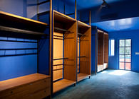
The India Fashion Store is envisioned as an austere House of Indian Fashion employing the hut as a rudimentary notion of shelter, with facets of the Indian design ethos as architectural interventions. A candid reference is made to the Single Line hut diagram;planned in the form of the veritable architectural notion of the Plan, section and the Walls, a hut-like section with a pitched roof allows for the generation of a strong axis that facilitates the demarcation of the space into the two key components of a retail store- display and movement. The Section exaggerates the linearity of the space, the entrance, and finally, its visual termination with a blue niche at the end to emphasize depth and the axis of the store through dissonance.Given the evolutionary nature of the space with its changing collections, a perception of order and Indian tenet is endowed through a play of scale, materiality and technique.
The aperture at the entrance transforms itself into the main door, its solidity becoming characteristic of its physical identity.It also aids in announcing the store to casual observers, rendering its formidable presence, making it larger than life. The niche at the rear converges into an altar-like entity, bestowing the House with a profound solace that only a visitor can encounter. The central space is left vacant for topical display, generating a scale that encourages people to look up towards the pitched roofupon entering, a relic of the hut. This allusion to the pitched roof insinuates the home for Indian Fashion. The Hut Wall mimics the elevation of a house with a window (where the attendant sits) and is clad in distressed zinc simulating the Indian fabrication experience.
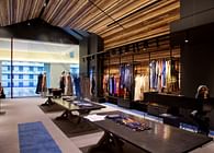
Upon entering, one is taken in by the rendering of the surfaces with the multiple shades of often forgotten eleven timbers of Indian origin (Padauk, Neem, Babool, Rosewood, Teak, Sheesham, Deodar, Spruce / Pine, Mango, Hollock, Eucalyptus).Typically oak, spruce and other non-Indian timbers are used in contemporary architecture, without rethinking the material strategy. In today’s context, Indian timbers cost the same, and have a much more serious sustainable connotation, and befit the regional context of the store. As homage to traditional craft and local materials in India, and as a hat tip to the craft styles of the country and the designers being showcased at the store, the multifarious 11-timber collection from various regions is used in a lattice to highlight the altar-like niche at the termination of the section and the Display System. The sizes of the timber are determined by the dimension of easily available planks and the gaps between are measured using theIndian Five Rupee Coin as a construction module. An interesting visual texture is fashioned, with the timber being finished with an open grain hand rubbed using Neem Tree Oil (another forgotten Indian craft). Thediverse colours of the timber breakdown the scale of store, and render it with colour without resorting to kitsch or common techniques such as engravings and cutouts. The lattice terminates into a zinc-clad slit in the ceiling that accentuates the hut-section and the lapse in the pitched roof.
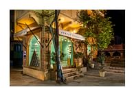
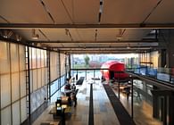
The entrance is not a customary shop-window that is planned every season with a new collection, the store façade is conceived as an architectonic entity; a clear glass façade that scales the contiguous corridor and helps to establish the store’s identity despite having a lower clear elevation as compared to others in the vicinity. A 4.5m tall opaque door, finished in distressed hand beaten zinc, augments this vision by delineating the boundaries through a gesture of texture.Had the door been glass, the store volume would recede into its surroundings. The trial room is also finished in the same distressed zinc, creating a continuity of material through the store. The distressed zinc is seized as a reference from the corroded-tin boxes (used by slum dwellers for shelter or households in the 80’s), and is also a remnant of the entrance to the House of royals(the diwan-e-khas) at the Red Fort.Tall, Free-floating, black metal frames are appended to this extremely structured space to enable additional display. The modular storage system fashioned with mild steel members, also makes a reference to the structural members that are used to hold the roof together in a hut.Devised as a framework with voids, thetractable storage system can accommodate an assortment of products to showcase the shades of Indian design. Tall and varying in dimension, the metallic stands add a sense of scale to the sheet volume of the store and whilst being flexible, create a sense of order.
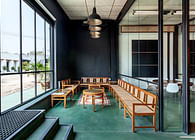
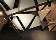
An overall muted color palette is used to offset the curated content at the store. All the incidental, residual elements intended as a backdrop, are hence rendered black with a no-sheen, black paint (called Blackboard) that is typically used in public schools to refresh the chalkboards. Another classic technique used to executethe matte black finish, is the use of kajal polish (the Indian Kohl Pencil) toexploit the void-ness of black. The timber lattice defines the volume, with Distressed Zinc, aluminum insertsand Blue Accents. Originally envisagedas a series of the traditional Indian ‘duhrrie’, representational of the Indian weaves, the floor is a hand tufted carpet in Ecru and Blue with nine different tones of grey and knots. Running through both the horizontal and vertical surfaces, this carpet transforms into a blue rung ladder on one wall intended for display and blue niches on the other. The ladder is also a suggestion of the hut prototype of the simple ladder used in traditional huts to move to the top.The Blue carpet terminates into a blue niche at the end of the store, slightly off-centred, emphasizing the axis running right through. A threadwork installation(sutra-a remnant of textile weaves)at the front of the store in shades of blue(neel)and orangealso makes a reference to the branding, terminating in the form of a woven wall at the extreme end.
Lighting is premeditated in a simplistic and flexible manner to accentuate the elements of the design process and the blackness of the residual elements. The primary intention is to light up the merchandise, whilst simultaneously exploiting light to enhance the volume of the store by rendering the floor and ceilinguniformly. The apparatus used allows for both functional lighting for the display and ambient light to render the roof materiality. Typically, retail stores have too many “light” punctures; At Neelsutra, the intent is to have a minimum intervention in a defined manner while creating a focus with colour at the far end of the store. This also aids in the definition of the intersection of the church wall and the ceiling with an “imprint” of light from the top of the church wall.The high contrast of display is minimized by generating ambient light with a row of deep, recessed fixtures that are finelyconcealed in the ridge of the roof. The self-contained track and uplightallows for various levels of light to enhance the store, yet permitting flexibility in display.
The experience of the hut-section, the clarity of the plan together with the presence of altar-like backdrop at the far end of the spacerenders Neelsutra as a unique,well-defined, progressive endeavor with a handcrafted approach in retail store design that is befitting to the avant-garde India.
Status: Built
Location: Gurgaon, IN
Firm Role: principle architect
