New Delhi, IN
53 SILVER OAKS
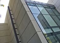
Gurgaon is often cited as a shining example of India’s growth story. Replete with tall glass skyscrapers, wide roads and millionaire-worthy housing estates, it has manifested almost overnight, with vast swathes of the city almost impossible to differentiate from one another. Most of this modernity, however, is just a façade, with poor urban planning and regressive construction systems creating deeply unsustainable living patterns. The glass facades hide ordinary concrete framed structures, often with services designed as an afterthought, negating most of the benefits to be reaped from a frame/skin system of construction.
Deep within this context of banality lay the rectilinear project site and a complex brief of requirements. The client wished to accommodate a large public space and a combination of several kinds of guest rooms, on a site that mandated that no windows could overlook either of the long sides. Having lived in a climate responsive and an inward looking house made in exposed brickwork and concrete, he also wanted the building to imbibe the unique qualities of the mid-century modernism that put post-independent Indian architecture on the global map.
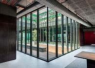
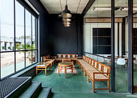
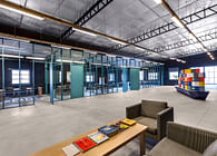
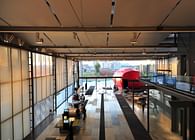
As a unique parti, it was decided to create the main public areas below ground level and thus, the principal entrance leads to a generous subterranean space. The glass walls of this light-filled space are set in, detached from the peripheral retaining walls, eliminating the sense of being underground by creating deep horizontal views and negating any impact of possible dampness. On the upper floors,an efficient combination of suites and rooms are organized around a central vertical movement core, emphasized by the stark geometry of the stair. Skylights and atriums bring light directly into what is almost an ephemeral space, consisting of translucent and reflective surfaces, multiplying the light by reflecting
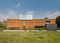
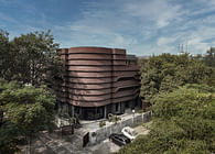
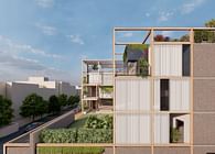
The overall intent begins from the need to express the architectural concerns within space and not just leave them to the exterior massing/public spaces; hence the structural system and construction techniques being expressed clearly (as opposed to practice wherein most internal surfaces are concealed by cladding, plaster etc.) A uniquely symbiotic relationship has evolved at 53, between the design of the structural system and the exterior skin.For centuries, architecture in the Indian subcontinent has battled the sun, the dust and the heat. The screen (or the Indian jaali) is a marvellous architectural device, reduced somewhat unfortunately to a mostly decorative element in the contemporary scenario. Adapted to a contemporary interpretation, here, it is used to keep out the glare of the sun, moderate the interior temperature, whilst all the while providing a uniform subtle light quality in interior spaces.The objective was to wrap the structure in a thin, light, perforated screen so that the structure itself could be lighter and free from supporting the weight of unnecessarily heavy interior and exterior partitions. This porosity and transparency has been one of the recurring themes of architectural investigation in our studio, evolving constantly through many of our projects, notably in ManaRanakpur. The pattern of the perforations are not simple repetitive modules; instead they are seemingly random until viewed together, when they coalesce into anoverall composition.Further, the mesh creates a Uniform envelope around the building, whilst creating a dynamic play within by enabling a play of shadows internally, yet ensuring privacy from the road by creating a significantly clear architectural product. The skin also facilitates a peak into the outside world, while bringing in filtered views of the trees inside through corridors, creating a controlled engagement for the occupier vis-à-vis the neighbourhood.
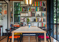
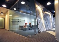
By limiting the use of concrete to the basement retaining walls and roof slabs, the resultant building is remarkably sustainable in its life cycle, maximising the use of recyclable materials. Nearly all of the walls are made of double insulated glass units, eliminating privacy concerns with respect to noise. The steel frame itself was designed for maximum lightness, with bracing provided by diagonal members, their geometry expressed through the glass. Not only does this allow maximum flexibility, it enables easy maintenance by nearly eliminating repeated painting. The metal frame is finished with aircraft grade non-VOC paint. The steel joists that hold up the deck slabs are visible within the guest rooms. The main load bearing columns are expressed through the public spaces as slender elements.
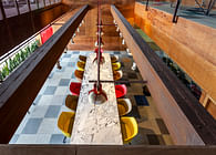
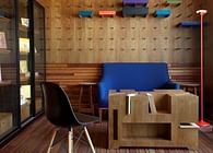
India’s construction boom means that labourers are often not professional craftsmen, and in the local context, it is a constant challenge to produce a quality building. Over-reliance on site built finishes inevitably mean higher costs and a greater uncertainty over the final finish. By using mostly dry materials and highly articulated material transitions, the building can be assembled quicker and with a greater degree of precision. Locally sourced materials have been used throughout the building. Eschewing the popular Italian marbles that adorn bourgeois Indian homes, a deeply veined Indian marble was deployed in an asymmetrical pattern to complement the cool tones of the interior glass partitions. This understanding, that materials that need to be touched should be warm, continues in the design of the staircase that is enveloped in wood, acting as the dissonant piece in the composition, making it whole.
Since the building would eventually be used as a transitional space for most guests, it was imperative to design the services to take decades of wear and tear without needing costly maintenance or routine supervision. Plumbing, lighting and air conditioning were conceptualised within the framework of the building at an early stage including systems like pressurized water supply, solar hot water generators with recycling pumps, rainwater harvesting etc. As Gurgaon is prone to long power cuts, the use of split power generators aid in the reduction of running costs. Every mundane decision was re-examined, whether it was the room lighting, where single dimmable fixtures were chosen for the efficiency, user customization or the common areas, and backlit architectural fabrics are used for dramatic effect. This fabric also finds use in the headboards of the rooms and the ceilings, minimizing maintenance. A professional kitchen situated in the basement caters to the entire building. An insulated roof increases the thermal mass of the building, while the glass walls allow it quickly cool in the evening. The interior furniture in solid oak wood, stained in a Scandinavian fadeis designed to complement the interiors and reflect the environmental concerns of the property.The boundary wall, otherwise a banal necessity in the urban context of Gurgaon, has been transformed into an animated part of the building by incorporating a retractable planted screen, enabling a dynamic expression of the plants from the back to the basement.
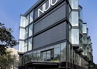
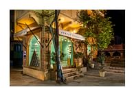
The resultant aesthetic is one of elegant simplicity. At night, the varying pattern of the retractable blinds animates the ordered elements, while during the day, the shadows of the surrounding trees play out on the façade, reflecting their movement. A single material used in the façade, not in the manner of the local context, but one that fully exploits the abilities of composite glass to act as a sustainable peripheral skin.
Status: Built
Location: 53 Silver Oaks Avenue, DLF Phase 1, Gurgaon
Firm Role: Principal Architect
Additional Credits: Design Team - Nishant Malhotra / Nikhil Auluck
