New Delhi, IN
ART DISTRICT XIII
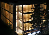
Life in Delhi’s urban villages is defined by the two conflicting forces of exploding unregulated development and a dense inherited city grain. Defined by archaic laws that relied on a periphery demarcated by a red string (or Lal Dora), these ancient settlements are fast transforming into the city’s hip areas as cheap rents attract young entrepreneurs with big ideas and limited budgets. Adding to the mix is the general sense of lawlessness that pervades these areas, whether it is poor regulation of building bylaws or safety for establishments against theft and arson. Vibrant during the day, strong opaque shutters are drawn across show windows by night, further lending an air of desolation as the traditional residential population has slowly gentrified and moved out.
Within this framework of chaos, Architecture Discipline was asked to create a gallery space by a client who was a keen art collector and endorsed our vision of a more aggressive intervention. In the past century, the design of the modern art gallery has been reduced to a dumb white box - it does not convey any visual information and thus cannot be processed as anything of interest by the layman or the casual passerby. In our specific context, inserting a simple white container would have further alienated the internal content from the neighborhood where lack of comprehension is already an issue. Rather than eliminate the possibility of dialogue by creating a secure shuttered box to protect the precious internal objects, it was important to continue the engagement beyond closing hours and foster a relationship with the community by establishing an identifiable location on the street. Carrying forward the ethos of the client that art should be accessible and appreciated by all, as demonstrated by his other online initiatives, this created the fundamental idea of the space, an inviting gallery that dispels the notion that art is elitist.
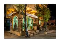
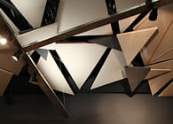
Conceived as a reconfigurable space for Art, with architectonic interventions, the Art District is an un-imposing urban insert in Delhi’s upcoming cultural hub.As one approaches the gallery, a colorful effervescent screen comes into view. Composed entirely of twisted metal flats placed at varying intervals, the screen announces an artistic presence on the street. Predominantly white and neon green, there are a few splashes of bold pink highlighting the brand colors, echoed in two bold lollipop signs that carry the name of the gallery. The partial transparency allows a glimpse of the interior space, which seems almost like an extension of the street outside, an illusion furthered by a single bold yellow line that starts outside the steps and leads one inwards into the space. Also visible from outside is the stark furniture in the reception space, consisting of a few carefully selected pieces in bold colors, emphasizing and encouraging the inherent voyeuristic nature of the process of looking in to a private space from the street.
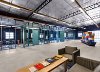
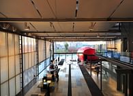
As we weren't allowed to puncture the walls or make any structural changes, the challenge was to create a theatrical space that did not attempt to compete with the art on display but created enough interest to create a series of layered spaces that complemented the disjointed floor plan. Due to the diminutive size of the space, it was important to have an entrance that created a transition from a brightly lit outdoors to the dark interiors, without creating a sensation of being too enclosed. From the entrance, a long thin unusable space was animated with a linear neon green pitched roof that pulls the eye into the main gallery space. Floating away from the walls, this creates a tunnel of vision by complementing the bold yellow line in the floor. Another pitched roof hovers above the reception area, but is inverted to allow for a wider outside view. These give way to a flat ceiling in the rear main gallery, creating a dialogue between clean white spaces that are inhabited by transient art and dynamic coloured spaces that are inherently engaging. Storage and back of house areas are discretely hidden away at the rear of the space and given an inexpensive maintenance free surface finish. Large panels can be moved around to reconfigure the gallery for different sizes of artwork and these also form temporary storage areas.
Since the interior space had no daylight, the focus of the lighting was to create both a comfortable level of ambient lighting and focused areas of brighter lighting for the artwork, so it would “pop out” and capture attention. By carefully balancing the levels of illumination in the space to minimize shadow, we could ensure that there would be no gallery fatigue. Concurrently, the track system was designed in a way that the artwork could be suspended 100mm away from the back wall so that the individual positions could be curated for maximum effect. This also creates the possibility of viewing the art from closer proximity by allowing for toe-in space, while allowing the gallery owners and artists to use the shadows for their own advantage, creating areas of emphasis. The bold line on the floor continues to wrap around the periphery of the gallery spaces and the cues from the street continue in the design of the artwork information plates. These are uniquely placed on the floor below each piece, akin to a parking sign, signifying the need to pause and engage with the work on display rather than pass by with the cursory glance.
Status: Built
Location: F-213C Lado Sarai, Old MB Road, New Delhi - 110030
Firm Role: Principal Architect
