INITIAL BRIEF / CLIENT REQUIREMENTS
Creating an edgy and young yet sophisticated and functioning office space for Delhivery , which is an e-commerce logistics company, was the requirement of the client for the re-modelling of their office interiors.
While being environmentally responsive and highly technical, its projection had to be of a certain level of dignity and portray an image of stability since these management consultancies had been present for several years and were quite predictable due to their consistent and steady growth rate. Meanwhile, a start up by its very nature is unstable due to its aggressive and erratic growth rate. It lacks a systematic hierarchy, set rules and proper communication sets. Being a start up with the capacity of a long-term organisation, the clients for Delhivery came with certain expectations, knowing the experience of Architecture Discipline.
AD PAST AND EXPERIENCES
The projects done by Architecture Discipline in the past were low density as the studio had not done a large to medium size office for years and faced a challenge specific to this start up - that despite just starting out, they had reached a high capacity and were continuing to grow.
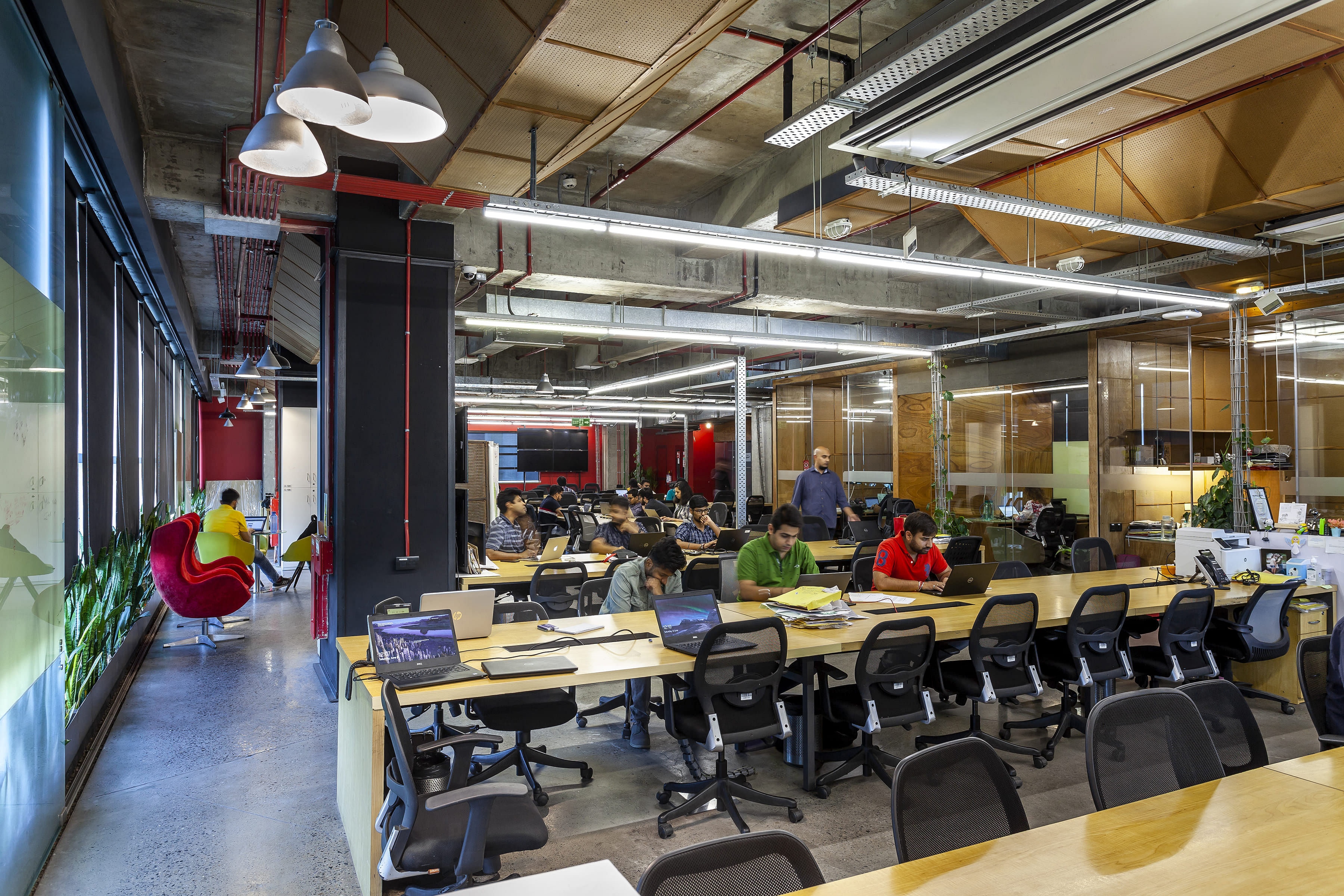
Architecture Discipline has technical understanding and experienced performance acquired over several years. This allows for creation of breakout spaces that are an amalgamation of a formal yet semi-casual arrangement. The offices give off a modern and young appearance while maintaining a certain urbanity and practicality. Irrespective of the work culture, visual chaos and noise clutter within a space can make it function poorly as a productive area. While Delhivery wanted an edgy facade of a start-up established by young leaders, the space should function with the knowledge and experience of a well operating office.
DESIRED DESIGN ENVIRONMENT + EXTENSION STORY
The company being youthful, presented an opportunity to explore environmental responsibility through a found aesthetic and bare minimum intervention. The specification of wanting a space depicting aesthetic edginess made the process simpler.
Considering it was an office for young people, it required a touch of eccentricity. Several factors were taken into consideration around this framework, planned and implemented accordingly. The challenging aspect of the project was the planning the flexibility of the design to fit the unpredictable rapid growth within the entire system and produce an office that was bare boned and yet had an air of sophistication.
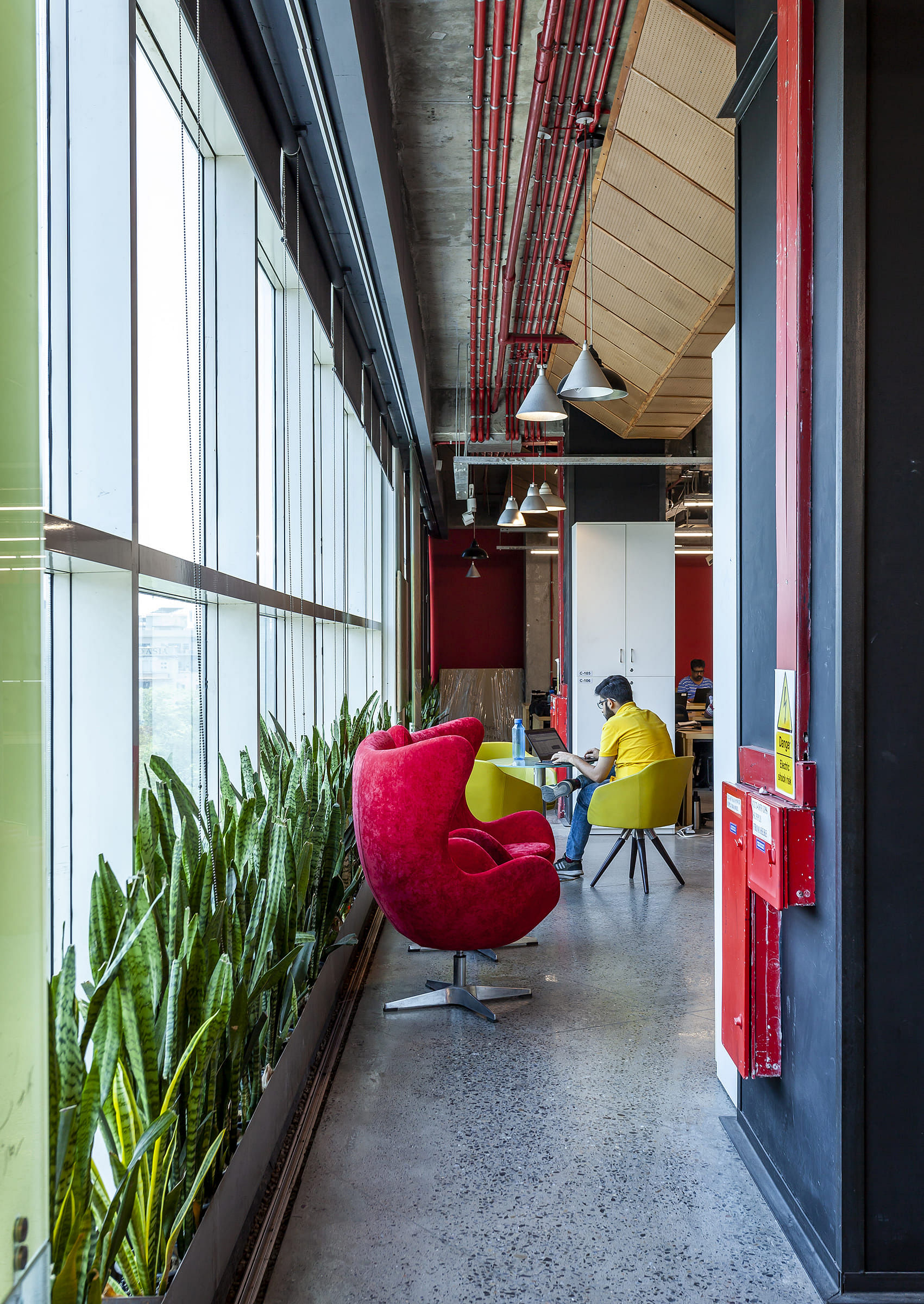
The experience with Delhivery is not of going to a dreary office, but of attending university. The working environment is casual, where employees can show up in slippers. Overnight stay is common so bunk beds are fitted in some cabins above the work stations. Similar to university, the flow to the men's and women's bathroom is alternate, where one would be required to move up or down a floor in order to use the facility, making the physical act intuitive. While this is a healthier benefit, it also allows for interaction among employees, since one cannot rely solely on an elevator in such a populated office.
Initially, the office was to have 2 empty floors as Delhivery did not have the capacity to fill it out. However, as the space was completed within the specified time, their office density had increased by 15-20 % and the clients were in need of more space. An intervention that accommodated a change in density was devised, where 20 people could be added to each floor, thus maximising the efficiency and utilisation of the space without having to physically increase it. Being short on time, readily available objects or material that could be acquired without any lag time were employed.
TEXTUAL DESIGN WALK THOROUGH
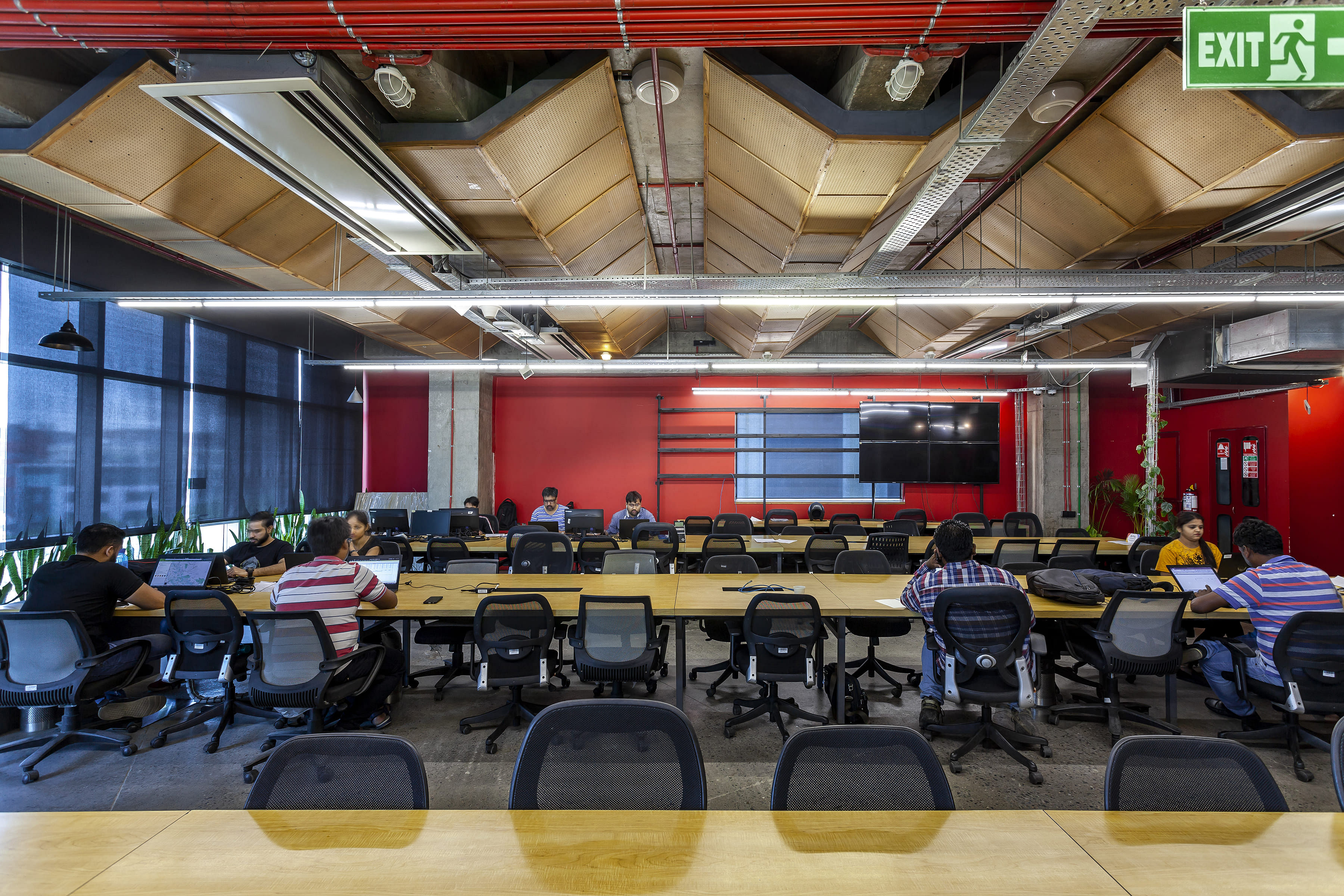
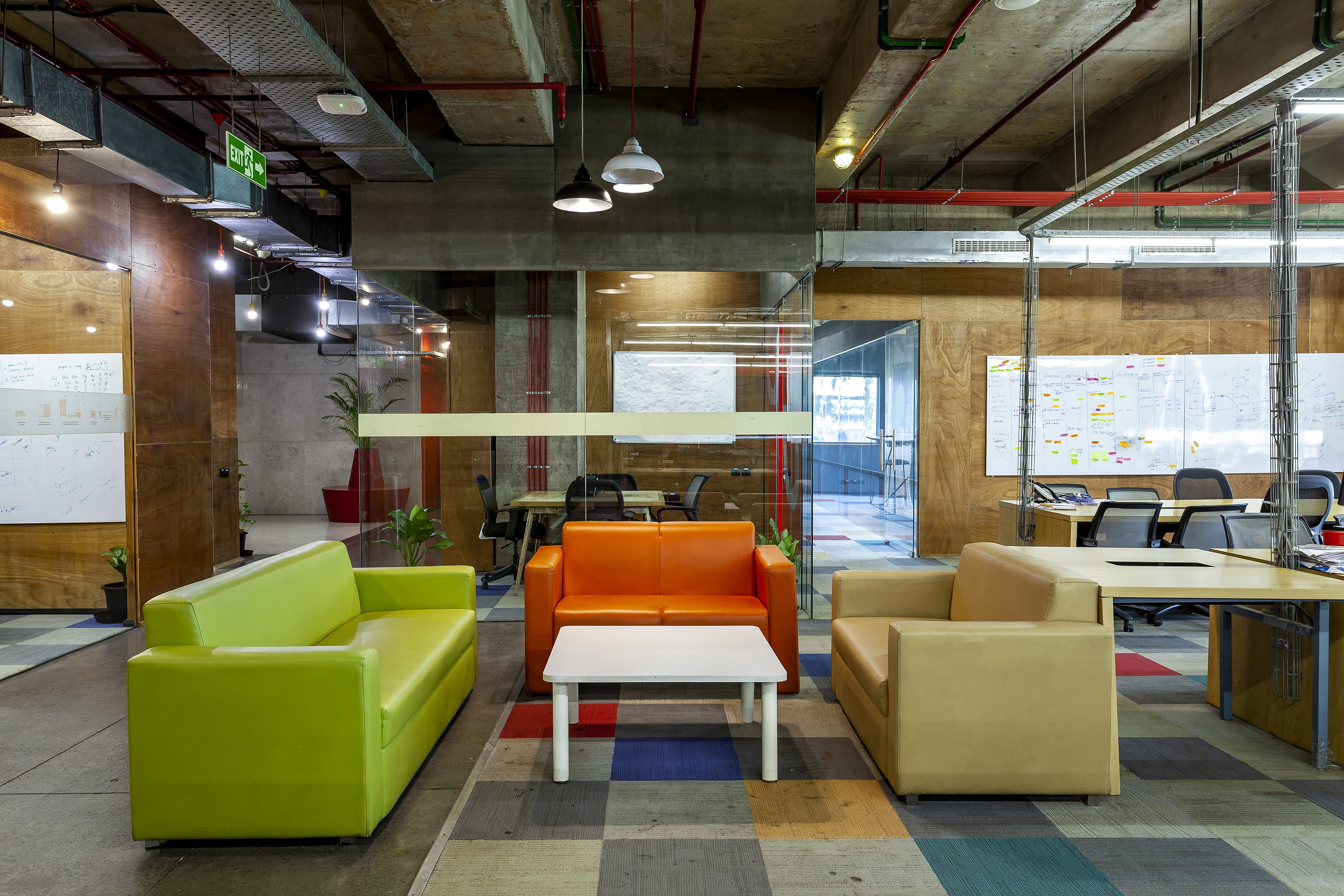
The entrance for Delhivery was through the cafeteria rather than a stereotypical reception, highlighting the experience of attending university or a place that is welcoming. The employees have no designated seating and have the liberty to sit with friends or favourable networks, making the overall atmosphere interactive and amicable. The physical orientation of working can be relaxed, since the employee would always be in close proximity to a couch or an easy chair. Along with being a fruitful working experience, it is also a social and cultural experience.
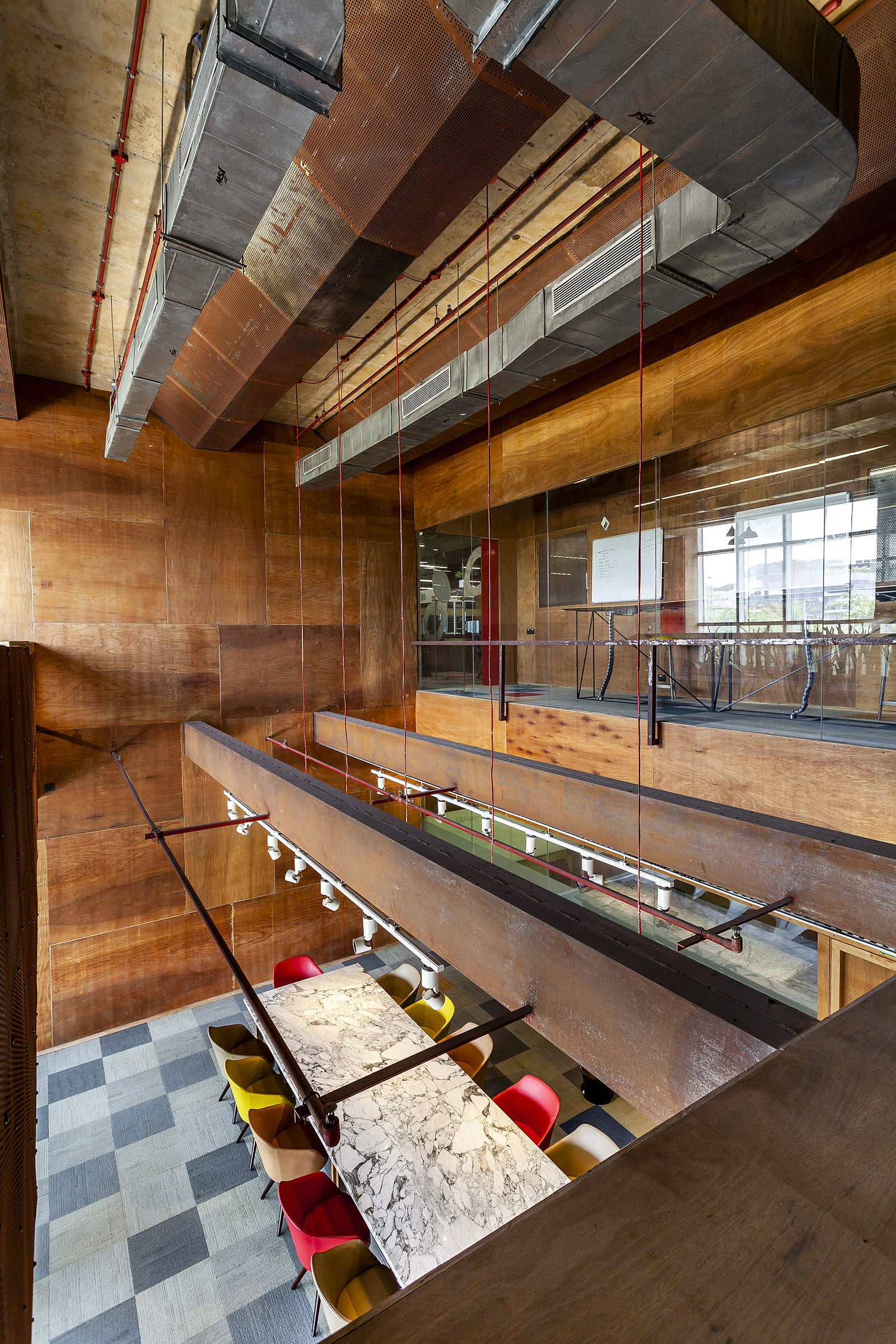
The cafeteria is their largest public immersive space. It supports an industrial grated deck that has ambulatory staircases that can be moved as the need arises. The deck itself can take a load of upto 50-70 people, making the entire arrangement capable of containing upto a 1000 people at a time. Like the office space, this area too is designed in a way that it can be used for serious hard desk work or relaxation. This tactful approach arose from adapting the knowledge of a structured office to an open plan and implementing that familiarity and experience.
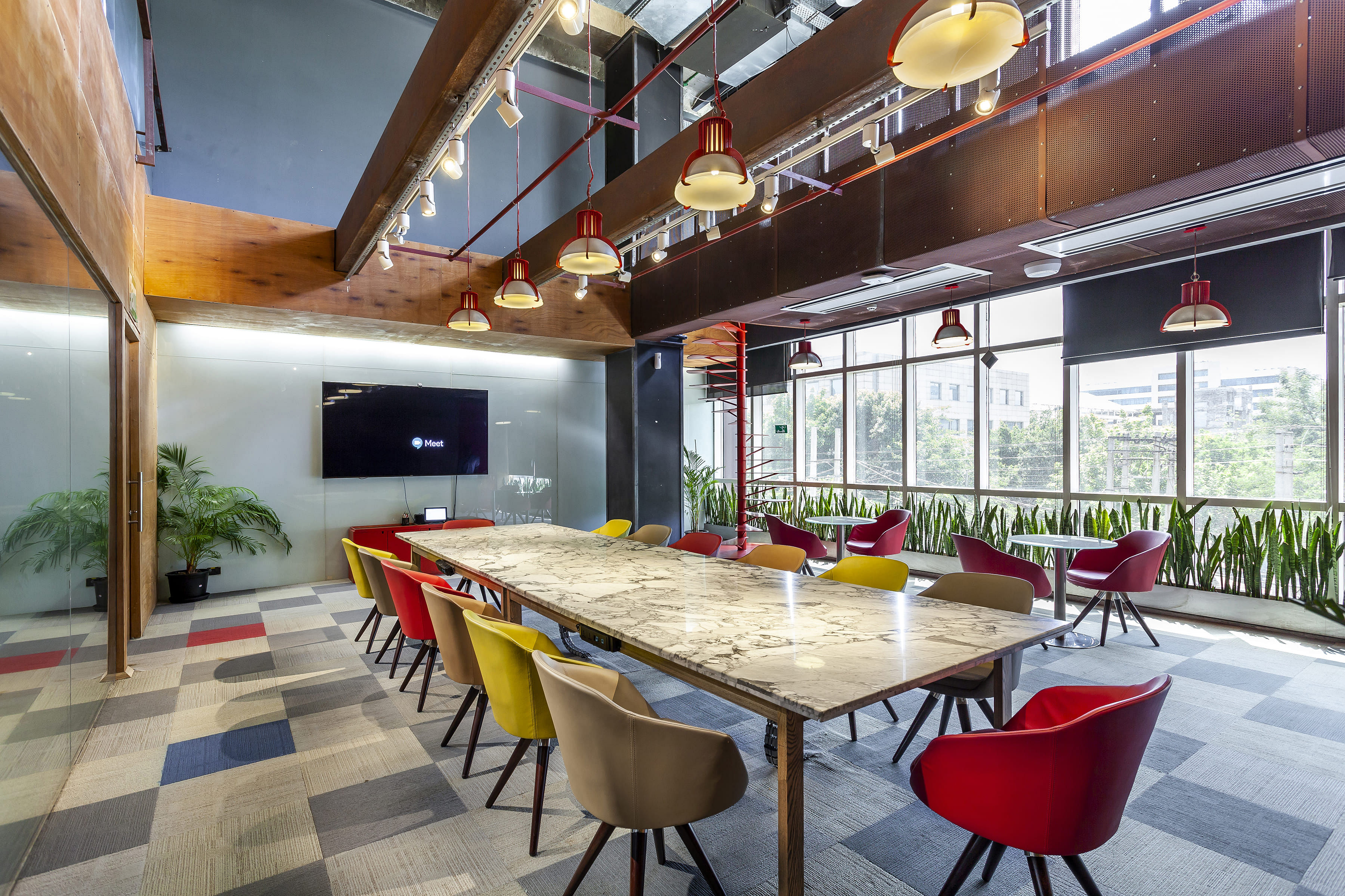
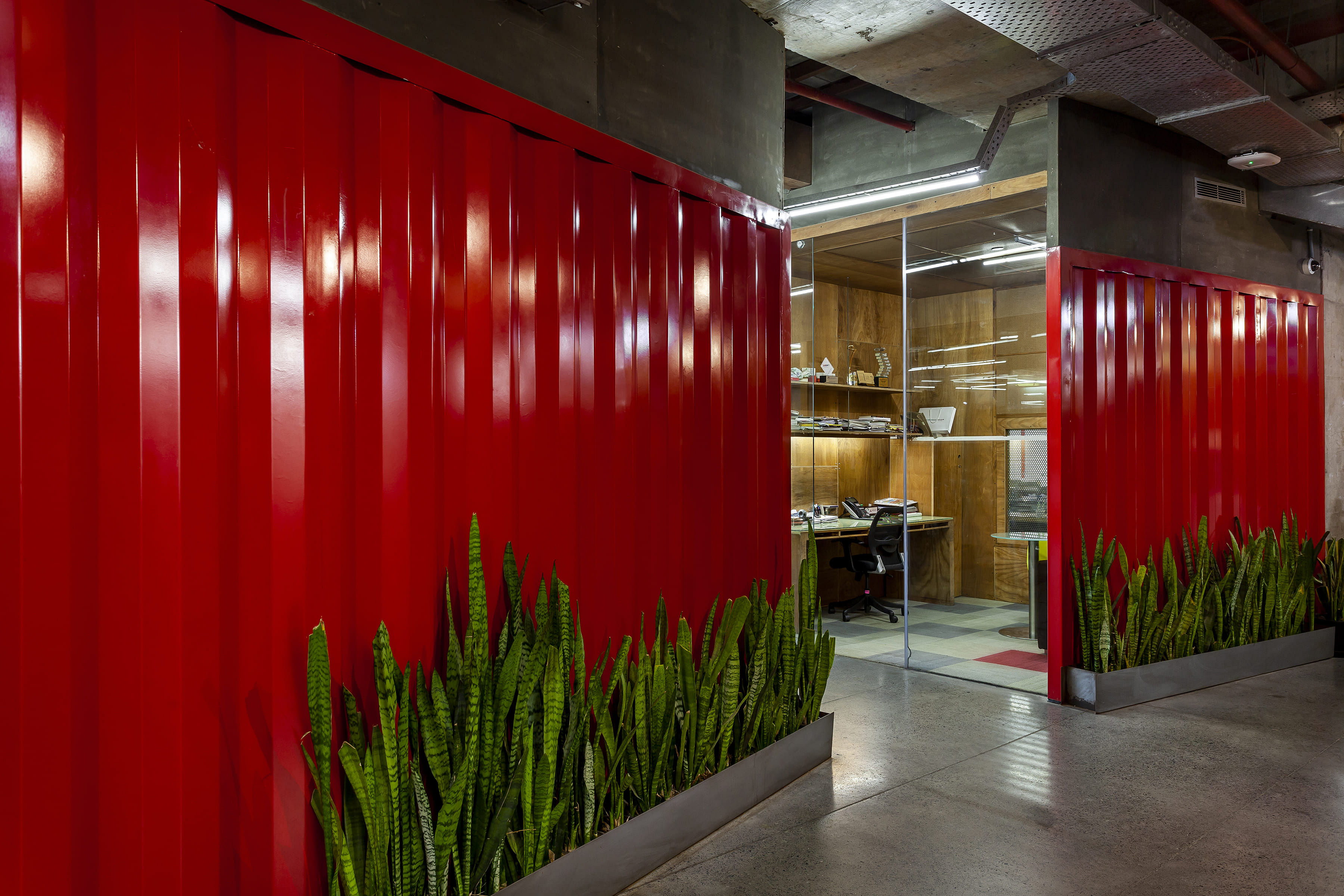
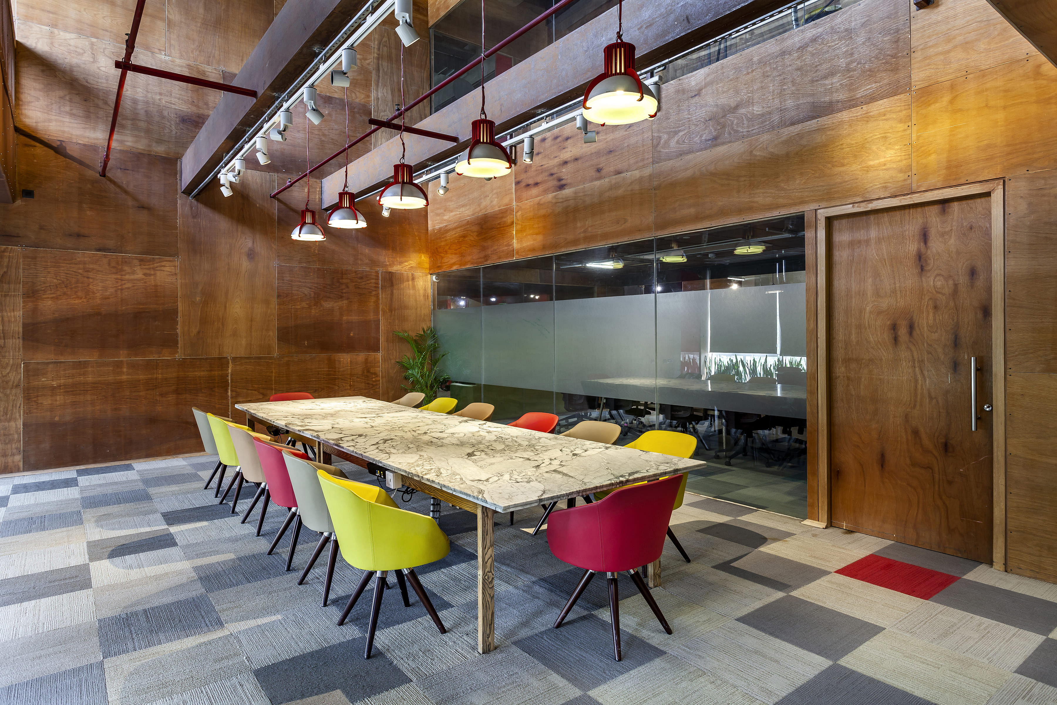
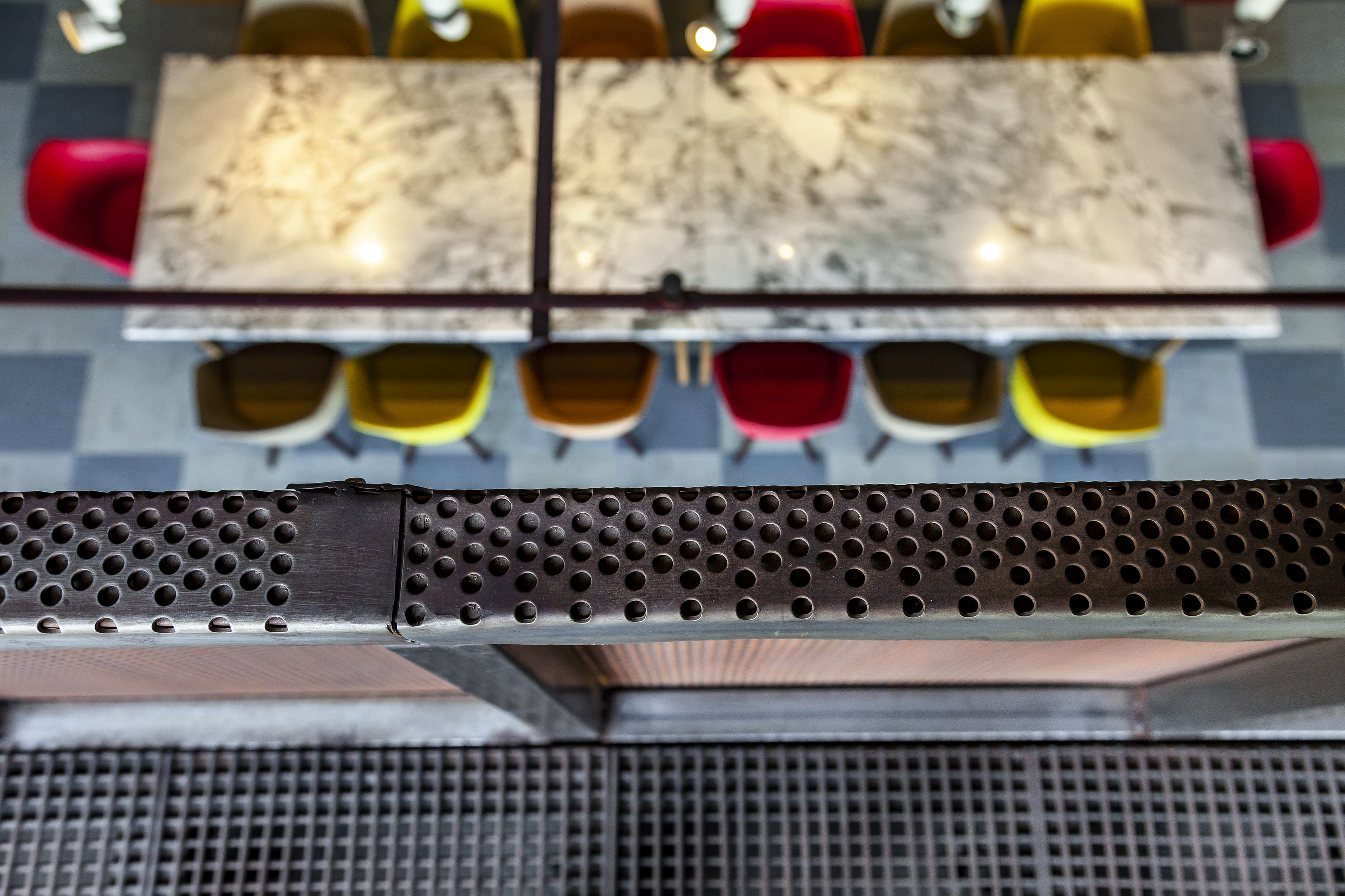
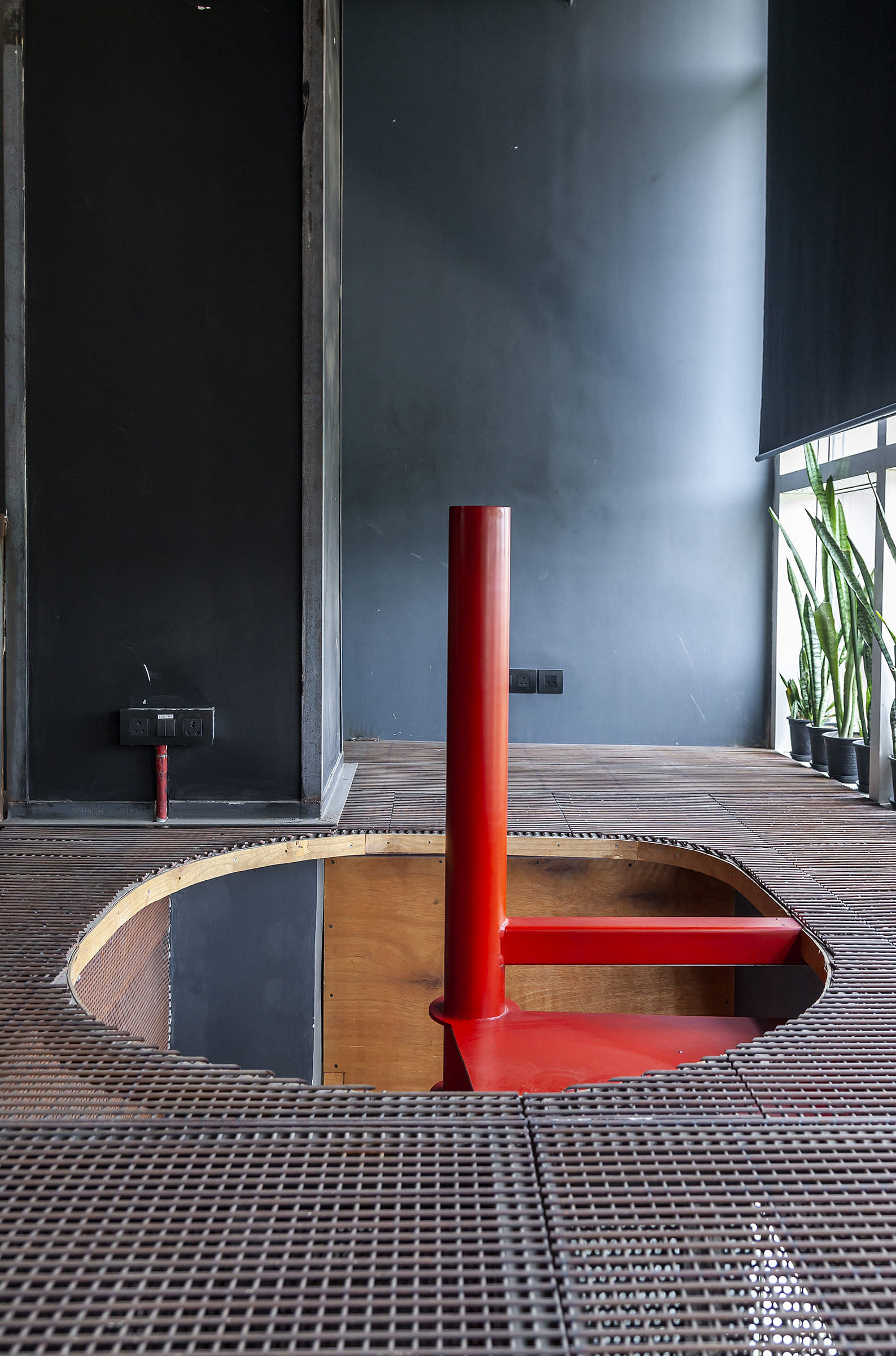
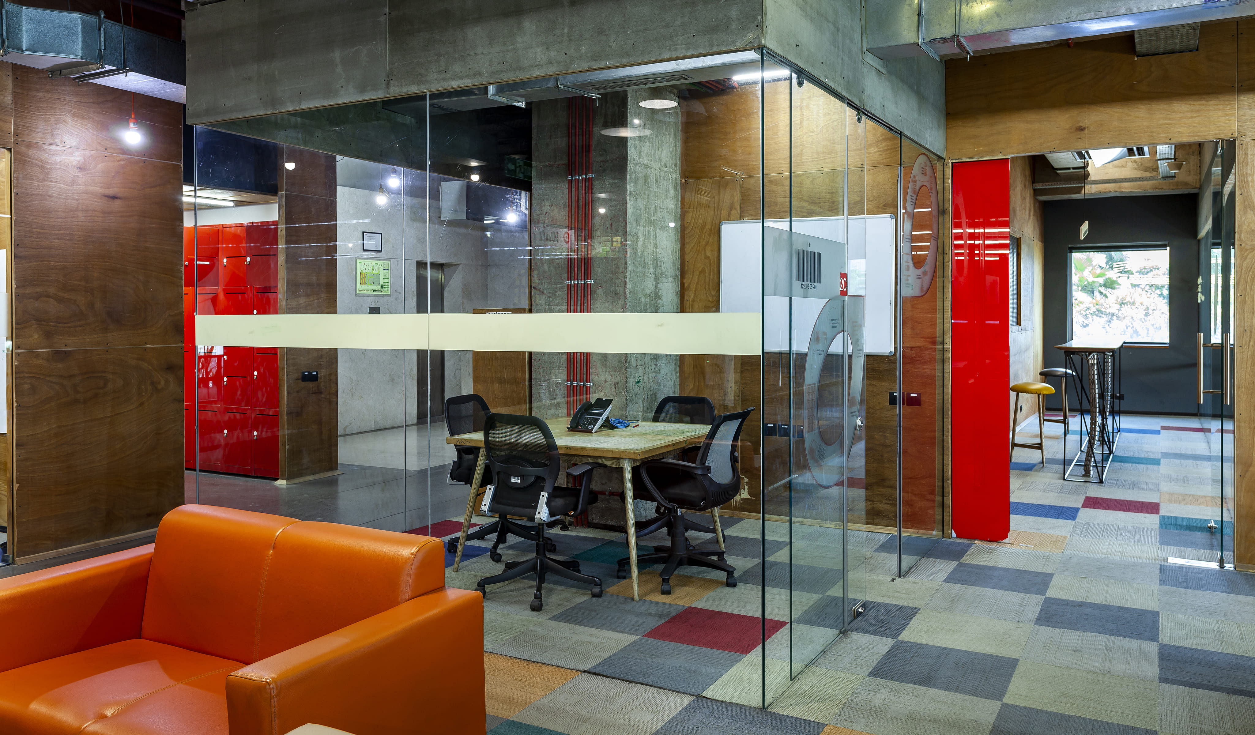
The boardroom was constructed as an expensive and extravagant double heightened space with transparent walls to allow a clear view of the proceedings while upholding acoustic privacy. Being a multi-levelled room, the entrance is from both the first and second floor. With a breakout space on the second floor, so if there is a meeting or a large gathering, it can act as a townhall. The room also has a sculptural staircase painted in red (Delhivery's corporate colour) for free flow of movement between the two levels. The floor inside is laid out with carpet for acoustic reasons and to provide some break out space from the concrete floor. The purpose of creating the room as a double heightened space was so people could sit and watch the proceedings, making it a learning experience rather than giving it a stiff boardroom perspective. Being a technical company, there is a need to write a lot. Thus, blackboards and white boards were installed to encourage writing. Since these boards are transient and movable, it maintains an image of physical interaction between the environment and the people and the realisation that actions affect the working space. The design allowed for a lot of interactive spaces, even the few enclosed spaces had a view of the outside to allow visual relief and unhindered natural light, keeping it simple.
DESIGN DETAILS
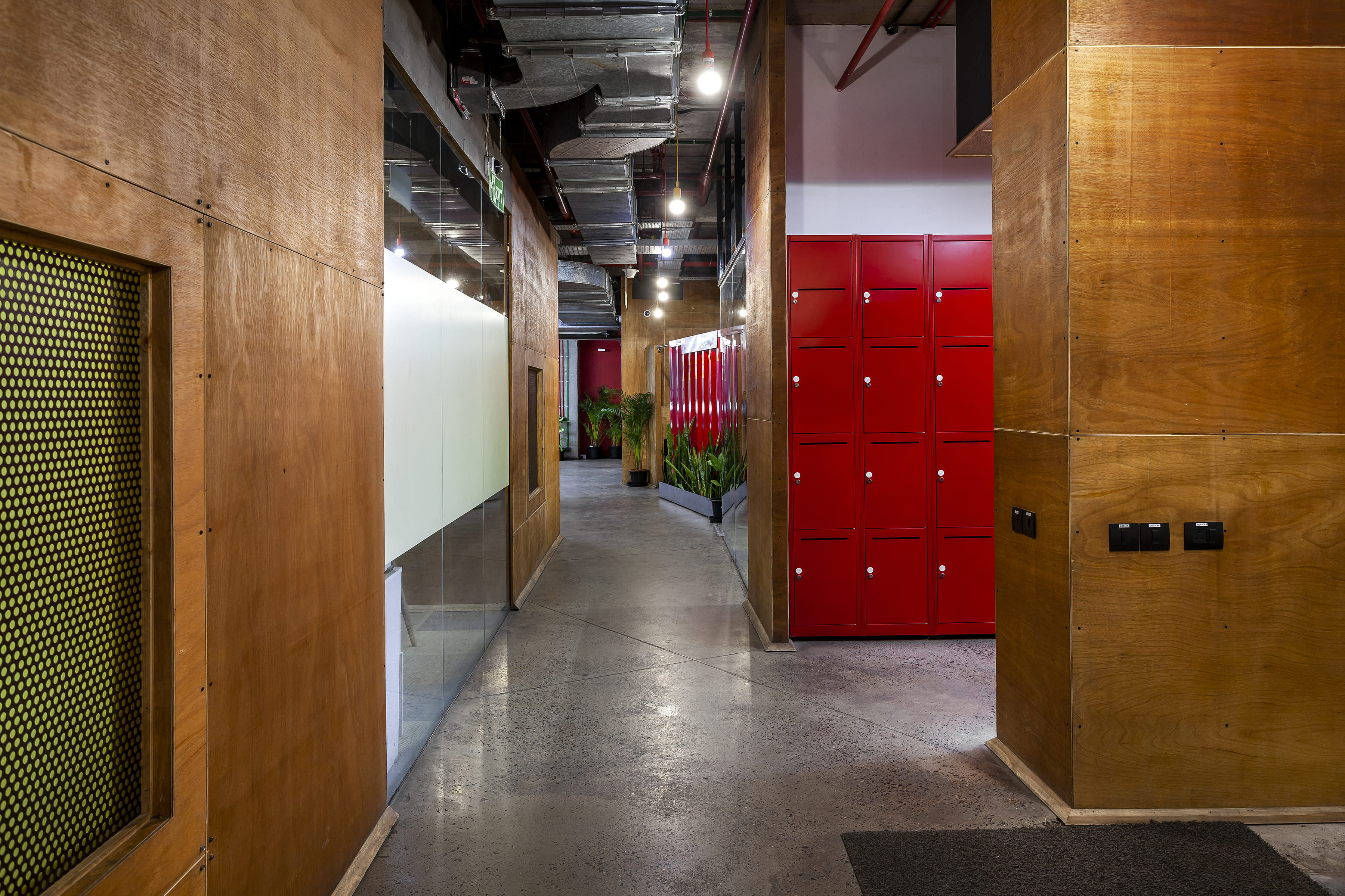
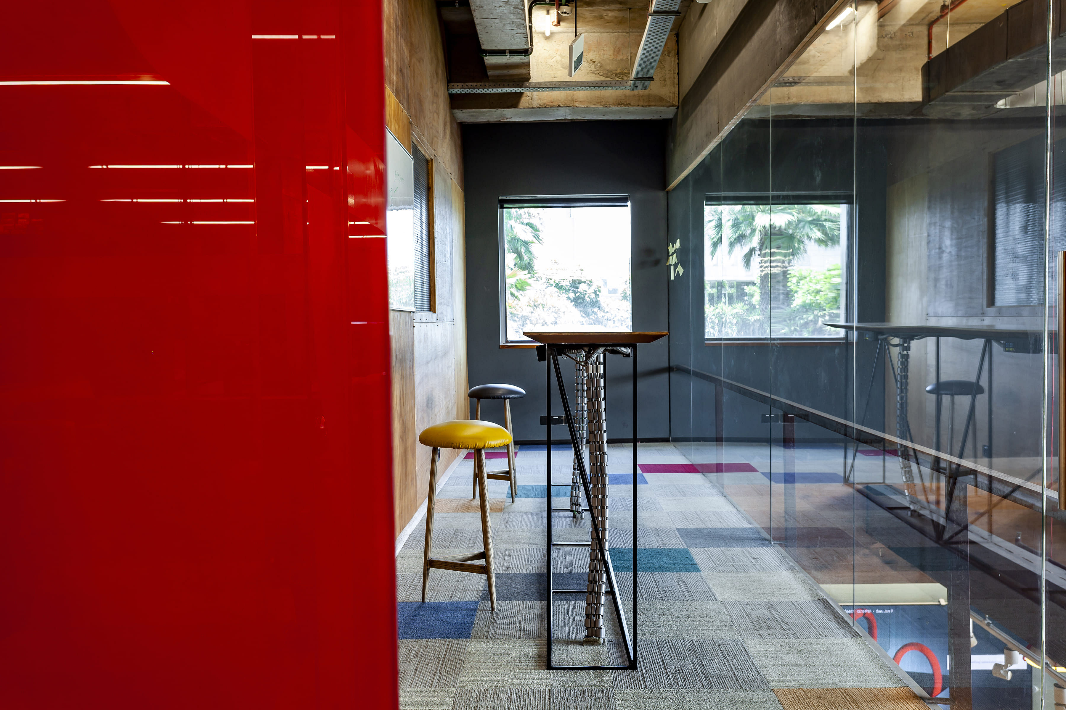
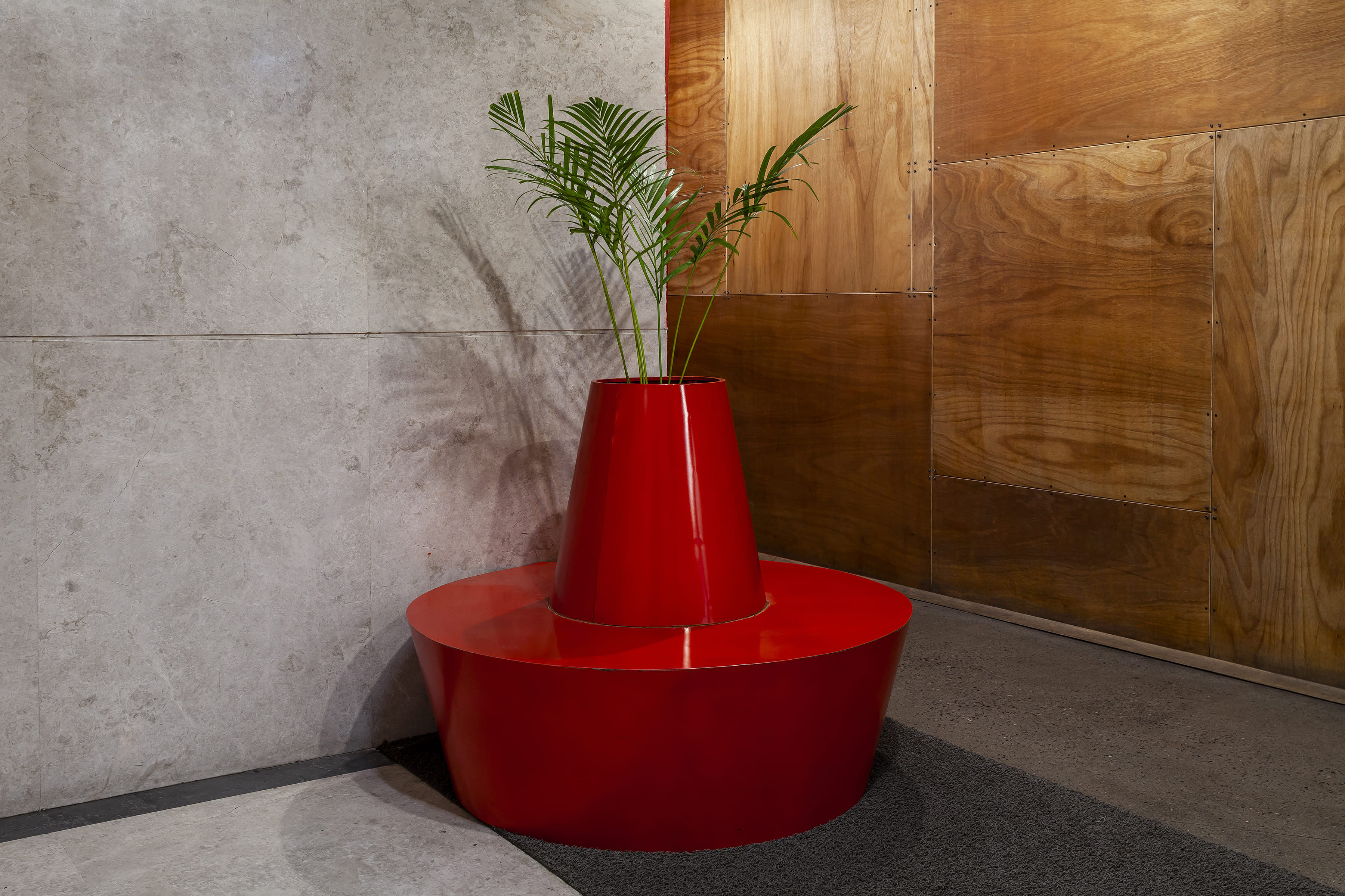
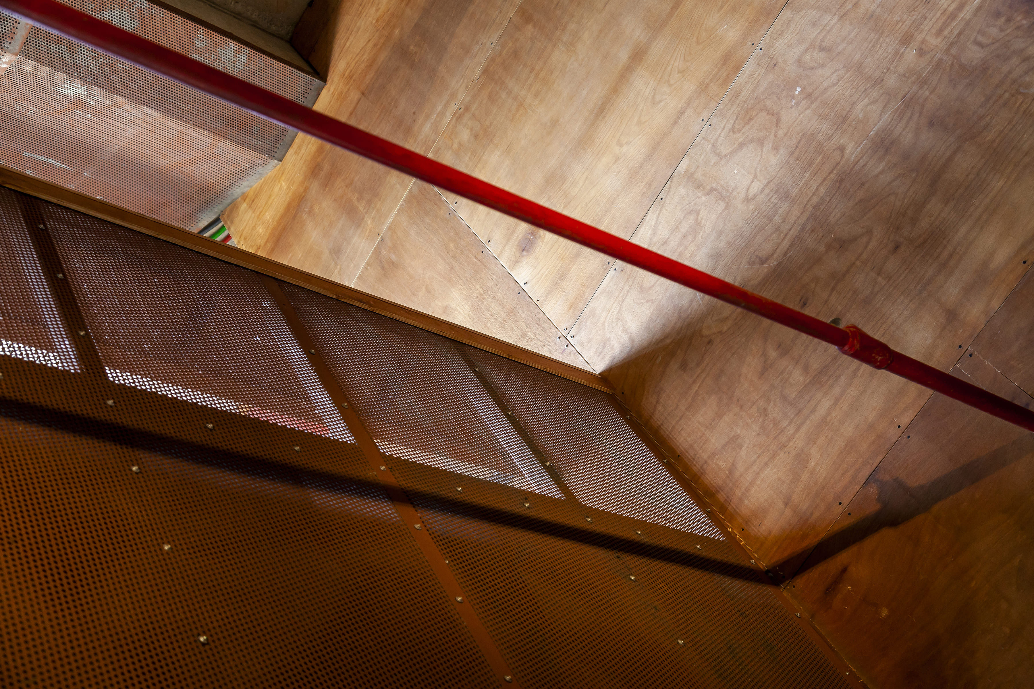
Perforated board was used as the acoustic material for the false ceiling, intentionally exposing the concrete ceiling in the process. The use of carpet was limited, leaving the floor bare. The floor looks like polished concrete but is actually core cut concrete, where the slab is ground to the basic aggregates, giving it the appearance of old-fashioned mosaic. The basket like cable trays on the ceiling expose the painted conduit, giving a clear view of the services and their colour coding running through the floor, giving it a little flash of rawness. Pursuing the 80's theme, sculptures of plants were added to tempt people to sit down next to the pond, which can be reconfigured, depending on the number of people taking up the space for their activities. Several open spaces have been designed in way that enables them to be reinvented in a similar way, allowing for quick, last minute interventions.
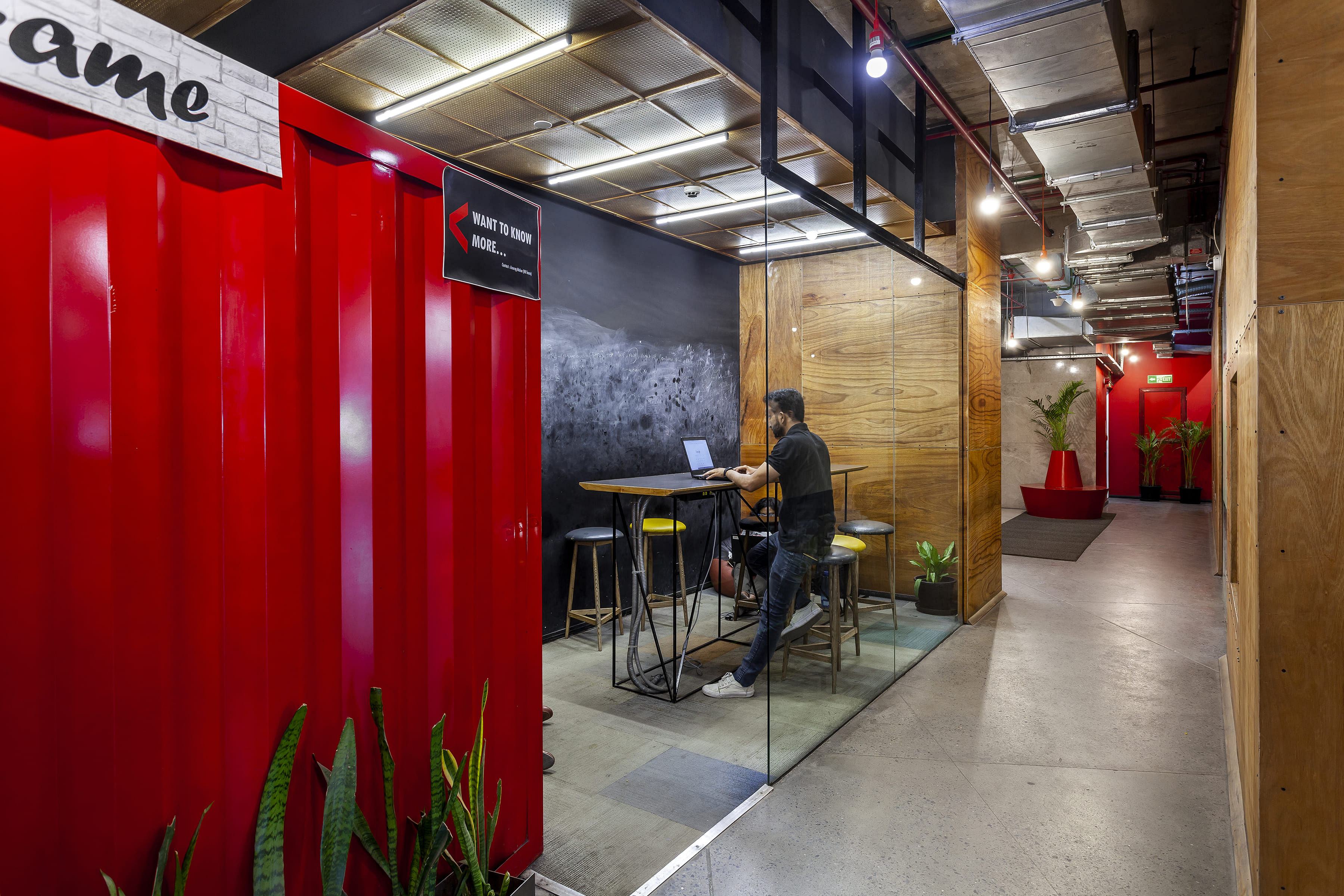
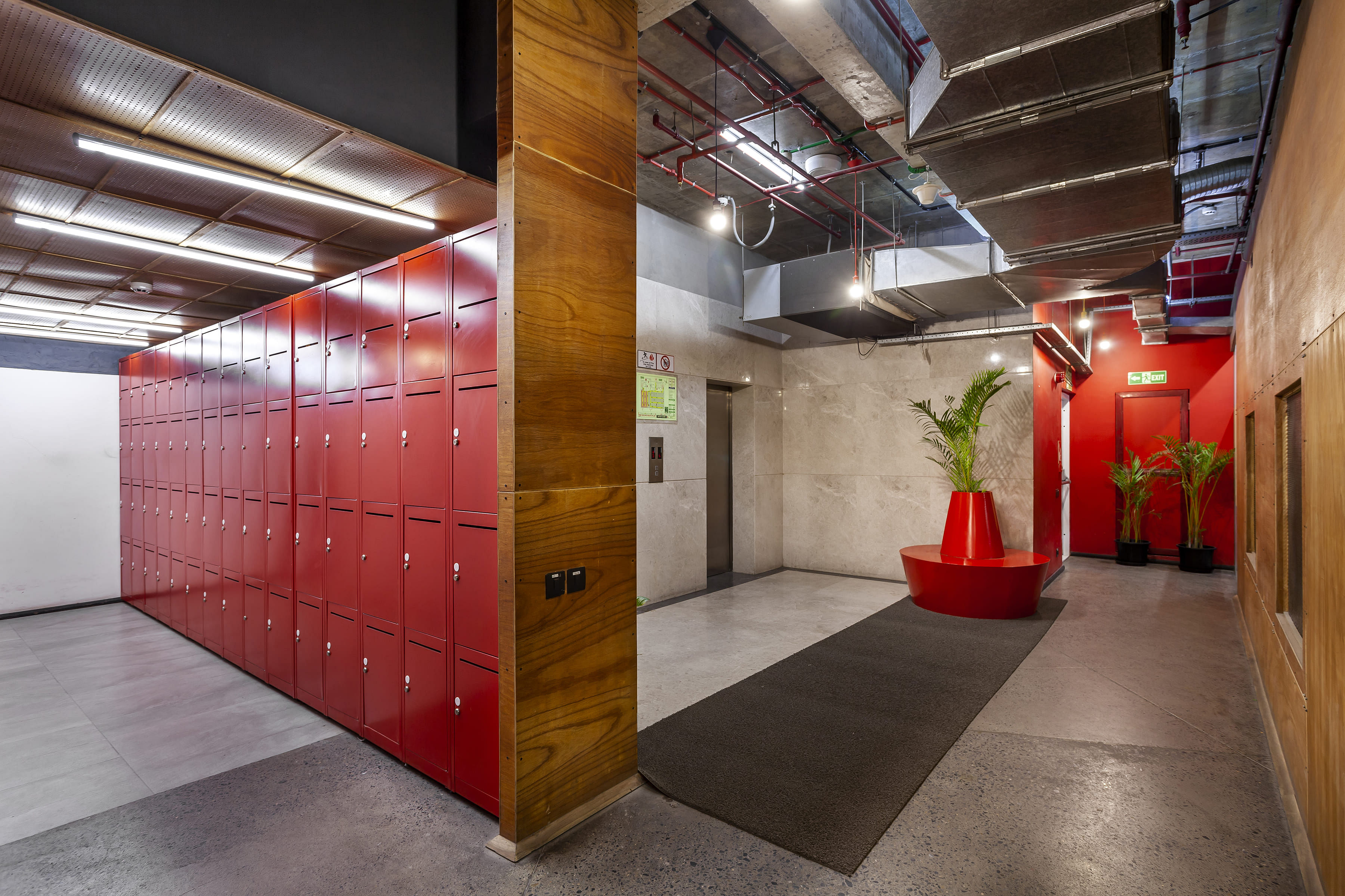
Certain areas needed to be emphasised, so IKEA industrial style hanging pendant lights were used. Minimal in its appearance and easy on the eyes, they would drop down from the ceiling and hold the space. In all the other spaces, LeD lights were used for uplighting and downlighting and the services were left exposed on purpose for aesthetic reasons. Containers were later added to the design as a way of reminding people who are working for the logistics company from within enclosed spaces what the business is. Consequently, the first thing a person who walks into the bathroom or the breakout space is a container, emphasising the function of the organisation at every major location. Since there was a connection to the organisation's fundamental work, the containers were an easy fit. There was no use of veneer with the implementation of ply. The flitch of the commercial grade ply is a standard backing veneer. We had specified the colour of the backing, thus preventing the use of veneer and keeping the ply inexpensive. Upon closer inspection of the partitions in the cabins, the ply appears to be extremely thin (30mm) and performs well acoustically.
The Delhivery office in Mumbai was built as an extension to the Delhi office. While the design was mostly the same, a few changes were made due to the building regulations restring the height of the structure. We could not do concrete floors and so were forced to use carpets. To make it look dynamic, instead of using a single carpet in one colour, industrial carpet or textile was cut and snipped in different contrasting shades, making it vibrant. The process was similar to taking a banal material and bringing it to life, making people believe it is more than just a useful and practical product. The overall ethos and value system of interactivity was remained largely the same as the Delhi office.
Status: Built
Location: Mumbai, IN
Firm Role: Principal Architect


")