
Jan '05 - Sep '06
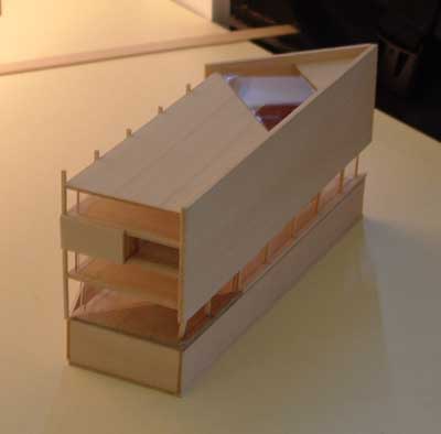
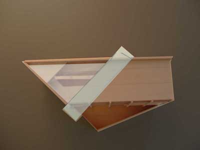
Here, finally, are some images of my project. There are some photos of a partially complete basswood model I built of it, some images of the model with the vertical circulation band--which is still pretty conceptual at this point--done in Photoshop, and some images of the computer model I built. The facade with the solid wall is the "front"and the more open facade is the "rear."
I'll get more into that later and want to comment on what Steven Ward posted, which I think is really interesting. I actually live on a small lake back home and the house is very much oriented to the lakefront, which my grandparents who used to live in the house always refer to as the front, as opposed to the streetfront. The front of the house looks sort of like a small, typical ranch with double-hung windows while the back is much more open with much larger windows. It's an interesting difference, which I don't think is what Steven Ward was talking about exactly and it's obviously on a much smaller scale than his example, but it still talks about this differentiation between sides and spaces.
Site plan showing the museum roughly in center (and a bit lighter than the rest). Huntington Ave is the major road running in front of the museum.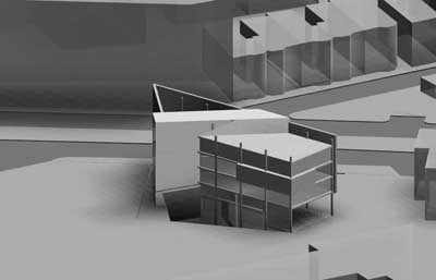
Rear view
Aerial view showing the band which contains emergency and handicap vertical circulation, as well as a viewing platform and a depressed area in the triangular portion of the building--I'll talk about this more soon, but it's also pretty conceptual at this point.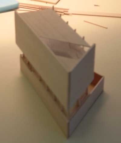

Top view of model w/ conceptual band added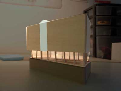
View of street face of museum w/ conceptual band added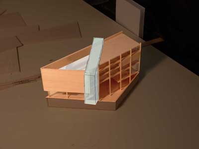
View of rear side of museum w/ conceptual band and depression added

2 Comments
not much information about the character of the site here, so i don't want to speculate beyond what we can see: a figure ground relationship in which most buildings along huntington address it with a firm, defined urban street wall. why in the world would you diverge from that instead of reinforcing it? looks like there is plenty of other empty/open space around, so your forecourt is not really an added amenity.
a defined street edge would also begin to answer the 'formal front' side of your discussion, even in the relatively closed and mute expression you're giving it to contrast it with the open interior. since there is so much undefined open area at the site's interior (at least from what we see) maybe the court could be shifted to the back and the building could wrap around it in a protective and defining gesture?
with any building that will be public and will necessarily be working as an urban intervention in addition to satisfying its program, you need to understand (for yourself) and describe (for us) the urban condition. that is: where are walks, drives, other paths? how is the landscape developed? where do people gather, or do they have a place? what is the character of the space around this thing and how is it responsive to that character?
would like to understand more about the cut in the ground plane. looks a bid forebidding at this point, almost like a moat indicating that the public is not welcome from this side...
finally, please let us know what establishes the angle of the circulation bar. this is obviously very impt and is a primary expressive feature of the thing you've made. so, to what is it responding? it looks like it's pointing to something, but we don't know to what.
hope overt crits like this are helpful and not taken the wrong way. you may hear some of the same in your school crits, so maybe it'll help to be ready for them.
nice models and drawings. they give a good understanding of what the things are that we can talk about and that you need to study and resolve. thanks.
Why do they continually have projects that use the Edwards/Rodgers site? They're the best dorms on the whole campus...
And to reinforce what Steven mentioned above, walk up Huntington towards Longwood and check out the Harvard Medical building that fronts Huntington (the rip off of city hall- the Xavier Building or something like that). It deviated from the urban street wall and the result is horrible. Hell, the 610 dormitory is another example (it was originally planned to have Baker demolished, not sure if the proposed or current condition is worse). By deviating with the street wall along Huntington you're proposing that your project has the same/similar cultural/social signifigance of the MFA, which has every reason to deviate from the urban street wall condition established by the apartments that flank Huntington.
Couple questions:
Is the the glass slash in the building is meant to connect the small plaza you're forming adjacent to the firestation to the path along the MassArt parking lot? Also, why turn your back on the activity and life of Huntington (and the plaza you're forming), and instead have the "open" facade face the parking lot of the campus? The best part (for me at least) of living in Huntington was hearing the T go by and the fire trucks screaming out of the station, and watching the Northeastern quasi-frat across the street get busted by the cops. I don't think the parking lot/WIT campus can come close to that sort of urban experience...
Block this user
Are you sure you want to block this user and hide all related comments throughout the site?
Archinect
This is your first comment on Archinect. Your comment will be visible once approved.