
Jan '05 - Sep '06
I just wanted to respond to Steven Ward and Pixelwhore's posts, which I do appreciate. It's interesting that none of the four professors I've got now thanks to this ridiculous rotating thing have really brought up the urban wall topic. One of my past professors was very big on the urban wall and street edge though, so it was on my mind a bit. However, the "overt crits" were definitely helpful and brought up some things that as I said my professors haven't brought up yet anyway, and some things that I have neglected to address or consider.
As far as the urban wall and orientation of the building on the site, as of yesterday, it has changed and returned more or less to how I had originally. I had to change this after we realized that the folks who built the site model, which I based my initial site plan on, had cut out the site in the wrong shape. This caused me to change the angle of the building on the site to not align as closely on a north-south axis and caused a larger front plaza (for lack of a better word at the moment) and a smaller rear courtyard. This was something that's been bugging me for awhile and after the comments from a couple days ago I decided to go back and adjust the building to fit the original orientation, as seen in the image below.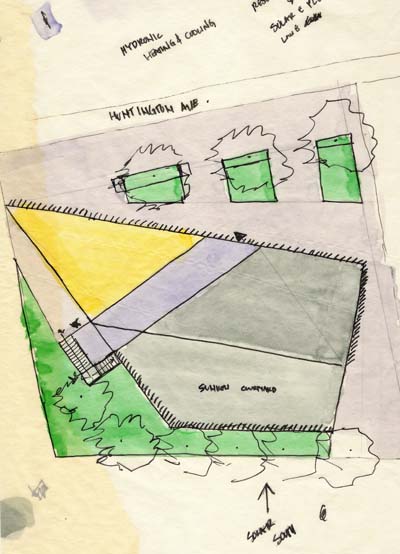
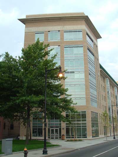
However, I do disagree quite a bit about the urban wall condition along this stretch of Huntington. In my opinion, there is no urban wall anywhere between Brigham Circle and the Symphony end of the Northeastern campus (except for some pockets such as the MassArt building, the Marino Center, and much less successfully in the new 555 dorm at Wentworth and the Harvard building that is actually on Huntington). The whole probably mile-long stretch of Huntington Ave between Brigham Circle and Symphony is a mix of bland high-rises, setback campuses and institutional lawns, parking lots, gas stations, blank residence walls and a precious few low-rise buildings forming a true urban wall. Even the fire station directly next to the site is set back from Huntington twenty feet, as is Baker. This is why I did not and still do not feel a responsibility to conform the building to an urban wall. That having been said, I do think that generally speaking the urban wall is something vital to a positive urban setting and something sorely lacking in many American cities. I've included some photos of the area around the site that I think illustrate the lack of an urban wall.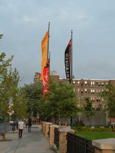

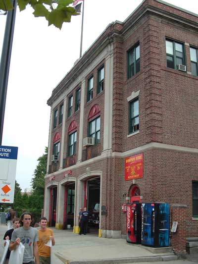
I also agree that the significance of the MFA warrants its deviation from the urban wall (again, however, there is no true urban wall in this area as far as I can tell), but this principal is also presented in Whitaker's Architecture and the American Dream using a house on Martha's Vineyard as an example of acceptable deviation and Lincoln Center as an unsuccessful example. In my design as it stands now, the triangular tip of the building will be twenty feet from the road, matching with the fire station, and will be angled back slightly (about fifteen degrees). However, as I was planning (but not showing) before, I'm hoping to have a small plaza out front with trees, also set back twenty feet, and raised planters and benches forming a slightly more ambiguous urban wall, as shown in the scanned sketch site plan above. That site plan is still pretty sketchy and has a number of things that need to be worked out still.
The sunken courtyard will also be enlarged quite a bit by the new orientation and will include a larger raised planted area behind it. This, I hope, will create a sort of buffer between the parking lots to the rear (south) and west of the site, while returning some greenery to the site. These parking lots aren't shown on the site plan I posted last time, which I think made the site look larger than it really is. And to the point of putting the "open" facade on the rear, I did this after considering doing the opposite. While I do think eating on the street (of course as with all Wentworth design projects--including a bus shelter project, a cafe with outdoor dining is part of the program) is a nice thing, I don't find this area of Huntington to be particularly suited to it. Directly across the street is a gas station, for example, and I think the lack of an urban wall and the real sort of urban retail-oriented density is missing here. That, plus the desire to work with the idea of public vs. private led me to put that area on the rear, but sunken, because I agree that the parking lot doesn't make for a very nice enviornment either.
Finally, the band around the building is actually not meant to be a "slash"--though I can see how it appears that way in some of these representations--but rather as a band wrapping around the building. The geometry of it is entirely based on the internal grid and layout of the building, rather than external factors. However, it does help externally by creating more of a visual division between the "front" and "back," as well as blocking some of the western afternoon sun from the courtyard and open face of the building.
Sorry this is so lengthy and sort of rambles on without much direction, but I hope it addresses some of the points you brought up. I'd love to get more feedback. Also, I agree that Edwards/Rodgers are the best dorms on campus and hopefully the new president will be more receptive to that notion and in less of a rush to knock it down and build a bunch of new fake Wentworth Halls around campus. I'm also not sure if that frat is there anymore. It's a real shame if it's not.

9 Comments
I'd have to strongly disagree with your statement that there is no urban wall on that stretch of Huntington. The wall may not be consistantly formed in the same manner (aka a building immediately adjacent to the sidewalk) but rather reinforced and formulated in various was to varying degrees of success. The current urban wall of Huntington has developed over time in a quasi-archeological manner: originally the buildings were all the same, and presented themselves to the street in a similar manner. As colleges expanded through the area, chunks of the urban fabric were surgically removed for varying reasons, and replaced with new buidings and a few random "green" spaces. I think you should look at the segmental development of the urban wall (and the various rhythms in fenestration and all that jazz) along huntington and establish your relationship to it: do you mess with it, ignore it, restore it, etc. That descision is yours to make, and I'll keep my bias out of it. I do think it is important to note that from Ruggles to Longwood the urban wall is mostly gone, and as a result this is the absolute worse stretch of Huntington to experience. By readdressing it you could be attempting to connect to the older fabric of the street and make an improvement, or by ignoring it you could choose to move forward to establish a new... ummmm... whatever you'd like. However you should take a strong stance and develop the fuck out of it - thats all that matters.
And despite the fun of watching the frat makes fools out of themselves, being a RA and finding random drunk girls passed out in bushes and abandoned by their friends makes me feel the place deserves to be closed.
hey Pixel, I agree that there is an urban wall there, I guess what I was trying to say is that it's a fragmented or in parts unsuccessful urban wall. I do, however, disagree about the history of the area. From what I've found, the area around Wentworth was never developed or filled in more. The campus was originally some sort of manufacturing facility--I can't remember what, but it was never built up. The same is true of the Northeastern campus, which was previously home to a baseball field and railyards, I believe. Old photos of the area show open spaces that were farms less than a century ago and old farmhouses. I think Edwards/Rodgers is actually the exception in this neighborhood. It was built with the expectation that the rest of the land around it would be developed in a similar way (with a higher density and more of an urban wall), but I don't think that was ever realized. That's my understanding anyway. As far as addressing the current urban wall situation, I agree with you that it's something I should do, and I hope I am. My intention is not to restore an urban wall, since I don't there ever was a truly effective one here and also because I don't think it is likely to ever be realized between Ruggles and Longwood. Rather, my intention along Huntington Ave is to address the pedestrian condition, which is not addressed in any of the buildings along there (including 555 which does form a very strong urban wall). By having the first floor streetface done in glazing it creates a more interesting visual front for pedestrians, in the same way a bay window does in a surburban home. As far as the little plaza out front (that I need to find a better term for), I hope to use this space to form a less barrier-like urban wall while at the same time using it to invite passersby into the site. I think something that is also missing in both site plans is how I'm hoping to replace that little walkway along the MassArt parking lot with one that cuts under the side of the building along the fire station. I definitely think you're right though that regardless of the history and current condition of the site, I do need to take a strong stance on it and develop the fuck out of it. Thanks.
Hey, did you ever do some real nice sketches of the Christian Science Center? I think I remember seeing them and who I think you are with them at some reception lunch for first year students two years ago. Anyway, seriously thanks for the feedback. I do appreciate it even if I disagree at some points, but it really has been hugely helpful. I never went to that frat, but would miss it only for the thrill of watching them make asses of themselves, but it sounds like we're probably better off without them I suppose.
I did sketches of the CSS, but I don't recall if I did a lunch or not. Although I wouldn't have been surprised if I did.
And a plaza is a plaza, regardless what you call it.
Oh yeah, for the whole "front door/back door" thing on a utilitarian level, be sure to check out the clusterfuck that is the MFA...
whatever your approach to the street edge, i'll buy it as long as you believe in it and don't forget about it. i don't know the site like pixel does, so the character of the place is kind of an unknown to me.
the fire house, though, seems to address the sidewalk quite nicely, even if it is 20' back or so. your planters begin to address this edge; make sure they are big/strong enough to have an impact.
one thing about this site plan, though, that still bugs me. don't stop thinking about this building as an urban intervention. therefore, don't show a "site plan" that stops at the building's extents. everything that shows the goals and solutions at the site/urban intervention scale should INCLUDE the surroundings - as much to keep them in your head as for illustration to others. don't zoom in too close and forget your responsibility to the local environment.
paving: if you're defining the sidewalk with planters, can the paving change at that edge. what happens around the corner, to the southeast? grass? more paving? how do you define the people spaces?
i don't understand your comment about the band wrapping around the building and not sure it's what i was talking about in my first comments. i'm addressing the swath that cuts through the building from the entry toward the lower right; shows up as vaguely light blu-ish in the site sketch. this looks like a cut through the building and it looks HUGELY important. but:
-it's lopped off at the front entry at an uncomfortable angle instead of expressing itself as a completed volume. even something small like an overhang protruding at the entry could give this bar its full measure of imptce.
-entry from the north is at an oblique angle, from the tightest space on the plaza, trapped between the facade and a planter, instead of a more generous and welcoming space.
-the planters and other site development at the entry don't acknowlege the swath through the building at all, and
-the gesture doesn't follow through to the southwest either. it points vaguely southwest towards ???.
-instead of allowing one to pass through, out the southwest end, it resolves in a wimpy little stair that switches back, and exiting requires a right turn.
-and the stair, instead of being contained in the bar, breaks out of the area of this block, making its own little bump which is not part of any of your other parti blocks.
even diagrammatically, these things should be red flags to you that one of your most forceful moves has been compromised. whenever you make a move, do a little self-critique. look at what you've done and determine whether it's clean or whether it's diluting what you're doing. what does it do to the surrounding environment, to a pedestrian, to the clarity of your parti, etc.?
like to hear more about the front/back thing. is that still driving your moves from a idea standpoint? not just as a dichotomy (this vs. that) but in really meaningful experiential ways? if you think about yin/yang as an example: the two essences inform each other, bleed into each other, add up to the whole, are of balanced importance and have a push/pull relationship. what is 'front' about the back? what is 'back' about the front? what's the dialogue?
I <3 Steven Ward
me too. most of those are all things I haven't really considered, or if I have, things I haven't addressed yet really. That site plan was a real quick sketch I did the other night and immediately realized some of the things you mentioned--particularly the rear stairs and the angle of the planters out front. I agree that the fire house is the building which most successfully meets the street on this stretch of road and does so in a pretty nice way. I did this site plan primarily for myself rather than a presentation of any sort (even though I put it up on here), and I drew it on trace over a larger site plan of the area, which is why it's concentrated so much on the site. As far as the planters and paving, I'd like to do something along the lines of the Rue de Meaux by Renzo Piano (http://194.185.232.3/works/027/pictures.asp), but I am thinking more of benches along the edges of the planters that people can use rather than bushes. I'm not set on anything there yet though. That blue-ish "slash" is in fact a band that wraps over the building, and it originally did come over the front rather than cutting through the building. I'm still not sure which way I'll end up going with that, but I do sort of like the idea of it coming across and out from the front of the building I think. In any event, hopefully I'll have some better representation of that band and the rest of the project by Monday. I'm wondering if you could expand on the whole yin/yang example. That's something I hadn't considered yet, but the front/back thing is still the driving force. Thanks again for the thoughts.
Block this user
Are you sure you want to block this user and hide all related comments throughout the site?
Archinect
This is your first comment on Archinect. Your comment will be visible once approved.