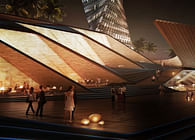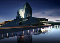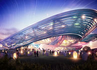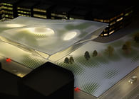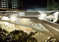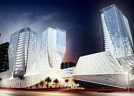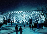
Our proposal for the Guggenheim Helsinki seeks to simultaneously define the building as both an exclusive world-class fine-arts museum that will attract visitors from around the globe, AND as an engaging cultural center and civic space that encourages regular visits from the residents of Helsinki.
Designed as an elevated museum hovering over the site, all of the ticketed programs of the museum (galleries, auditorium, event spaces) are placed at the upper levels of the building while the entire ground level is open to the public (retail, dining, etc). Private and public areas are both visually and spatially connected by a dramatic top lit central atrium space which will host a revolving series of public events, performances and exhibitions. Three open-air roof terraces/viewing decks sit at the top of the museum with each overlooking a different aspect of Helsinki (city center, waterfront, park)
The central atrium drives the organization of the entire building as vectors are drawn from the 3 primary site conditions (city centre, waterfront, park) to tangents around the atrium perimeter to create an interlocking pinwheel diagram which torques around the atrium in a clock-wise direction. This warping 3D diagram drives the entire design concept, as the building circulation, programmatic organization, and structure all begin with this diagram of three interlocking reciprocal structures. The formal language of the building is also informed by this diagram, as all geometries are defined as hyperbolic ruled surfaces - entirely composed of straight lines warping in space. These striated surfaces are informed by both a structural logic (inspired by the work of Felix Candela), and a fabrication logic of constructing a reinforced concrete structure with a permanent formwork of Finnish timber.
The facade of the building abstracts a typical Finnish design motif - the striated geometric patterns of the traditional Finnish knit sweater. By starting with the same 3-legged interlocking pinwheel pattern of the masterplan and building, the fibre reinforced concrete rainscreen of the building is a highly articulated and visually dynamic pattern of interlocking geometries that create variable bandings of opacity. The screen gives a definitely Finnish quality to the building, yet remains particularly contemporary in its geometric patterns. With variable opacities and transparencies, the screen also responds to building orientation, and occupation to allow more light where needed and less where it is not wanted.
An emphasis is placed on sustainability through the integration of indirect natural lighting, passive energy systems, and grey water collection systems in the building design. Rather than conceive of these strategies as accessories added to the design, they are embedded in the design intentions of the buildings geometries - as solar orientation and drainage slopes define the angles and warps of the building skin and the placement and orientation of apertures and PV panels.
Status: Competition Entry
Location: Helsinki, FI
Firm Role: Architect
Additional Credits: Project Team: Alvin Huang, AIA (Principal), Chia-ching Yang, Timothy Harmon, Filipa Valente
Structural, Mechanical, & Environmental Engineering: ARUP (Bruce Danziger, Russell Fortmeyer, David Lambert)
Vizualisation: Polynates
![[C]Space Pavilion [C]Space Pavilion](https://archinect.gumlet.io/uploads/88/88pzf96hi94k7u78.jpg?fit=crop&auto=compress%2Cformat&enlarge=true&crop=entropy&w=195&h=140)
