THE ARTLESS DRAWING: NEIL DENARI, 1982-1996.
For Archinect, Eric Chavkin reviews architect's current exhibition curated by Sylvia Lavin for ACE Gallery in Los Angeles. 
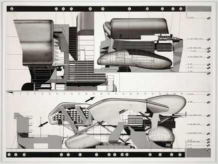
Image courtesy of MOMA
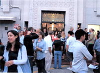
Free drinks and slick drawings are a sure bet to bring in a crowd of architecture students to view the Ace Gallery show on Wilshire Blvd. Although much of the work is from older projects from the 80 and 90s for me it was a chance to view his work anew, with fresh eyes. What there was to see was literally illuminating. The drawings, mostly acetate transparencies, are displayed backlit, and mounted on fluorescent panels. The collection is arranged on an array of tall vertical free-standing light boxes, the kind one would use view photo slides, but exaggerated. Screen printed on the plywood edged sides are titles, media-type, and your typical museum- art-gallery information. It was like one was shipping crates of light.
Architecturally the drawings are excellent and well conceived; snapshots into a complex system, with numbers and callouts that refer to other parts. Typography, line drawing and pantone all work together to communicate a neat graphic solution. It has the detailed precision of a plastic injection prototype.
As a gallery spectator, I am seduced by the verisimilitude of exactness. Looking at these mechanical inspired illustrations, one wants to pursue the parts, get into it and see how it all fits together.
Overall the viewing experience has a strange clinical feel, like looking at x-rays. The cool glow throughout the space emits an antiseptic quality. My philosopher friend remarked that it didn’t feel human. I thought it worked well within Denari’s future themed designs. I am more forgiving.
But a crowded gallery is not the place to contemplate detailed drawings, or even look closely, so I have to ask questions.
Where is Neil Denari coming from? Or more to the point of what interests me, from where does his architectural imagery derive?
My friend Larry Totah gave me an answer. “Neil Denari is from Texas. He started out working in aeronautics; drafting, designing for airlines. That’s where the imagery comes from”. Of course. The Pantone shading, the emphasis on skin, the prominence of numbers… these all reference the shape and look of aerospace design. It’s space-age aesthetics.
The philosophy that generates the ideas stems from a belief in technological-positivism. I’m taken by it myself. The imagery is sublime if not beautiful. It’s a kind of science fiction film fetish that gave birth to the cult of Archigram and Buckminster Fuller. They are the parents. Jan Kaplicky, Luigi Coloni, and Syd Mead are the children. Each of them and Neil Denari too, are the great, great, great, great grandchildren of Jules Verne.
THE ARTLESS DRAWING: NEIL DENARI, 1982-1996
Ace Gallery June 6 – July 15, 2010
Reviewed by Eric Chavkin
20 Comments
I really wish there was a "like" button. Crisp writing Orhan, by far one of the more illuminating reviews of an exhibition.
Nice review, but I've got to take issue with your lineage there. Luigi Colani and Syd Mead were doing their thing earlier than Denari, and I think the influence flows from them to him, not vice versa.
These drawings and structures are minor copies of Wes Jones' work from the 80's. Denari has nothing "new" to offer.....look elsewhere.
I could be mistaken but I think Denari has been doing this stuff for a while now and should not be mistaken as a wes jones ripoff. Let's also not forget that Denari opened his office 5 years before Wes.
And I agree that Denari would be influenced by Sid Mead and not the other way around.
Um, Corbuuu, these are Denari's drawings from that same period. They are similar to some of Jones' work, but it would be hard to characterize them as derivative.
Interesting to ponder each other's relationship, if one influenced the other, I think it was more a meeting of like minds. Denari worked in Wes Jones's office in the late 80s when it was Pfau Holt Hindsaw Jones. He was doing these drawings at the same time Jones was doing his, but Denari was in NYC before moving to LA to actually work for Jones. Both were doing an updated version of Corbusier's machine for living, which is an obvious idea to look at, many people probably thought of doing that, it is that they were the best. In fact that is perhaps what characterizes the whole 80's LA scene, they were doing a post-modern Corbusier.
Denari, Jones, and others all published in the Building Machines issue of Pamphlet Architecture back in 96:
http://www.amazon.co.uk/Building-Machines-Architecture-Robert-McCarter/dp/0910413401
I doubt they would have worked together and published together if anyone was 'copying' anyone else here, Corbuuuu.
Tons of shit info in the comments. Eric Chavkin wrote the review, Orhan posted it.
Wes' and Neils' drawings might 'look' similar but were produced in different fashion and generally for different reasons.
Neil never worked for HHPJ (Holt Hinsahw Pfau Jones) and the office was in SF, not LA.
Technically, Wes was the 'founding' partner of HHPJ in '87. Neil started Cor-Tex in '88, so cut that however you want.
If you read Neil's work as only an updated version of Corb's machine for living, you are missing out on his point. To my knowledge he has never made that specific reference himself.
"Neil never worked for HHPJ (Holt Hinsahw Pfau Jones) and the office was in SF, not LA."
Ok, I thought I read he did.
And no, he has never made the machine for living comment, this is said as a glib generalization.
Respect out to Appleseed for the fact check!
Apple:
"Wes' and Neils' drawings might 'look' similar but were produced in different fashion and generally for different reasons" Huh? Hand drawn vs Computer?
Denari's reason was what ? Likes shinny things cause he can see his own reflection.
It's comic book Po Mo that has nothing to do with architectural ideas and more similarities with package design and "art" movements like Pop. More akin to pimping a car than to designing spaces.
Going further back :
The Centre Pompidou (1971-77) is the genesis of all this later "High Tech Style" stuff. Piano and Rogers' masterpiece makes architecture out of Khan's Servant/ Served (technical) not another blobby plasticy shinny airplane interior.
In case it needed clarity, I was not venturing out on the branch to explicitly state that Neil's personally generated drawings simply fancied 'blobby plasticy shinny airplane interiors', but there is a fairly large gap between those explorations, and Wes' project driven images that are based principally in function over form. While some of it is fetish-ised, there is distinct purpose in why the things look the way they do, it is obviously related to how/what the fuction is.
As to bringing up 'hand drawn vs. computer' All of that early stuff (both Neil and Wes) was hand drawn, though Neil's drawings obviously try much hard to look as though produced through early digital means. Quite relatable to his technical draftsman background. Wes on the other hand, errs to the fine art / comic slant, and this might come through most obviously in the generous use of halftone / shader patterns.
For the record, I do and always have loved Neil's drawings.
This turned into "my daddy can beat your daddy" fan-fare.
The Centre Pompidou references the work of Archigram...but we could forever go on.......everybody borrows and steals from everyone... this conversation of who did what first seems a bit trivial.
Nico and Spade :
Read the article not just the comments : (you do read?) Chavkin footnotes Archigram. I was giving props to the obvious omissions of Wes Jones and Piano Rogers in the lineage of Denari. By the author's poor scholarship this needed to be filled out.
You are adding nothing to this discussion.
OK. This is where step in. This review is not about genealogy (who came first) nor connoisseurship (who did what). It is a gallery show review and not an academic paper. If I wanted to trace the visual precedents from Verne to Russian futurism to today, well that another story. My visual references are general and are meant to implicate a broader visual tendency that owes much to science fiction. My aim was to 'expose', in a polite manner, a visual debt.
eric chavkin
The 50'-60s science fiction graphics of Richard Powers comes closest to this visual debt. The Powers look defined much of the surrealist biomorphic imagery from that era. Our software generated renderings today are mute in comparison.
http://www.scalzi.com/whatever/rpowers.jpg
http://www.asahi-net.or.jp/~we8y-mrt/vanvogt/coverart/mixedmenberkley.jpg
http://home.earthlink.net/~cjk5/idiots.jpg
http://home.earthlink.net/~cjk5/ballard72a.jpg
http://home.earthlink.net/~cjk5/reachbg.jpg
http://www.askart.com//AskART/photos/HER20100506_37455/87185.jpg
eric chavkin
^take that corbuuuu you stuuuupid pompous ass.
Nice, on the Richard Powers links, Eric. I recognize that stuff from countless old paperbacks checked out of the library, but I never thought about it as a body of work that still has a lasting influence. Very cool.
... and a great review, too!
Thanks. And thanks to everyone. I do appreciate the commentaries.
eric
Block this user
Are you sure you want to block this user and hide all related comments throughout the site?
Archinect
This is your first comment on Archinect. Your comment will be visible once approved.