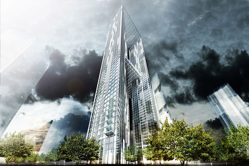

Seoul's new Yongsan International Business District continues to dominate the news:
Now we just received images of Pentominium, the 320-meter-tall residential development designed by Chicago-based Murphy/Jahn Architects.
Project Description from the Architects:
The Yongsan International Business District will set a new standard for an integrated global city. Situated on a high-profile site in the western side of the district, plot R5 houses a signature topend residential building, 320m in height, which will attract the most exclusive clientele from both Korea as well as the rest of the world. These Pentominium units will provide unsurpassed urban living experiences, with spatial and privacy features normally associated with individual houses.
In order to maximize window views and create a sense of exclusivity through minimizing the number of units per floor, two slender towers were chosen for the design. A simple square footprint provides the geometry basis for each tower floor. To take advantage of the desirable vistas to the southwest, the cores for the towers are shifted off center towards the northeast elevations. The resulting U-shaped usable areas can then be divided into one, two, three, or four units per floor, most with view access to the southwest.

↑ Overall view (Image: Murphy/Jahn Architects)

↑ Street view, night (Image: Murphy/Jahn Architects)

↑ Aerial view (Image: Murphy/Jahn Architects)
Around each unit, the enclosure façade moves in and out from the square tower footprint to create customized bay windows, wintergardens, and enclosed balconies. An exterior screen of vertical and horizontal bars is located outboard of the balconies. The primary module of the screen is 5.0m tall by 3.0m wide to align with the façade geometry. In areas where increased privacy is preferred, such as bedrooms and bathrooms, additional vertical bars are added within the primary module. In addition to becoming the signature design feature of the project, the exterior screen provides four distinct benefits:
1. Provides solar shading to the façade, reducing the cooling load of the building
2. Enhances privacy between towers
3. Creates a visual and structural framework in which balconies and interior room projections can be inserted.
4. Maintains an ordered, clean visual appearance in front of the shifting enclosure façade behind.

↑ Facade (Image: Murphy/Jahn Architects)
The façade layering of exterior bar screen, to balcony/terrace, to enclosure façade creates a three-dimensional space in lieu of the traditional two-dimensional façade. This zone breaks down the barrier between interior and exterior areas, helping to provide the experience of individual house living in a high-rise urban context.
At various heights in each tower, structural bays are carved out of the sides of the building enclosure to create four-story high skyparks. Each skypark will be developed to provide a distinct amenity experience for the Pentominium residents, from a place of meditation, to an exterior lounge, and a sporting/exercise zone. Open joint glass panels in the exterior screen here help to temper these spaces climatically, while still maintaining an exterior experience for the residents.

↑ Interior view (Image: Murphy/Jahn Architects)

↑ Interior view (Image: Murphy/Jahn Architects)

↑ Interior view (Image: Murphy/Jahn Architects)

↑ Interior view (Image: Murphy/Jahn Architects)
Amenity functions are located at a mid-height level of the towers. A platform with both interior and exterior areas connects the two towers here, allowing residents to have their own private garden and lounge area in the sky. At the top of the towers are private roof gardens for the ultraexclusive single floor unit super villas.
Officetel units, with circulation separate from the Pentominiums, are located in the bottom eight floors of the east tower, as well as an adjacent four-story podium building. Secure parking for the Pentominium units is located in the basements below, with direct elevator access to each floor as well as the retail concourses below grade.

↑ Site plan (Image: Murphy/Jahn Architects)

↑ Section (Image: Murphy/Jahn Architects)

↑ Sketches (Image: Murphy/Jahn Architects)
4 Comments
Towering inferno comes with its own designer smoke. It's nice when architects flush out seemingly unimportant details like that.
what a punishment to look at this
Compared to some seemingly random acts of form making within the rest of the YIBD development, id say this is a solid counterpoint.
haha. They added a few planes to the world trade center design and called it new!....how very retro of them!
Block this user
Are you sure you want to block this user and hide all related comments throughout the site?
Archinect
This is your first comment on Archinect. Your comment will be visible once approved.