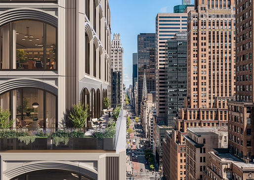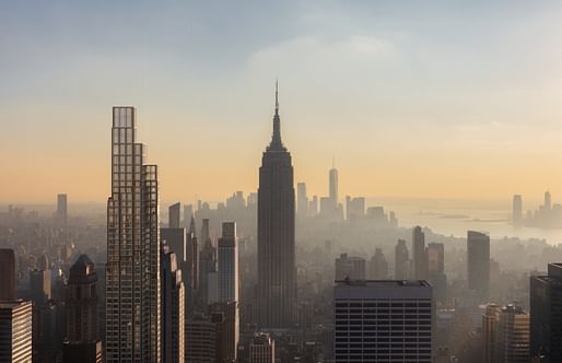
KPF has released new images of a supertall tower currently under construction in Midtown Manhattan. Named 520 Fifth Avenue, the tower rises 1,000 feet to “strike a distinctive presence on the most famous skyline in the world and rub shoulders with distinguished architectural icons,” according to the design team.

When completed in 2025, the 450,000-square-foot tower will contain residential and office functions alongside ground-floor retail. The interiors have been designed to provide “venues of quiet retreat and spirited engagement,” while also targeting LEED, WELL, and WIREDSCORE certifications.

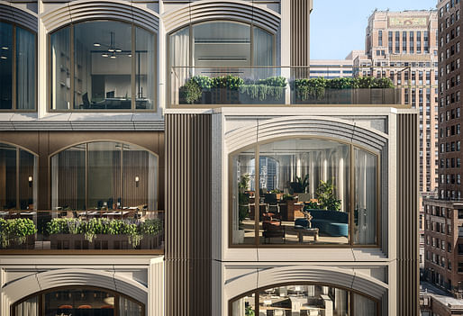
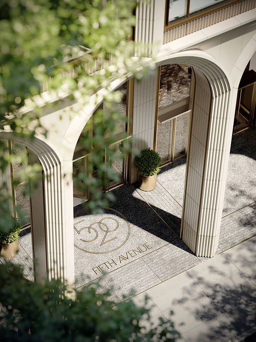
The scheme’s exterior is defined by a motif of arched windows with design details inspired by the tower’s prominent neighbors including The Century Association, the New York Public Library, Grand Central Station, Rockefeller Center, and the Chrysler Building. The tower is also expected to the the second tallest on Fifth Avenue after the Empire State Building.

“Our design for the 520 Fifth Avenue tower combines the setbacks of Hugh Ferris’ 1920s New York with arches arranged in modular bundles - rising to 1,000 feet,” said KPF President and Design Principal James von Klemperer in a statement about the scheme. “The architectural expression of stepping volumes echoes the setbacks of midtown towers, while the delicately articulated exterior wall details are inspired by the facade of The Century Association adjacent to our site."
“We also looked to the arches of the landmarks in the neighborhood, including the New York Public Library and Grand Central Terminal, translating these forms into a modern version of this motif,” von Klemperer added.

News of the scheme comes one week after SOM completed Two Manhattan West, providing two million square feet of new office space. January also saw a major cantilevering hotel tower for Midtown Manhattan revealed by Marin Architects.
8 Comments
Someone needs to explain to me how making an entire building out of one motif is a good idea? And that massing so clunky, looks like more like an effort to maximize FAR than an actually design consideration.
A single motif might be ok if it were a good one, which KPF doesn't have here. The design really is just a a pattern of arches applied like wallpaper over the shape of the maxed out zoning envelope.
would be interesting to dissect why you think the motif employed is not a good one?
You might want to ask MV De'Row or every other architect since 1945
Not inspiring at all.
Construction is well advanced.
New Renderings Revealed For 520 Fifth Avenue Supertall in Midtown, Manhattan - New York YIMBY
I think the reaction to the repetitive motif here is not actually about the motif units themselves, which if you look at them in isolation are fine. The problem is two-fold:
1) It's using those motif units as a surface texture across building mass which is clearly not being shaped or informed by them: it's copy-paste architecture.
2) The motif is being applied with too much scale-jumping, and therefore has no hierarchy or rhythm in variation beyond the trivial, textural effect. There are no intermediate-scale building elements to bridge the perceptual/proportional gap between the overall mass and the motif elements. There's nothing to stitch the whole thing together.
I think you have put into words the entire RAMSA-esque pastiche that everyone in NYC but architects seem to love (for reasons that I also cannot put into words).
Block this user
Are you sure you want to block this user and hide all related comments throughout the site?
Archinect
This is your first comment on Archinect. Your comment will be visible once approved.