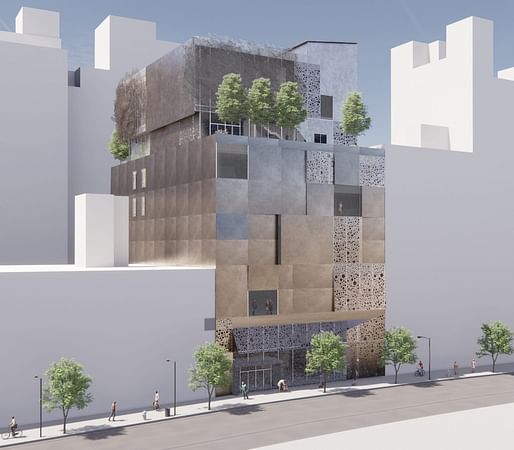

An important part of New York’s rich cultural fabric is coming into closer view after the Museum of Chinese in America (MOCA) revealed renderings for its new Maya Lin-designed permanent headquarters at 215 Centre Street in Manhattan.
The project will entail the expansion of its existing building into a 68,000-square-foot museum with classrooms, a research and genealogy center, theater, and exhibition spaces from Ralph Appelbaum Associates that will host up to 300,000 visitors a year.
In spite of some recent local opposition, Lin said she wants the museum to serve as an inspirational resource at a time when the community has seen an increase in the kinds of hateful acts that she personally reports to have experienced throughout her life.
Her design for the museum’s new nine-story facade is formed by perforated metallic cladding intertwined to invoke the shape of a popular Chinese Tangram puzzle.
Inside, a “strategic” influx of sunlight offers the 42-year-old institution’s two-floor permanent collection, fifth-floor temporary exhibition space, and narrowly salvaged archives. Public space is added to the structure with a landscaped terrace on the seventh floor and a double-height lobby at the ground level that welcomes visitors with a tea room and atrium-spanning “memory core” wall.
“This is a true passion project for me,” Lin explained in a press statement. “As a child of Chinese immigrants, I have throughout my life experienced firsthand anti-Asian discrimination and hostility. I’ve been drawn to MOCA and its critical mission for years and am incredibly moved to be able to present our design for its new headquarters — a place that will welcome, teach, and inspire visitors from around the world.”
The current iteration will close at the end of next year ahead of a construction phase that will last until 2025. The overall cost for the expansion is reported to be around $118 million. Archinect will share more project updates as they are made available.
3 Comments
This is exceptionally bad
I hope this develops into a stronger project ... but that metal panel facade looks pretty meh in the render. The massing is a bit clumsy too. A comparable project would be TWBT's demolished MOMA annex, which used its metal facade to great effect.
This is good. The goal is to create a nice experience (check) out of the ordinary that doesn't bankrupt the museum. And it doesn't overpromise in the renderings with some crazy forms that will end up looking like garb in reality.
Maya Lin exceeds the expectations.
Block this user
Are you sure you want to block this user and hide all related comments throughout the site?
Archinect
This is your first comment on Archinect. Your comment will be visible once approved.