

Architectural landmarks often become beloved symbols of their cities, but many were not always welcomed with open arms. Throughout history, some of our most acclaimed structures have in fact provoked heated debates, divided public opinion, sparked fierce controversy, and in one case, caused the late great architect Richard Rogers to be attacked by an elderly Parisian with an umbrella.
To mark World Architecture Day 2024, we take a look back through the history of some of the architectural structures most beloved by the public today, and demonstrate how their status as landmarks was hard-won.
To see how a building initially deemed a monstrosity, an eyesore, or an insult to tradition can evolve into the defining element of a city’s character is an interesting exercise in itself. Beyond the novelty, however, these stories raise apt questions for architects today. To what extent do, or should, we design in response to present tastes? Do we too quickly abandon ideas today in response to critical backlash that, decades later, would come to be loved? How good or bad are we as architects at judging how our work will be perceived long after we are gone? Are there projects under construction today, such as LACMA or the Lucas Museum of Narrative Art, where criticisms made today will be drowned out by praise in decades to come?
Maybe; maybe not. However, as can be seen below, some of our most revered landmarks are monuments not only to architectural brilliance but to architecture's endurance and resilience across tastes and time.
Throughout its 140-year construction journey, still ongoing, La Sagrada Família has evolved to become Barcelona’s most recognizable architectural landmark. The basilica receives over three million annual visitors, who come to marvel at architect Antoni Gaudí’s organic, nature-inspired forms and intricate facades.
The basilica has also endured its fair share of criticism. The most famous rebuke arguably came from George Orwell, describing the basilica as “one of the most hideous buildings in the world” in Homage to Catalonia (1938). The Spanish Civil War was raging at the time, with Barcelona under the control of anarchist groups. Opposed to symbols of religious power, anarchists set fire to parts of the basilica in 1936, destroying many of Gaudí’s original drawings in the process. “I think the Anarchists showed bad taste in not blowing it up when they had the chance,” Orwell added.
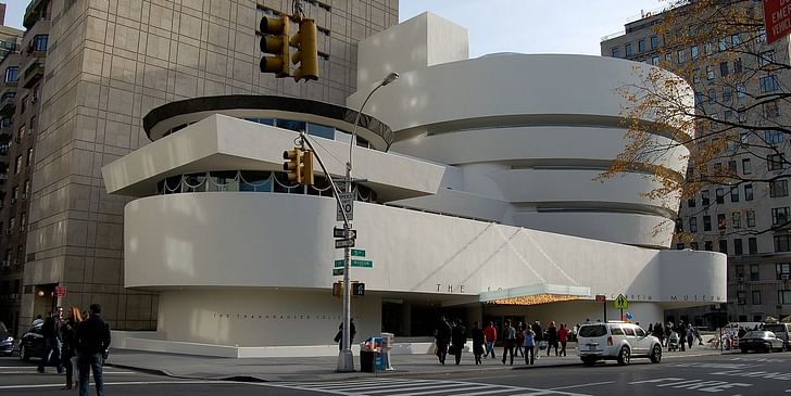
One of Frank Lloyd Wright’s most famous works, the Guggenheim Museum was completed in 1959, designated as a New York City landmark in 1990, and placed on the World Heritage List in 2019. Despite winning modern-day acclaim, the building deeply divided opinion among architecture critics and the public alike. Writer Norman Mailer said the museum “shattered the mood of the neighborhood…wantonly…barbarically.” Writing in New York Times Magazine in 1959, Anna Louise Huxtable noted the following:
“Ever since Frank Lloyd Wright’s controversial Solomon R. Guggenheim Museum began to take shape on upper Fifth Avenue, New Yorkers have been playing a guessing game, “What Is It?” The massive, circular concrete building has been likened to an inverted cupcake, a washtub without handles, a giant Jello-mold, and the last outpost of the Maginot Line.”
Appearing on the Mike Wallace Interview in 1957, Wright responded to Wallace’s citing of such criticism and unfavorable comparisons. “We all see as we are…every time we express a reaction of this sort, we give ourselves away,” Wright replied.
"Somebody said the museum out here on Fifth Avenue looked like a washing machine," Wright added. "Well, I've heard a lot of that type of reaction, and I've always discounted it as worthless, and I think it is."
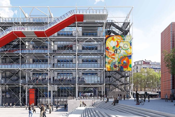
The Centre Pompidou opened in January 1977 and has received more than 180 million visitors since. Despite becoming a must-visit destination in Paris, the building was controversial from its inception. In a hostile press conference unveiling the radical design for the center, for example, one furious individual was removed by French police.
Shortly after its opening, meanwhile, architect Richard Rogers was standing outside the Pompidou when an elderly woman approached him to ask his opinion of the building. “I proudly told her I was the architect,” Rogers would later recall. “She paused, looked at me, and hit me over the head with her umbrella.”
Similar to Wright’s Guggenheim, the Pompidou would endure a range of unflattering comparisons in the press, including an oil refinery, the Loch Ness Monster, and an “architectural King Kong.” “It was hell,” Rogers said, who only remembers one positive newspaper piece from the time. “It was the most hated building ever.”
Fifty years on, the press and public have warmed to the landmark. “The Pompidou must be among the most important buildings of the century,” The UK Telegraph wrote in 2021 shortly after Rogers’ death. “It set new directions in architecture, informed every arts institution that followed, and, at a time when cities were in deep decline, made a powerful, seductive advertisement for the pleasures of urban life.”
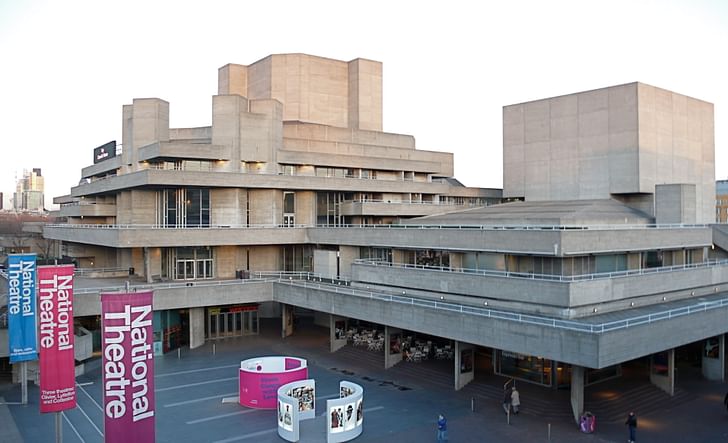
When the National Theatre opened on London’s Southbank in 1976, its stark Brutalist design divided opinion. Designed by Sir Denys Lasdun, the building features rugged concrete terraces, geometric shapes, and an imposing façade that some hailed as a masterpiece of modern architecture. When the design was unveiled in 1967, the famous actor and director Laurence Olivier promised that the National Theatre would be “the finest-looking theatre, the finest-working theatre in the world.”
However, others were less forgiving. “Look at the National Theatre, it seems like a clever way of building a nuclear power station in the middle of London,” then Prince Charles, now King, said in a 2016 documentary while sailing along the bank of the River Thames. Elsewhere, the monarch used a 1984 speech at the RIBA to rebuke a planned modernist wing of the National Gallery, calling it a “monstrous carbuncle on the face of a much-loved and elegant friend.” Today, the Carbuncle Cup is awarded annually to the ugliest building in the UK by Building Design magazine.
Meanwhile, the National Theatre has become one of London’s most iconic Brutalist landmarks alongside the Barbican. “‘When you see the hard cold concrete of a brutalist building, they can look very inhuman, like a machine-made building,” said Richard Battue, Project Architect for a 2018 refurbishment of the nearby Queen Elizabeth Hall at the Southbank Center. “But if you stop and think about how they were actually made you start to realise that really they’re a very deep expression of the craft involved in making them.”
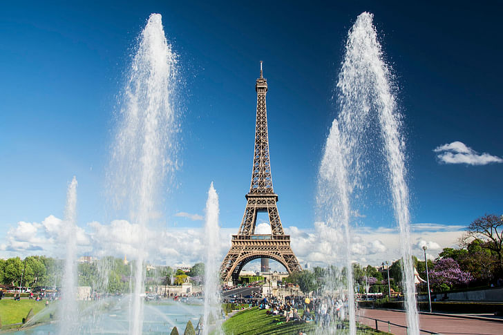
Unveiled at the 1889 Exposition Universelle, The Eiffel Tower was met with fierce criticism from Paris’s artistic elite. Designed by Gustave Eiffel, its skeletal iron frame was deemed an eyesore, clashing with the city’s classical beauty. Architects in particular were outraged that Eiffel, an engineer, was chosen for the project.
In 1887, a letter was published in Le Temps newspaper calling for the project to be stopped. The letter was signed by major figures in the art and literary world including composer Charles Gounod, writers Guy de Maupassant and Alexandre Dumas (son), poet François Coppée, and Opéra Garnier architect Charles Garnier.
“We come, we writers, painters, sculptors, architects, lovers of the beauty of Paris which was until now intact, to protest with all our strength and all our indignation, in the name of the underestimated taste of the French, in the name of French art and history under threat, against the erection in the very heart of our capital, of the useless and monstrous Eiffel Tower which popular ill-feeling, so often an arbiter of good sense and justice, has already christened the Tower of Babel,” the letter read.
Guy de Maupassant was particularly outspoken, calling the tower a “giant ungainly skeleton [...] aborting to form a ridiculous, skinny, factory chimney stack.” After the Eiffel Tower was completed, de Maupassant would have lunch on the first floor of the tower, saying it was “the only place in the city where I won’t see it”.
Despite calls for its demolition after the 1889 Exposition, the tower’s utility as a radio transmitter saved it from being dismantled. Over time, perceptions shifted, and what was once viewed as an industrial blight has become an enduring symbol of Paris, celebrated worldwide for its elegance and engineering brilliance.
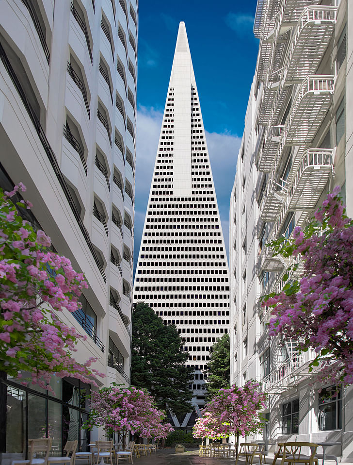
When the design for the Transamerica Pyramid was unveiled in 1969, it instantly stirred controversy among San Franciscans. Designed by architect William Pereira, the building’s distinctive pyramidal shape was criticized as being out of place amid the city’s low-rise Victorian architecture.
San Francisco’s city planner called the tower “an inhumane creation,” while the San Francisco Chronicle’s architecture critic testified against the building at City Hall. Other reviews slammed the building as “hideous nonsense,” “authentic architectural butchery,” and “an affront to San Francisco."
The scheme was nonetheless completed in 1972 and, over time, became a defining feature of San Francisco’s skyline. Today, the Transamerica Pyramid is celebrated as an architectural icon, described as “a wonderful building” by one architect who had previously fought against the design. Last month, a Foster + Partners-led redevelopment of the center opened to the public with modern-day amenities and a new lobby.
When London’s Tower Bridge was unveiled in 1894, it drew mixed reactions from Londoners and critics alike. Designed by Horace Jones and John Wolfe Barry, the bridge combined Gothic stone towers with modern steel bascules, a juxtaposition that many found jarring.
In 1894, The Pall Mall Gazette’s architecture critic dubbed the structure a “horrible mixture of ironwork and gothic stonework” before adding that “This huge but childish structure shows the vanity of forty years of sentimental gush about art...its unparalleled lack of proportion, its niggled and meaningless ornamentation, and the discordance between the iron and steel parts.”
In a separate edition two months before the bridge opened, the publication noted that “there certainly seems to be a subtle quality of ungainliness, a certain variegated ugliness, so to speak, that age can scarcely wither or custom stale, about this new bridge. It is excellently situated for our ugliest public work, straddling across our Thames, to the terror of the errant foreigner.”
As the years passed, however, Tower Bridge’s distinctive duality and engineering prowess came to be admired. Today, it’s one of London’s most recognizable landmarks, celebrated for its historical charm and innovative architecture. “Despite its age, the bridge still plays a vital part in river life,” the BBC said in 2014 as the bridge reached its 120th anniversary.
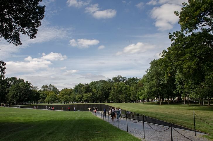
Maya Lin’s design for the Vietnam Veterans Memorial was completed in 1982, and sparked intense debate from its first unveiling. A minimalist, V-shaped wall of black granite, engraved with over 58,000 names, the design was criticized for its abstract shape, dark color, and absence of patriotic symbols. The absence of such symbols, along with Lin’s Asian descent, fuelled criticism from veterans, politicians, critics, and the public that the memorial embodied an anti-war position.
Among the attacks of the time was that the memorial was “a monument to defeat, one that spoke more directly to a nation’s guilt than to the honor of the war dead and the veterans,” along with a “black gash of shame,” a “degrading ditch,” and a “wailing wall for draft dodgers and New Lefters of the future.”
Over time, the memorial’s powerful simplicity and emotional impact prevailed, and the site is now visited by three million annual visitors. “The controversy surrounding the memorial instantly vanished from the pages of the press, replaced by celebrations of its interactivity, tranquility, and emotive power,” art21 magazine wrote in 2017.
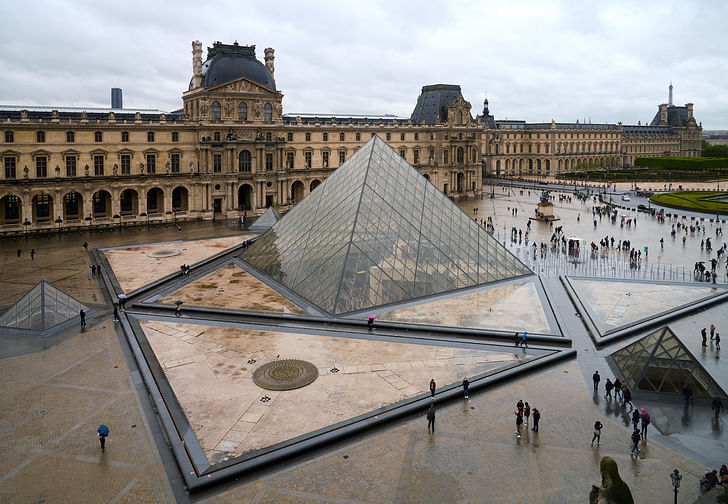
The addition of the Louvre Pyramid in 1989 provoked uproar in Paris before its design was ever unveiled. Designed by Chinese-American architect I. M. Pei, many criticized the selection of Pei without an open composition and the perceived snubbing of French firms.
When the design for the glass pyramid was unveiled, criticism grew more intense. In 1985, The New York Times summarised the critiques as “an architectural joke, an eyesore, an anachronistic intrusion of Egyptian death symbolism in the middle of Paris, and a megalomaniacal folly imposed by Mr. Mitterrand,” the French president at the time.
“When I first showed the idea to the public, I would say 90 percent were against it,” Pei recalled in a PBS documentary. “The first year and a half was really hell. I couldn’t walk the streets of Paris without people looking at me as if to say: ‘There you go again. What are you doing here? What are you doing to our great Louvre?’ ”
Decades later, the pyramid’s transparency and juxtaposition with its 12th-century palatial surroundings have made the Louvre an architectural icon of Paris. Almost nine million people visited the Louvre in 2023, more than the Eiffel Tower.
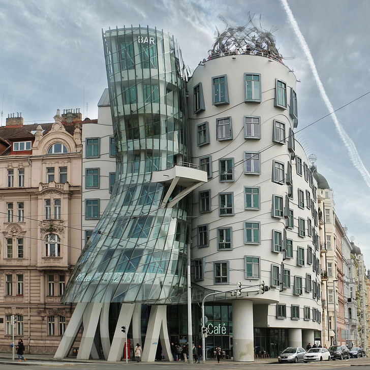
When the Dancing House, designed by Frank Gehry and Vlado Milunić, was completed in 1996, it divided opinion in Prague. With its curved, flowing forms and deconstructed silhouette, the building sharply contrasted with the city’s Baroque, Gothic, and Art Nouveau architecture. Critics accused it of disrupting the historical harmony of the riverfront and labeled it “The Drunk House” for its unconventional, wavy appearance.
The scheme has nonetheless become a landmark in its own right. The building is referenced on the 2,000 Czech koruna coin while winning Time magazine’s design content in 1997. The building’s playful form is also seen as a symbol of freedom and liberation in contrast to Czechia’s communist past.
Niall Patrick Walsh is an architect and journalist, living in Belfast, Ireland. He writes feature articles for Archinect and leads the Archinect In-Depth series. He is also a licensed architect in the UK and Ireland, having previously worked at BDP, one of the largest design + ...
4 Comments
Note that Helmut Jahn's State of Illinois Center (aka the Google Roomba) is NOT on this list.
It's sooooo good and it's so sad to see what's happening to it now.
I would love to see a student competition or a challenge amongst professionals where one would apply modern day materials to a building such as the National Theatre. You would not be allowed to add to the footprint of the structure, you would only be allowed to add exterior finishes to the Brutalist Base Design. See if someone could make His Majesty change his mind.
The National Theater is where George Orwell's Room 101 is located. The last thing dreary, rain-streaked London needed is a Brutalist, grey, grim, fortress building.
Block this user
Are you sure you want to block this user and hide all related comments throughout the site?
Archinect
This is your first comment on Archinect. Your comment will be visible once approved.