Salford’s cotton-weaving history is behind Make Architecture's design for a brick commercial space Three New Bailey that will serve as a gateway to the city’s £1 billion master plan currently under development by the English Cities Fund.
Envisioned as a new regional hub for HMRC, the 7-story building will greet visitors and residents exiting the adjacent Salford Central train station into the newly formed piazza created on the 50-acre former brownfield site developed by the city council in collaboration with Legal & General and Homes England.
Per the architect: “The building’s simple and honest form was created in direct response to the HMRC brief and provides large, efficient, repeating floor spans with a side core to maximise flexibility in achieving their workplace needs for today and the future.”
Make incorporated a tiered system of weaves for the building’s short and long elevations that were developed with help from contractor Thorp. The articulated nature of the facade helps to break the orthogonal mass of the structure all while giving off impressions of depth and movement. Curved panels, glazing and two types of brick bonding work together to emphasize the contrast in elevations and linear arrangement.
The 48,000-square-foot building’s cladding is projected between 100 and 400 millimeters away from the glazing line in order to capture light as it passes across the brick facade and exposes the weave.
Make had previously delivered two other buildings in the master plan, each with its own distinct facade and material composition. The Three New Bailey is expected to be completed in early 2022.
9 Comments
Nice basket case!
.
Obvious precedents aside, this is a nice look. Interesting, and a little playful, without being gimmicky or ridiculous. Big fan.
I do not like brick panels.
cute, but definitely gimmicky
Apparently the interior is not composed of woven spaces.
Be very nice to the ants living in that outsized pic-a-nic basket!
I work in the building squashed in next to this and have watched it be built over the past few years and believe me, it is even uglier up close. Before lockdown and now that we're back, I hear constant comments on how unpleasant it looks and wondering what on Earth the architect was thinking. We hate having to look at it all day.
The building process was interesting to watch, though. Those woven pieces came in brick segments more than ten feet long that were lifted into place by crane. One of the builders dropped a load of cement from several floors up once. Missed his colleague on the ground by a few inches. Watching them scream at each other livened up a dull workday.
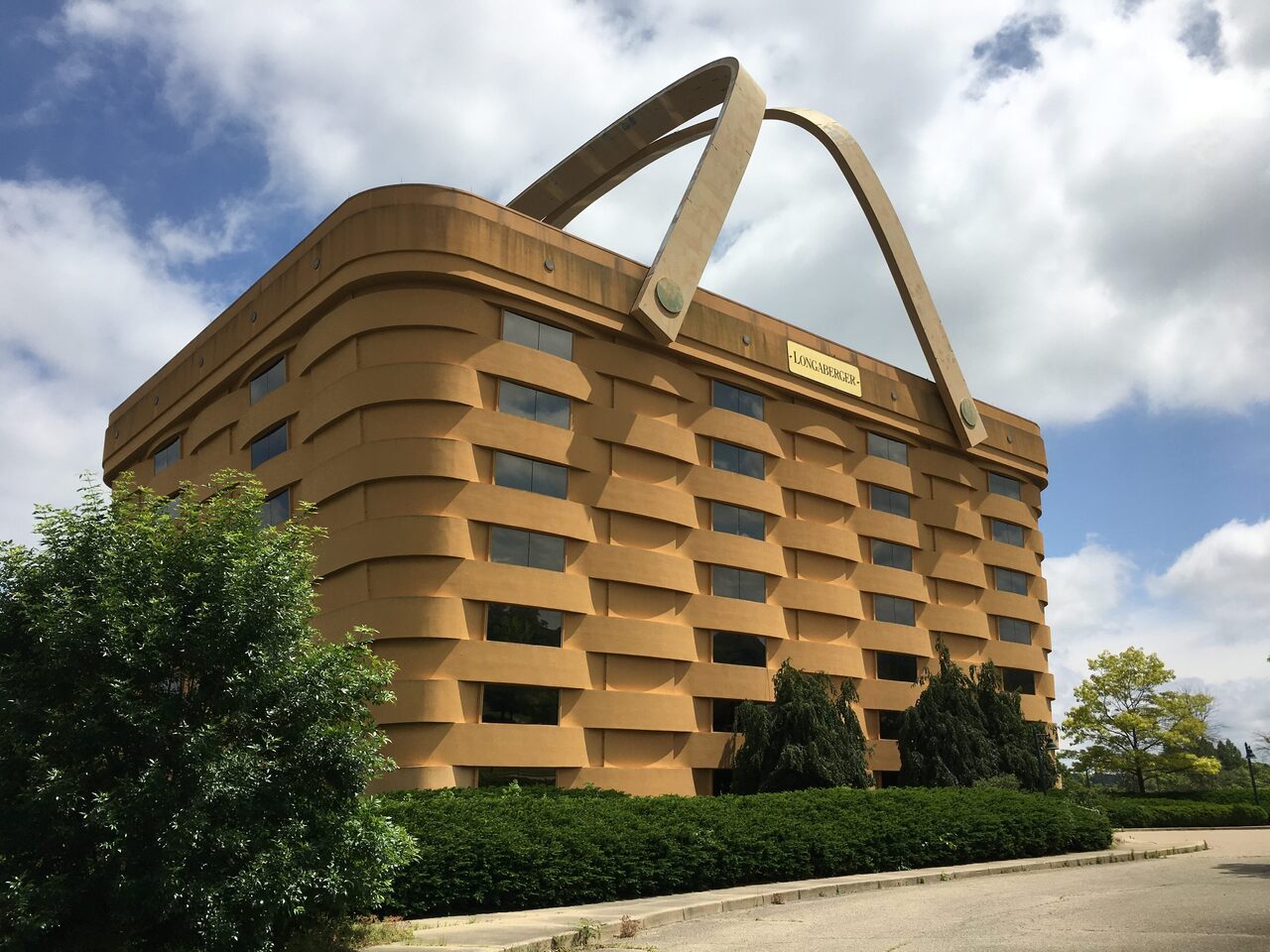
I prefer the Longaberger ...
Block this user
Are you sure you want to block this user and hide all related comments throughout the site?
Archinect
This is your first comment on Archinect. Your comment will be visible once approved.