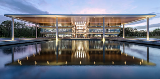

The new Foster + Partners-designed PGA Tour global headquarters in Ponte Vedra Beach, Florida has officially opened. The building brings the entire organization under one roof for the first time. It focuses on health and wellbeing, with a design that blurs the boundaries between the surrounding landscape and the interior spaces. Shaded outdoor terraces and generous amenities allow for new ways of working and collaboration.
The project was first announced in 2018 and broke ground the following year. The $65 million complex was completed late last year, ready for full capacity by mid-February.
Nigel Dancey, Head of Studio at Foster + Partners, said: “On our very first visit to the site at Sawgrass, we were inspired by the quality of the landscape, the interplay of light and shade and the water. This led to our very first sketches, maximizing light and views beneath a generous overhanging roof that creates shaded external terraces and plaza spaces. The building was then set amidst a ‘natural‘ lake on axis with the famous 17th green.”
The building’s design incorporates biophilic principles through prioritizing natural light and fresh air flow in order to enhance staff wellbeing and improve the quality of the workplace. The 187,000-square-foot structure is comprised of a low-sitting, three-story glazed volume. It is nestled within the verdant landscape and surrounded by a newly created lake. The floorplates are bisected by an atrium that runs the length of the building. The atrium is the focal point of the building’s program, containing flexible formal and informal meeting spaces.
A grand central stair cascades down the central atrium, creating a dynamic spatial and visual flow between the levels. The two resulting building bays are connected by 20-foot-wide bridges, which encourage informal meetings and gatherings. This is all situated beneath a large, column-supported roof structure that extends past the dimensions of the bays. In addition, the western end of the building contains a new staff café and gym on the ground floor.
The glazed façades and atrium fill the building with natural light, while also providing panoramic views of the surrounding landscape. The building’s raised floor aims to futureproof the building with the flexibility to change internal configurations over time.
Work on a separate digital media building, also being designed by Foster + Partners, is currently underway as part of the second phase of the project that will help create an integrated campus at TPC Sawgrass (the name of the golf course that surrounds the PGA Tour headquarters).
11 Comments
We were inspired by [blank], so we created a huge overhanging roof (again). Good to see the return of the 1970's shopping mall atrium.
what is a 'natural' lake?
Kinda looks like one of those places where alcoholics or drug users with lots and lots and lots of money go for treatment. That or a place for face-lifts and boob-jobs.
I don't know about TPC Sawgrass, but I bet you could find plenty of alcoholics and drug users with lots and lots and lots of money at many golf courses. Probably plenty of face-lifts and boob-jobs too.
IMO the design is quite elegant and, I think, "peaceful" in a way that reflects the sort of meditative quiet of golf and golf-courses. That said, the accompanying explanations are a bunch of Archibabble BS.
Golf courses, or as they are also known: Fuck Your Waterways, My Game is More Important
Sure. I'm not making a moral judgment. I'm making an aesthetic one.
Drawings are always helpful:
https://www.archdaily.com/9640...
Thanks. The site plan really helps explain the "Natural Lake" comment.
Yeah, I think "natural lake" refers to an organic waterline as opposed to a formed reflecting pool.
That being said, in a golf context the "lake" reads like an extension of a water feature from the course.
(garh... "water hazard" would be the golf term but that doesn't sound as good as "natural lake")
Block this user
Are you sure you want to block this user and hide all related comments throughout the site?
Archinect
This is your first comment on Archinect. Your comment will be visible once approved.