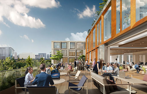
Global architecture firm Kohn Pedersen Fox (KPF) has broken ground on Platform 16, a new 1.2 million-square-foot office and commercial complex slated for a site next door to Google's forthcoming Transit-oriented village in Downtown San Jose, California.
According to a press release published by the firm, "Platform 16 offers access to outdoor space on each floor, and will include active pedestrian plazas, expansive floorplates, and 15-foot floor-to-floor heights, prioritizing the experiences of diverse occupants."
Additionally, the building's highly articulated facades are crafted to "create a sense of depth and texture with a faceted expression that modulates their scale and evokes an organic composition," a design that, according to the architects, reflects "a nod to the project’s sustainability" attributes. Those sustainability approaches add up, and the project is slated to outperform current AIA 2030 Commitment goals, which call for an 80% reduction in greenhouse gas emissions for a typical building of this type and size.


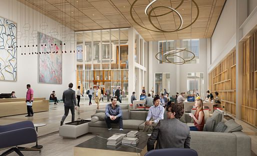
The project's interiors feature interlocking double-height and mezzanine spaces typical of pre-pandemic, open office, and mixed-use designs. Wood finishes, especially along the ceilings, mark the designs of the interiors.
A project statement on the KPF website describes the buildings' canted facades as being defined by "three module orientations—center, left, and right—[to] create a sense of depth and texture by breaking down the scale and shimmering like sequins in the sun’s reflection." The statement adds, "Bronze in color, the terrace facade contrasts the main wall in materiality and scale, evoking an organic composition that also points to the project’s sustainability."
A construction timeline has not been announced for the project.
8 Comments
the description is so much better than the design —I especeally loved “Bronze in color, the terrace facade contrasts the main wall in materiality and scale, evoking an organic composition that also points to the project’s sustainability."
Yep; them colors are SO delicious.
I haven’t been so baffled by bulls heat in years!
The perks of having a large PR/marketing department to spice up mediocre designs that we've seen from OMA c.s. a decade ago or so already when they as one of the first regurgitated Structuralism so much better and exciting, even without the bronze...
The developer or its marketing agent probably came up with that language.
KPF is always on the verge of doing something not-meh. Then they realize the perils of being a "global architecture firm" and add on an extra serving of blah, beige and bland.
So is it actually modular, or does it just look like it is? Meaning, is it a pile of pre-fab boxes with the endwall window inserts turned in different directions, or does it just appear to be?
Edited to add: I think it's a pretty project. Just trying to understand it better.
I'd imagine this would be heavily marketed as being modular if it was, but I haven't seen anything...
"Platform 16 offers access to outdoor space on each floor, and will include active pedestrian plazas, expansive floorplates, and 15-foot floor-to-floor heights, prioritizing the experiences of diverse occupants."
So we've moved past greenwashing to ... diversitywashing? What is the relationship between commodity real estate features and diversity?
I'm just teasing. The PR is over the top, but the design is tasteful and suitable for any ordinary situation. It's like Hans Kollhoff for the West Coast.
I think they just threw that adjective there because all of the other nouns had filled their adjective quotas.
Block this user
Are you sure you want to block this user and hide all related comments throughout the site?
Archinect
This is your first comment on Archinect. Your comment will be visible once approved.