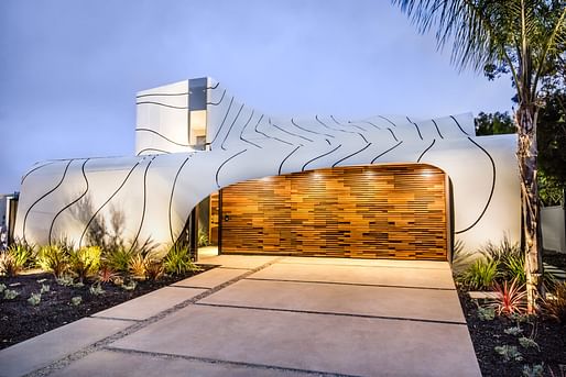

To many longtime residents, the cookie-cutter constructions stripped Venice of its distinctive architectural character, turning parts of the neighborhood into uniform eyesores.
“Over the last year or two specifically, we’re seeing more chances being taken and more unique developments going up,” Lackey said. “This wave of architecture is great for Venice, which has always been a hub of individuality.”
— Los Angeles Times
Boring boxy developments have taken over Venice, California in the last 15 years, but in this LA Times piece, some architects think it's time for the coastal town to return to its eclectic architectural roots...currently in the form of multimillion-dollar luxury homes.
6 Comments
Good luck. Neighbors are shutting down any project for pretty much any reason at this point. By right? yeah right.
The house in that illustration is a couple of blocks from me, and I'd be careful tossing around the term "eyesore" if defending it. Your jaw drops when you pass by, it's so awful.
That said, the larger critique about the proliferation of horrible, 'trendy' boxes is sadly true. Most are unbelievably bad, the spawn of mindless realtors and spineless developers... and, unfortunately in some* cases, complicit architects.
*Hoping that many are built w/out our participation.
this was designed by one of the most prestigious firms in the us, only architects participation
https://www.archdaily.com/419204/petersen-automotive-museum-unveils-20th-anniversary-transformation
"As luxury-home designer Kim Gordon puts it, the only way to make things interesting in box homes is to see how sexy you can make the windows."
Interesting to contrast above, with Hawthorne's recent "Boring Architecture".
The solution to the proliferation of trendy boxes is not to wrap the trendy boxes in undulating metal panels, or giant cut-out flowers. The solution is to respect the scale and character of the neighborhood.
I'm very familiar with that "wave house", since some good friends live within a stone's throw of it. The ironic thing about that house is that the thing is still just a big box...behind that undulating pile of goo is the same modernist box house that all the other oh-so-trendy folk are building. It's wrapped in parametric pudding just at the street facade. It's a big billboard broadcasting to the neighborhood, "fuck you, I'm way more cool than you are".
Same thing with the flower house, which is just around the corner from my office. That thing couldn't be more out of scale with the neighborhood.
It's all in the WRAPP'n!
Block this user
Are you sure you want to block this user and hide all related comments throughout the site?
Archinect
This is your first comment on Archinect. Your comment will be visible once approved.