
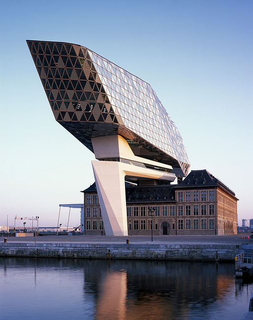
The glistening Port House in Antwerp is Zaha Hadid's latest project to be completed posthumously. But the glass building isn't mere folly. Built atop a disused historic fire station, the striking landmark operates as the new headquarters for the Port of Antwerp, Europe's second largest port.
ZHA was selected to design the new extension following a competition, in which the main objective was to preserve the original fire station, according to Port of Antwerp president Marc Van Peel. All five shortlisted competitors proposed a new structure above the building, but the Port deemed Zaha's design as “the most brilliant”.
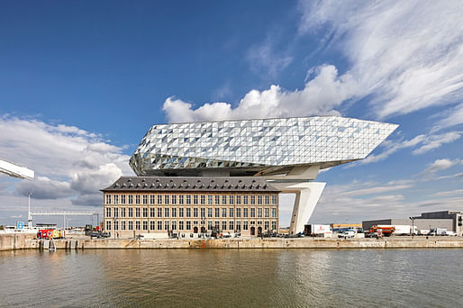

At 111 meters long and 21 meters high, the new glass extension “floats” above the old fire station. “Like the bow of a ship, the new extension points towards the Scheldt, connecting the building with the river on which Antwerp was founded,” ZHA describes.
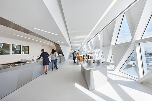
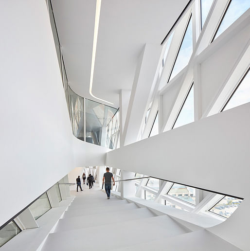
The building also shows off a glazed facade of transparent and opaque triangular facets that allow sufficient natural light into the building, as well as provide enclosure and offer panoramic views of the Scheldt, the Port, and the surrounding city.
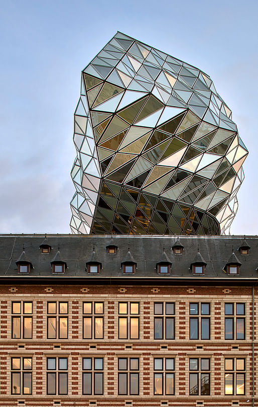
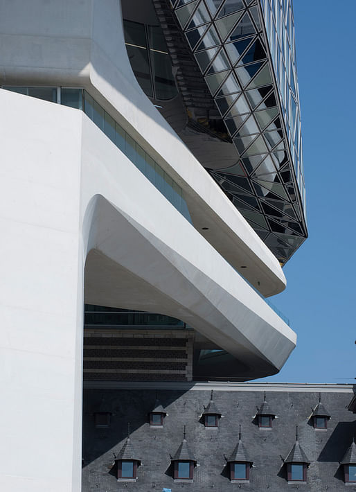
ZHA enclosed the original central courtyard with a glass roof and converted the space into a new reception area. From here, visitors can explore the historic public reading room and library within the carefully restored firetruck hall, and access the new extension via panoramic lifts. An external bridge links the existing building to the new structure.
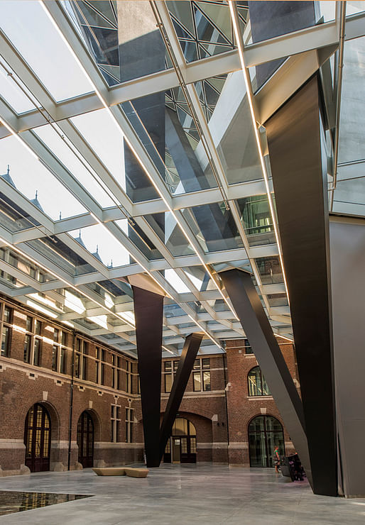

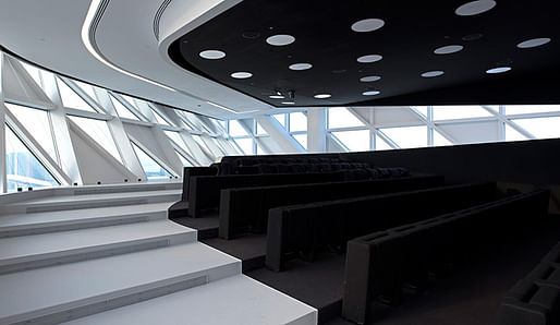
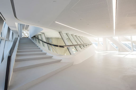
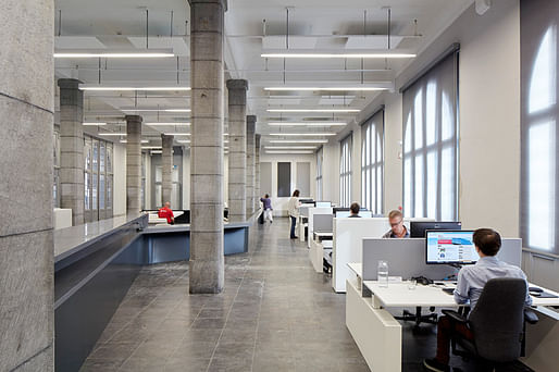
Responding to the Port's requirements for an “activity-based office”, ZHA integrated new meeting rooms, a 90-seat auditorium, and a restaurant into the upper levels of the existing building and the bottom floors of the new glass extension. Open-plan offices occupy the remaining floors.

All images courtesy of Zaha Hadid Architects.
More on Archinect:
ZHA after Zaha: Patrik Schumacher on Zaha and what's next for the firm, on Archinect Sessions #61
Zaha Hadid's repertoire is a stunning display in Venice's Palazzo Franchetti
41 Comments
I have an opinion about this
Sick, Epic, Dope, Bangin
as I go back to meaningless AOR stuff all weekend. but yeah be a critic, I'm sure you're doing better.
As someone who generally likes ZHA: this is bad.
no, it's offensively good like this guy
That poor old building never knew that one day it would be dry humped by this thing for the rest of its life.
like I said, jla-x...old mother hubbard and rover..
Andrew Dice Clay - The Evolution Of Dirty Nursery Rhymes
Me , Just a question :
How will the little kid or the old lady will find her way ?
seriously ?!
What is this obsession with geometry , slick objects etc ?
jla-x, I LOL'd.
The interior spaces look pretty wonderful, but the way it attacks - dry humps - that old building is just horrid. It's aggressive. It reminds me of the billboards featuring huge axe murderer gore imagery that show up every Halloween advertising a local haunted house in our region. Inevitably they're left up until December so right when I'm in a holiday frame mind this huge image of a bloody screaming face pops into view and it's so jarringly out of place.
I have no need to comment here, because you have said it all. Thanks.
Like most of ZHA buildings, this one should be thought of from the inside out.
Nice tongue, Black Orchid!
Bold and inspiring... there is plenty of unhumped old buildings to go round...
This thing screams "Sucker!"
I love this building.
A commenter on Dezeen called it a turd, and combined with the 'floating' terminology used in this Archinect headline now I picture it as one of those pesky floaters that refuses to flush.
Again, the interior spaces look super cool. But ugh. Go away.
Horrifyingly bad: a rigorously polished turd.
welcome to the future.
you're all haters. this is a highly polished Lebbeus Woods building. and since when does everything need to be in zen harmony? such conservatism here.
Do you want to live in a Lebbeus Woods universe? I don't. It's not about conservatism, it's about humanism.
what about humanism?
Humanism prioritizes what's best for the human beings (that will live with this building) as understood by the most recent scientific research. It has nothing to do with politics.
so the argument is that this building does not prioritize what's best for the human beings that will live with this building based on scientific research? there's so many problems with that statement.
first of all, what is best for human beings? who prioritizes? based on what criteria? what research? what's the validity of the research? has it been tested? who did the research?
to say this is about humanism isn't critique. it's just a flip statement from someone who doesn't like the building but wants to sound like their opinion has some gravitas to it.
makingspace, if you like this building, that's fine, but it's obvious that even on this site devoted to promoting modernism, this thing is a turd. It's literally anything goes. As for humanism, I'll let you research your own questions if your actually curious. You sound like a Fox News viewer unwilling to agree on even the most basic facts of common knowledge.
"conversation of appropriate architecture" meaningless jargon. humanism in architecture is but one idea. one idea i hear mostly from new urbanists and classicists like the kind out of notre dame. imo, the fox news of architectural theorists.
i'd say based on her portfolio and my actual experience of going to a ZHA building i'd say it was in touch with the "human condition" and that it was successful in meeting programmatic requirements, human factors, and the surrounding urban context. so far i've heard nothing remotely similar in terms of analysis.
quondam, yes, that's the building that came to mind.
what was the other option here, a box on top of an old box?
lebbeus woods on zaha and humans...https://www.google.com/amp/s/lebbeuswoods.wordpress.com/2011/03/27/zahas-way/amp/
"to say this is about humanism isn't critique. it's just a flip statement from someone who doesn't like the building but wants to sound like their opinion has some gravitas to it."
Your are absolutely correct. I don't like the building. In part, I don't like it because I think it's ugly and violent. It's designed as a parasite, to appear to dominate and defile its surroundings. It's not a coincidence that, like the War of the Worlds killing machines, it stomps its feet down and penetrates the older building. It has climbed atop the other building, in an act of rape. This imagery is unmistakable, and has to be intentional. In a humane society, this is the antithesis of architecture.
Just my opinion.
Clearly there are people who view the purpose of architecture differently than I do. That's fine. For those of you who enjoy architecture that's less into "zen harmony", and a little more "rapey", there's always Libeskind.
well done here imo
ODN, correct, a box on top of a box is so much more humanist. or even better, a box adjacent to the existing one.
as for rape...wow.
a modern building that integrates itself in tension between new and existing and makes metaphors to being a ship docked at port is not rape. as for placing it on top, one could say that it is building atop of tradition. since it's the same program, it's not as if this is a Bank of America building on top of a local treasury building. your metaphor is way out of line.
3 people in this thread see the new humping the old...thats 3 who at least posted...
I think it looks kind of like a boat. I guess non-consensual sex is not often at the top of my mind. If that's how viewing the world in 'zen Harmony's looks to you, I suppose there's always krier
^
For me, going back to the competition drawings for The Peak, Zaha's work is about the vitality and movement of the city. The humanistic side comes in as an acknowledgement that humans are constantly changing and flowing. The CAC definitely catches this energy, and I love it.
On the other side, maybe, is the Baku project, that is much more of an object in a field but is SO graceful and sensuous. It's beautiful but flows in a balanced way.
This project, for me, is static. It doesn't float, because it's anchored by that enormous shaft, and it simultaneously disrespects the existing building under it - a building that was apparently considered worth saving, or it would have been demo'd for an entirely new building on this site.
I do think the faceted glass is very beautiful, though again it's much more rigid pattern than I feel like most of ZHA's work uses.
I do think the faceted glass is very beautiful
I agree, but isn't architecture something more than beautiful pattern making? Context.
EKE that's a good example in that it's a war museum. There should be discord and violent juxtaposition of forms. I don't like Liebeskind either because his form making never matured beyond the Jewish Museum.
Hadid's cloud walker while it does dominate over the existing building is not raping it and frankly all these sci-fi references are knee jerk reactions rooted in pop culture visuals.
"Giant glass grasshopper mates with building"
http://www.dezeen.com/2016/09/27/zaha-hadid-port-antwerp-authority-priestmangoode-carmody-groarke/
"Zaha's dildo" - RWCB (sorry to dredge up that screwball)
Why should a war museum be violent and discordant? Why not design a war museum that provides consolation and reconciliation in sorrow?
+++++EKE
That requires insight and maturity.
EKE it could be but that's not what happened here. and the form making was justified. sure, you can do a museum to provide consolation and reconciliation and it can be classically proportioned and sit in background to the surrounding context. there's room for both. much like this floating crystal above an old building works.
There's room for both, just not on this site, or in 99% of all architecture schools. Hospitals design for "harmony" even though all us healthy people seem not to need or crave it... except in our music, literature, food, gardens...
Block this user
Are you sure you want to block this user and hide all related comments throughout the site?
Archinect
This is your first comment on Archinect. Your comment will be visible once approved.