Every April, music fans venture in droves to the High Desert outside of Los Angeles for the Coachella Valley Music and Arts Festival – a veritable rite of spring for the selfie era.
And, like with any good spring bacchanal, the musical experience is often enhanced through the consumption of substances, licit or otherwise. But while imbibing may help you maintain stamina for the dance floor, it can also ramp up your internal body temperature (likely already elevated by the grueling desert sun).

Enter the architects and artists responsible for the latter half of Coachella's proper name. Tasked with designing structures that both shade and visually-entertain, the selected designers are given one of the more unusual – and fun – prompts around.
Here's a look at some of the structures that adorned the Empire Polo Club this year:
The Tower of Twelve Stories
Jimenez Lai (Bureau Spectacular)
Described in accompanying texts as a "a cartoonish metropolis of tiny bubble-like spaces populated by eccentric characters," Jimenez Lai's folly for this year's Coachella festival well-represents his design ethos. At once playful and deeply-referential, the all-white tower has a steel base and a structure made of lumber and wire-cut foam clad in plywood. At night, the structure is illuminated with projections and embedded lighting.
The 20 ft. tall tower was conceptualized in relation to Rem Koolhaas' concept of the "typical plan" of Manhattan skyscrapers, Leonard Cohen's "Tower of Song," and Louis Sullivan's writings – although festival goers probably care more about its long shadow than its theoretical relevance.


Portals
Phillip K. Smith III
A couple years ago, Phillip K. Smith garnered a good deal of attention after one of his projects went viral. Lucid Stead, a highly photogenic work, comprised retrofitting a 70-year-old desert homestead with mirrored bands to achieve a trompe l'oeil illusion of transparency.
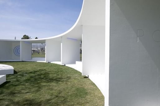
For his Coachella installation, Smith designed a donut-shaped, all-white pavilion with mirrored stainless steel columns. Inside the pavilion, a series of 6-ft.-diameter "portals" generate color gradients, apparently in reference to the California Light and Space movement of the '60s and '70s. The pavilion also houses a mesquite tree and patches of grass for visitors to lounge upon.


Bésame Mucho
Roberto Behar and Rosario Marquardt (R&R Studios)
The least architectural of these installations, Besame Mucho deserves a mention since its designers, the Argentine-born, Miami-based duo Roberto Behar and Rosario Marquardt, both studied architecture at the Universidad Nacional de Rosario.
Inspired by the Hollywood sign as well as the famous song that gave the project its name, Bésame Mucho contains some 100,000 silk flowers. According the artists, the installation is an "imaginary solution for a better world to come, a future of everyone dancing in the green — poetic and political, without being militant, a way to criticize with a positive point of view."


For related articles, check out these links:
No Comments
Block this user
Are you sure you want to block this user and hide all related comments throughout the site?
Archinect
This is your first comment on Archinect. Your comment will be visible once approved.