
The title "Rock and Roll Fantasy" might be a little misleading for this SCI-Arc studio project lead by Ball Nogues ' Benjamin Ball, Gaston Nogues and Andrew Lyon. While the program was 100% rock and roll, the practical lessons learned during this collaborative design-build experience were far from fantastical.
The goal of the studio was to develop an iconic architectural installation for the popular music festival Coachella . The students had to work within the tight constraint of a single semester to design and build a structure using a budget of only $15k.
Ball Nogues' studio is across the street from the Archinect HQ in downtown Los Angeles, so I was fortunate enough to follow the progress of this endeavor since the conception, prior to the start of the semester. I caught casual stories and occasional development drawings during my lunchtime visits with Benjamin. It kept me very curious and, honestly, a little doubtful that they could pull off such an ambitious undertaking. The result, as you will see, proved me wrong, but the story of the process through which this project took form is what I find most inspiring.
- Paul Petrunia
Elastic Plastic Sponge
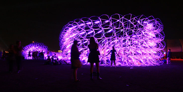
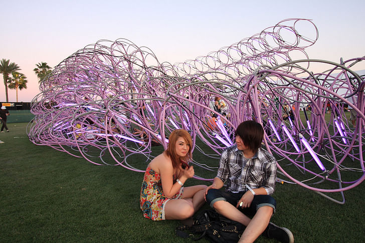
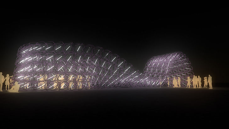
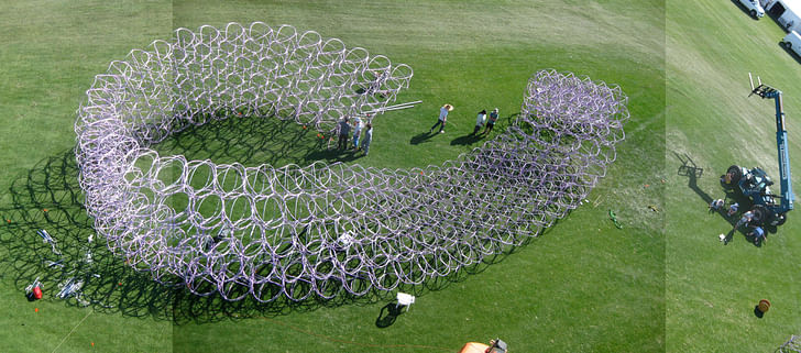
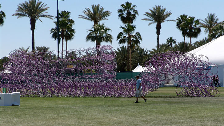
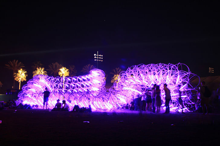
The Elastic Plastic Sponge was created by students from the Southern California Institute of Architecture (SCI-Arc) led by Benjamin Ball, Gaston Nogues and Andrew Lyon of the Ball-Nogues Studio. The Elastic Plastic Sponge is a large scale installation and can be twisted, arched and curled to form different types of space including a lounge, a theater, or a large sculptural Mobius strip. In the desert heat of Indio, the architectural installation will provide a respite from the sun by making shade and mist while at night, each “cell” within the Elastic Plastic Sponge supports a fluorescent tube–the tubes shift in orientation relative to each other to create the effect of sweeping motion. The motion effect is evident from close-up as well as impactful from across the vast festival grounds–an important asset in an environment of throngs of festival-goers and competing spectacles.
The Elastic Plastic Sponge is a unique structure. In architecture terminology, the phrase that describes a system whose form is derived from its material properties is “form active.” These types of structures are difficult to study using software. They often require architects to explore their designs by testing full-scale mock-ups, and using that empirical information to help inform the process of digital modeling, which is studied in the studio rather than in the field.
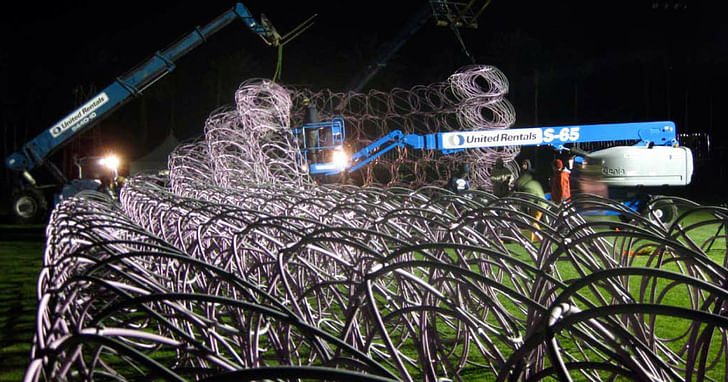
The Elastic Plastic Sponge is comprised of 250 cells, each fabricated using custom jigs designed by SCI-Arc students. The cell module is a very effective way of constructing a temporary structure: each can be transported as a flat unit to the Festival and rapidly assembled on site.
From the Festival’s standpoint of an event spanning several days, the Elastic Plastic Sponge can be rapidly reconfigured to create unique spatial arrangements; its flexibility allows the designers to adapt to changing crowd, climate and site conditions. From a pedagogical standpoint, the Elastic Plastic Sponge's mutability enabled students to examine its unique structure at full scale; working and reworking its shape as they would a digital model.
Paul Petrunia: How was the idea for this studio conceived?
Benjamin Ball: In the fall of 2008, Phil Blaine, the art curator for the Coachella Festival contacted us to say that he wanted to do something with SCI Arc for this year's festival. Ball-Nogues Studio created a project for the '08 festival entitled Copper Droopscape, so Gaston, Andrew and I know Phil well. Ming (Fung), Chris (Genik), Phil and we had a meeting at which Ming and Chris proposed we develop an upper division elective design studio out of which would spring a project for the Festival.
We’ve been thinking for a while about how one can be an experimental practitioner within a world depleted of the financial capital to fund most building projects. What are some options? Music festivals commission installation projects. Festivals are thriving semi-public spaces that exist for short periods of time. There are several factors at play (at music festivals) that are similar to those in our cities: organization of space, infrastructure, public space, waste, traffic, mobilization, spectacle, and vandalism – to name a few.
Given we were dealing with a festival that is renowned for its indie rock, what would be a “rock and roll” architecture? It's sort of corny on the surface, but when I started thinking about it more deeply, it suggested an approach to making something happen with available resources, to being part of an ensemble where performance was paramount, and work intended to be experienced viscerally. Festival installations, given their budgets and logistics, require a close integration of design and fabrication. A comparison could be made to rock as a method of composition where a songwriter engages with the performance directly by playing the music versus say classical music where the composer may not be one of the players; the composer is responsible for the recipe, other people play the music. It is design with realization as its primary goal rather than the pursuit of the representation of idealized states (a common approach in school). We titled the studio Rock and Roll Fantasy: SCI Arc at Coachella to provide a window into what it means to build in a festival environment. We think that festivals deserve more thorough consideration from architects.
Phil pledged a 15k from Goldenvoice for the project about two weeks before the beginning of the semester. The outline for the studio needed to come together very quickly. We wanted a situation where students would have to grapple with the challenges of designing and building something that was uniquely suited to a festival environment based on analysis of the festival as a public space. We wanted them to take responsibility for their choices and prove feasibility. We aimed to have them investigate a range of festivals as precedents so that they would begin to understand the context and see their endeavors as part of the evolution of transitory spatial design while considering the history for this type of work. They went though a research phase looking at festivals and spectacle events across various cultures followed by the history of the rock festival from Woodstock through the charity festivals of the '80's to Pink Pop and Coachella. Finally they did a case study analysis of various lightweight structures and temporary environments – the studies ranged from “installation art” projects involving an architectural approach to structure, to formally engineered lightweight structures such as those by Otto, to floats for the Tournament of Roses Parade.
Explain the relationships between the studio, SCI-Arc, and Coachella organizers.
The administration at Sci-Arc facilitated the development by providing leeway for the students to take on a demanding project and enabled it to evolve organically – the process involved a lot of trust. You are talking about three different cultures coming together to create something within a very short time frame – it could have been difficult, but it wasn't. Each has its own set of needs and goals for the project. Design for festival environments does not march to the beat of either the professional or academic architecture drum: the expectations of the respective audiences are different, the time frames are different, the budgets are different, the relationship between the designer and production of the work is different, and the logistics of production are different. The administration at Sci-Arc facilitated the development by providing leeway for the students to take on a demanding project and enabled it to evolve organically – the process involved a lot of trust. The same goes for Phil and the Coachella people – they know how to foster an environment where these projects can be successful. Phil knows when to step in and knows when to give the development of a project space.
Describe how the design for the pavilion evolved. Was it a group design project from the beginning, or did it emerge out of individual studies?
We had a terrific group of students. It was important to encourage camaraderie among the students as well with the production staff of the Festival during the 14 week term. There was an exploratory competition within the studio that was evaluated by the creative staff of the Festival followed by a development and fabrication phase where we collaboratively synthesized the ideas explored in competition; that synthesis yielded the Elastic Plastic Sponge.
What were the more inspirational student proposals that had the most influence in the final design?
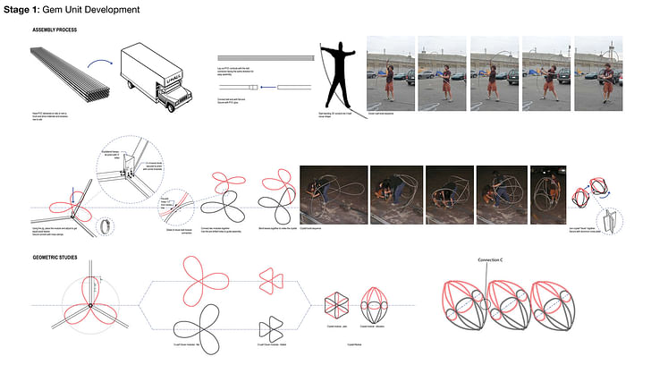
From a structural perspective, two projects in particular held promise – the team of Benlloyd Goldstein and Joanne Angeles had been studying bowing and looping plastic tubing into individual cells (or what came to be known as “gems”). The gems had springiness to them which was very interesting. The gem also occupied a lot of space while using very little material – an important factor in this project given that the one of the only stipulations for the project by Phil was that it be big enough to hold its own within the chaos competing spectacles within the Festival. The question was how to aggregate the gems to become a compelling and feasible structure?
The team of Will Kim and Jorge Miranda proposed a shade structures using short tubes that were packed into sheet assemblies to form what could be considered an architecturally scaled composite material – like a giant honeycomb except the cells were tubes rather than hexagons. These could be flexed into shell structures and vaults in a 1/2” scale model but their potential at the scale of building was an open question: what combination of tube material, tube depth, wall thickness, and packing strategy would produce a feasible structure at the scale of architecture? It was a material dependent question that would have been very hard for us to analyze digitally and very time consuming and costly to analyze using full scaled mockups; there were too many unknowns.
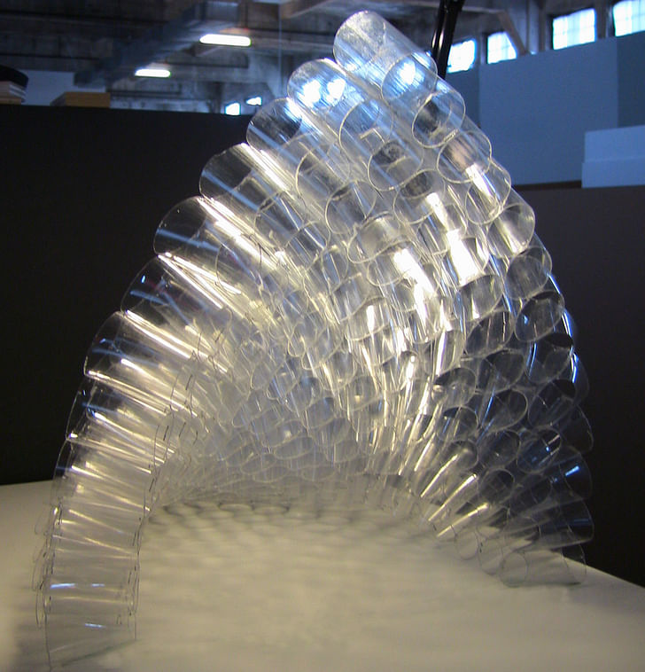
The structure of the Elastic Plastic Sponge was a combination of the gem concept and the giant composite concept. The question became “can we aggregate the cells to form a giant ribbon of tissue 250 feet long then bend the whole array into a shape that meant something as a space within the Festival?” The photograph we made of green scrub pad material cut into a ribbon then twisted into the shape of the Elastic Plastic Sponge illustrates this procedure quite nicely.

The project is form active: the parameters of its potential shape were dependent on its material properties and how that material gets configured. It was important for the students to understand that you have to work with the material to get that weird shape, you can't for example, imagine it with the aid of a computer then using a numerically controlled machine and a subtractive milling or cutting process make it out of a solid material. The form arises out of the materials and their configuration.
Tim Peeters and Mandana Ozlati had proposed a project that used light and mist as a means to creating atmosphere. We knew that the lead up to the opening of a festival can be chaotic. Sometimes festival organizers need to make changes to the ground plan. A fixed spatial configuration for our project could have been problematic; one needs to be able to adapt to a changing context. Three days before the crowds arrived, the producers were considering moving our project to another location on the grounds that had very different characteristics than our site: it was in a more confined space at the terminus of the main channel of human movement – a cul-de-sac. Our configuration would not have worked. The flexible ribbon was well suited to abrupt changes in context because we could curl it into a different shape that befitted the new situation; we wouldn’t have needed to build something new or subtract pieces.
Atmosphere is paramount in a Festival – a novel structural system doesn't guarantee that a project will succeed. We all agreed that our structure needed spaces that bring people together while creating a strong shared memory. Tim Peeters and Mandana Ozlati had proposed a project that used light and mist as a means to creating atmosphere. Their approach influenced the lighting as did the proposal made by James Jones and Deana Giordano.
What is the primary material used for the pavilion? Why did you choose to use this material?
The material was a lightweight flexible plastic tube. The material was a lightweight flexible plastic tube. I think Benlloyd and Joanne chose the material because they had been studying how to weave a structure - like it a big basket. They needed an inexpensive and easy to find material during the exploratory phase of their proposal. It is not a sexy material viewed in its unformed state, but as they learned its bowing properties through building mock ups their experiments began to look quite elegant. They developed a tacit knowledge of its formal potential; the gem then became the module for the Sponge.
How was the structure held together?
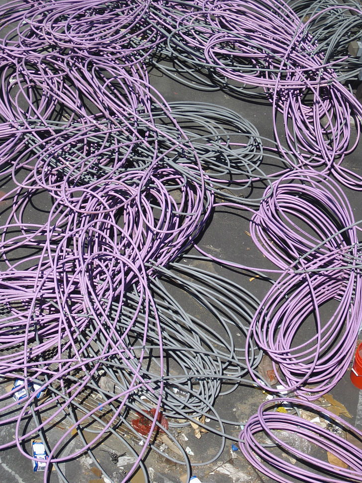
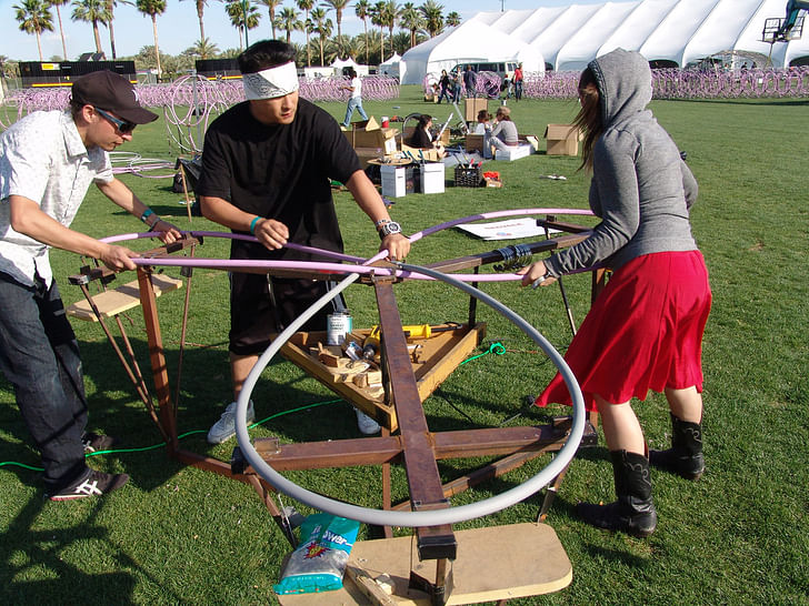
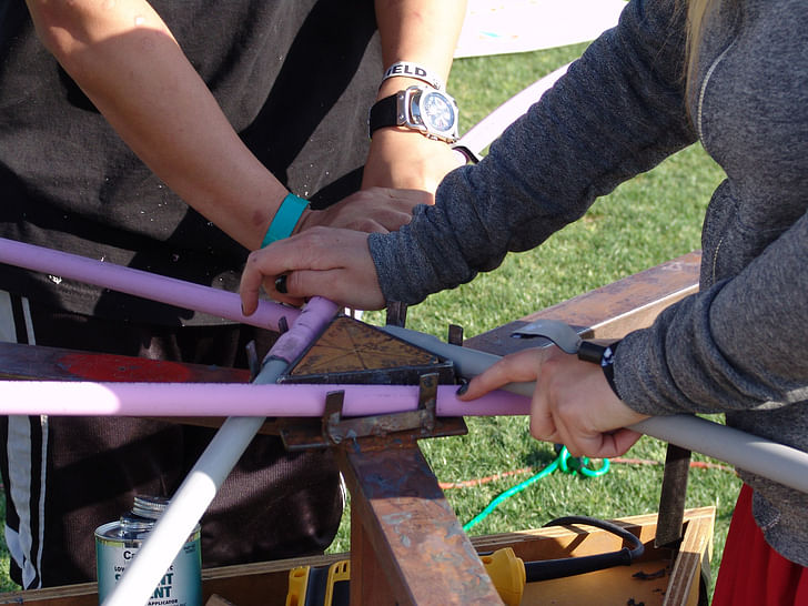
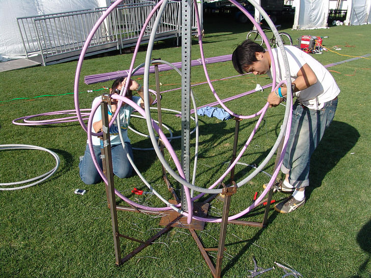
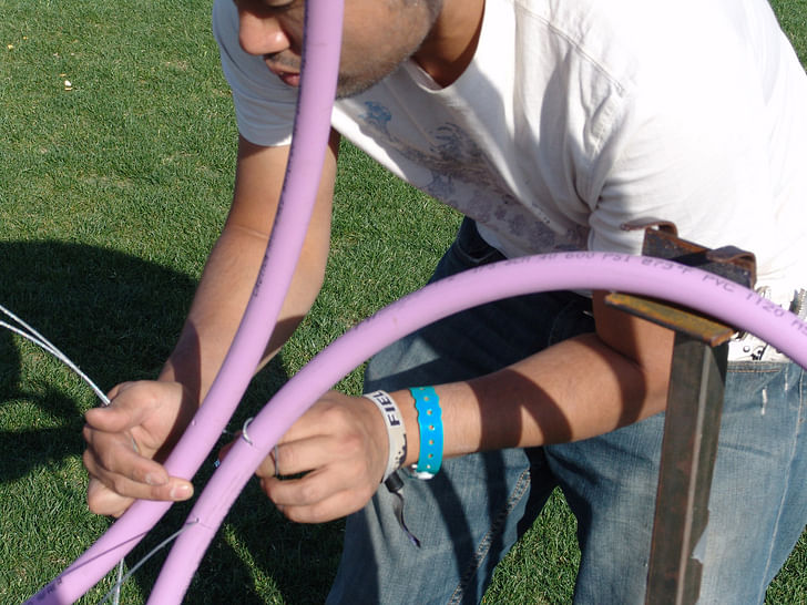
We held the individual gems together using loops of aircraft cable precisely threaded through very small holes drilled in the tubing. There was a lot of testing that went into this - the plastic can crack if this is not done precisely. The gems were held together as a big ribbon using worm drive hose clamps in precise locations.
Was it structurally sound?
The structure operated like a big sponge – it is inherently squishy, so it is difficult for me to use a sound / unsound rubric. If a couple of people hung on the arch portion of it, it would droop downward but not break. This was the intent: it was not meant for people to hang on it, but for it to be squishy – you can build unconventional structures like this for a festival!
That, by the way, is how Jeff Morrical came up with the name "Elastic Plastic Sponge", it is pretty much spot on. It would not fall down under heavy winds either, it was too open and was anchored to the ground using earth nails. In heavy winds it was stationary because it was so open.
How did you light the space?
There were two student projects that really took on light as a generative tool – the team of Deana Giordano and James Jones, and the team of Mandana Ozlati and Tim Peeters. Their studies of color and atmospheric lighting effects as well as technical considerations helped shape the final concept. We arrayed the entire Sponge with T5 fluorescent tubes gelled purple – one fixture per gem.
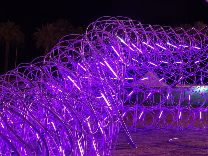
This achieved two things, it gave the whole project a soothing glow and it indexed the twisting and arching of the ribbon to yield a kind of visual dynamism. The lighting enabled one to really understand the deformation of the ribbon shape as a whole while making the work visible from across the 90 acre field of competing spectacles within the Festival. We thought it was very important to create a beacon with the lights.
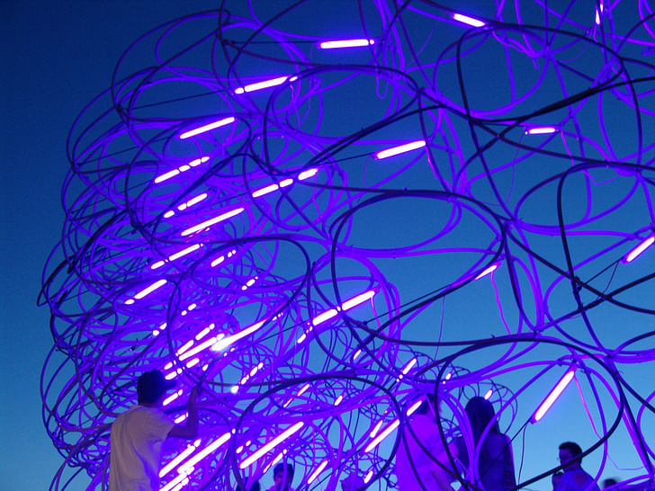
The lights were loaned to us by American Apparel – Chris Ball is the lighting director for American Apparel and facilitated the loan. The attachment mechanism (bungee cords stretched through polycarbonate tubes that can be rapidly deployed and demounted within each gem) was originally conceived by him – the studio then adapted this system for the project.
How long did it take to assemble? Disassemble?
It was military style logistics executed with a communal ethos: we were all going to have to cooperate to make it a success. We encouraged resource sharing (not only because it was essential for this project but because we believe it has become necessary in design practice as a whole).
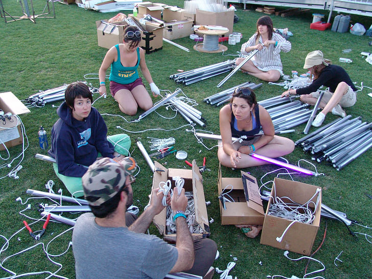
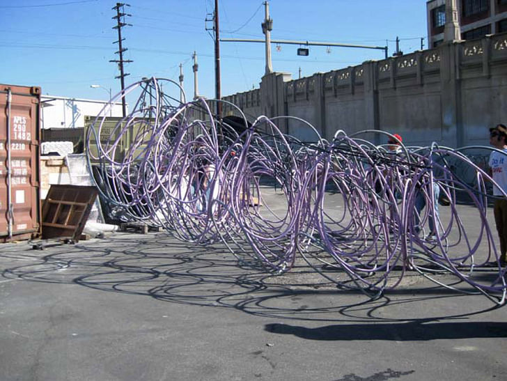
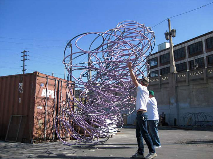
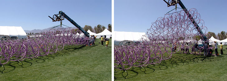
There was so much to figure out, everybody in the studio contributed to the project. We looped the tubing into 500 flat “clover leafs” using custom steel jigs – this took about 2 weeks. At this point, Anthony Lagunay and Seyoung Choi handled a lot of the transportation logistics, hauling the clovers in a five ton truck along with our tools, camping gear, and our kitchen (well designed by Deana Giordano) to the Festival grounds in Indio. Once on site the students assembled the clovers into 250 gems, and then attached the gems into the big ribbon. Andrew Lyon, from our studio and one of the instructors, was at the festival grounds from the beginning keeping construction on schedule. When the ribbon came together we brought in two cranes and twisted it into an amphitheater shape and the arched passageway – that took one long day.
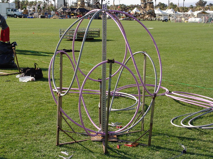
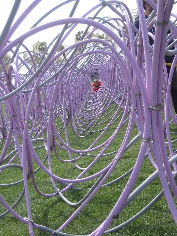
The studio was camping on site for 11 days – one day loading in and building the camp and kitchen, seven days doing assembly, three days enjoying the Festival, and one day disassembling and loading out. As far as I can tell it was a good experience for everyone (although Monica Gutierrez cracked a tooth that she had to have extracted, this didn't, however, slow her down). One intensely focuses on building the project for seven days then there is a three day party that happens while documenting and observing how the public responds to the work.
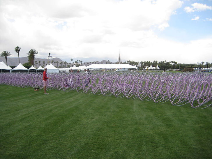
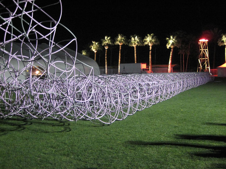
This is obviously a non-traditional structure. What type of real-world lessons did the students learn during the design-build process?
One big lesson that people got out of it was that materials and their aggregations can generate the parameters for form making... you couldn't just twist the big ribbon in Maya and expect it to perform the same way in meat space. I think there is a lot that can be learned from this type of project. One big lesson that people got out of it was that materials and their aggregations can generate the parameters for form making. That may seem obvious but it was not when developing this structure and form active structures in general – you couldn't just twist the big ribbon in Maya and expect it to perform the same way in meat space. We did a lot of testing of the material and structure as a whole using full scaled mock ups in the SCI Arc parking lot. On site with the ribbon assembled, we got feedback from the structure itself by doing test lifts and twists using a high reach forklift (essentially a crane). It was only after we had gone through that process that we could “find” the form that was there during the festival. It meant each of us developing an intuition for how the material and the structural system wanted to deform based on tactile experience – it was the only practical way of studying it. You don't get to explore this kind of thing at this scale too often – real world or academic – it would be very impractical. The Festival production team gave us extensive access to high reach fork lifts that enabled us to lift and twist the shape until we had it right. From a pedagogical standpoint students were working with an analysis model for form finding but at full scale.
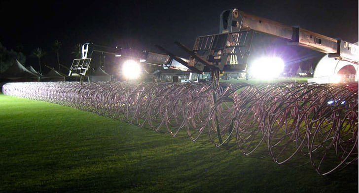
A second lesson that became apparent involved fabrication. We went through many different mock-ups and time trials and material tests. Since the students built the installation themselves, through the mock up process they became intimately aware of how their hands would have to negotiate the physicality of the built piece. This is an important part of our practice, in terms of considering how the production of these structures is designed from the hand assembly to the heavy equipment used to located and raise them.
A great lesson the instructors got was that we could work in collaborative environment where the final resolution of the project is not clear.
It would be great to hear what lessons the students learned from their points of view.
So we asked student Benlloyd Goldstein what he learned from this studio...
First of all, the Rock n' Roll Fantasy studio was a fun semester. This was hugely do to our professors. Benjamin, Gaston, and Andrew led us through a studios dream semester : design, build, party. Normally a semester involves digital pinups and printouts, hours on end in front of the screens, and evaluation based on imagining how the design could be experienced at full scale. However, we started this semester knowing that we would be working through both physical models and computer models to build a full scale space for Coachella as a team, and that it had to rock.
I think 2 important lessons i learned this semester was one relating to design and one relating to the execution of a project.
design//
No matter how much we seem to be enticed by the sensations of form on the screens, one thing alot of us students took away from this semester was the idea of "listening" to a material that has embedded complex structural logics and abilities.
For example, Joanne and I spent a while working with tube models, looping them and bending them to make them strong and springy ; every different scale model and material would generate its own unique set of curves, its own solution. The final gem solution was more of a discovery brought forth through working with the material at its specific scale than an imposed "image" of what the design should look like. The result was a system of Lissajous like curves that yielded an optimized physical performance of the unit as well as an inspiring "image".
Lesson : listen to matter
execution//
Some design studio semesters focus on developing an individuals methods and production, causing the student to rely on him/her self to achieve design goals. This semester was different.
This semester gave us an invaluable lesson in getting a project developed and built as a team for a real client with a real budget in a short time frame. There really is no way this could have been done without the efforts of the whole studio and the instructors. From the jig construction , fabrication process, budget, designing the transportation, deployment, down to the healthy eats of the kitchen; we worked, camped, partied, laughed, cried, and bonded as a studio. As we met constraints we would respond as a team, and the design would evolve further, until we met our goals. Then came the final mission which was to party! It was an awesome semester, and Im so glad I got to be a part of it.
Lesson : healthy team dynamics are essential to the success of built work
Observing the way the public responded also provided important lessons.
So how did the concert-goers respond to the installation? Was it used as you expected? Were there any surprises?
During the day it was a sculptural curiosity that cooled people off with mist. At night it completely transformed – people flocked to it like moths around a light – it was a different place, they came there to soak up the atmosphere; the atmosphere affected them. It was a kind of psychological oasis apart from the mayhem of crowds and loud music; it was soothing. People hunkered down inside of the gems (except for a few times when we needed people to clear out to take “architectural” photographs devoid of people). People smooched, lounged, and smoked in it.
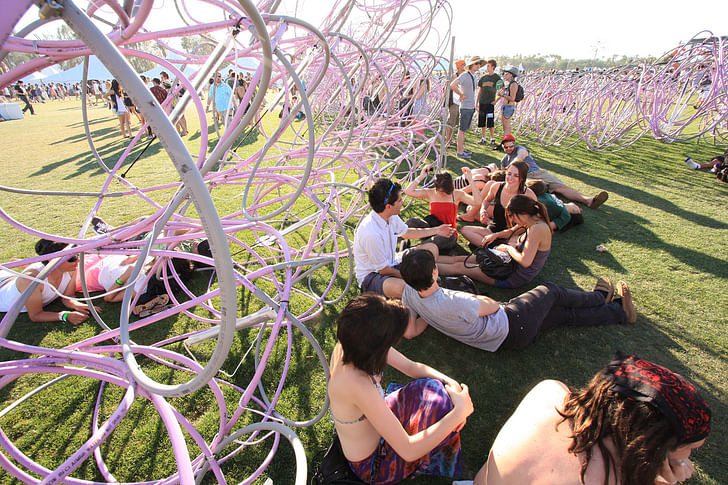
Most concert goers are not there to understand form active structures or to look critically at a design methodology. In working on a festival, designers can have these agendas for themselves but it is not the same as exhibiting in a gallery or an art fair where there is an expectation that the audience will try to understand the work as developing through a methodology and set of intentions outside the creation of spectacle and atmosphere. So we were advancing different agendas - one for the Festival organizers and one for the team.
It had clear spatial typologies within it – an amphitheater space, a vaulted passage space and individual gems which became private chill out pods. It had clear spatial typologies within it – an amphitheater space, a vaulted passage space and individual gems which became private chill out pods. The passageway was oriented with the festival ground plan in mind so that the crowds moving from stage to stage would see it and pass through – it had misters , people would pose in front; it was a continual photo opportunity. All of this was expected.
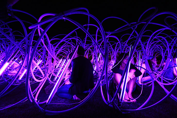
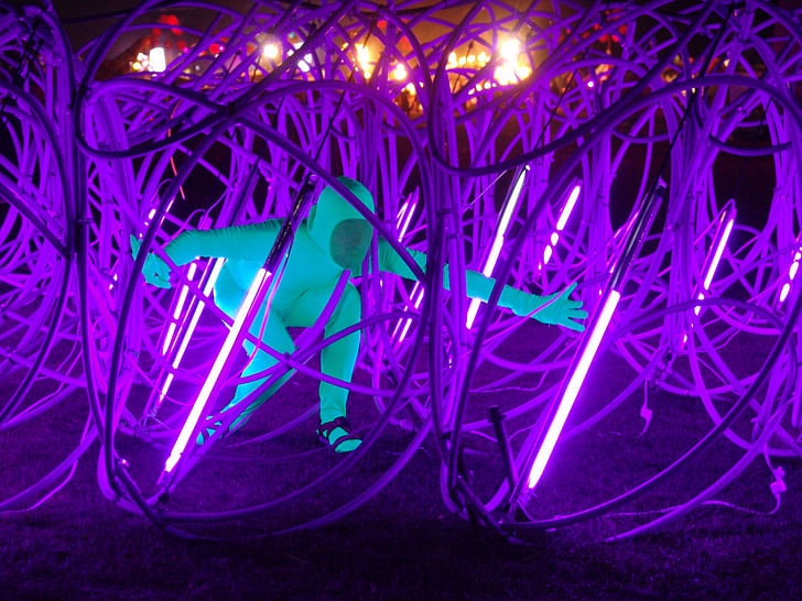
One night, we found a guy in a featureless chromakey green body suit posing like a superhero in some early 80's post apocalyptic radioactive world: it was as though the Sponge was designed for him. The purple light illuminated his suit in a way that made him seem like he had been manipulated in Photoshop; I think it may have made a lot of the public question the amount of drugs they had taken.
We had an Air Guitar Karaoke “Aireoke” event MC'd by Dan Crane AKA “Björn Türoque” - a professional air guitarist, this happened in the amphitheater – it was a hoot.
Are you going to offer this studio again in 2010?
We'll see, stay tuned...
Paul Petrunia is the founder and director of Archinect, a (mostly) online publication/resource founded in 1997 to establish a more connected community of architects, students, designers and fans of the designed environment. Outside of managing his growing team of writers, editors, designers and ...
10 Comments
Nice feature Paul...
I am guessing the photos were taken by the studio? The night ones seem all warm and fuzzy. Maybe it 's the purple lighting. Because the material doesn't seem to particularly exude those characteristics...
Very cool.
I love the idea of using cranes to flip this thing around like a giant piece of foam rubber. The tubes have a material logic, but the the thing itself becomes a huge chunk of stuff, too.
good job guys looks great!
I haven't read the whole article, but dang, that thing is so, so cool-looking! I love it. Congrats students on a fantastic piece of work.
Now, can you bring it up to the Oregon Country Fair? I'd love to see the old-time hippies interact with it.
nice work!
"in meat space" though?, oh I get it: in meatspace...
You worked as ants with some genetic inspiration for survival; this kind of exercise brings more than whole year of sitting in front of computer screen. Such training brings a healthy learning in a good team ambience. Result is amazing. Congratulations!
very beautiful!
Way too cool…. and very much within the ‘interventionist tradition’ of the SCI-Arc BYOD (bring your own design) ethos.
First year studio SCI-Arc students under Glen Small designed transportable rod and translucent canvas tensile tents and carried them site to site all over LA, a sort of bicycle driven Instant City. It made the cover of the Sunday LA Times Magazine.
Another Glen Small / Adhi Ladhi first year studio designed a playground structure the kids called “The Spider” and transported / built it for an orphanage in Mexico..
My own experiences with interventionist systems was also at SCI-Arc. As students we were inspired by the visionary works of Buckminster Fuller and designed, and fabricated out of white cloth and fiberglass rods, the worlds largest tensegrity sphere. At the first Los Angeles Whole Earth Expo the sphere was suspended from the ceiling of the Los Angeles Sports Arena and inside, projecting outwards, were three slide projectors each screening images against the inside surface of this huge lit ball.
eric chavkin
Great:)
tiight
Block this user
Are you sure you want to block this user and hide all related comments throughout the site?
Archinect
This is your first comment on Archinect. Your comment will be visible once approved.