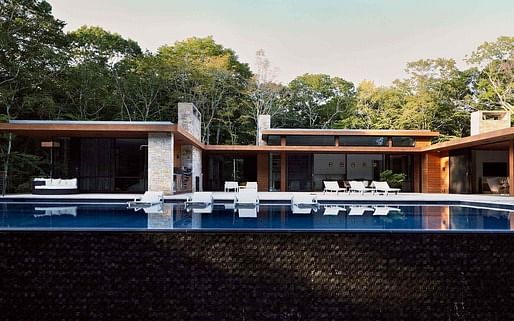
Ever since Mies Van Der Rohe's groundbreaking designs popularized the deceptively simple glass facade, architects have experimented with the incorporation of the material in their designs. Some, such as PLP Architecture, have opted to create commercial buildings that utilize an almost entirely glass facade in order to facilitate new types of professional interaction. Others, such as Kevin O'Sullivan + Associates, have tempered their use of glass with other materials to create a more integrated feel with the surrounding landscape. Archinect decided to survey these two firms about the challenges they faced in their design process. Here, in their own words, the architects speak about how they ultimately arrived on their new final designs.

David Leventhal of PLP Architecture on the Deloitte HQ
As Sylvia Lavin puts it, 'Architecture generally considers environmental design to be repulsive, an odious amalgam of pseudoscience, bad form and moralism.' The challenge for us was to conceive a green building that does not look or feel like a green building. We wanted to deliberately undermine and subvert all the clichés accumulated over years of mediocre green-wash architecture.
We deliberately restricted ourselves to a ruthlessly simple formal palette, establishing architecture as an interplay of environments and atmosphere and moving away from architecture as an object.
Instead of a normative office space, predicated on a logic of maximum efficiency, we proposed a sequence of non-standard spaces that intensify human interaction to produce unexpected situations and counter-intuitive effects. These internal spaces communicate with each other and, through the lens of an atrium, they also project this atmosphere outward as a civic spectacle.
One can imagine that it was not the easiest task in the world to convince our accountant clients to choose such intangible qualities over measurable net area.
Kevin Sullivan of Kevin Sullivan + Associates on Amagansett Bell Estates II
I scoured the areas of Amagansett and East Hampton with the clients to find a suitable property. I feel that Architecture should grow organically from the ground and good 3D topography enables this. I selected a property that had great topography and wonderful privacy in Amagansett. I designed the floor plans and elevations as a response to the topography and the client's needs. I strive for a feeling of timelessness in the design, taking reference from the midcentury modern era and reinterpreting it for the 21st century modern lifestyle.
The is no delineation between interior and exterior spaces for me. It should be as much of a seamless blend as possible and having a lot of glass is a way of achieving this goal.
The interior color palette is a reflection of the exterior.
No Comments
Block this user
Are you sure you want to block this user and hide all related comments throughout the site?
Archinect
This is your first comment on Archinect. Your comment will be visible once approved.