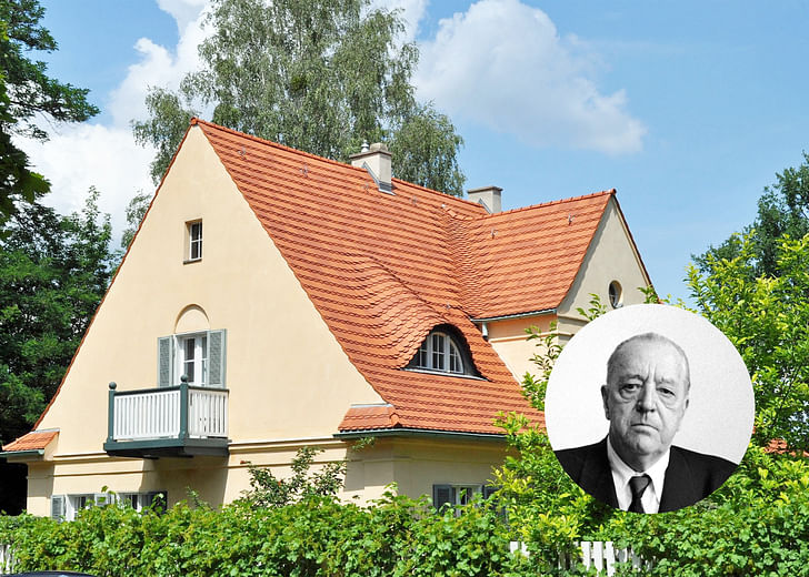

From the Ground Up is a series on Archinect focused on discovering the early stages & signs of history's most prolific architects. Starting from the beginning allows us to understand the long journey architecture takes in even the most formative of hands and the often, surprising shifts that occur on its journey. These early projects grant us a glimpse into the early, naive, ambitious—and at points, rough—edges of soon to be architectural masters.
A storied figure in architecture’s history from built work to the academy, what is left to say about Ludwig Mies van der Rohe? After all: less is more. However, during the install of his show at the Museum of Modern Art in 1947 — three years after his move to the United States — Mies protested the inclusion of his first commission to the then director of the architecture department, Philip Johnson.
Riehl House, located in Potsdam, Germany and completed in 1907, is an eighteenth-century manner home for professor Alois Riehl and his wife, Sophie Riehl. The couple commissioned then 20-year-old Mies to design their home, where at the time Mies was working as a draftsman for architect and furniture maker Bruno Paul. The two-story home sits on a podium, with stucco walls and a steeply pitched roof capping what desires to be a single volume. At first glance, it is easy to agree with Mies’ protest to the inclusion of the home in his body of modernist work. However, on second reading, it seems as though Mies himself missed the clear reading of his hand attempting to master material and form that would later shape his work and position on architecture.
From stucco in Riehl, to brick in Haus Lange and Haus Esters, to steel and glass in his future towers that would define the American metropolis, evolved not only Mies’ work but also the discipline of architecture itself.
A dissertation could be written on Mies’ corners. The evolution and resolution between the change of material and completion of form seem to be the project that runs throughout his work. From stucco in Riehl, to brick in Haus Lange and Haus Esters, to steel and glass in his future towers that would define the American metropolis, evolved not only Mies’ work but also the discipline of architecture itself. In Riehl, an attempt to resolve the house as a single form can be seen where wall and roof meet. The overhang of the roof drastically pulls in, only offset a few inches from its flush façade. Upper windows are cut cleanly through the mass in primitive forms without the clutter of frames. As the shingles delineate from the roof’s mass, seamlessly pulling the form as a continuous fabric leaves remnants of Art Nouveau curvilinear forms. Here the second-story window tucks underneath the fold.
The wall defines architectural space beyond enclosure and establishes a misreading between exterior to interior.
The house is propped up by a retaining wall on its North side. Simultaneously acting as plinth in the horizontal plane and a wall in the vertical, the retaining wall transitions effortlessly into the main façade. This single wall can act as a window into the rest of Mies’ work to follow. The wall defines architectural space beyond enclosure and establishes a misreading between exterior to interior. The use of architectural elements — ground plane and vertical wall — are flattened into abstractions and no longer held within the constraints of their predisposed functions. Here, Mies shows his early mastery of element and material into technique and image.
“Of all the great modern architects Mies van der Rohe is the least known.” Philip Johnson states in his first sentence of the 1947 exhibition catalogue. How time changes everything. It seems as though the desire for amnesia in forming one’s identity does not seem too culturally different over seventy years later. However, if each project is considered a “try” Mies would later traverse through the material, through technique, and through identities to master his work, leaving a long trace of a single Architectural Project that begins with Riehl.
Daniela Leon is an editor of PAX, a publication about present day cities and past architects.
1 Comment
Love how Mies' portrait is slightly rotated, gives it the exact right attitude :)
(in the first hyperlink is written van der Rhoe instead of van der Rohe)
Block this user
Are you sure you want to block this user and hide all related comments throughout the site?
Archinect
This is your first comment on Archinect. Your comment will be visible once approved.