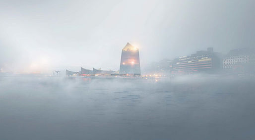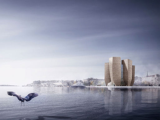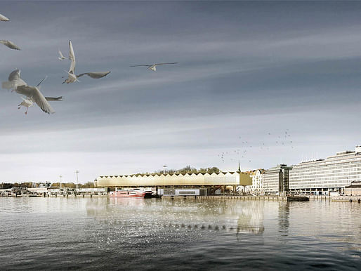
December 2 marks the day that the six finalists of the Guggenheim Helsinki competition are revealed. The controversial competition has sparked enough debate in the architecture + design community that a counter-competition called The Next Helsinki is currently having their own call for alternative solutions. Stage One reeled in an entertaining mix of 1,715 entries from 77 countries. — bustler.net
The 11-member jury, who convened for four days last month, were tasked with selecting the proposals that show the most potential for developing into outstanding designs during Stage Two.
Here are the six finalists:


More details about them on Bustler.
Previously: What do you think of the Guggenheim Helsinki Stage One entries?
21 Comments
These all seem nice, different direction and unknown archs, but I was expecting just a bit more from the judges. Kind of second rate ideas I've seen before--there's the Holl ref, there's the Ingels butterfy, the Piano roof....nothing that will get funders excited or that create a new guggenheim paradigm. I think all of them use the "beacon" or "lighthouse" concept. Meh.
Gonna wait and see the Next Guggenheim competition. Maybe there will be more intelligent ideas.
The jury deliberation process is, to me (being a dork), an interesting read.
Important:
The single theme, which linked the chosen six, and united the Jury, was the impulse to expand the idea of what a museum can be. How can this new museum create a vital, meaningful, public and intellectual presence within Helsinki? Which of these concepts will develop so that they bear comparison with the city’s architectural exemplars?
The third one, the oblong form draped by flowing illumination, looks gorgeous in that rendering.
agree. the third one seems very elegant.
From the competition conditions:
"the design should be located so as not to obscure views from Tahtitornin Vuori Park past and over the building".
from top to bottom:
#1 Gehry light, but I like the beacon concept and sexy fog rendering.
#2 An uncomfortable cold, dark courtyard surrounded by seemingly windowless towers. Are those wood shingles?
#3 Christo was here. Or Iceberg by day, Superman's crystal fortress at night. The interior has possibilities.
#4 The Black Box has some interesting interior courtyard ideas, but the exterior is forbidding.
#5 Airline / shipping terminal? An ill-proportioned industrial space with an odd mix of materials.
#6 A really, really bad student project. How did this make the finals?
I can't even begin to image reviewing >1700 entries.
where is the guggenheim potato?
potato? oh, they left that in the microwave.
oh, and i like the cymbals proposal the best.
we are just hitting ourselves on the head for not completing the project on time... damn, we could have been contenders...
Seriously though, being somewhat familiar with the context and the competition, the results are perfect. Akin to Chicago Tribune and Sidney Opera House contests, G.H. managed to create a major-ness about it. Architecturally speaking, it also manages to put most familiar styles onto the shelves. The shelves full of rendering lights, flawless photoshops and other up-to-date energies aside, it is the end game of culture industry expansion. I am certain the market for it increasingly getting crowded and competition is intense. Culture is now associated with intense commercialism and consumed inexpensively everywhere. However beautiful its imagery, the competition is engulfed in the saturation times, This is why Guggenheim Helsinki is pointed a finger.
from the competition conditions:
" the design should be located so as not to obscure views from Tahtitornin Vuori Park past and over the building".
Love this sentence, Orhan: Culture is now associated with intense commercialism and consumed inexpensively everywhere.
This building will be wildly, ridiculously expensive to build, whichever scheme is chosen, I have no doubt. But it will be affordable enough for most people to attend or engage with, thanks to sponsors, and most people won't question whether this is a good way for consuming culture or not, because it will all sparkle.
Culture is intense commercialism.
There, I fixed it for you.
whatever, it still is a completely bogus result when they so blatantly violate the objective parameters of the design brief. IMHO there is no other lesson here other than that a jury will pick the most inoffensive aggressively generic designs when they are trying to placate a skeptical public. When a spokesman for the Guggenheim said that they need a lot of work and that they are not going to look like this and the deputy mayor says they are "interesting" it is hardly a ringing endorsement of their selections.
With the glass curtained proposal aside (which I'm rooting for!) I couldn't imagine why these museums would be significantly more expensive than any other contemporary art museum. The scale is sensible and there's essentially no beta testing for any of the construction techniques or materials.
I have to admit I'm enjoying this saga unfolding.
Agree with Nerd that program is all-important. Not that design arguments can't be made for modifying it but they should be clearly elucidated as part of the proposal.
Maybe they are - it would be nice if the finalist's proposals were presented in a larger format online.
vado you mean this right?
^Miles - if you click through here there are PDF booklets of each scheme large enough to zoom in.
There's more to #6 than the rendering shows. Actually I like that the rendering is totally indifferent to the look of the design. I'm undecided whether the proposal is a good idea or just interesting though.
I'm skeptical of the value in bringing a guggenheim to Helsinki, but most of these proposals seem like modest buildings that would be nice and flexible for use as exhibit space. I visited Helsinki a few years ago and really enjoyed the loose spacious feel of the harborfront - the 4 long low schemes seem to best incorporate that aspect of the site. Orhan, your scheme would have fit in nicely too.
Thanks. And you're right, #6 is an adaptive reuse, very interesting.
Upon more detailed review, the Iceberg's interiors are horrible, the shadowed public space under #5 is a disaster and there's a serious misrepresentation of scale in the renderings for #2.
We discuss these on the Archinect Sessions podcast this week!
The more I look at 31 Rooms the more interesting it becomes. If the brief truly is looking to "expand the idea of what a museum can be" then the introduction of thermal variety is an intriguing way to do so. Having worked for several years now in perfect 50/70 environment, and wondering why we don't just let these human objects age as they normally would in a human environment, I'm totally ready for some thermal experimentation!
Since the jury made a complete mockery out of the brief, I will respond in kind:
1. Hey dude, look at the lamp I found in the stoner section at Target.
2.As part of their new contract, the Keebler Elves received new living quarters.
3."See, I told you the mall would still be open".
4.Frank finished his cigarette, flipped it into the void and went back inside to stock the cereal aisle.
5.As the truck pulled in, Harriet the chicken clucked approvingly, blissfully unaware her new house was a rendering plant.
6."Honey, look at this ad, ceiling fans are two for one at the Dollar Store.
Just looking "beyond the brief", man, there is nothing like wrapping pedestrian motives in high minded rhetoric to make me laugh.
++ nerd
Block this user
Are you sure you want to block this user and hide all related comments throughout the site?
Archinect
This is your first comment on Archinect. Your comment will be visible once approved.