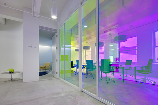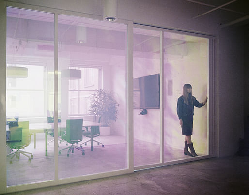
When it comes to a high-energy drink giant like Red Bull, most would probably expect their corporate offices to reflect the sporty, frat bro-friendly culture that the brand overwhelmingly attracts. Not a single hint of that can be seen in the company's newly designed office in New York by Brooklyn-based architects INABA.

In fact, Red Bull's New York office looks generic and insignia-free -- which is not common for large companies. INABA states that the design doesn't integrate the latest theories of workplace productivity nor is it driven by narrative or graphic imagery. It ignores workspace interior trends like grand-scale gestures, playful recreational lounges, or urban-chic office decor. On the other hand, the no-brand minimal aesthetic is a growing trend itself as well.


The office's "timeless" and brandless design questions the standard that corporate offices must be a spatial representation of the company and the brand qualities of which it established itself. "Red Bull’s New York space is the antithesis of this best practice...The space is dialed back to reset the focus of the experience on the basic architectural qualities of scale and light," INABA describes in a statement.
Below are further details from INABA of the office's design:

"Acknowledging that offices and technology are evolving quickly and the future functions of the work environment are unpredictable, the architects composed a layout of spaces with distinct, fixed features. The three types of spaces are large open zones, medium-sized enclosed areas, and small rooms."


"They are used now as open office seating, conference areas, and small meeting/workrooms, respectively. Designed to be unique in size and day lighting and not to any particular functions invites people to invent new uses for them in the future.
To emphasize these elements of the project, INABA worked with photographer Naho Kubota who shot the space using film. The images in this series include closely framed views that describe the sense of proportions and natural light in the spaces. Other photos by Kubota and Greg Irikura document the color of surfaces, materials, and furniture."


Project credits:
Architectural Design: INABA, Brooklyn, NY: Jeffrey Inaba, Ostap Rudakevych, Yoichiro Mizuno, Alan Kwan
Executive Architect: SLAB Architecture, Brooklyn, NY: Jill Leckner, Matthew Voss, Min Chen
Lighting Design: WALD Studio, New York, NY: William Armstrong, Kelly Roberts
Structural Engineer: Buro Happold, New York, NY: Jeffrey Thompson
Mechanical Engineer: Kam Chiu Associates, New York, NY: Kam Chiu
More photos can be found in the gallery below.
2 Comments
Nice, tasteful design. Totally agree that the basics of good workplace design are universal across different companies - with adjustment only according to the group dynamics and team vs individual work. Most of the flashiest/ gimmicky office spaces (esp in the tech sector) are about showing off to potential recruits rather than providing useful space. In contrast, the kind of flexibility this somewhat generic approach provides is very valuable.
But the photos seem to avoid showing the actual workstations where employees presumably spend most of their time. That should be a priority in the design.
I judge interior architecture awards occasionally, and the failure to photograph workstations is a common mistake. These guys also don't show the coffee bar, another place the workers every day. I like the anti-branding stance, but if you don't do brand visuals, there should be some decent art on the walls instead.
Block this user
Are you sure you want to block this user and hide all related comments throughout the site?
Archinect
This is your first comment on Archinect. Your comment will be visible once approved.