MADE UP: DESIGN FICTIONS is Art Center's new group exhibit surveying recent boundary bending design projects. The common link among the three dozen or so speculative works is an awareness of, and reaction to, 'the accelerating developments in technology'.
REVIEW. MADE UP: DESIGN FICTIONS
eric chavkin
All MADE UP and no where to go
MADE UP: DESIGN FICTIONS is Art Center's new group exhibit surveying recent boundary bending design projects. The common link among the three dozen or so speculative works is an awareness of, and reaction to, 'the accelerating developments in technology'.
Before I arrived I was expecting some pretentious art scene mostly because the exhibit categories seemed half-organized in hyped hipster-speak: GET REAL, FAKING IT, AS IF: MADE BELIEF; IN YOUR DREAMS. LIES. Instead there was music to listen to and not talk.
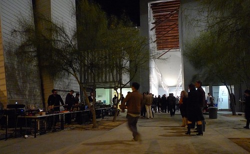
Always the outsider I instinctively pulled back from jumping in and listened first to the ambient sounds , later to passerby talk. The space was brightly lit, and I got to watch the gallery goers.
Drone…. …Drrrrooooonnnne…. Drrrrronnnnnne….Dddddrroonnnnne…. waves of sound to be with yourself. The high brisk sky was pricked with stars.
Drrrrrrone…. drrrroooonnne ….. The colder court space was more what I was into at the moment. Drrrrroooonnnnn as in moan.
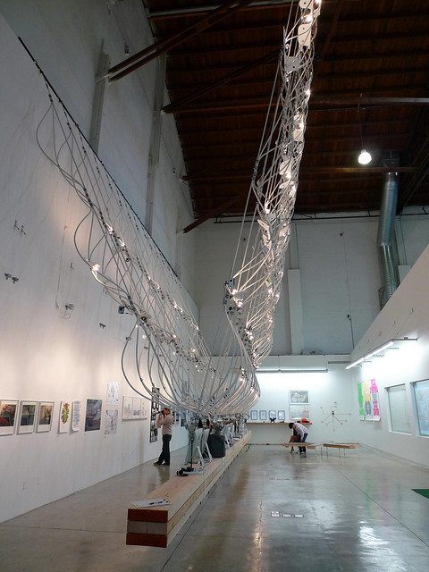
My spell was broken when curator Tim Durfee spotted my friend and enthusiastically described his installation. I backed off and listened. "This is a giant interactive scanner" I summarize: … embedded on the suspended frame are an array of 24 mini-cameras recording and transmitting multi-image projecting of the opening event in real time. There are outputs for printing, plotting and online. This I gathered is what it was all about.
Drone. From the distance I was at the installation looked good. The always positive Craig Hodgetts congratulated Durfee. I said from outside the work looked looked 'elegant'. Silence. Wrong comment. Duct tape is never elegant.
The large suspended installation by Durfee centers the exhibition space out-doing most all of the other art. At almost thirty-feet (unfolded) the folded vertical frame of woven tubing is a half-open (or half-closed) book. It successfully fills a very tall and awkward space. The rough and ready installation design is all off-the–shelf fasteners, tubing, and duct tape. As my friend says, tubing is the new 2x4. This was the most impressive part of the exhibit.
The new technologies that are not specifically mentioned are present as variations and permutations of software-based and miniaturized design. Some projects speculate on the possibilities and all are described as fictions. So every picture tells story as Rod Stewart sings so if you seen it before pass on to the next. There were a lot of 'I seen THAT before' comments.
I was hoping for some arty interactive video linked with the scan, something like face recognition linked to Facebook profiles or DMV records or something equally intrusive.. That would be something. But I was disappointed. It was like getting all dressed up and nowhere to go. I think the idea was better than the outcome and this is a work in progress.
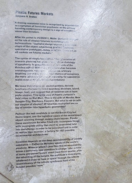
This was more like a contemporary overview and for me there was not much in ground-breaking design or mind-bending concepts. Highlights for me were Perry Kulper's works and Benjamin Bratton's word vortex Plastic Futures Markets. It was good to see a few of Coy Howard's hand-to-mouse renderings exhibited again and kids liked playing with the Macs that were there for the software based projects. As I mentioned the suspended installation by Tim Durfee was the best piece. The exhibit is on until March 20.
Wind Tunnel Gallery
Art Center College of Design South Campus
950 South Raymond Avenue, Pasadena 91105
Janurary 29 – March 20, 2011
10 Comments
link to art center event
http://blogs.artcenter.edu/dottedline/tag/tim-durfee/
eric, i am glad you wrote the review. i opted for cairo..


i just dug up my notes from the opening night, after i dropped you off late at night last month;
... But hold on.. There is more to the curators' show. Let me reconstruct;
in this case, the made up show is 'something' or an idea surrounded with object makers' objects to manifest the 'what?' interchangeable with 'now' interchangeable with 'this.'
Designers and architects are dutifully good at this. A social media spectacle with polished amounts of exhibition 'look,' admired by the excited audience, participants and flack juggling bloggers, burning man recruiters, scene of scanprint working at best to make the experience of the belonging, fullfiling and slopshistic.
At worst, failing to materialize in more serious ways in real time of the bigger audiences, yet, 'the utopia disposable' fistfighting, wanting to be jettisoned, but idle.
High expected with the curve shaped pvc pipes, the new 2x4 of the architecture gallery circuit, down beamed, and happy customered.
“Here you leave today, and enter the world of yesterday, tomorrow and the fantasy” said the dead in the urn Mickey Mouse He is off the shelf choarcol now.
It felt like he would, if he could, 'turn on the wind and puff.., liberated at last.'
Tonight we know, the real revolution is in Egypt.
Now, I don't want to review this show, I have already seen it years ago, in other places, few times. Besides, the night is really significant in Cairo.
1/29/2011, Los Angeles
here are some pictures;
Dear Orhan,
Thank you for adding your reflections on an evening. I am flattered that you would move within a sentence from this small exhibition mounted by a tiny department in Pasadena that never uses the word “revolution” to an event as monumental as the mostly bloodless uprising in Egypt.
I should hope an exhibition like this would come a distant second to “Egypt.” But I am certain that what occurred in Cairo never would have happened if it were not for the same perceptual, procedural, and epistemological shifts that are underlying the work in this exhibition, or the earlier versions of it you report to have seen...
To imagine what isn’t can be pure delusion. Or poetry. Or design. Or art. Or science. In Egypt it was revolution.
Tim
Dear Eric (PART 1):
Thank you for taking the time to compose your blog entry. I am, however, compelled to write this response to the one or two paragraphs where you directly address the work and themes in the MADE UP exhibition.
First of all, the very title of your entry gets the name of the exhibition critically wrong (the subtitle is “Design’s Fictions,” not “Design Fictions.”) The first sentence of your piece (except the repeated incorrect title) is fine: “group,” “survey” - sure. Then, however, you excise a phrase from the introduction to the show and declare that to be “the common link” among the work: “The common link among the three dozen or so speculative works is an awareness of, and reaction to, 'the accelerating developments in technology'.” The complete introduction to the MADE UP exhibition - from which you isolated the above phrase - is:
(from the MADE UP exhibition intro:)
We hear a lot about how the world around us is changing. But we are changing, too. The way we see the world, the way we know, what it means to “know.”
To question the boundaries of the real and the imaginary was once the domain of poets and philosophers (and perhaps the stoned.) However, several conditions of contemporary life – from the routine experience of simultaneous realities, to the awareness of rapid global change, to the accelerating developments in technology - are clouding this fundamental divide, making the serious meditation on an unknowable future more necessary and the indulgence in speculation less marginal.
Design is popularly considered an “objective” field of endeavor. An arena for the facts. MADE UP is a gathering of works that demonstrate a possible shift: the deepening relationship in design - for this moment, for the future - between the facts and the fictions.
(end quote from exhibition intro)
(...post continues in PART 2...)
(PART 2)
The entire introduction above mentions “technology” only once, and clearly as context, not as subject. And yet, later you write: “The new technologies that are not specifically mentioned are present as variations and permutations of software-based and miniaturized design.” What “new technologies?” It appears you are suggesting the works in the show are included to demonstrate “new technologies.” The second part of the sentence – “variations and permutations of software-based and miniaturized design” – causes me to wonder if you reviewed a different exhibition. “Software-based” design (while I am not certain what that means, as it is nearly impossible to avoid the use of software now) perhaps is referring to work whose form is enabled by – or possibly fundamentally engaged with – computation. I can think of two works in the exhibition (of over 40 pieces) that could possibly be understood as part of the no-longer-contested mid-2000’s debates about “software-based” design. As for “miniaturized design,” do you mean something referring to nanotechnology? Design for dollhouses? Legoland? I honestly do not know what “miniaturized design” means, or where it could have been present in MADE UP.
(...post continues in PART 3...)
(PART 3)
When I skimmed what follows the first time, I somehow caught a reference to Stewart Brand – meaningfully relevant to multiple conversations orbiting around the MADE UP exhibition – but then I realized you were referring to the writing of another Stewart: that would be the ageless ROD Stewart. “So every picture tells story as Rod Stewart sings so if you seen it before pass on to the next.” It is an awkward sentence, but I believe you are suggesting that you had seen all of the work before, or nothing was “new” to you. Somewhere in there might be a valid point: while most of the work was produced within the past year (some much older, however) and many of the pieces were student projects from schools in London, New York, and LA, it is possible you saw some of the work before online. This is an inescapable reality of staging exhibitions these days. If by “seen it before” you mean the type of work had been seen before, again I am afraid you are making a category mistake: this show is not – nor does it ever profess to be – about “newness.” Not that it is specifically anti-modern, but it is as much about context as it is about the works themselves. Needless to say, most forms of speculative practice are not new at all. Not to turn your point around too easily, but as stated in the introduction statement: it is the unremarkable-ness – the near-ubiquity – of speculation in contemporary design that is the originating observation. I do not write this to deflect any lack of enthusiasm you may have for individual works in MADE UP – that is your prerogative - but your critique simply does not register until it addresses the actual subjects of the exhibition.
(...post continues in PART 4...)
(PART 4)
The MADE UP exhibition - the first mounted in the Wind Tunnel Gallery since the 35-student Graduate Media Design program (mdp) joined the Grad Art program on the Art Center South Campus last year – is one part of a much larger series of research fellowships, lectures, readings, screenings, and publications on the theme. The format is open, not didactic – and intends to provide opportunities for all forms of thoughtful engagement, questioning, and debate about issues affecting the world and design today. I appreciate the commentary you made about the exhibition – positive and otherwise – but, with all due respect Eric, if you are “reviewing” an exhibition, you should not “move on” from piece to piece as you wrote, but rather spend time with all the work, and consider what potentials exist for ideas other than those with which you arrived.
Sincerely,
Tim
PS: The array is actually 75'-0", not 30'-0" "unfolded" (by 40' wide.) The cameras scan, but are not interactive.
Orhan,
Thanks for the photos - they capture the moment perfectly.
Tim,
Thanks for the corrections. I was working from memory. 75.0' is even more impressive. As I told you that night I really liked what your design. Interactive next time.
As to the 'review', I would describe what I wrote as more like my 'impressions' of the night that grew in length and was not intended to be in detail. My two hours at the opening were spent looking at the 30 odd works, talking and listening to others about them. There were too many pieces in the show to get into precise critique of each one or highlight a few. And 'moving-on' from one piece to another is what people do at art shows.
What I liked about the opening was the ambient music and your installation - in that order.
Lets try to get some of the designers and artists from the show to continue some dialog here.
eric chavkin
Hello Tim,
Regarding comparing your show to revolution in Egypt. If you remember that night, the 29 th. was the thick of protests in Tahrir Square. I came home to write few words on Made Up which I did above. I have taken pictures to elaborate on my ideas, following week, I went back with another friend out of town, and at the end, I decided I really don't want to write about it.
You are thinking I am comparing your show to Egyptian Revolution? No and yes. My notes indicate the overwhelming occupation of my mind with something else, on keyboard, on sentences, on ideas.. I declined after few sentences. My outline was never fulfilled. Because I saw the real time camera work in Egypt, stuff your show talks about (or doesn't) was already in action. The people made the difference. When I was visiting the show for the second time, it looked insignificant. For a writer, the inspiration was gone. End of sentence.
However, I do have a bias for Bratton's article, Commonwealth's fabrication and I have already covered Coy's work.
And when I say I saw, I recall about the works going few decades back to Dan Graham, Dara Birnbaum, Jack Goldstein, Jeff Wall, David Askevold, David Lamelas, Steven Prina et al.., and many others I can't recall at this moment and whose works I am familiar with. (Again, this is not particularly a comparing but the context of the precedent I am viewing the exhibition in regards to some works.)
Tim, anyway, how do you think critics should review the show? Should they be corrected?
Not everything gets covered as you want them to. People write what they see.
Best,
Orhan
* ad. 11;28
Here is a slideshow of my collection of the works in the exhibition to display the flavor of Made-Up. So readers don't think that I was giving you a superficial rub down but a real try.
http://www.flickr.com/photos/87051047@N00/sets/72157625974575561/show/
As I said, earlier that day, I was myself making up something from something...
http://archinect.com/news/article.php?id=104218_0_24_0_C
Thanks for inviting me Tim!
Block this user
Are you sure you want to block this user and hide all related comments throughout the site?
Archinect
This is your first comment on Archinect. Your comment will be visible once approved.