Eric Chavkin reviews Coy Howard's follow up exhibition at SCI Arc Gallery.
"From Hand to Mouse, to Alternate Universe."
From Hand to Mouse, to Alternate Universe
Coy Howard Gallery Exhibition
Part I: From Hand to Mouse, from Furniture to Architecture
On view Oct 8-Nov 7, SCI Arc Gallery
By Eric Chavkin
This is the second time I have seen this show and each time the works reveal more. The first time I saw this exhibit was a few months ago at Harbor College and afterward we visited the Coy Howard designed McCafferty House. This exhibit at SCI-Arc is part one of a two-part exhibition and discussion to be held later in November.
From Hand to Mouse is a combination of old works and new. The older art-furniture pieces, most designed for the art patron Max Palevsky, occupy the gallery center. It is like an island populated by alien-creatures. The newer computer renderings, are arranged along the periphery in a continuous row. 
The 'hand' in the exhibit title is a play on words. A pair of framed black on white 'hand-rubbed' pencil sketches mark the entry. The 'hand-made' craftsmanship, precisely the quality found in the art-furniture and objects, plays like another pun on the title. But I wouldn't put too much emphasis on wordplay. The works stand on their own.
Individually the designs and execution are impressive, equally evocative to eye and brain, and is as much art as function. The exotic woods and cast bronze legs conjure an imaginary entomology. The markings on the carved and curved shapes imitate the shells of the insects. The segmented metal extensions translate equally well as beetle tarsi. You can almost imagine this animated metaphor scurrying about.
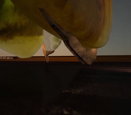
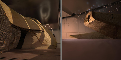
The 'mouse' part of the exhibit are the fifty-odd digitally constructed set pieces semi-hidden behind lavender curtains. The act of 'drawing the curtain', another pun, immediately evokes an intimacy as if peeking beyond a veil. My graphic artist friend called it interactive. I find that term too tech-jargon. Perhaps user-curious is more accurate. The curtain invites the viewer to enter these portraits as portals to an alternate universe.
The digital renderings, either cropped or in close-ups, lack scale, and suggest a physics where gravity is amiss. In this world geologic forms are suspended by too-thin wire; under-scaled supports balance top-heavy weight; a pregnant glow emits from within a solid boulder. There is an implied denial of the objects physical properties. The illusions read as a visual disconnect. The renderings are the most interesting part of the exhibit. 
As for pictorial narrative it is ambiguous and minimal. The settings are non-specific, mood is made from non-directional light sources, architectural character is implied by texture and material, and scale and size define the spaces between objects. Some clues are explicit, piecemeal quotes from other projects. Sometimes there is a small train and track, but that is probably a symbol referring to linear time. Seen one after another in quick succession these abridged mini-narratives are hard to figure out but you want to stay because of that.
In a totally different way they reminded me of the silent woodcuts by the Japanese artist Hiroshige, infused with the added darkness of De Chirico metaphysics. Behind every shadow is a setting sun. I like the cerebral yet intuitive aspect of the renderings and the overall quiet and almost melancholy mood created. For me there is a kinship in translating the devices of poetic rhetoric into visual imagery. I can relate. Then afterward, driving home, I replayed what I saw and felt as I wandered in and then out of someone's dream.
1 Comment
I love this phrase...
user-curious
Block this user
Are you sure you want to block this user and hide all related comments throughout the site?
Archinect
This is your first comment on Archinect. Your comment will be visible once approved.