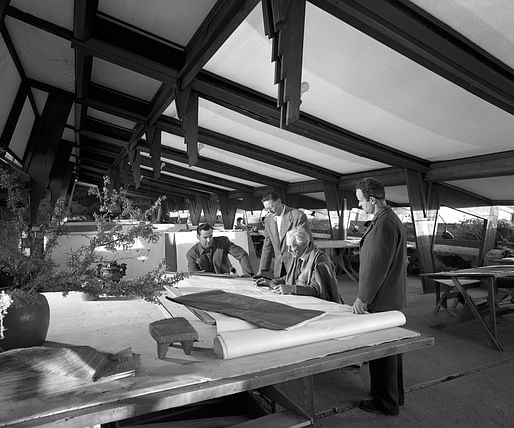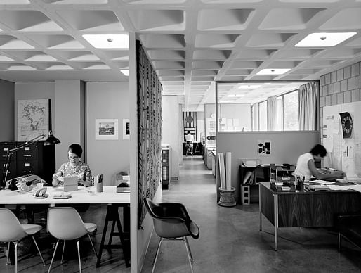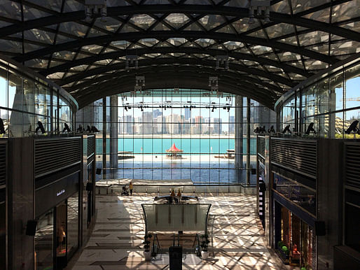
Styled after American corporate identity throughout the 20th century, our next featured 2014 Venice Biennale pavilion is "OfficeUS" representing the U.S. of A. Organized by NYC's Storefront for Art and Architecture in collaboration with PRAXIS Journal, the two-part exhibition will showcase and critically reinterpret the global influence of American architecture in the last century...For each week of the Biennale, OfficeUS will also address 25 issues relevant to its project archive. — bustler.net


More on Bustler.
3 Comments
This seems like the exact opposite of the program objective. The elements are lost in an identity and process game. Nice design, but the curators really messed this up trying to out clever the oh so clever Koolhaas.
That splash page image totally looks like all the AVROKO employment ads.
Related: My favorite drafting room image:
The Saarinen one is lovely, too, of course, as is the Wright.
I like what they've done with the American pavilion space. Emphasizing production and practice. Does this statement of intent ...an active, global, experimental architecture office that researches, studies, and remakes projects from an onsite archive...mean reenacting? Wish Rita Novel could be the US Commissioner one of these years.
Bummed my image is no longer showing up.
Block this user
Are you sure you want to block this user and hide all related comments throughout the site?
Archinect
This is your first comment on Archinect. Your comment will be visible once approved.