How does our design can function as a catalyst to merge people‘s shopping experience into the pleasure of a healthy lifestyle?
An organic market is not simply an ordinary place to purchase food. It is a place where you go to seek out products that reflect the taste and feel of nature. With this in mind, our goal is to design every part of the market based on the principle of flexibility, adapting every decision to the nuanced demands of each kind of food and product. Thus, the experience of purchasing daily goods becomes more than a routine, it becomes an experience wherein the customer perceives the essence of the products sold in this kind of place.
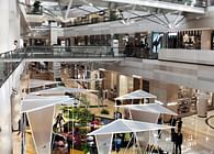
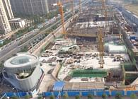
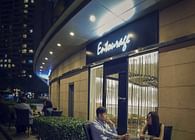
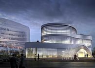
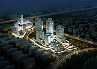
Original Life Market is a 2,000 square meter space focusing on the sale of organic products. Located in Xindong Road, the center of Beijing, the market is in the underground area of an open square. Two escalators are covered with a roof glass connect the open square with the underground market. The underground space of the market is divided into a semi-exterior space at the entrance and a large inner area for food display and preparation.
The semi-exterior space at the entrance contains a resting area that helps to make the space friendlier, and also to attract casual encounters among the neighbors of the area into the shopping activity.
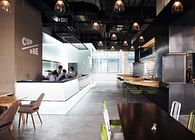
The interior space starts with the cashiers, small bakery, and flower shop that the costumer sees first. The rest of the market is organized in thematic areas which have been arranged using modular system, creating a common theme that defines the proposal: fruits and vegetable area, butcher shop, dried fruits area, dairy products area, refrigerator area and a wine cellar. These areas have their own organization and specific features although integrated with the common language of the whole market.
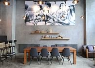
The design language is based on the materials applied for: the flooring which is designed as a pattern of hexagonal tiles that adapts to the different areas, with different shades of green; The ceiling which is composed of a grid of tubular white structure that works as a base for the lighting system. Meanwhile, it hides the HVAC infrastructure and gives a sense of continuity to the whole space. We designed 30 kinds of furniture types, which are built with the combination of wood veneer and white tubular steel. This system gives a sense of coherence design at the same time provides flexibility for the likely changes in the products arrangements. The furniture has been designed using the same proportions to construct wall-mounted or low shelves, cashier stations, counters, tables and so on. This strategy minimizes the cost of production, enables an easier set up and provides a common theme that unifies the entire space.
The whole design principle forms a unique identity that resonates with the healthy lifestyle that the market promotes.
Status: Built
Location: Beijing, CN
Firm Role: Chief Designer
Additional Credits: Year: 2014 - 2015
Type: Commission
Status: Completed
Client: Yiyang Group
Program: 2,000m²
Budget: 1,100,000€
Principal Architect: Manuel N. Zornoza
Team: Andrea Ramos Rodriguez, Bo Liu, Jorge Cortes de Castro, Lisa Bai, Lucia Bravo Guinea
Photographer: Shannon Fagan
@LATITUDE (www.latitudestudio.eu)
