A Place to Foster Innovation
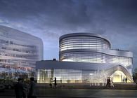
The goal of this technology campus is to create a working environment suitable for the production, interchange and management of IT knowledge. LATITUDE’s proposal was chosen, not just because of its functional organization, but based on three points: the proposal's integration of the existing landscape; the human-scale design of the buildings, including both the whole project and the interior spaces; and the incorporation of flexible spaces in the towers’ facades.
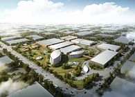
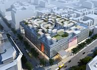
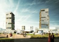
The plot is organized in a basic grid with 8,25 x 8,25 m squares as the master unit. That grid works in the same way as “1” and “0” in the binary system of computer programming. This means that the squares grow or shrink depending on what the architectural program and its functions require. These squares are grouped together, forming bigger squares of 16,50 x 16,50 m and 33 x 33 m depending on the function they contain. The result is a layout in which the Podium and the towers arise inferentially and with different heights: 7 office towers, with the tallest ones on the northern part of the plot, and the lowest on the south, next to the river, and a 2 story Podium made of 16,50 x 16,50 m and 8,25 x 8,25 m square pieces for commercial and office use.
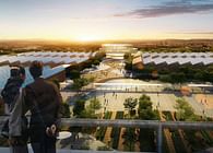
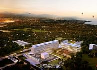
The general appearance of the proposal is a gigantic cascade of buildings that decreases towards the river, allowing the sunlight and the views to become part of the design.
This “cube carpet” created by the grid grows up following guidelines and conditions that were considered crucial to the design process; such as the existence of a highway on the eastern part of the plot (with a road several meters wide and elevated above the ground level) or the importance of the north-south connection in the plot. This connection is important because of the presence of the river in the south, and the pre-existing green area on the north. Together with these factors appears the keystone of the project: the deck view. These decks were strategically placed in order to provide all of the towers with at least one generous open air surface that affords the best possible view from each individual tower; either towards the river or the inner space of the IT Campus. The decks will also provide a space for outdoor activities: presentations of company products, meetings, or simply for leisure time.
In order to give each tower the best possible views, the towers are not aligned. Looking at the plans, one can notice that they are placed just like the seats in a theatre, so that all of the audience is able to see between the heads of the people in front of them.
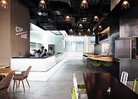
The principle that has driven the design of the public spaces is based more on creating an attractive place to socialize and boost the exchange of knowledge, than the technological and futuristic working character inherent to an IT campus.
The ground level and rooftops of the buildings are finished with green areas, wooden materials and pools of water. These materials are reflective of the feeling caused by the surrounding area's natural environment. The towers' facades have been configured with LED panels to allow the tenants to experiment with their own technology and make the buildings into extensions of their desktops.
A technology campus can be imagined as a physical experience. Far from being just a place for technology, it is also a place for those who build that technology up. No matter whether it is viewed from the inside or the outside, it is a landmark that can be enjoyed in and of itself.
Status: Built
