(Sorry for the break in action....my computer died before I was able to finish the last speaker. The good news is, I got a lot written before it did die.....)
Buckle up, kids....Karim Rashid just took the stage. He's wearing all white. Pictures later.
Karim is making a repeat appearance from his first time at GRAVITY FREE last year. I just want to mention I have most definitely NOT seen him wandering around the conference like everyone else the past couple of days. I'm going to do this a little differently this time, I don't want to miss anything....
-Time Magazine called him the "Poet of Plastic".
-He says he doesn't necessarily have a dangerous mind, but a submissive provocateur's mind.
-"so you want to change the world?" He talks about how if you search for the words "change the world" on the internet, you'll get 1.7 million hits.
-Microsoft: "Change the world or go home"
-an image of Brad Pitt in New Orleans! (Pink Project, woo hoo)
-He's talking about when Neil Armstrong stepped foot on the moon and how we thought we were going to live there in the future, and how this is not happening.
-The slides in the background seem to be paging through at a timed rate....they started off with images relevant to what he was saying and they are now images of products that he's designed. (At the beginning they said he currently has over 2000 items in production)
-He's talking about sustainability and how certain products, like bioplastics, have really been around for a very long time, but that weren't always cost-effective.
-"How can I make the contemporary world?"
-He designed a water bottle with polypropylene (sp?). He's talking about the problem of the water bottle, and how only one out of every 10 in this country are recycled. He said that people were reluctant to use polypropylene because they couldn't get it clear, but now they can.
-He just said that he's going to go down in history for a garbage can, which is very depressing (lol).
-Oooh, he designed the Method line of products? I did not know that. Makes sense.
-He's talking about how the road to true environmental responsibility will be a long line of incremental shifts.
-"There's only one thing that differentiates a brand.....design"
-There have been 75,000 patents in the world in the past several years…..
Thanks everyone for your comments! This is so much fun. I mean the conference is cool but I'm glad I get to share it with everyone.
Time for pictures! Here are some photos from today's "Play With Your Food" luncheon, including my own humble submission.
"Free Gravity" - creativity!
"Champion Man" - see the "C" carved into his chest?
"Hearts Not Bullets" - simple and great
"World Hunger" - excellent. I think this is the scraps from everyone else's projects.
"One Fruit One Flight" - this is mine. I felt guilty using a whole plate of food to convey an idea. So I cut up a pear and fashioned it like the plane behind me, and I ate the rest.
Emily, you are doing such a great job, it's like we all have free passes to hang out in the upper balcony during the conference - we are so lucky! Big thanks to your employer, your roommate, and Archinect for making this happen too!
Thanks lb! Honestly if any of you were here with me, we'd probably be goofing off in the back so let's just be grateful I'm here alone, LOL. More photos....
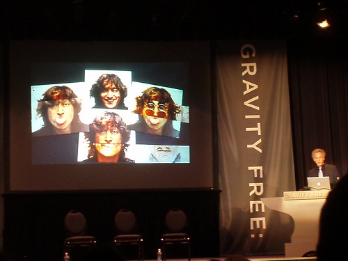
Looking at classic photos with Bob Gruen:
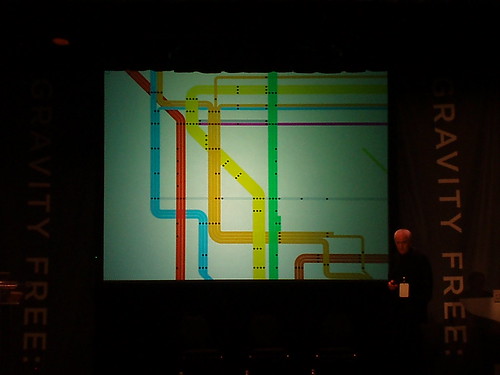
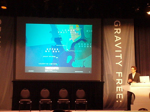
Navigating the process of designing an iconic New York map:
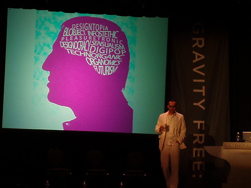
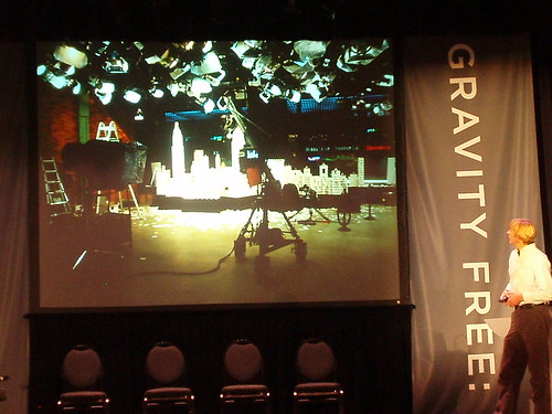
Taking a look inside Karim Rashid's brain:
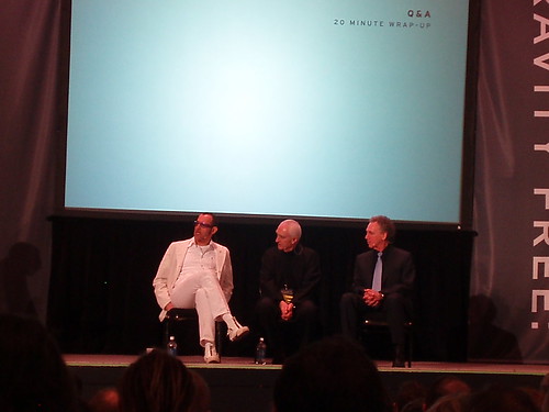
And the wrap up of the three....if I had to give a title to this group, I would call them the "Living Legends":
I thought that I was going to have enough time on the computer to cover all of Rashid's lecture....but I did not, because he got about twice as much time as all of the other presenters, which I noticed on the schedule later on. It was an interesting presentation, and the imagery of his work behind him was at times distracting....some of his stuff is quite lovely! So if you are the type that gets distracted easily you might have lost your place in his talk, and I did a few times. Overall I got the impression that he is a serious designer who lives, eats, walks and talks design. He gave lengthy and thoughtful answers at the Q&A but I didn't see him at the roundtables later....unless he was in the middle of that swarm of people I was avoiding on the other side of the room!
If nothing else, this conference is a lesson in various presentation techniques. Each one has been vastly different, and although some of the speakers have very clearly read from scripts that they prepared, I didn't feel that this took away from their material. I loved Bob Gruen's especially because he had such a carefully crafted and relevant presentation....you really got the sense that he enjoyed being there and interacting with the designers. Not his usual crowd since he used to hang out with the Sex Pistols, LOL.
In the roundtable session at the end of the day, I found zen at the table of Janne Kyttanen (*if anyone can tell me how to type those two little dots above the "a" in his last name, I would appreciate it). With some heavy hitters holding court at other tables, Janne attracted a relatively small crowd and I took the opportunity to ask him some questions. I'll come back to that later, and in the meantime, just a couple more pictures to end the day....
Janne Kyttanen (on the right) at his roundtable:
And here is a chain mail purse by his company, FOC. This was made using a 3D printer, which is mind-boggling to me. How does that work!?! I can understand a model, but chain mail?....
has anyone talked about designing nothing? design even good design really is just about making more consumer items rather than asking what items are not needed. just because you design a cool spatula doesnt mean that a cool spatula was needed in the first place other than to compliment your philippe starke juicer. quit buying so much shit people.
Good morning everyone! Thanks again for all the positive feedback....I've heard that some of my fellow participants are checking out the blog here as well, and to them I say, welcome to Archinect!
This morning our first speaker is Tom Hennes, an exhibition designer. This is especially notable because exhibition designers seem to make up a large portion of the crowd....I'd say that the majority of people that I've met here are in this industry, which is great because I'd never really met any before I showed up in Chicago a few days ago.
Tom started off by talking about the Creation Museum in Kentucky, and how the "exhibition" is there, but is basically a representation of make-believe. On a personal note, the Creation Museum is not far from where I grew up in the Greater Cincinnati area, and one of my dear high school friends recently "took one for the team" and visited. If you are interested in a more personal account of the museum and its fantasy-land, click here.
Now Tom is talking about the California Academy of the Sciences in San Francisco. The drawings that he's showing on the screen are very expressive....they look like the type of architectural drawings that we are used to, but they are interspersed with illustrations of trees and color that some of our professors probably would have hated.
Tom is now showing a slide that is asking us..."What is dangerous?" First he says, are "unexamined assumptions." Another answer is "fixed meanings," and next is "the chaos of democracy." Tom is saying that he thinks our work can actually change the world, and in the end, "we're only dangerous if what we do matters."
has just taken the stage with his thick Italian accent, and this aerospace designer and architect is already engaging the crowd by talking about gravity and "the beauty of the extreme." He told us to sit back and enjoy!
4 million people are in the air every day.....this is a fact that Arturo is using to frame a discourse about human beings and our space exploration. And now he just showed us a picture and video of Italian astronaut Roberto Vittori.....his brother! So everything is starting to come together....
Arturo's company is called Architecture and Vision, and their projects cover a wide range of habitats for extreme environments. Its clear that they are paying close attention to issues of climate, as well as fabrication, installation, and ease of use....the diagrams of their various structures are single-line but extremely descriptive in both instruction and concept. One thing that I've just figured out is that AV's MoonBaseTwo is actually on display in a different part of this very museum...I saw it yesterday at breakfast! Here is an image of it, taken from the AV web site:
Our third speaker this morning is Philip Tiongson, an interactive designer and byproduct of MIT's Interactive Media Lab. Philip's company is called Potion Design, and he's describing some of their projects right now, starting off with designs for the National World War One Museum in Kansas City, MO. For this location they designed interactive "issues tables" that "use proprietary Potion sensing technology that enables up to 24 visitors to interact with the scenarios simultaneously." Super cool!
(Sidebar: Philip's slides are quite amusing because he has discreet captions at the bottom with sentences like, "I think this is the first time my mom understood what I do")
Philip's next presented project is the Museum at Eldridge Street in New York City. This location is apparently the first synagogue built by Eastern European Jews in New York, possibly in North America. Their work here includes interactive screens and touch tables that support a visitor's center and help people learn about the history of the synagogue.
Lastly, Philip is talking about a project they did in Beijing for Nike called "100 Battles, 100 Victories" which is an interactive (there's that word again) exhibition about....shoes. It includes a display where you can weigh your shoe and an area where you can measure how high you jump.
I'll post a picture later, because right now, I have to move on to....
Karin is an experience and title designer, which means that her work can typically be found on video and at the beginning of movies. She's starting off by showing us a video that she produced for Herman Miller called "Get Real". She is using this theme to launch into an explanation of her work, including the title sequence for the movie Charlotte's Web, which is based on the idea that the book "comes alive".
With Karin's presentation, I'm beginning to understand the process that's involved in title design....how many of us have ever considered that these 3- or 4-minute blocks of time at the beginning of movies are entirely separate design processes, and that they set the tone for the movie itself? Do we ever walk away from a film saying to ourselves, "wow that was one special title sequence"? Probably not....it seems like a field in which art is created in support of a larger theme, but that it is maybe a thankless job. I don't suppose these designers expect that their work will be memorable, unlike the bulk of the rest of us.
Karin continued her presentation by showing the work that she did at the beginning of the movie Definitely Maybe, starring Ryan Reynolds. This meant that I got to watch Ryan Reynolds for a few minutes. Which is a fine way to spend a Wednesday morning.
Finally, Karin is rounding out her slide show with images from the "dynamic outdoor theater" that she worked on for the Wynn Las Vegas. This is quite a spectacle....it changes constantly and at any give time, has a giant floating head that escapes from the pavement in front of the main screen...here is just one of its many visualizations:
In conclusion, what I take away from this speaker is to look for design where you least expect it....for instance, try to pay attention the next time you enter a movie. Maybe the best design isn't always that which we are aware of...
there was a thread this week celebrating the title sequence for 'ironman'. and stanley donen's opening credits in the 60s (like for 'charade') are classic. i actually DO pay attention to these and i often get more enjoyment out of them than the movie....sad to say.
re: Karin Fong! The art of title design matured with Kyle Cooper's amazing sequence for Fincher's 'Seven'. After that film opened, every graphic designer and animator I knew wanted to get into title design (and a few did). I believe the craft/art got its start with george lucas (who else?) and the optical effects pioneered for star wars, before that the titles and credits were very very different (see gone with the wind for example)
Steven, I was trying to recall the intro to Ironman during the presentation earlier but I thought it was just a standard Marvel intro....I'm sure there was more to it but I can't remember.
(Sidebar: someone came up to me at lunch and said "Michelle?"....could someone have mistaken me for Michelle Kaufmann? How flattering....we both have big hair, a roman nose and a fancy for green design, but she's taller. Just for the record. :o)
Those banners....on both sides of the people just don't look so gravity free....think they should have brought in the French Winter Olympics Design team to help them out.
That's about the first word that comes to mind when you see the work of Bryan Berg, "Card Stacker" and architect. Bryan holds the world record for the World's Tallest House of Cards.
I'm going to have to come back to this post because I'm so enthralled I can't concentrate on writing.
....Ok, so when Bryan was building the World's Tallest House of Cards in Dallas, Texas in 2007, he knew that the hall they asked him to build it in was too small....so when he got to the top, he had to remove the wooden ceiling and build into the insulation!
Do a search for this....watch some of the videos on YouTube.....Bryan has been telling us about how he actually tested the card waffle pattern that he uses for structural compression, and that it can hold 600 pounds. Amazing!
~~~~~
In the meantime, I'm going to continue here with Jake Barton who is a media designer and, judging by his presentation, a filmmaker. Jake is involved with StoryCorps, which you may have heard about on NPR, and a project called TimeScapes, a narrated film about, among other things, the history of New York City.
We're starting to wind down here....the clock is ticking for me, I have to get in a cab and go straight to the airport in about an hour. We were just told that we had a "Surprise" speaker that was supposed to come this afternoon and fill in for Luigi Colani, who could not make it, but it turns out our Surprise speaker could not make it as well. Bummer. Nonetheless, it's been a whirlwind and exciting three days here in Chicago and I'm glad I got a chance to participate. I'll post some final pictures in a little bit.
In response to your earlier question about "has anyone talked about NOT designing something"....it has been alluded to throughout the conference but I've been getting the sense that everyone here is aware of our most pressing environmental issues. So the focus, I would say, has been about how to design good stuff when you do design things.
So about 75% of the people here cleared out after the last Q&A session. The good news is that when i went into the round table room, it was much less crazy than it has been the last two days. As a result, I had a great conversation with Bryan Berg, which I'll summarize more later. I did tell Bryan about Archinect though and he might stop by....HI Bryan!
Some final photos:
3rd place in the play with your food competition - "Chicago Night #1":
Winner of the competition - "Full":
Bryan and one of his card structures:
Jake and a project:
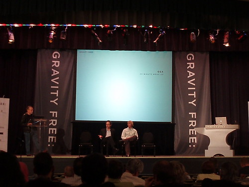
Final Q&A:
....And with that, I have to run. It's been great! I'll post some final FINAL thoughts after I get back to Los Angeles. Have a great afternoon everybody!
Thanks for all of your efforts Wonder! It is to bad this stuff isn't main streamed so we could all watch video feeds. Well hopefully that is coming down the pike.
Back in LA now. Thanks again to everyone for their positive support. I'll be doing a little write-up about the conference and about some of the conversations I had in the next week or so. Before that happens, I have to get my computer back! (I'm at work right now) But I will keep you posted on that and where it ends up as soon as I know.
In the meantime, I am curious to know what everyone thought about the work that these designers presented. From my perspective in the audience, and in what I tried to convey to everyone here, I saw a long line of people who were doing quality work, and who had either already been recognized or were starting to be recognized for this work. I didn't necessarily think that they were all "dangerous" minds though....some of their work could be considered revolutionary and ground-breaking, yes, but I guess I wasn't terribly surprised by it all (except for the card stacking...I still have no idea how he does that). So I guess in retrospect, I am left wondering what an event like this is trying to accomplish....and after meeting the people that I did, I am also thinking that people from outside the design industry could really benefit from a line-up of speakers like this.
I just watched some YouTube videos of Bryan Berg. He's great, although I feel as though we've heard of "honeycomb structures without joints" somewhere before... Did you tell him about per, Emily? :)
This is definitely a thread that I will come back to over the next few months. You must have suffered from information overload. And did you get the books?
I too, like SW, have been a fan of good title design for a while. Classic comedies of the 40's and 50's are some of my favorites. Thanks for the great reporting as I had no clue what the conference was all about.
LIVE from GRAVITY FREE 2008
Check out the documentary Helvetica for an interview with Massimo Vignelli and some insight into his work.
Awesome reporting Emily. I'm looking forward to your thoughts on Karim Rashid's presentation.
Love what you are doing here EmKem. Can't wait to hear more of what you are seeing/learning.
(Sorry for the break in action....my computer died before I was able to finish the last speaker. The good news is, I got a lot written before it did die.....)
Buckle up, kids....Karim Rashid just took the stage. He's wearing all white. Pictures later.
Karim is making a repeat appearance from his first time at GRAVITY FREE last year. I just want to mention I have most definitely NOT seen him wandering around the conference like everyone else the past couple of days. I'm going to do this a little differently this time, I don't want to miss anything....
-Time Magazine called him the "Poet of Plastic".
-He says he doesn't necessarily have a dangerous mind, but a submissive provocateur's mind.
-"so you want to change the world?" He talks about how if you search for the words "change the world" on the internet, you'll get 1.7 million hits.
-Microsoft: "Change the world or go home"
-an image of Brad Pitt in New Orleans! (Pink Project, woo hoo)
-He's talking about when Neil Armstrong stepped foot on the moon and how we thought we were going to live there in the future, and how this is not happening.
-The slides in the background seem to be paging through at a timed rate....they started off with images relevant to what he was saying and they are now images of products that he's designed. (At the beginning they said he currently has over 2000 items in production)
-He's talking about sustainability and how certain products, like bioplastics, have really been around for a very long time, but that weren't always cost-effective.
-"How can I make the contemporary world?"
-He designed a water bottle with polypropylene (sp?). He's talking about the problem of the water bottle, and how only one out of every 10 in this country are recycled. He said that people were reluctant to use polypropylene because they couldn't get it clear, but now they can.
-He just said that he's going to go down in history for a garbage can, which is very depressing (lol).
-Oooh, he designed the Method line of products? I did not know that. Makes sense.
-He's talking about how the road to true environmental responsibility will be a long line of incremental shifts.
-"There's only one thing that differentiates a brand.....design"
-There have been 75,000 patents in the world in the past several years…..
And so on.....
Thanks everyone for your comments! This is so much fun. I mean the conference is cool but I'm glad I get to share it with everyone.
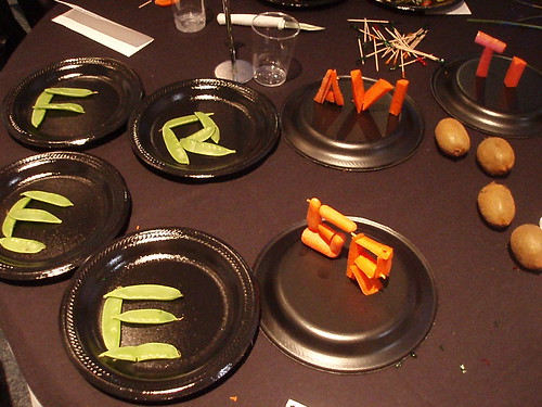
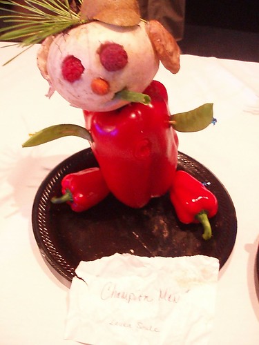

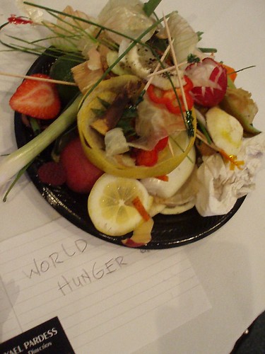
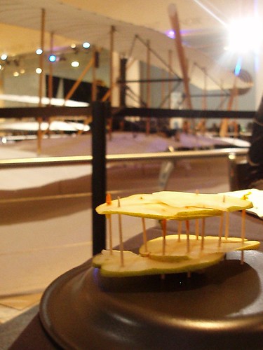
Time for pictures! Here are some photos from today's "Play With Your Food" luncheon, including my own humble submission.
"Free Gravity" - creativity!
"Champion Man" - see the "C" carved into his chest?
"Hearts Not Bullets" - simple and great
"World Hunger" - excellent. I think this is the scraps from everyone else's projects.
"One Fruit One Flight" - this is mine. I felt guilty using a whole plate of food to convey an idea. So I cut up a pear and fashioned it like the plane behind me, and I ate the rest.
Emily, you are doing such a great job, it's like we all have free passes to hang out in the upper balcony during the conference - we are so lucky! Big thanks to your employer, your roommate, and Archinect for making this happen too!
Thanks lb! Honestly if any of you were here with me, we'd probably be goofing off in the back so let's just be grateful I'm here alone, LOL. More photos....
Looking at classic photos with Bob Gruen:
Navigating the process of designing an iconic New York map:
Taking a look inside Karim Rashid's brain:
And the wrap up of the three....if I had to give a title to this group, I would call them the "Living Legends":
I thought that I was going to have enough time on the computer to cover all of Rashid's lecture....but I did not, because he got about twice as much time as all of the other presenters, which I noticed on the schedule later on. It was an interesting presentation, and the imagery of his work behind him was at times distracting....some of his stuff is quite lovely! So if you are the type that gets distracted easily you might have lost your place in his talk, and I did a few times. Overall I got the impression that he is a serious designer who lives, eats, walks and talks design. He gave lengthy and thoughtful answers at the Q&A but I didn't see him at the roundtables later....unless he was in the middle of that swarm of people I was avoiding on the other side of the room!
If nothing else, this conference is a lesson in various presentation techniques. Each one has been vastly different, and although some of the speakers have very clearly read from scripts that they prepared, I didn't feel that this took away from their material. I loved Bob Gruen's especially because he had such a carefully crafted and relevant presentation....you really got the sense that he enjoyed being there and interacting with the designers. Not his usual crowd since he used to hang out with the Sex Pistols, LOL.
In the roundtable session at the end of the day, I found zen at the table of Janne Kyttanen (*if anyone can tell me how to type those two little dots above the "a" in his last name, I would appreciate it). With some heavy hitters holding court at other tables, Janne attracted a relatively small crowd and I took the opportunity to ask him some questions. I'll come back to that later, and in the meantime, just a couple more pictures to end the day....
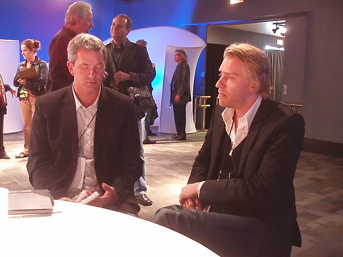
Janne Kyttanen (on the right) at his roundtable:
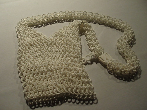
And here is a chain mail purse by his company, FOC. This was made using a 3D printer, which is mind-boggling to me. How does that work!?! I can understand a model, but chain mail?....
Ok, time to retire. Last day tomorrow!
[as lb said, we'll be watching from the upper balcony!]
emily, you can cut and paste äñ¥ symbol from word or other application into your archinect posting windon.
aml, now I got the muppets theme in my head! :-)
it would be fun being there with you, but I get to be there without being bored or hungover. Again thanks Emily.
Emily - thanks for posting. great stuff.
has anyone talked about designing nothing? design even good design really is just about making more consumer items rather than asking what items are not needed. just because you design a cool spatula doesnt mean that a cool spatula was needed in the first place other than to compliment your philippe starke juicer. quit buying so much shit people.
Emily, this is great! Thanks.


Hey, the schedule says Luigi Colani has been replaced by 'Surprise!'.
The work of Colani:
Good morning everyone! Thanks again for all the positive feedback....I've heard that some of my fellow participants are checking out the blog here as well, and to them I say, welcome to Archinect!
This morning our first speaker is Tom Hennes, an exhibition designer. This is especially notable because exhibition designers seem to make up a large portion of the crowd....I'd say that the majority of people that I've met here are in this industry, which is great because I'd never really met any before I showed up in Chicago a few days ago.
Tom started off by talking about the Creation Museum in Kentucky, and how the "exhibition" is there, but is basically a representation of make-believe. On a personal note, the Creation Museum is not far from where I grew up in the Greater Cincinnati area, and one of my dear high school friends recently "took one for the team" and visited. If you are interested in a more personal account of the museum and its fantasy-land, click here.
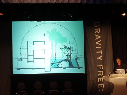
Now Tom is talking about the California Academy of the Sciences in San Francisco. The drawings that he's showing on the screen are very expressive....they look like the type of architectural drawings that we are used to, but they are interspersed with illustrations of trees and color that some of our professors probably would have hated.
Tom is now showing a slide that is asking us..."What is dangerous?" First he says, are "unexamined assumptions." Another answer is "fixed meanings," and next is "the chaos of democracy." Tom is saying that he thinks our work can actually change the world, and in the end, "we're only dangerous if what we do matters."
has just taken the stage with his thick Italian accent, and this aerospace designer and architect is already engaging the crowd by talking about gravity and "the beauty of the extreme." He told us to sit back and enjoy!
4 million people are in the air every day.....this is a fact that Arturo is using to frame a discourse about human beings and our space exploration. And now he just showed us a picture and video of Italian astronaut Roberto Vittori.....his brother! So everything is starting to come together....
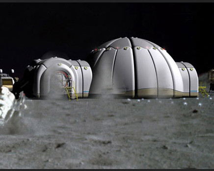
Arturo's company is called Architecture and Vision, and their projects cover a wide range of habitats for extreme environments. Its clear that they are paying close attention to issues of climate, as well as fabrication, installation, and ease of use....the diagrams of their various structures are single-line but extremely descriptive in both instruction and concept. One thing that I've just figured out is that AV's MoonBaseTwo is actually on display in a different part of this very museum...I saw it yesterday at breakfast! Here is an image of it, taken from the AV web site:
Inspiring stuff here!
Our third speaker this morning is Philip Tiongson, an interactive designer and byproduct of MIT's Interactive Media Lab. Philip's company is called Potion Design, and he's describing some of their projects right now, starting off with designs for the National World War One Museum in Kansas City, MO. For this location they designed interactive "issues tables" that "use proprietary Potion sensing technology that enables up to 24 visitors to interact with the scenarios simultaneously." Super cool!
(Sidebar: Philip's slides are quite amusing because he has discreet captions at the bottom with sentences like, "I think this is the first time my mom understood what I do")
Philip's next presented project is the Museum at Eldridge Street in New York City. This location is apparently the first synagogue built by Eastern European Jews in New York, possibly in North America. Their work here includes interactive screens and touch tables that support a visitor's center and help people learn about the history of the synagogue.
Lastly, Philip is talking about a project they did in Beijing for Nike called "100 Battles, 100 Victories" which is an interactive (there's that word again) exhibition about....shoes. It includes a display where you can weigh your shoe and an area where you can measure how high you jump.
I'll post a picture later, because right now, I have to move on to....
Karin is an experience and title designer, which means that her work can typically be found on video and at the beginning of movies. She's starting off by showing us a video that she produced for Herman Miller called "Get Real". She is using this theme to launch into an explanation of her work, including the title sequence for the movie Charlotte's Web, which is based on the idea that the book "comes alive".

With Karin's presentation, I'm beginning to understand the process that's involved in title design....how many of us have ever considered that these 3- or 4-minute blocks of time at the beginning of movies are entirely separate design processes, and that they set the tone for the movie itself? Do we ever walk away from a film saying to ourselves, "wow that was one special title sequence"? Probably not....it seems like a field in which art is created in support of a larger theme, but that it is maybe a thankless job. I don't suppose these designers expect that their work will be memorable, unlike the bulk of the rest of us.
Karin continued her presentation by showing the work that she did at the beginning of the movie Definitely Maybe, starring Ryan Reynolds. This meant that I got to watch Ryan Reynolds for a few minutes. Which is a fine way to spend a Wednesday morning.
Finally, Karin is rounding out her slide show with images from the "dynamic outdoor theater" that she worked on for the Wynn Las Vegas. This is quite a spectacle....it changes constantly and at any give time, has a giant floating head that escapes from the pavement in front of the main screen...here is just one of its many visualizations:
In conclusion, what I take away from this speaker is to look for design where you least expect it....for instance, try to pay attention the next time you enter a movie. Maybe the best design isn't always that which we are aware of...
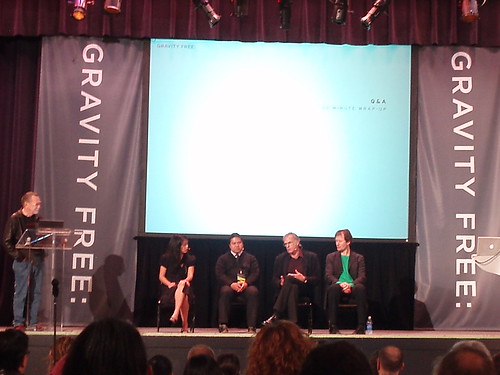
Here is a photo of the wrap up of the morning group, whom I am affectionately calling "Finding Great Design Where You Least Expect It":
there was a thread this week celebrating the title sequence for 'ironman'. and stanley donen's opening credits in the 60s (like for 'charade') are classic. i actually DO pay attention to these and i often get more enjoyment out of them than the movie....sad to say.
re: Karin Fong! The art of title design matured with Kyle Cooper's amazing sequence for Fincher's 'Seven'. After that film opened, every graphic designer and animator I knew wanted to get into title design (and a few did). I believe the craft/art got its start with george lucas (who else?) and the optical effects pioneered for star wars, before that the titles and credits were very very different (see gone with the wind for example)
Kyle' reel
Steven, I was trying to recall the intro to Ironman during the presentation earlier but I thought it was just a standard Marvel intro....I'm sure there was more to it but I can't remember.
(Sidebar: someone came up to me at lunch and said "Michelle?"....could someone have mistaken me for Michelle Kaufmann? How flattering....we both have big hair, a roman nose and a fancy for green design, but she's taller. Just for the record. :o)
Those banners....on both sides of the people just don't look so gravity free....think they should have brought in the French Winter Olympics Design team to help them out.
WOW....
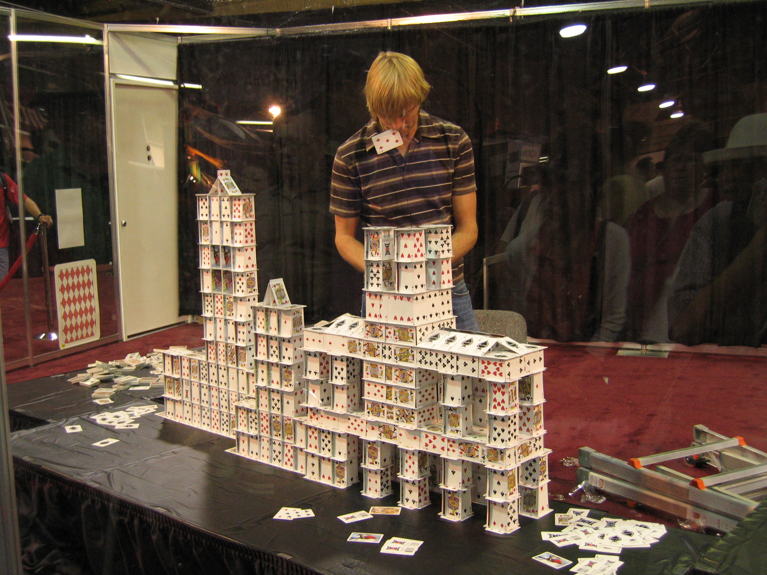
That's about the first word that comes to mind when you see the work of Bryan Berg, "Card Stacker" and architect. Bryan holds the world record for the World's Tallest House of Cards.
I'm going to have to come back to this post because I'm so enthralled I can't concentrate on writing.
....Ok, so when Bryan was building the World's Tallest House of Cards in Dallas, Texas in 2007, he knew that the hall they asked him to build it in was too small....so when he got to the top, he had to remove the wooden ceiling and build into the insulation!
Do a search for this....watch some of the videos on YouTube.....Bryan has been telling us about how he actually tested the card waffle pattern that he uses for structural compression, and that it can hold 600 pounds. Amazing!
~~~~~
In the meantime, I'm going to continue here with Jake Barton who is a media designer and, judging by his presentation, a filmmaker. Jake is involved with StoryCorps, which you may have heard about on NPR, and a project called TimeScapes, a narrated film about, among other things, the history of New York City.
We're starting to wind down here....the clock is ticking for me, I have to get in a cab and go straight to the airport in about an hour. We were just told that we had a "Surprise" speaker that was supposed to come this afternoon and fill in for Luigi Colani, who could not make it, but it turns out our Surprise speaker could not make it as well. Bummer. Nonetheless, it's been a whirlwind and exciting three days here in Chicago and I'm glad I got a chance to participate. I'll post some final pictures in a little bit.
haha. i like it. empty podium: 'surprise!'
way to go emily. you are the female clark kent and i'm sure you got a red cape someplace!
vado - thank you! I do love Superheroes ;o)
In response to your earlier question about "has anyone talked about NOT designing something"....it has been alluded to throughout the conference but I've been getting the sense that everyone here is aware of our most pressing environmental issues. So the focus, I would say, has been about how to design good stuff when you do design things.
So about 75% of the people here cleared out after the last Q&A session. The good news is that when i went into the round table room, it was much less crazy than it has been the last two days. As a result, I had a great conversation with Bryan Berg, which I'll summarize more later. I did tell Bryan about Archinect though and he might stop by....HI Bryan!
Some final photos:
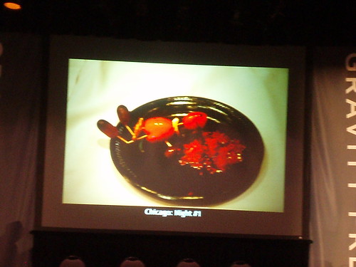
3rd place in the play with your food competition - "Chicago Night #1":
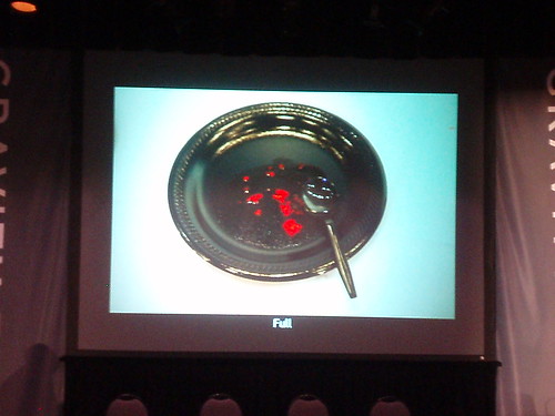
Winner of the competition - "Full":
Bryan and one of his card structures:
Jake and a project:
Final Q&A:
....And with that, I have to run. It's been great! I'll post some final FINAL thoughts after I get back to Los Angeles. Have a great afternoon everybody!
:o)
What a pleasant hi speed report! Thanks Em, I enjoyed it a lot. :)
Have a save flight home to LA (it's just starting to REALLY warm up over here...).
Thanks for all of your efforts Wonder! It is to bad this stuff isn't main streamed so we could all watch video feeds. Well hopefully that is coming down the pike.
Dubbers, You rock. Thanks for your reporting.
yeah, i second that. great thread dub!
have a burger @ the billy goat. make sure you ask for a pepsi and fries.
Back in LA now. Thanks again to everyone for their positive support. I'll be doing a little write-up about the conference and about some of the conversations I had in the next week or so. Before that happens, I have to get my computer back! (I'm at work right now) But I will keep you posted on that and where it ends up as soon as I know.
In the meantime, I am curious to know what everyone thought about the work that these designers presented. From my perspective in the audience, and in what I tried to convey to everyone here, I saw a long line of people who were doing quality work, and who had either already been recognized or were starting to be recognized for this work. I didn't necessarily think that they were all "dangerous" minds though....some of their work could be considered revolutionary and ground-breaking, yes, but I guess I wasn't terribly surprised by it all (except for the card stacking...I still have no idea how he does that). So I guess in retrospect, I am left wondering what an event like this is trying to accomplish....and after meeting the people that I did, I am also thinking that people from outside the design industry could really benefit from a line-up of speakers like this.
Thoughts? Comments?
"Bueller? Bueller?"
<crickets chirping>
OK, so no one seems to have any more comments. That's fine too, lol.
Nevertheless, I'm glad I got the chance to go and bring this unique experience to everyone. See you all on the rest of the forum....
;o)
I just watched some YouTube videos of Bryan Berg. He's great, although I feel as though we've heard of "honeycomb structures without joints" somewhere before... Did you tell him about per, Emily? :)
This is definitely a thread that I will come back to over the next few months. You must have suffered from information overload. And did you get the books?
I too, like SW, have been a fan of good title design for a while. Classic comedies of the 40's and 50's are some of my favorites. Thanks for the great reporting as I had no clue what the conference was all about.
Block this user
Are you sure you want to block this user and hide all related comments throughout the site?
Archinect
This is your first comment on Archinect. Your comment will be visible once approved.