apu never just give your clients sketches - bad practice. I've had cases were clients held on to them and tried to develop project just off my sketches.
lopaka, do you have a web host for your pictures (flickr, photobucket, etc) ? If so, use the URL assigned to your image and place it here between If the image is wider than 420 pixels you will need to limit it; put width=420 in front of the [/img] with a space following your URL. Got it ?
lopaka, you can follow the code (in gray) to post an image below the comments box. The problem is that Archinect (understandably) does not let you upload the picture, it has to be hosted somewhere else and the code references that picture. I use flickr, but I think there are plenty of other options to host pictures.
Cris - Thanks. Personally I think the three birds in the spanish steps sketch is the best part.
archetype - Nice sketches. I like the loose sketching style. Sometimes it is so loose, you are right on that threshold between abstraction and linework.
I think it'd be pretty cool for archinect to print a book of sketches collected on here. Kind of like that "Dinner for Architects" book of sketches on Napkins from famous architects - except it'd be a book of sketches from anonymous architects.
some of these are old. some are recent. i always drew people rather than buildings or landscapes so here are a few left over from time before i quit trying to be an artist
and some stuff from my sketchbook. they are selected by their availability on my computer more than anything else...
you seem to have a nice, old school modernist streak there jump, i like.
Nov 19, 07 10:26 am ·
·
landscape design for Battery Park City, 1986.10.06
rectangle with dots in lower center represents a raised platform the size of the largest elevator of the World Trade Center on top of which are as many life size nude human statues that would fit with then a trail of nude human statues meandering through the park and out into the Hudson River.
To those that are having trouble (and it does take a little while to master it), here's the best way to post images, first this is the code, copy/pasted right from the grey text below the response box:
[ img ]http://www.image.com/image.jpg[ /img ]
(I put spaces before and after the brackets so it would show up here, you'll have to remove them to get this to work.)
What I do is this, first, copy/paste the code into the response box, then I open another browser window and go to the url of the image I want to post, that means right-clicking on the image and going to 'view image'.
Then, copy/paste the image url into another line in the response box, away from the image code I already pasted in there.
Last, just highlight the url in the box, and this time, instead of copying it (ctrl-c), I cut it (ctrl-x). And then highlight the part of the image code that says 'http://www.image.com/image.jpg', and paste (ctrl-v) the new image url back in, now in the right place (make sure you don't accidentally add any extra spaces or it won't work).
The only other thing you might have to do is add 'width=425' one sapce after the image url like this:
Philarch's awesome bridge sketch reminds me of the Medieval Spanish city of Ronda, it has an old Roman bridge like that, called 'The Old Bridge'. When I was there I made a drawing of 'The New Brdge' (new meaning 1793):
This drawing was made while sitting on a rock, with another 300 ft drop immediately to my left.
... and BTW, here's the code for that image above, with spaces added:
...if this works, this is early design sketches for an architecture faculty, 3rd yr degree. It was originally A3, not sure how kind the scaling down'll be to it...you don't really need to se the annos, just things like "rotating knives" scrawled in the margins....
Thanks ! I know it'd be worth a closer look. Great drawing. . .and the bonus of a "sky" thanks to the uneven lighting (?). Nice use of line weight to artiulate the major land forms. Quite a locale -- what do you think of that bridge ?
Thanks, sevensixfive. I seldom draw from nature (as we used to call it), despite a lifetime of advising all who would listen -- design students, anyway -- to do so on a daily basis.
the official sketch thread
this is the Swimming Pavillion in Antigua
sketched during lunch 28 Feb 2004 on a napkin
I think I had nachos for lunch with heineken from the tap
I just did a pretty decent sketch of a threshold space at a client meeting today, but he wanted to keep it and I don't have a scanner handy.
Always try to eat at places that have paper placemats. . .
apu never just give your clients sketches - bad practice. I've had cases were clients held on to them and tried to develop project just off my sketches.
come on folks add your sketches
Ponte Vecchio
Florence, Italy
november 8, 1997
Made in my A4 sketchbook, ten years ago.
I didn't do this but....sketching is sketching!

I guess these are these sketches. . .I did them in my sketchbook. Drawing is fun -- as long as the pencil has an eraser !
http://savewright.org/wright_chat/viewtopic.php?t=2451
thanks for the heads up archi, ill keep that in mind!
Here is one from the top of the Spanish Steps. Don't have the confidence to post a design sketch.

Wow, finally learned how to post a flickr image...

Here is a bridge from Bruges
if you look at the lower left corner, I have sketched myself in and you can even see the sketchbook!
nice ones philarch!
How exactly do you add an image?
lopaka, do you have a web host for your pictures (flickr, photobucket, etc) ? If so, use the URL assigned to your image and place it here between If the image is wider than 420 pixels you will need to limit it; put width=420 in front of the [/img] with a space following your URL. Got it ?
lopaka, you can follow the code (in gray) to post an image below the comments box. The problem is that Archinect (understandably) does not let you upload the picture, it has to be hosted somewhere else and the code references that picture. I use flickr, but I think there are plenty of other options to host pictures.
Cris - Thanks. Personally I think the three birds in the spanish steps sketch is the best part.
archetype - Nice sketches. I like the loose sketching style. Sometimes it is so loose, you are right on that threshold between abstraction and linework.
. . place it here, with [img]
in front of the URL and [/img]
following the URL (with no spaces between). If the image is wider. . .
I think it'd be pretty cool for archinect to print a book of sketches collected on here. Kind of like that "Dinner for Architects" book of sketches on Napkins from famous architects - except it'd be a book of sketches from anonymous architects.
some of these are old. some are recent. i always drew people rather than buildings or landscapes so here are a few left over from time before i quit trying to be an artist


and some stuff from my sketchbook. they are selected by their availability on my computer more than anything else...
you seem to have a nice, old school modernist streak there jump, i like.
landscape design for Battery Park City, 1986.10.06
rectangle with dots in lower center represents a raised platform the size of the largest elevator of the World Trade Center on top of which are as many life size nude human statues that would fit with then a trail of nude human statues meandering through the park and out into the Hudson River.
[IMG width=410]http://img.photobucket.com/albums/v484/lacubana17/siena.jpg[/IMG]
Night sky in the Campo, Siena
medusa needs a hand here.... i would try but i would screw it up,.....hahaha
and i started to use the preview button more too...hahaha....
b
I will never master image-posting. Sorry, guys.
there you go Medusa, your width=410 needed to go after the siena.jpg
that's a wickedly interesting sketch medusa
Thanks. I did it after spending several evenings in the campo, lying down on the pavement... just me and a bottle of chianti.
Just one bottle of chianti?
Seriously though, sketching at night with a bottle of wine with nothing else to worry about is one of my favorite things to do.
Jump,
I like the sketch with the blue..
Is that a dome?
What a great idea. These sketches were done in Italy during 2002-2003.

Let me try this again:
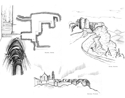
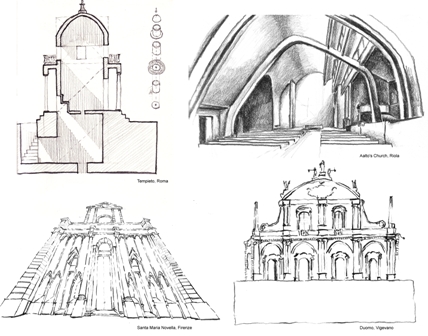
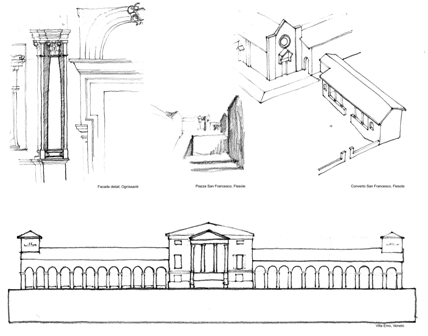
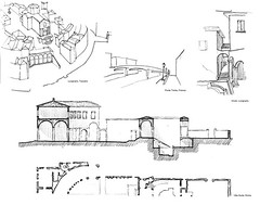
All images are compiled from my sketchbooks while I resided in Italy.
"He came, he saw, he sketched. . .!"
Nice sketches, futureinthepast (cool name, too)
To those that are having trouble (and it does take a little while to master it), here's the best way to post images, first this is the code, copy/pasted right from the grey text below the response box:
[ img ]http://www.image.com/image.jpg[ /img ]
(I put spaces before and after the brackets so it would show up here, you'll have to remove them to get this to work.)
What I do is this, first, copy/paste the code into the response box, then I open another browser window and go to the url of the image I want to post, that means right-clicking on the image and going to 'view image'.
Then, copy/paste the image url into another line in the response box, away from the image code I already pasted in there.
Last, just highlight the url in the box, and this time, instead of copying it (ctrl-c), I cut it (ctrl-x). And then highlight the part of the image code that says 'http://www.image.com/image.jpg', and paste (ctrl-v) the new image url back in, now in the right place (make sure you don't accidentally add any extra spaces or it won't work).
The only other thing you might have to do is add 'width=425' one sapce after the image url like this:
[ img ]http://www.image.com/image.jpg width=415[ /img ]
(again, I'm adding spaces at the brackets here so it'll show up.
Whew, well that's actually a lot easier than it sounds! Try it!
Oops, that should read 'width=415', not 425, and that should be 'space' not 'sapce'.
That just illustrates the most important point, the more copy/pasting you can do, the more likely you'll avoid dumb typos like those.
... so back to the sketches!
Philarch's awesome bridge sketch reminds me of the Medieval Spanish city of Ronda, it has an old Roman bridge like that, called 'The Old Bridge'. When I was there I made a drawing of 'The New Brdge' (new meaning 1793):
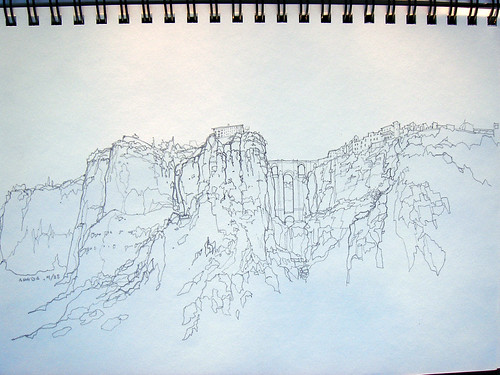
This drawing was made while sitting on a rock, with another 300 ft drop immediately to my left.
... and BTW, here's the code for that image above, with spaces added:
[ img ]http://farm1.static.flickr.com/197/481195042_756e41f97a.jpg width=415[ /img ]
Nice drawing, 765. I wonder if you could shoot (or edit) a close-up of part of it ? It looks to be worthy of the effort !
...if this works, this is early design sketches for an architecture faculty, 3rd yr degree. It was originally A3, not sure how kind the scaling down'll be to it...you don't really need to se the annos, just things like "rotating knives" scrawled in the margins....
thanks nam. dome-like. it is an egg shaped object housing a concert hall for a campus master plan...i was into morphosis and mecanoo at the time.
Cheers, SDR. My scanner got busted in a move, so all I've got are photos until I get another one.
Here's a link to a larger version:
link
Thanks ! I know it'd be worth a closer look. Great drawing. . .and the bonus of a "sky" thanks to the uneven lighting (?). Nice use of line weight to artiulate the major land forms. Quite a locale -- what do you think of that bridge ?
Keep that pen moving. . .!
don't laugh, I drew that on a bus....
aw nuts, the image didn't show...here's a link...
http://www.dotphoto.com/Go.asp?l=dhanishtha&P=BE82&AID=4911985&IID=173660826
There you go. Looks like you knew what you wanted ?

Yup -- just a towel thrown on the shower curtain rod -- but I liked the way it looked.
765 that almost looks like someone giving you the finger - very cool sketch.
***bump***
That towel is gorgeous, SDR, so simple.
Thanks, sevensixfive. I seldom draw from nature (as we used to call it), despite a lifetime of advising all who would listen -- design students, anyway -- to do so on a daily basis.
There must be a mechanical and chemical mechanism that can imprint, under pressure, the image of a shoe tread onto a newly-fallen leaf. . .
great thread, nice work in here!


some sketches from macedonia, spain, and tunisia respectively.
I like those, Duderino, especially Tunisia.

This is a little more prosaic -- a bracket beneath a projecting bay, on an old San Francisco Eastlake Victorian
Block this user
Are you sure you want to block this user and hide all related comments throughout the site?
Archinect
This is your first comment on Archinect. Your comment will be visible once approved.