These are a couple things from my graphics sketchbook last year. Pardon the yellow tint of my Moleskine.
Some staircase in Savannah I never bothered finishing:
For every day of one week we had to draw our hand first in blind contour, then with our right hand, and then with our left. These are my skecthes from the end of the week and by then the differences between the blind contours and using my right or left hand began to fade. It was a good assignment.
Come on people, lets see some more sketches. I'm working on Sunday Night - I need some inspiration!
Can anyone guess where this is?
Below is my last sketch from Rome - and because it was my last, I took the most time with it. If you want to be picky though, I made a mistake with the obelisk... Thats what I get for doing it in pen, although I've found that its actually more liberating being able to make mistakes.
Good point. I think that's why I asked what Philarch "doesn't like" about the obelisk, rather than "what's wrong" with it. . .
In fact, perhaps the best advice I had about drawing (sketching) from life, was to draw "only what you see" -- intended no doubt to eliminate the "stuff" we are tempted to add to an insufficient-looking effort, or (more likely) to discourage substituting what's "supposed" to be there for what's actually in front of us, warts and all.
". . . although I've found that its actually more liberating being able to make mistakes." Good point.
I couldn't sketch my furniture ideas without an eraser. I like the spontaneity of an unedited sketch, and (for better or worse) strive to keep that appearance even when redrawing. But there's nothing like getting it the first time.
In ink, the best analogy I know is with calligraphy. It's absolute death to a letter to correct or even touch it up (except extremely carefully, when something is missing, perhaps). You simply have to be consistently "on" with each stroke. But, to take your point, once you make a mistake in sketching and find that you can move beyond that, that the drawing isn't necessarily spoiled, it's a gift.
Well, the sketch was done about 3 years ago but I still distinctly remember that I (for some odd reason) drew it top down, and so when I got to the bottom, I drew it too high on the page. It wasn't good for composition (you can tell I added additional lines to bring it further down - ugh..) and it is wrong in terms of perspective.
This sounds weird, but when I sketch from life, my sketching priorities change. So something like St.Peters I want accuracy, and for Corbu's work I want to capture his work's feel. Guimard's buildings and Bernini's work I do with pencil and don't do outlines, to understand their sculptural nature. All this, I noticed in retrospect as I went through my sketchbooks. I can't be the only one here that does this when drawing from life?
Exhibit A - Corbusier (looks somewhat childish)
Exhibit B - Guimard - A bit washed out during scanning but it is one of my favorite ones.
I think its really interesting how everyone has a different approach and their "hand" shows. As much as I like computer graphics, nothing beats hand sketches that show the character of the sketchers as much as the character of the subject.
If only one view of a structure or site condition were available or permissible, I would choose the section. (Of course, you can "cheat" and include what's visible beyond, in any section. . .!)
on a side note.... if you work at a place and there are people that burn up a whole sheet of paper for a sketch that could be done in 1/4 the size.... slap them in the head....... especially if it's a weak pencil sketch that really didnt need to be sooooo large in the first place let alone bad sketching skills.
the official sketch thread
These are a couple things from my graphics sketchbook last year. Pardon the yellow tint of my Moleskine.
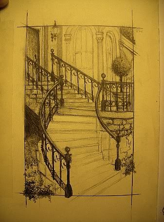

Some staircase in Savannah I never bothered finishing:
For every day of one week we had to draw our hand first in blind contour, then with our right hand, and then with our left. These are my skecthes from the end of the week and by then the differences between the blind contours and using my right or left hand began to fade. It was a good assignment.
concept sketches of my island villa
Great Thread -


futureinthepast - nice sketch! ;-)
um k? WTF?
Bump
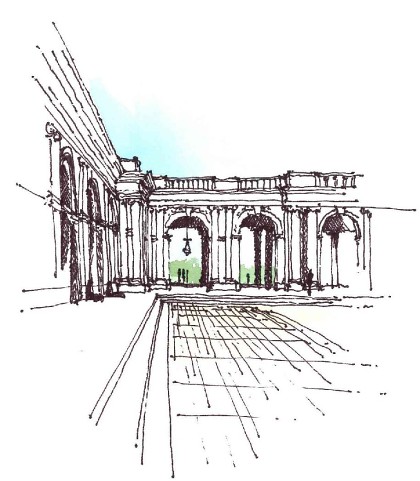
Come on people, lets see some more sketches. I'm working on Sunday Night - I need some inspiration!
Can anyone guess where this is?
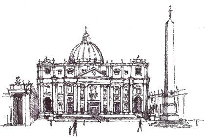
Below is my last sketch from Rome - and because it was my last, I took the most time with it. If you want to be picky though, I made a mistake with the obelisk... Thats what I get for doing it in pen, although I've found that its actually more liberating being able to make mistakes.
What don't you like about the obelisk ?
Whatever the court is above, the court of the San Francisco Legion of Honor museum may have been inspired by it. . .
sketching is an interpretation of what YOU see communicated on paper. Not necessarily what is actually there.
Good point. I think that's why I asked what Philarch "doesn't like" about the obelisk, rather than "what's wrong" with it. . .
In fact, perhaps the best advice I had about drawing (sketching) from life, was to draw "only what you see" -- intended no doubt to eliminate the "stuff" we are tempted to add to an insufficient-looking effort, or (more likely) to discourage substituting what's "supposed" to be there for what's actually in front of us, warts and all.
brilliantly placed. Now you have me wishing it were light so I could go out and sketch.
". . . although I've found that its actually more liberating being able to make mistakes." Good point.
I couldn't sketch my furniture ideas without an eraser. I like the spontaneity of an unedited sketch, and (for better or worse) strive to keep that appearance even when redrawing. But there's nothing like getting it the first time.
In ink, the best analogy I know is with calligraphy. It's absolute death to a letter to correct or even touch it up (except extremely carefully, when something is missing, perhaps). You simply have to be consistently "on" with each stroke. But, to take your point, once you make a mistake in sketching and find that you can move beyond that, that the drawing isn't necessarily spoiled, it's a gift.
Well, the sketch was done about 3 years ago but I still distinctly remember that I (for some odd reason) drew it top down, and so when I got to the bottom, I drew it too high on the page. It wasn't good for composition (you can tell I added additional lines to bring it further down - ugh..) and it is wrong in terms of perspective.
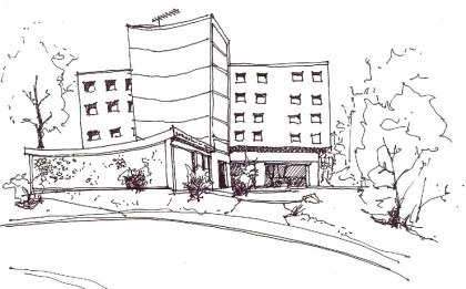
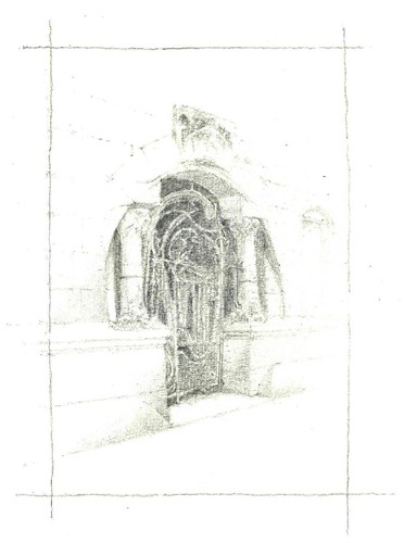
This sounds weird, but when I sketch from life, my sketching priorities change. So something like St.Peters I want accuracy, and for Corbu's work I want to capture his work's feel. Guimard's buildings and Bernini's work I do with pencil and don't do outlines, to understand their sculptural nature. All this, I noticed in retrospect as I went through my sketchbooks. I can't be the only one here that does this when drawing from life?
Exhibit A - Corbusier (looks somewhat childish)
Exhibit B - Guimard - A bit washed out during scanning but it is one of my favorite ones.
Pozzuoli with Mt. Vesuvius in the background:


Circus Maximus:
I really like your care-free linework Medusa.
I think its really interesting how everyone has a different approach and their "hand" shows. As much as I like computer graphics, nothing beats hand sketches that show the character of the sketchers as much as the character of the subject.
I love the section medusa - I came back from the GMMC doing my sketch sections that way and haven't looked back since
If only one view of a structure or site condition were available or permissible, I would choose the section. (Of course, you can "cheat" and include what's visible beyond, in any section. . .!)
recent sketch of the proposed pool/master bedroom addition to the house I've purchased. Sketch is dated the 28th February 08
*bump
on a side note.... if you work at a place and there are people that burn up a whole sheet of paper for a sketch that could be done in 1/4 the size.... slap them in the head....... especially if it's a weak pencil sketch that really didnt need to be sooooo large in the first place let alone bad sketching skills.
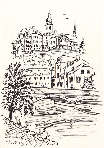
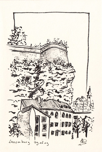
Some recent drawings made in Luxembourg city.
bump*
Such a great thread!
amazing thread.
keep posting, guys, i'll look over my sketchbooks when i get home and see if have anything halfway interesting to contribute.
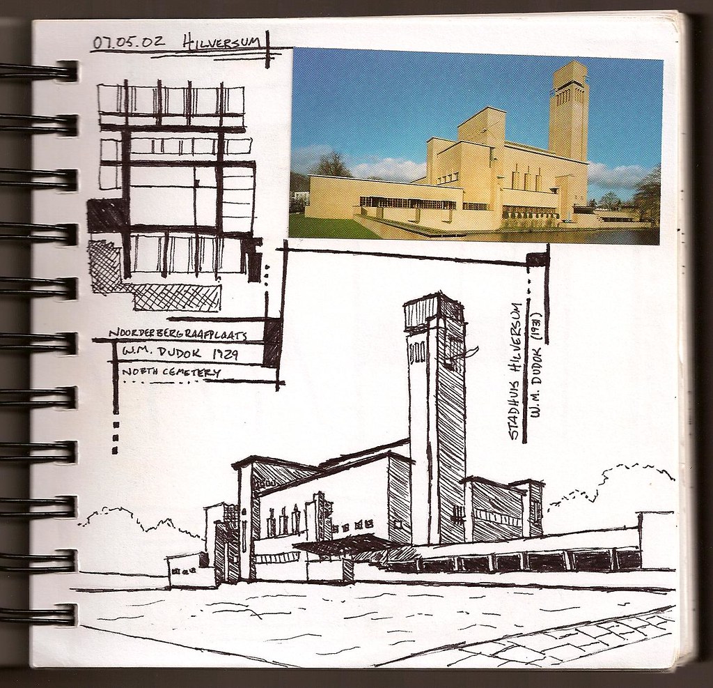
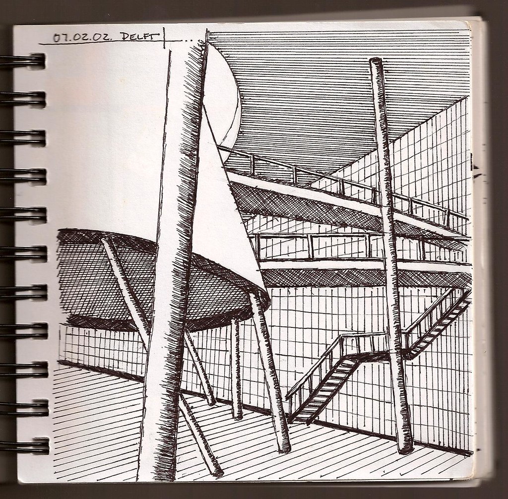
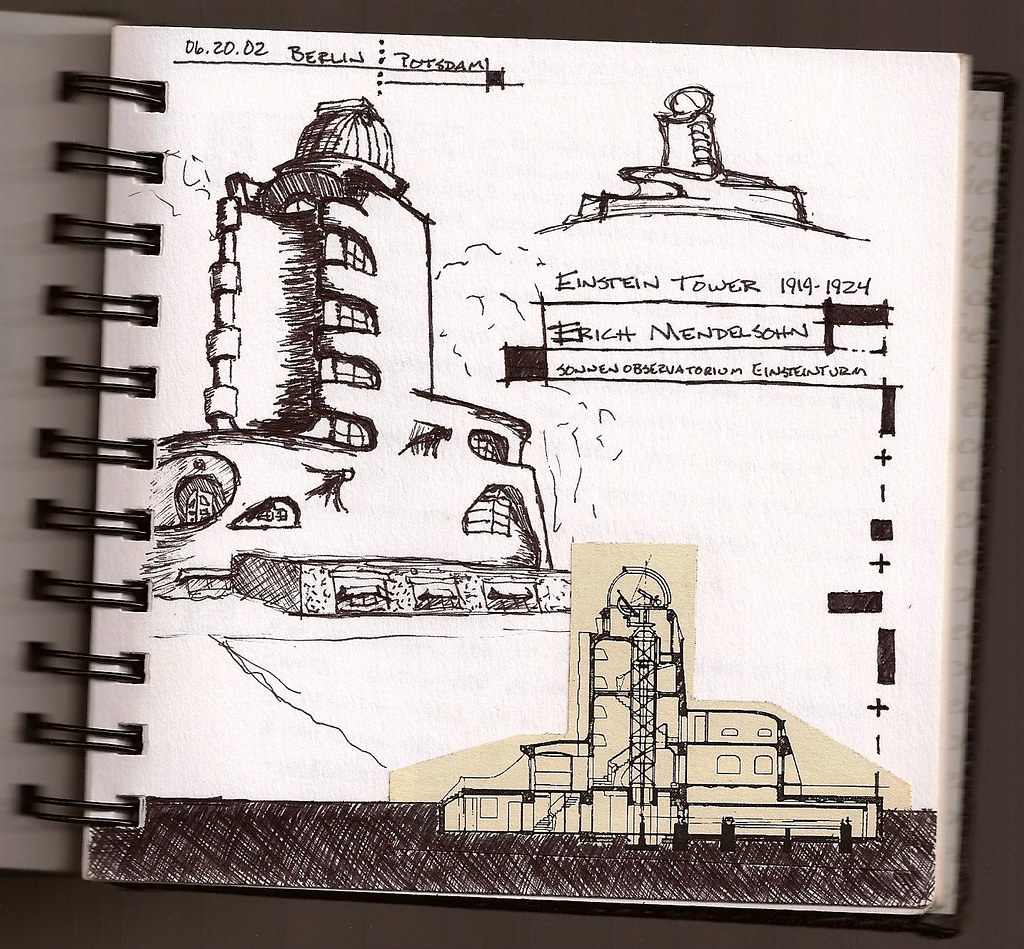
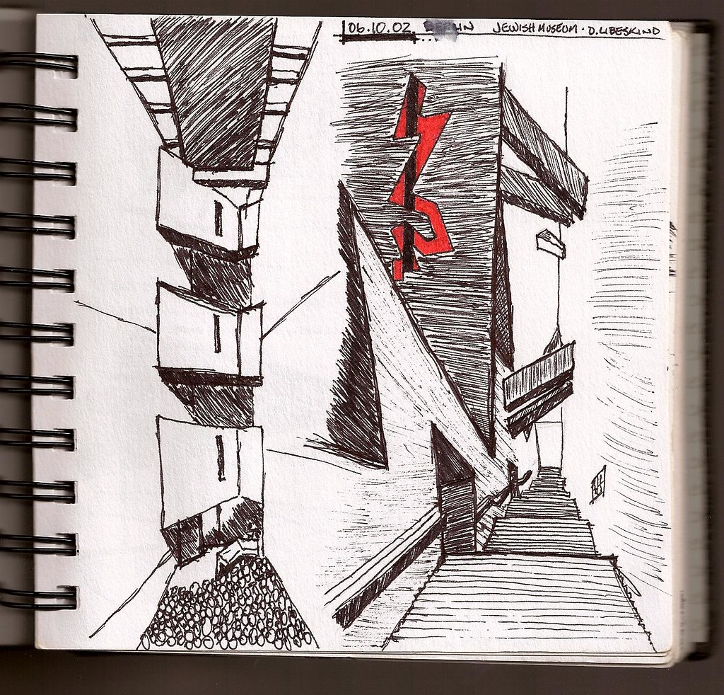
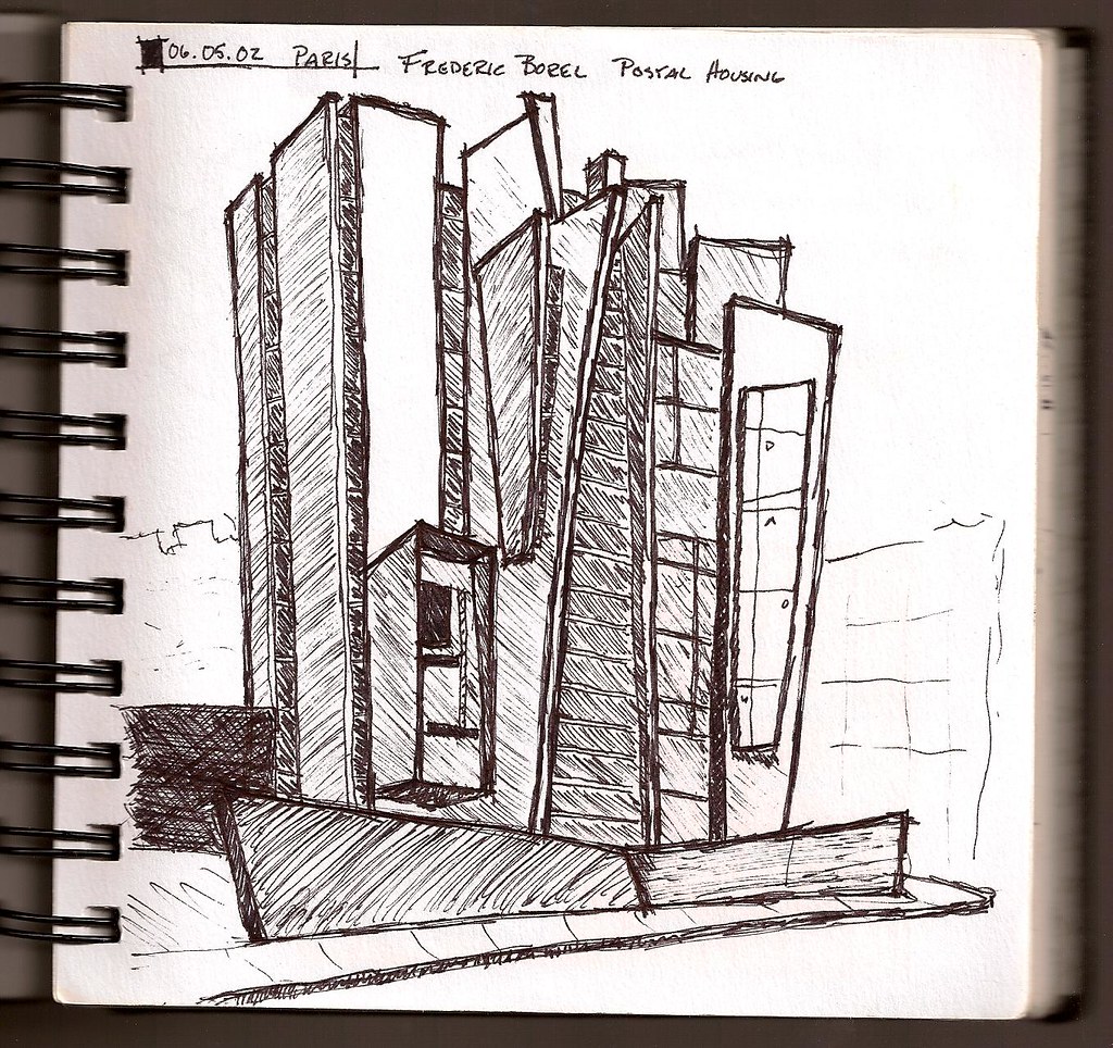
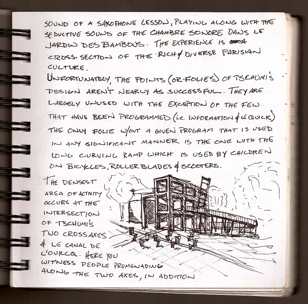
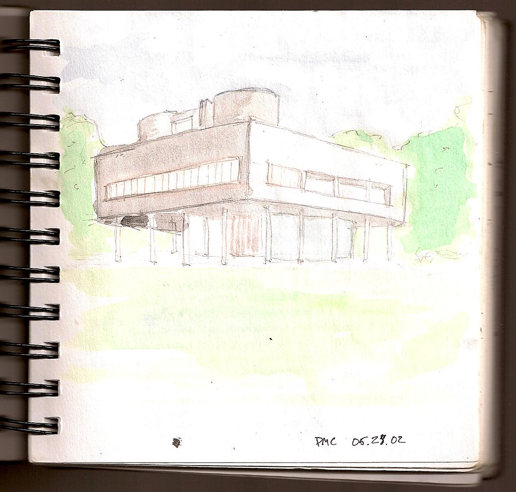
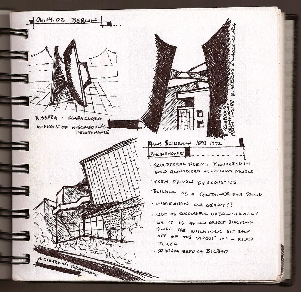
a few sketches that i already had scanned from a trip to europe in 2002...
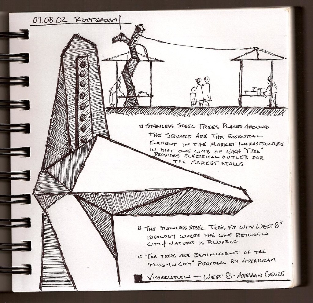
west 8's visserijplein in rotterdam
some dudok projects in hilversum
mecanoo's library at tu delft
mendelsohn's einsteinturm in potsdam
serra and scharoun in berlin
[im]http://farm3.static.flickr.com/2585/4125355676_27333be2c6_b.jpg width=400[/img]
libeskind's jewish museum in berlin
borel's postal housing in paris
tschumi's parc de la villette in paris
a really washed out watercolor of corbusier's villa savoye
oops, here's the serra and scharoun one that i screwed up...
My watercolor skills still need work but I am enjoying the addition of a little color to my sketches.

maison (and everyone else) - nice stuff.
Block this user
Are you sure you want to block this user and hide all related comments throughout the site?
Archinect
This is your first comment on Archinect. Your comment will be visible once approved.