Though I was raised near New York, and attended one of the opening nights of the museum, it's been many many years since I was last in Manhattan. I well recall the color of the museum when new; it was very much the color of a manilla file folder -- or even a bit darker. It had escaped my notice until now that the museum had migrated to a lighter and colder color.
Are there any opinions here about the color to be chosen as part of the current restoration ? What color is the tower addition -- which I assume is of precast panels not intended to be painted ?
No prob. I think the commision came in '43, so you're no far off.
Never one of my favorites -- but since we have it it might as well (like any other building) represent the architect's wishes ? And a warm color seems to suit it, to me -- a sand castle in the middle of Manhattan ?
Yes -- they are doing quite a patch job, inside and out. They mapped every crack, divided into three categories by width. Big job. At least they didn't have to do structural intervention as at Fallingwater (took up stone floor, inserted tension members to prevent further sagging, re-laid floor). Same restoration architects. . .
Right. Wright was not a Bauhaus man, after all. . .! His interior surfaces were typically intergrally colored sand-float plaster, where they were not wood, brick or stone. A project as large as the Guggenheim would have the "compromise" of painted surfaces. . .
But museum officials and neighborhood groups argue that the building was buff yellow for only its first five years, and that after four additions, the museum is more than the iconic circular structure designed by Wright. “I’ve talked to lots and lots of people and I have yet to find somebody who remembers this building buff yellow,” said Pamela Jerome, director of Wanks Adams Slavin Associates, the project’s preservation architect. “This is not black and white. It’s an extremely complex question, as stupid as that sounds for mere paint.”
So once a building is too old for anyone living to remember the original color it's an irrelevant question? This is from a preservation architect? I guess she says it's a complex question not irrelevant.
I went to Corb's Esprit Nouveau a few years back and it looked like it was in pretty good shape...it is used as an architecture office now...so I would imagine that they would keep it looking good.
Aside from all the hypodermic needles in the grass outside the pavilion its a great place!
Is that Corbu's mint green ? And did Terragni get his Casa del Fascio facade from this building ? (Not a good copy, if he did !) Nice to see that original graphic still in place. . .
Is it too obvious a statement to say that the white will simply look better than the beige? (Yes, some would disagree, but they would be wrong.) We should stop treating FLW like a sacred cow, and begin to consider his monumental achievement as a living, relevant entity to be worked with/in/on. The Guggenheim is too good a building to be treated as a mummified artifact too precious to withstand anything new. FLW was a genius, but he had his tacky side; it shouldn't be heresy to acknowledge this. If the building could survive the Gwathmey addition (and in fact be improved by it), it can handle the white paint.
My only point is that in this particular instance, with this particular building, the beige would not look as good as white. Remember that in earler renderings, Wright had drawn the building in everything from sky blue to yellow to hot pink (as has been mentioned in a previous comment). I guess I should just be thankful he settled on beige. Imagine the conversation we'd be having now if he stopped on green!
Hmm -- so you like white. That's ok. It's been painted a grey-white, apparently, for decades. And if it looks to some like a big washing-machine (as it apparently did, to some) then white is perhaps the best color.
Someone call Mies and tell him that book-matched veined marble is so 'thirties. Let's put flowered Contact Paper on that Barcelona Pavilion replica and "bring it into the 'nineties". . .
The colors could be shaded in a progression from left to right, so the color at the right end of one level would continue at the left of the next ramp. . .
I bet someone's working on "electrric paint" -- a coating that can be changed in appearance at will, like the windows that can be switched from clear to opaque.
it would probably be very feasible to paint it a color that changes according to sun levels. On a cloudy day its grey, on a sunny day its beige. Of course that would cost money but the technologies been around for a while.
Yeah, automatic would be good. I imagine the effect would be that the areas actually exposed to direct sunlight would change, so you'd have a two-tone building ? A bright day would give a "ghost shadow" effect when clouds passed over. . .
Oct 23, 07 3:45 pm ·
·
Block this user
Are you sure you want to block this user and hide all related comments throughout the site?
Archinect
This is your first comment on Archinect. Your comment will be visible once approved.
Paint the Guggenheim
From Archinect News: http://www.newsday.com/news/local/wire/newyork/ny-bc-ny--guggenheim-paint1014oct14,0,79485.story
Though I was raised near New York, and attended one of the opening nights of the museum, it's been many many years since I was last in Manhattan. I well recall the color of the museum when new; it was very much the color of a manilla file folder -- or even a bit darker. It had escaped my notice until now that the museum had migrated to a lighter and colder color.
Are there any opinions here about the color to be chosen as part of the current restoration ? What color is the tower addition -- which I assume is of precast panels not intended to be painted ?
SDR, you're old enough to remember the opening? Pretty impressive mate considering that was 70 years ago.
I personally like it lighter than the original manila color, but I know wright would want it redone exactly the way it was 70 years ago.
1959 -- almost fifty years. I was a senior in high school. More discussion by us Wright nuts, here:
http://savewright.org/wright_chat/viewtopic.php?t=2401&sid=0b5ee2c191f4b4189118a6128b6c2f3d
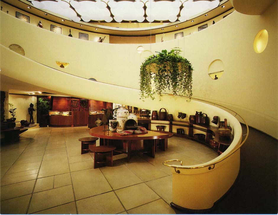
The interior was also painted, and used, differently from Wright's imaginings.
The cold white color looks pretty good to me.
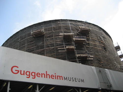
I was just up there a few weeks ago. Too bad most of it is covered with tarps and scaffolding right now.
i think they should paint it pink right now, kind of like when they light the Empire State Bldg a color on special occasions...
Oh, sorry bout that SDR I thought it opened in '39.
No prob. I think the commision came in '43, so you're no far off.
Never one of my favorites -- but since we have it it might as well (like any other building) represent the architect's wishes ? And a warm color seems to suit it, to me -- a sand castle in the middle of Manhattan ?
well i was in nyc last month and sort of enjoyed seeing it scaffolded. i mean, it's temporary and it was suddenly just a different building.

that place is falling apart...its about time they fixed it up!
Last itme I was there was about 2 yrs ago...and the facades were crumbling...I mean you could see large chunks that had fallen off!
Yes -- they are doing quite a patch job, inside and out. They mapped every crack, divided into three categories by width. Big job. At least they didn't have to do structural intervention as at Fallingwater (took up stone floor, inserted tension members to prevent further sagging, re-laid floor). Same restoration architects. . .
i love the piece from the NYTimes about mapping the cracks in the shell:

here's a direct link too: ...here...
the interior at the FLW Xanadu Gallery in SF, on Maiden Lane, has the creamy, yellow-y off-white too. nothing WHITE about it.

here:
Right. Wright was not a Bauhaus man, after all. . .! His interior surfaces were typically intergrally colored sand-float plaster, where they were not wood, brick or stone. A project as large as the Guggenheim would have the "compromise" of painted surfaces. . .
Found this here http://www.douglasanders.com/ (scroll down)
But museum officials and neighborhood groups argue that the building was buff yellow for only its first five years, and that after four additions, the museum is more than the iconic circular structure designed by Wright. “I’ve talked to lots and lots of people and I have yet to find somebody who remembers this building buff yellow,” said Pamela Jerome, director of Wanks Adams Slavin Associates, the project’s preservation architect. “This is not black and white. It’s an extremely complex question, as stupid as that sounds for mere paint.”
Really ? What's her phone number ?
So once a building is too old for anyone living to remember the original color it's an irrelevant question? This is from a preservation architect? I guess she says it's a complex question not irrelevant.
I say give her a call SDR!
Wanks Adams Slavin Associates
T 212.420.1160
Ask for Pamela
I went to Corb's Esprit Nouveau a few years back and it looked like it was in pretty good shape...it is used as an architecture office now...so I would imagine that they would keep it looking good.

Aside from all the hypodermic needles in the grass outside the pavilion its a great place!
Thanks, p-m -- I'm on it.
Is that Corbu's mint green ? And did Terragni get his Casa del Fascio facade from this building ? (Not a good copy, if he did !) Nice to see that original graphic still in place. . .
Is it too obvious a statement to say that the white will simply look better than the beige? (Yes, some would disagree, but they would be wrong.) We should stop treating FLW like a sacred cow, and begin to consider his monumental achievement as a living, relevant entity to be worked with/in/on. The Guggenheim is too good a building to be treated as a mummified artifact too precious to withstand anything new. FLW was a genius, but he had his tacky side; it shouldn't be heresy to acknowledge this. If the building could survive the Gwathmey addition (and in fact be improved by it), it can handle the white paint.
Yes, Wright could be tacky. Is anything but white also tacky ? Or is it just beige that you object to ?
My only point is that in this particular instance, with this particular building, the beige would not look as good as white. Remember that in earler renderings, Wright had drawn the building in everything from sky blue to yellow to hot pink (as has been mentioned in a previous comment). I guess I should just be thankful he settled on beige. Imagine the conversation we'd be having now if he stopped on green!
Hmm -- so you like white. That's ok. It's been painted a grey-white, apparently, for decades. And if it looks to some like a big washing-machine (as it apparently did, to some) then white is perhaps the best color.
Again I ask, what color is the tower addition ?
let's go sage, how 'bout? a little greenwashing for pr purposes.
Sage is good. Wright was about earth colors.
Maybe a different color for each level ?
Someone call Mies and tell him that book-matched veined marble is so 'thirties. Let's put flowered Contact Paper on that Barcelona Pavilion replica and "bring it into the 'nineties". . .
kewllll!
The colors could be shaded in a progression from left to right, so the color at the right end of one level would continue at the left of the next ramp. . .
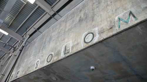
leave it naked.


Now there's an idea.
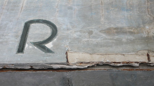
Looks like they cast those bronze letters right into the concrete ?
Is that a CAMERA inserted in the soffit ??
I think it should be painted in bar-code stripes !
doo doo brown
chrome it!
more naked gug:

Clear-coat ?
I bet someone's working on "electrric paint" -- a coating that can be changed in appearance at will, like the windows that can be switched from clear to opaque.
SDR, i actually know someone who worked (or may still be working) on something like that at Ga Tech.
Well, the Gugg would seem like an ideal showcase, if there's a system that's ready to be installed. . .
I could have my manilla beige on Tuesday's, or whatever. Giddyup !
it would probably be very feasible to paint it a color that changes according to sun levels. On a cloudy day its grey, on a sunny day its beige. Of course that would cost money but the technologies been around for a while.
Yeah, automatic would be good. I imagine the effect would be that the areas actually exposed to direct sunlight would change, so you'd have a two-tone building ? A bright day would give a "ghost shadow" effect when clouds passed over. . .
Block this user
Are you sure you want to block this user and hide all related comments throughout the site?
Archinect
This is your first comment on Archinect. Your comment will be visible once approved.