I'm curious to see what you all may have encountered in the rehabilitation or rebuilding of rowhomes.
In my ventures around Baltimore City I've come across several modern designs that in some cases succeeded in setting a precedent for the neighborhood, in others not so much, and its sparked my curiousity.
Hopkins Row Home by Division 1 Architect (Washington DC)
It's hard in a place like B-more, where so many blocks of rowhouses have such rigid repition, to be the black sheep of the block no matter how nicely designed your house is. I live on a block of rowhouses where the only thing that really differentiates my house from the rest is a green aluminum awning. It's known by everybody as "the house with the green awning". Imagine if I did a modern rehab. Seems easier to pull off at end units.
I'm really more interested in what people do to the interiors. Rowhouses have a lot of limitations (light & air to interior rooms, privacy, circulation, lack of places to put furniture), especially when you get into ones less than about 14' wide.
Some of the more innovative rehabs take the traditional horizontal segregation of spaces and turn it to a vertical orientation so "public" spaces like kitchen, living room, and dining room are distributed vertically through the house and not stuck on the first floor.
My former home in Philly. Note bars on front door.
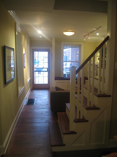
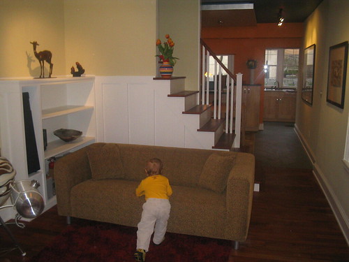
The house is 13' wide, 55' long. Front to back is living room, stair, dining room, kitchen. We kept a single circulation path along one wall on axis with the front door - emphasizing the depth of the whole first floor to make it feel bigger. The front window has a window seat, a place to sit without taking up too much floor space.
The lack of a railing on one side of the stair (not to code) also makes it feel more open. We made "traditional" casework in the front living room, then went more modern as you move back through the first floor. My intent was to add a skylight above the two-story stairwell, but we sold the house. Above the dining room table is an aluminum-leafed floating plane - it centered the dining table without lowering the ceiling too much, and reflected light in a really nice way.
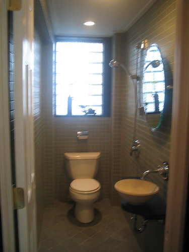
At the back the house became 16' wide. We inserted a powder room behind a kitchen pantry, and made it a "wet" room - shower head on one side, floor drain. Thus we were able to call it a 2-bath house, not 1.5. Monochromatic tile all the way up keeps the wall simple in a very constricted space.
Oh, and paint colors were neutral in front and bright orange in the kitchen- to draw your eye to this "lantern" space at the back of the house when you come in. It had a huge impact.
weren't there some modern baltimore rowhouses featured in this month's metropolis? can't remember the architect and it's probably not quite what you're looking for, but they were quite nice.
My former apartment in Chicago was in an old row house that the landlord (himself an architect) had renovated. Each floor is a separate apartment, and were renovated at different times.
Third Floor Apartment
I lived here for a few months rent-free while he had the building up for sale. He eventually took the building off the market and let me move down to the second floor for a reduced rent.
(Follow the links above for plans, description, and additional photos.)
wow those are all much nicer than the one i live in
which is a stagger 13 feet wide
there are some mildly interesting ones going up in philadelphia
the ones i have seen arent all that adventurous, but some of the newer ones are turning out kind of nice
i was hoping to buy the lot directly behind my house, which is currently empty
and have a nice long narrow fenced in yard, which could have some interesting elements to it
i doubt it will happen though
oh well
It was pretty good, if a little dry. Interesting to read about the socioeconomic forces behind the type, and their influence on the development of the architecture.
4arch, the floating plane in my old house is just 2x4s and mdf, with the pieces that attach to the ceiling set back about 8" from the leading face of the box.
i love the potential in rowhouses. the closest we have here are shotguns - the southern version of the northern/industrial city rowhouse. equally modifiable.
i think louisville is about as far north as you'd find neighborhoods full of shotguns. funny, we're almost as far north as baltimore, but the character of the two cities is so different.
I used to work in and on brick brownstone rowhouses in Boston. It was a wonderful experience. Construction methods of the 1860s are fascinatingly wacky!
I typically enjoy seeing a true historic brownstone converted into something elegantly modern more than I enjoy an all brand-new modern rowhouse. I think the challenge of working within the existing conditions ultimately makes a richer and more seductive building. That said, those new modern rowhouses above are very nice.
so i relocate from baltimore to boston, and now i find tons of archinecteurs from baltimore. how ironic. jafidler i subscribe to metroplis, i'll have to check that out in this months issue.
this project by drew mandel in toronto is less than 13' wide with a large central light well and a split level section to further enhance light peneration into the interior.
this is really weird, I have been meaning to do a ideas competition as part of my blog and this new corporation (without the conflict of interest) about how to conceive the contemporary row house - given that it has to fit into a historic model (see image below)
image are not of house - only to illustrate my thoughts
Does a rowhouse have to fit into a historic model? I've seen streets of historic rowhouses studded with random rowhouses that look nothing alike, but at the same time take nothing away from the street and in fact add richness and interest. I would understand if it is deemed by the city's Historic Committee as a historic street, but if not, I don't see why it has to fit in, in terms of form and image. Can a rowhouse fit in, in other ways?
Sorry, for one of my urban design projects, I researched patterns in rowhouses. I found that static patterns across lengths of streets reflected a disconnect with the occupant. Didn't mean to sound argumentative, now that I read my own comment.
i agree with that Philarch
i think some of the charm of rowhouses is in those that are different from its neighbors
the neighborhood i live in in philly, there are stretches where it is essentially the same house repeated, and i find that takes away from the appeal of a rowhouse
it turns it into a prefabricated feel like a development in a suburb where all the houses are the same
not saying that is bad, but it doesnt fit the rowhouse appeal in my opinion
of course if there werent stretches of the same static pattern, then those individual different ones might not have as much charm as they do
so i guess its a give and take situation
I love the rows of identically well-detailed brownstones--and I ain't no historicist, either. I just appreciate how the long scheme of repeated basic proportions and ornament makes a handsome elevation and a wonderfully relaxing feel in contrast to the jumble of randomness that pervades 99.9% of the rest of the world.
If repeated rowhouses were the dominant norm, I'd love the chaotic divergent introduction even more. But since chaotic divergence is the norm, the rowhouses induce a feeling of calm in me. I found while spending 70% of 3 years of my life in a rowhouse neighborhood that having a repetitive background serves to highlight the life going on in front of it that much more--there's more vibrance to note in the goings on in the street, there's more liveliness amongst neighbors, there's more vitality in the growth of vegetation--the vital STUFF of life stand out so much more! Also, when you do notice a random discrepancy in the houses, you come to cherish it that much more.
i see your point myriam
where did you live when you lived in a rowhouse neighborhood?
where i live, unfortunately, its not a well detailed brownstone, it tends to be a very simple and inexpensive brick facade or cheap fake stone that continues for 4 or 5 houses in a row
that way, it looks very nice when you have a different looking facade that is still affordable to build (as my house did not break the bank for anyone involved)
all it took was a little bit of detail with the brick and a nice awning over the front door, plus a little more detail
and it makes all the difference on my little street
(in my area, the livliness of the neighbors tends to lend itself to the more illegal activity, that sort of STUFF, haha)
Depends on the city I believe. Philadelphia inspectors come across a lot of these stairs built a long time ago that do not meet anything close to code (8" rise & 8" tread for example). If there is no major renovation or if making it meet code will cause an excessive change to the budget or scope of work the inspector will allow it. Am I taking this question too seriously?
Kind of a planned chaos. It even looks like they have the same floor to floor, instead of the same window shape for example. That is kind of what I meant by being similar in different ways that form or image.
Typically you install a temporary (ie, 2x4) stair railing to meet code during inspection and then the owner can choose to take it out when he/she takes ownership (and liability) of his/her residence. You can only get away with that in a residence however.
Oct 1, 07 7:40 pm ·
·
Block this user
Are you sure you want to block this user and hide all related comments throughout the site?
Archinect
This is your first comment on Archinect. Your comment will be visible once approved.
The Rowhouse: Unique/Interesting/Appealing Rehabs
I'm curious to see what you all may have encountered in the rehabilitation or rebuilding of rowhomes.


In my ventures around Baltimore City I've come across several modern designs that in some cases succeeded in setting a precedent for the neighborhood, in others not so much, and its sparked my curiousity.
Hopkins Row Home by Division 1 Architect (Washington DC)
Unkown Architect
Alexander Gorlin has done many
Just tagging this thread to come back later, I'm in Baltimore too.
My first project in arch. school was a rowhouse.
Not an East Coast American rowhouse, but relevant nonetheless. Oh, and it's breathtaking.

Claus En Kaan Architecten
It's hard in a place like B-more, where so many blocks of rowhouses have such rigid repition, to be the black sheep of the block no matter how nicely designed your house is. I live on a block of rowhouses where the only thing that really differentiates my house from the rest is a green aluminum awning. It's known by everybody as "the house with the green awning". Imagine if I did a modern rehab. Seems easier to pull off at end units.
I'm really more interested in what people do to the interiors. Rowhouses have a lot of limitations (light & air to interior rooms, privacy, circulation, lack of places to put furniture), especially when you get into ones less than about 14' wide.
Some of the more innovative rehabs take the traditional horizontal segregation of spaces and turn it to a vertical orientation so "public" spaces like kitchen, living room, and dining room are distributed vertically through the house and not stuck on the first floor.
My former home in Philly. Note bars on front door.


The house is 13' wide, 55' long. Front to back is living room, stair, dining room, kitchen. We kept a single circulation path along one wall on axis with the front door - emphasizing the depth of the whole first floor to make it feel bigger. The front window has a window seat, a place to sit without taking up too much floor space.
The lack of a railing on one side of the stair (not to code) also makes it feel more open. We made "traditional" casework in the front living room, then went more modern as you move back through the first floor. My intent was to add a skylight above the two-story stairwell, but we sold the house. Above the dining room table is an aluminum-leafed floating plane - it centered the dining table without lowering the ceiling too much, and reflected light in a really nice way.
At the back the house became 16' wide. We inserted a powder room behind a kitchen pantry, and made it a "wet" room - shower head on one side, floor drain. Thus we were able to call it a 2-bath house, not 1.5. Monochromatic tile all the way up keeps the wall simple in a very constricted space.
Oh, and paint colors were neutral in front and bright orange in the kitchen- to draw your eye to this "lantern" space at the back of the house when you come in. It had a huge impact.
weren't there some modern baltimore rowhouses featured in this month's metropolis? can't remember the architect and it's probably not quite what you're looking for, but they were quite nice.
i wasn't focusing on Baltimore, only, I meant worldwide.
LB,
Very nice!
How was the floating aluminum ceiling constructed?
My former apartment in Chicago was in an old row house that the landlord (himself an architect) had renovated. Each floor is a separate apartment, and were renovated at different times.


Second Floor Apartment
This was my home for about 1.5 years (furniture isn't mine).
Third Floor Apartment
I lived here for a few months rent-free while he had the building up for sale. He eventually took the building off the market and let me move down to the second floor for a reduced rent.
(Follow the links above for plans, description, and additional photos.)
wow those are all much nicer than the one i live in
which is a stagger 13 feet wide
there are some mildly interesting ones going up in philadelphia
the ones i have seen arent all that adventurous, but some of the newer ones are turning out kind of nice
i was hoping to buy the lot directly behind my house, which is currently empty
and have a nice long narrow fenced in yard, which could have some interesting elements to it
i doubt it will happen though
oh well
i was looking into the design of rowhouse, since i've moved into one and they are so prevelant here in philadelphia
does anyone know of any good books that are geared specifically towards rowhouse design?
I read this one this summer:

link
It was pretty good, if a little dry. Interesting to read about the socioeconomic forces behind the type, and their influence on the development of the architecture.
Isn't this supposed to be a driving influence for architecture?
ummm ...
I like this one ...may not be completely relevant but interesting non the less...

Archinecter jump's blog about his rowhouse-type project under construction in Tokyo. I'm thinking he's too shy to post it here himself, but it's a cool project!
4arch, the floating plane in my old house is just 2x4s and mdf, with the pieces that attach to the ceiling set back about 8" from the leading face of the box.
i love the potential in rowhouses. the closest we have here are shotguns - the southern version of the northern/industrial city rowhouse. equally modifiable.
i think louisville is about as far north as you'd find neighborhoods full of shotguns. funny, we're almost as far north as baltimore, but the character of the two cities is so different.
I used to work in and on brick brownstone rowhouses in Boston. It was a wonderful experience. Construction methods of the 1860s are fascinatingly wacky!
I typically enjoy seeing a true historic brownstone converted into something elegantly modern more than I enjoy an all brand-new modern rowhouse. I think the challenge of working within the existing conditions ultimately makes a richer and more seductive building. That said, those new modern rowhouses above are very nice.
so i relocate from baltimore to boston, and now i find tons of archinecteurs from baltimore. how ironic. jafidler i subscribe to metroplis, i'll have to check that out in this months issue.
this project by drew mandel in toronto is less than 13' wide with a large central light well and a split level section to further enhance light peneration into the interior.

mandel's crib featured in SlOwHoMe!
this is a firm that's done a lot of nice townhouses in NYC:
http://www.oda-ny.com/projects_r2.html
this is really weird, I have been meaning to do a ideas competition as part of my blog and this new corporation (without the conflict of interest) about how to conceive the contemporary row house - given that it has to fit into a historic model (see image below)

image are not of house - only to illustrate my thoughts
cool idea for an ideas competition architechnophilia
is it something that will be happening soon, or you would eventually like to do it?
Does a rowhouse have to fit into a historic model? I've seen streets of historic rowhouses studded with random rowhouses that look nothing alike, but at the same time take nothing away from the street and in fact add richness and interest. I would understand if it is deemed by the city's Historic Committee as a historic street, but if not, I don't see why it has to fit in, in terms of form and image. Can a rowhouse fit in, in other ways?
Sorry, for one of my urban design projects, I researched patterns in rowhouses. I found that static patterns across lengths of streets reflected a disconnect with the occupant. Didn't mean to sound argumentative, now that I read my own comment.
i agree with that Philarch
i think some of the charm of rowhouses is in those that are different from its neighbors
the neighborhood i live in in philly, there are stretches where it is essentially the same house repeated, and i find that takes away from the appeal of a rowhouse
it turns it into a prefabricated feel like a development in a suburb where all the houses are the same
not saying that is bad, but it doesnt fit the rowhouse appeal in my opinion
of course if there werent stretches of the same static pattern, then those individual different ones might not have as much charm as they do
so i guess its a give and take situation
I love the rows of identically well-detailed brownstones--and I ain't no historicist, either. I just appreciate how the long scheme of repeated basic proportions and ornament makes a handsome elevation and a wonderfully relaxing feel in contrast to the jumble of randomness that pervades 99.9% of the rest of the world.
If repeated rowhouses were the dominant norm, I'd love the chaotic divergent introduction even more. But since chaotic divergence is the norm, the rowhouses induce a feeling of calm in me. I found while spending 70% of 3 years of my life in a rowhouse neighborhood that having a repetitive background serves to highlight the life going on in front of it that much more--there's more vibrance to note in the goings on in the street, there's more liveliness amongst neighbors, there's more vitality in the growth of vegetation--the vital STUFF of life stand out so much more! Also, when you do notice a random discrepancy in the houses, you come to cherish it that much more.
i see your point myriam
where did you live when you lived in a rowhouse neighborhood?
where i live, unfortunately, its not a well detailed brownstone, it tends to be a very simple and inexpensive brick facade or cheap fake stone that continues for 4 or 5 houses in a row
that way, it looks very nice when you have a different looking facade that is still affordable to build (as my house did not break the bank for anyone involved)
all it took was a little bit of detail with the brick and a nice awning over the front door, plus a little more detail
and it makes all the difference on my little street
(in my area, the livliness of the neighbors tends to lend itself to the more illegal activity, that sort of STUFF, haha)
70 percent of three years is 766.5 days. thanks for the story problem myriam.
lb how did you get that stair past the inspector? if the current owner falls and breaks his leg are you then liable?
they never inspect that stuff.
really? than why does my boss care if that crap meets code?
Depends on the city I believe. Philadelphia inspectors come across a lot of these stairs built a long time ago that do not meet anything close to code (8" rise & 8" tread for example). If there is no major renovation or if making it meet code will cause an excessive change to the budget or scope of work the inspector will allow it. Am I taking this question too seriously?
no, that actually was a serious question.
This is what I am building now:
http://www.makearchitecture.com/qt/Fort_Mogerman.mov
There's one is on an 18 foot wide lot and the back presents a clean slate with which to do something that brings the outside in...
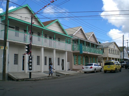
Personally, I like what happend in Borneo.

Kind of a planned chaos. It even looks like they have the same floor to floor, instead of the same window shape for example. That is kind of what I meant by being similar in different ways that form or image.
Typically you install a temporary (ie, 2x4) stair railing to meet code during inspection and then the owner can choose to take it out when he/she takes ownership (and liability) of his/her residence. You can only get away with that in a residence however.
Block this user
Are you sure you want to block this user and hide all related comments throughout the site?
Archinect
This is your first comment on Archinect. Your comment will be visible once approved.