oh sure, spend so much time worrying about the great things to put in a city and next thing you know its overrun with angry bees and denim jacket outlets.
perhaps its just as important to list some things to avoid, such as:
ridiculously big plazas.. i happen to know for a fact that this one didn't even look good on paper
don't ever let a city get to a point that one even entertains this idea
disney stores??.. come on, people, aren't we over this yet?
extra long buses! ..but longer's better, right?
graffiti with no effort.. at least make it aesthetically pleasing.
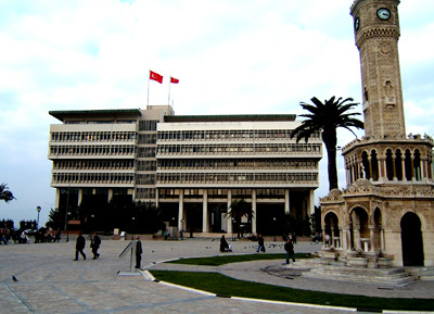
work for idle hands, your first picture, a city hall, is a dead ringer for the city hall of izmir, turkey. the izmir plaza with a beautiful historical clock tower and heavy everyday use is really nice though.
I've spent some time on the People Mover, but only on tourist occasions. Yes, a citizen using their own public transit as tourism in the 21st century. Technically it was the 20th century when I rode...
yeah, it's not the extra long buses that are the problem...
it's probably the only viable response for moving large quanitites of people without investing in a legitimate public transportation system.
they get packed during rush hour in seattle.
Pei didn't design Boston's City Hall.....It was a guy who wasn't licensed at the time, think he was a professor on the other side of the river at da big H... Kallman Mckinnel & Knowles.
i did my master's thesis on the design and planning of las vegas and don't find anything particularly bad with the original plan. (i didn't look at how the suburbs are currently developing.) the strip makes for a very clean separation of casino and non-casino functions. the location of the airport is excellent as it ties in well to both the strip (tourist) and maryland parkway (non-tourist).
in my thesis i argued for integration of a casino with the downtown urban fabric, but in practice, without a very sensitive developer behind the project, i'm not sure how well it would work without disneyfying the downtown (as if jerde hasn't gone far enough already). imho las vegas could be much worse, i.e. phoenix.
graffiti with no effort.. at least make it aesthetically pleasing
work for idle hands,
apart from not being aesthetically pleasing -which I agree it is not-, I would say this is not "just another" graffiti but a direct threat (and I'm afraid -at least I suspect so- the threatened target is probably a divorced woman.. or maybe a junkie who owes money to someone)... so its not funny
architecno - Personally, I liked bits and pieces of Kahn's plan for Philly. Edmund Bacon was just too stubborn - although he definitely did some good things for the city too.
Speaking of Philly, something that always bothered me was the fact that the city couldn't take advantage of a great natural resource - the river-fronts. Because of Philly's location, there are actually 3 river-fronts, all of which are simply used for transportation - I-95, I-76 and the Railroad tracks. The disconnect between the city and the river-front is something I often get frustrated about.
Agree on the Philly riverfronts, Philarch. After seeing how well Portland did with getting the freeway away from the river, I've always felt Philly was a lost cause. Blame Amtrak for a lot of the problem, at least on the Schuykill.
Medit: I'm gonna go with "To me your life is nothing".
pretty close liberty! but not exactly... it means exactly the same but with different words...
in fact, your quote would probably require more neurons -even a certain poetic view of existence- than what the person who did that basic, eloquent sentence on that wall has probably had in his (her?) life...
Well, I haven't completely lost hope - In case you haven't been back to Philly in a while LB, they've done a great job on the east side of the Schuylkill stretching the jog/bike path all the way down to Pine/Lombard Street with some nice moments - about 3 years ago, it was just dirt and trash. And of course on the Delaware, there is always stuff going on trying to revive that edge (although it may be a slots Casino). Speaking of which...
No Casinos in new cities! Especially right next to existing residential communities.
that's right n_... especially if it's written on your door or on your backyard's wall.. I'd rather have this on my facade.. not specially beautiful but at least less disturbing:
@ Simples
Amen,
Setback isn't always necessary as logn as you have public, open space in between buildings/block or neighborhoods....
In my humble opinion
simples, that might be. i like this older version of '0' setback and 2 less stories more successful with hand carved urban parks on every other block, better.
and re wall mart; that is why usa has to go to iraq to secure that excessive fossil fuel burning. how much more earthly resources we in america burn, is disgusting.
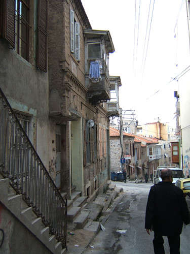
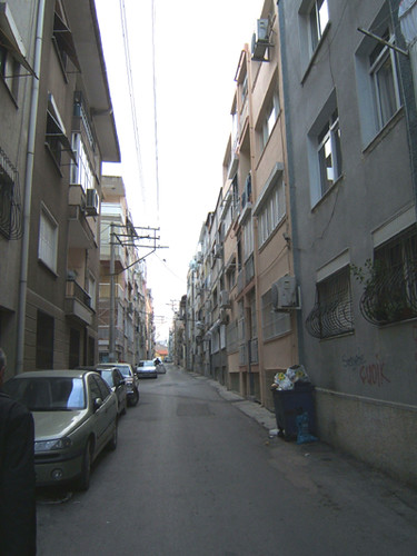
i like that older neighborhood O, I think the problem with the buildings on the lowest image is they are to tall for such a narrow alley condition (and i LOVE alley conditions)
heh heh, our final project during Landscape Architecture Career Discovery was working on a new plaza for boston city hall.
Pei didn't really design it as much as just demolish 150 houses and put pounding hot in summer/icy slippery in winter brick through the whole thing. No shade. Yuck.
My jury said my final design was 'too much architecture' :(
But at least Boston is somewhat of an urban setting with walkable communities. The American dream/mini mall pictures make me want to vomit. Americans refuse to live without there cars though >_>
orhan...agree...the last time i flew back to the US via Detroit Metro, driving through the Office Parks adjacent to the highways seemed literally bizarre...the concept of space is completely different here...
i was watching Anthony Bourdain (the chef) special on Sao Paulo last night...ahh...i miss being surrounded by concrete...
new city shitlist
oh sure, spend so much time worrying about the


great things to put in a city and next thing you know its overrun with angry bees and denim jacket outlets.
perhaps its just as important to list some things to avoid, such as:
ridiculously big plazas.. i happen to know for a fact that this one didn't even look good on paper
don't ever let a city get to a point that one even entertains this idea
disney stores??.. come on, people, aren't we over this yet?
extra long buses! ..but longer's better, right?
graffiti with no effort.. at least make it aesthetically pleasing.
Hahahaha I love it work for idle hands!
Now let me go rummage for some images to add....
public transportation that neither works or gets used. i imagine one is a direct result of the other.
"mobile advertising".. also corporation flags flying right next to your own country's


wirk for idle hands,
isnt the us flag essentially a corporate flag these days?
work for idle hands, your first picture, a city hall, is a dead ringer for the city hall of izmir, turkey. the izmir plaza with a beautiful historical clock tower and heavy everyday use is really nice though.

"0" setback zoning. no air, no trees, no light.
oops
no air? who lives there...robots?
Reminiscent of Pei's Boston city hall

Nice. Should have stuck to big pyramids.
pei's getting credit for city hall now?!
pei's office just did the master plan, including the plaza. the city hall was kallman mckinnell and knowles (now kallman mckinnell wood).
would Kahn's masterplan for Phili have killed his career if it was built
as for big plazas that don't work the most priceless/classic example is:

VEGAS. not talking about the casinos - many are appalling, some are amusing and fun - but the rest of the city/'burbs are an architectural nightmare.
'cept maybe a few mid-century ranches. a few are gems.
The DPM! Post-apoc, that one flew over my head!
I've spent some time on the People Mover, but only on tourist occasions. Yes, a citizen using their own public transit as tourism in the 21st century. Technically it was the 20th century when I rode...
Awww, what's wrong with extra-long busses? I like sitting in the middle. Makes the ride more interesting.
yeah, it's not the extra long buses that are the problem...
it's probably the only viable response for moving large quanitites of people without investing in a legitimate public transportation system.
they get packed during rush hour in seattle.
nightmare postmodern schlock

peach

Pei didn't design Boston's City Hall.....It was a guy who wasn't licensed at the time, think he was a professor on the other side of the river at da big H... Kallman Mckinnel & Knowles.
i did my master's thesis on the design and planning of las vegas and don't find anything particularly bad with the original plan. (i didn't look at how the suburbs are currently developing.) the strip makes for a very clean separation of casino and non-casino functions. the location of the airport is excellent as it ties in well to both the strip (tourist) and maryland parkway (non-tourist).
in my thesis i argued for integration of a casino with the downtown urban fabric, but in practice, without a very sensitive developer behind the project, i'm not sure how well it would work without disneyfying the downtown (as if jerde hasn't gone far enough already). imho las vegas could be much worse, i.e. phoenix.
Pei just designed the plaza.
work for idle hands,
apart from not being aesthetically pleasing -which I agree it is not-, I would say this is not "just another" graffiti but a direct threat (and I'm afraid -at least I suspect so- the threatened target is probably a divorced woman.. or maybe a junkie who owes money to someone)... so its not funny
someone guess what it says
er.. damn I had to post that pic with my post #666... scary
A little late response but...
architecno - Personally, I liked bits and pieces of Kahn's plan for Philly. Edmund Bacon was just too stubborn - although he definitely did some good things for the city too.
Speaking of Philly, something that always bothered me was the fact that the city couldn't take advantage of a great natural resource - the river-fronts. Because of Philly's location, there are actually 3 river-fronts, all of which are simply used for transportation - I-95, I-76 and the Railroad tracks. The disconnect between the city and the river-front is something I often get frustrated about.
Agree on the Philly riverfronts, Philarch. After seeing how well Portland did with getting the freeway away from the river, I've always felt Philly was a lost cause. Blame Amtrak for a lot of the problem, at least on the Schuykill.
Medit: I'm gonna go with "To me your life is nothing".
pretty close liberty! but not exactly... it means exactly the same but with different words...
in fact, your quote would probably require more neurons -even a certain poetic view of existence- than what the person who did that basic, eloquent sentence on that wall has probably had in his (her?) life...
Well, I haven't completely lost hope - In case you haven't been back to Philly in a while LB, they've done a great job on the east side of the Schuylkill stretching the jog/bike path all the way down to Pine/Lombard Street with some nice moments - about 3 years ago, it was just dirt and trash. And of course on the Delaware, there is always stuff going on trying to revive that edge (although it may be a slots Casino). Speaking of which...
No Casinos in new cities! Especially right next to existing residential communities.
It reads: If I see you, I'll kill you.
That's comforting.
that's right n_... especially if it's written on your door or on your backyard's wall.. I'd rather have this on my facade.. not specially beautiful but at least less disturbing:

neo-urbanism and neo-traditional design. anything with classical columns or mouldings/cornices.
neo anything should be thrown out
Especially Neo-Mohawks...

Tyson's Corner, VA

+1 on the noe-mohawk.... the mullet of the new millenium.
i call them "flo-hawks", since they flow...
i measure successful cities by the number of people with ear/clipped cell phones, walking around talking to themselves...
orhan, your 0 setback images are looking pretty good when compared to aquapura's wall-mart...
@ Simples
Amen,
Setback isn't always necessary as logn as you have public, open space in between buildings/block or neighborhoods....
In my humble opinion
Brasilia, the city that a great many architects seem to totally lose their shit over...

no one ever wants to see this in their city

Hold The Zombieeeez!

simples, that might be. i like this older version of '0' setback and 2 less stories more successful with hand carved urban parks on every other block, better.


and re wall mart; that is why usa has to go to iraq to secure that excessive fossil fuel burning. how much more earthly resources we in america burn, is disgusting.
again compare,
i like that older neighborhood O, I think the problem with the buildings on the lowest image is they are to tall for such a narrow alley condition (and i LOVE alley conditions)
heh heh, our final project during Landscape Architecture Career Discovery was working on a new plaza for boston city hall.
Pei didn't really design it as much as just demolish 150 houses and put pounding hot in summer/icy slippery in winter brick through the whole thing. No shade. Yuck.
My jury said my final design was 'too much architecture' :(
But at least Boston is somewhat of an urban setting with walkable communities. The American dream/mini mall pictures make me want to vomit. Americans refuse to live without there cars though >_>
..i think i did experience this this morning

"we are experiencing a delay, and we regret this inconvenience. we expect to be moving shortly"
orhan...agree...the last time i flew back to the US via Detroit Metro, driving through the Office Parks adjacent to the highways seemed literally bizarre...the concept of space is completely different here...
i was watching Anthony Bourdain (the chef) special on Sao Paulo last night...ahh...i miss being surrounded by concrete...
Block this user
Are you sure you want to block this user and hide all related comments throughout the site?
Archinect
This is your first comment on Archinect. Your comment will be visible once approved.